Material-ui: Implement native Select validation for non-native select field
Previously there have been requests (#12749, #11836) to allow native required validation on Select fields without using the native UI, and it was never tackled because it wasn't seen as possible:
@mciparelli Let us know if you find a way to change the implementation to get this done. But I have some doubt that we can achieve it.
However I have found a way to implement it which I believe would resolve any issues.
- [X] I have searched the issues of this repository and believe that this is not a duplicate.
Summary 💡
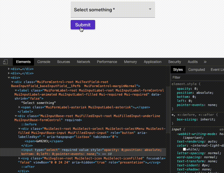
Currently the hidden native input element rendered by the SelectInput component is as follows:
<input type="hidden" value={value} />
We are allowed to spread other props to the hidden input, however the props type, style, className and required, which can be used to implement my fix, are excluded.
Instead a proper hidden input which detects and displays native required validation messages without polluting the screen or click surface area would be defined as follows:
<input
  type="select"
  value={value}
  required={required} // or just allow `required` to be spread
  style={{
    // make it invisible
    opacity: 0;
    // avoid letting click events target the hidden input
    pointer-events: none;
    // position the input so the validation message will target the correct location
    // (fake input is already position: relative)
    position: absolute;
    bottom: 0;
    left: 0;
  }}
  // added in response to issue comments
  aria-hidden={true}
  tabIndex={-1}
/>
Examples 🌈
And here's a hacky implementation of a Select with validation, using direct DOM manipulation and the current library:
import React, { useRef, useLayoutEffect } from "react";
import { Select } from "@material-ui/core";

export default React.memo(function SelectWithValidation(props) {
  const inputContainerRef = useRef();
  useLayoutEffect(() => {
    if (props.native) {
      return;
    }
    const input = inputContainerRef.current.querySelector("input");
    input.setAttribute("type", "select");
    if (props.required) {
      input.setAttribute("required", "");
    }
    // invisible
    input.style.opacity = 0;
    // don't interfere with mouse pointer
    input.style.pointerEvents = "none";
    // align validation messages with fake input
    input.style.position = "absolute";
    input.style.bottom = 0;
    input.style.left = 0;
    // added in response to issue comments
    input.setAttribute("tabindex", "-1");
    input.setAttribute("aria-hidden", "true");
  }, [props.native, props.required]);
  return (
    <div ref={inputContainerRef}>
      <Select {...props} />
    </div>
  );
});
And here's that code running in an example app: https://codesandbox.io/s/material-demo-t9eu2
Motivation 🔦
The native client-side validation in the browser can be useful and good sometimes and wanting to use that validation isn't a good reason to forsake the look and feel of the UI.
 benwiley4000
All 18 comments
@benwiley4000 Thanks for taking the time to write this issue. Have you looked into the a11y implications? We would at least need to remove the <select> from the tab sequence, but I wonder about the potential duplicated announcements by screen readers.
 oliviertassinari
on 4 Apr 2020
oliviertassinari
on 4 Apr 2020
@oliviertassinari great points. I think this is solved with the following additional code:
input.setAttribute("tabindex", "-1");
input.setAttribute("aria-hidden", "true");
https://codesandbox.io/s/material-demo-t9eu2
EDIT: I changed "" to "true" for aria-hidden because every example I see writes out "true."
benwiley4000
on 4 Apr 2020
@benwiley4000 Ok, this sounds good enough 🤔.
I leave it to @eps1lon to get his feedback on the proposed strategy. He has been recently working on the logic of the component.
oliviertassinari
on 4 Apr 2020
Thanks!! Great news.
benwiley4000
on 4 Apr 2020
Did a little bit of additional investigation. I believe the solution is robust. Note that the implementation relies on some (pretty safe) assumptions:
pointer-eventsis supported (all major browsers have since 2015, but IE 10 and earlier do not)- Modern screen readers should support
aria-hiddenaccording to this article and has been supported in all major browsers since 2013, with the caveats that:
- The input element must never be focused, since it will appear in the accessibility tree for the duration it is focused - but I don't think it's possible for that to happen in our case.
- We must avoid passing the
aria-describedbyattribute to theinputelement.
benwiley4000
on 4 Apr 2020
Also if we do want to support IE 9/10 we can work around lack of pointer-events by setting the width/height of the hidden input both to 0.
benwiley4000
on 4 Apr 2020
I fully support this request. Using the native version works, but that defeats the whole purpose of using Material-UI.
 RicardoMonteiroSimoes
on 4 Apr 2020
RicardoMonteiroSimoes
on 4 Apr 2020
@RicardoMonteiroSimoes At least, with the native version, it performs really well on mobile and doesn't look like this.

Instead, it has a consistent look with the textbox.
oliviertassinari
on 4 Apr 2020
I agree the native version is an ok compromise but it doesn't allow for any type of icon embedding inside the selection options, for example. Meanwhile it's true that many apps will implement their own validation UI eventually but it's frustrating to have to do that immediately because the MUI select UI doesn't support native validation.
benwiley4000
on 4 Apr 2020
The native select could also be an advantage with the browser autofill: https://twitter.com/devongovett/status/1248306411508916224. I think that we can move forward here :).
oliviertassinari
on 10 Apr 2020
Would be interesting to see how this is integrated into our component to be able to test it in different browsers etc.
Though I'd like to encourage you to extend your explanations. Most of your components repeat the "what" but I've been left asking "why". For example why not just use hidden? Why use <input type="select" /> (never seen that one) etc.
 eps1lon
on 10 Apr 2020
eps1lon
on 10 Apr 2020
Anything that qualifies to the browser in a binary sense as "inaccessible"
(display none, visibility hidden, hidden attribute) will result in the
input being skipped for validation. Opacity 0 + pointer-events none +
position absolute is sort of a hack to get exactly the same effect but
without indicating to the browser that the input isn't accessible to the
user. It is accessible after all, via proxy.
benwiley4000
on 10 Apr 2020
@benwiley4000 I had a closer look at the problem, with this playground case:
import React from "react";
import { Typography, Select, InputLabel, MenuItem } from "@material-ui/core";

export default function SelectDemo() {
  const [option, setOption] = React.useState("");
  const [successMessage, setSuccessMessage] = React.useState("");

  return (
    <form
      onSubmit={e => {
        e.preventDefault();
        setSuccessMessage("submitted with no validation errors!");
      }}
    >
      <label htmlFor="fname">Full Name</label>
      <input type="text" id="fname" name="firstname" placeholder="John M. Doe" />
      <br />
      <label htmlFor="email">Email</label>
      <input type="text" id="email" name="email" placeholder="[email protected]" />
      <br />
      <label htmlFor="adr">Address</label>
      <input type="text" id="adr" name="address" placeholder="542 W. 15th Street" />
      <br />
      <label htmlFor="city">City</label>
      <input type="text" id="city" name="city" placeholder="New York" />
      <br />
        <InputLabel id="country">Select an option (required)</InputLabel>
        <Select
          value={option}
          onChange={e => setOption(e.target.value)}
          variant="outlined"
          labelId="country"
          required
          name="country"
          style={{ width: 300 }}
        >
          <MenuItem value="" />
          <MenuItem value="a">Option A</MenuItem>
          <MenuItem value="b">Option B</MenuItem>
          <MenuItem value="c">Option C</MenuItem>
          <MenuItem value="France">France</MenuItem>
        </Select>
      <div>
        <button type="submit" variant="outlined">
          Submit
        </button>
      </div>
      <Typography>{successMessage}</Typography>
    </form>
  );
}
I have a proposed diff that seems to solve these cases (an extension of your proposal):
- Native form validation (#20402):

- Autofill (https://twitter.com/devongovett/status/1248306411508916224):

- Simpler testing experience (https://github.com/testing-library/react-testing-library/issues/322), the following test pass:
    it('should support the same testing API as a native select', () => {
      const onChangeHandler = spy();
      const { container } = render(
        <Select onChange={onChangeHandler} value="0" name="country">
          <MenuItem value="0" />
          <MenuItem value="1" />
          <MenuItem value="France" />
        </Select>,
      );
      fireEvent.change(container.querySelector('[name="country"]'), { target: { value: 'France' }});

      expect(onChangeHandler.calledOnce).to.equal(true);
      const selected = onChangeHandler.args[0][1];
      expect(React.isValidElement(selected)).to.equal(true);
    });
It's rare we can solve 3 important problems at once, with a relatively simple diff. It's exciting. What do you think, should we move forward with a pull request?
diff --git a/packages/material-ui/src/NativeSelect/NativeSelect.js b/packages/material-ui/src/NativeSelect/NativeSelect.js
index 00464905b..f9e1da121 100644
--- a/packages/material-ui/src/NativeSelect/NativeSelect.js
+++ b/packages/material-ui/src/NativeSelect/NativeSelect.js
@@ -90,6 +90,15 @@ export const styles = (theme) => ({
   iconOutlined: {
     right: 7,
   },
+  /* Styles applied to the shadow input component. */
+  shadowInput: {
+    bottom: 0,
+    left: 0,
+    position: 'absolute',
+    opacity: 0,
+    pointerEvents: 'none',
+    width: '100%',
+  },
 });

 const defaultInput = <Input />;
diff --git a/packages/material-ui/src/Select/SelectInput.js b/packages/material-ui/src/Select/SelectInput.js
index 4d17eb618..53a7b59b7 100644
--- a/packages/material-ui/src/Select/SelectInput.js
+++ b/packages/material-ui/src/Select/SelectInput.js
@@ -49,7 +49,6 @@ const SelectInput = React.forwardRef(function SelectInput(props, ref) {
     open: openProp,
     readOnly,
     renderValue,
-    required,
     SelectDisplayProps = {},
     tabIndex: tabIndexProp,
     // catching `type` from Input which makes no sense for SelectInput
@@ -121,6 +120,16 @@ const SelectInput = React.forwardRef(function SelectInput(props, ref) {
     update(false, event);
   };

+  const childrenArray = React.Children.toArray(children);
+
+  // Support autofill.
+  const handleChange = (event) => {
+    const index = childrenArray.map((child) => child.props.value).indexOf(event.target.value);
+    if (index !== -1) {
+      onChange(event, childrenArray[index]);
+    }
+  };
+
   const handleItemClick = (child) => (event) => {
     if (!multiple) {
       update(false, event);
@@ -205,7 +214,7 @@ const SelectInput = React.forwardRef(function SelectInput(props, ref) {
     }
   }

-  const items = React.Children.map(children, (child) => {
+  const items = childrenArray.map((child) => {
     if (!React.isValidElement(child)) {
       return null;
     }
@@ -272,7 +281,7 @@ const SelectInput = React.forwardRef(function SelectInput(props, ref) {
     // eslint-disable-next-line react-hooks/rules-of-hooks
     React.useEffect(() => {
       if (!foundMatch && !multiple && value !== '') {
-        const values = React.Children.toArray(children).map((child) => child.props.value);
+        const values = childrenArray.map((child) => child.props.value);
         console.warn(
           [
             `Material-UI: you have provided an out-of-range value \`${value}\` for the select ${
@@ -288,7 +297,7 @@ const SelectInput = React.forwardRef(function SelectInput(props, ref) {
           ].join('\n'),
         );
       }
-    }, [foundMatch, children, multiple, name, value]);
+    }, [foundMatch, childrenArray, multiple, name, value]);
   }

   if (computeDisplay) {
@@ -349,12 +358,20 @@ const SelectInput = React.forwardRef(function SelectInput(props, ref) {
           display
         )}
       </div>
+      {/**
+       * Use a hidden input so:
+       *  - native form validation can run
+       *  - autofill values can be caputred
+       *  - automated tests can be written more easily
+       *  - the vale can be submitted to the server
+       */}
       <input
         value={Array.isArray(value) ? value.join(',') : value}
         name={name}
         ref={inputRef}
-        type="hidden"
-        autoFocus={autoFocus}
+        aria-hidden
+        onChange={handleChange}
+        tabIndex={-1}
+        className={classes.shadowInput}
         {...other}
       />
       <IconComponent
@@ -500,10 +517,6 @@ SelectInput.propTypes = {
    * @returns {ReactNode}
    */
   renderValue: PropTypes.func,
-  /**
-   * @ignore
-   */
-  required: PropTypes.bool,
   /**
    * Props applied to the clickable div element.
    */
@oliviertassinari that's great! Yes I think it's a good idea. Would you like to make the PR since you have the diff ready? Otherwise I can try to submit something in the next few days.
benwiley4000
on 27 Apr 2020
@benwiley4000 For context, select2 uses this approach (a massively popular select for jQuery), so I suspect it's a safe move. If you could open a pull request, get the credit for the initiative, that would be great.
oliviertassinari
on 27 Apr 2020
I would like to work on it, if that's ok
 netochaves
on 23 May 2020
netochaves
on 23 May 2020
@netochaves Sure, happy exploration :)
oliviertassinari
on 23 May 2020
Thanks!
benwiley4000
on 24 May 2020
Related issues
 ryanflorence
·
3Comments
ryanflorence
·
3Comments
 sys13
·
3Comments
sys13
·
3Comments
 mattmiddlesworth
·
3Comments
mattmiddlesworth
·
3Comments
 ghost
·
3Comments
ghost
·
3Comments
 ericraffin
·
3Comments
ericraffin
·
3Comments
Most helpful comment
@benwiley4000 I had a closer look at the problem, with this playground case:
I have a proposed diff that seems to solve these cases (an extension of your proposal):
It's rare we can solve 3 important problems at once, with a relatively simple diff. It's exciting. What do you think, should we move forward with a pull request?