Material-ui: [docs] Customized hook at Autocomplete issue in dark mode
- [x] The issue is present in the latest release.
- [x] I have searched the issues of this repository and believe that this is not a duplicate.
Current Behavior 😯
Expected Behavior 🤔
Steps to Reproduce 🕹
Steps:
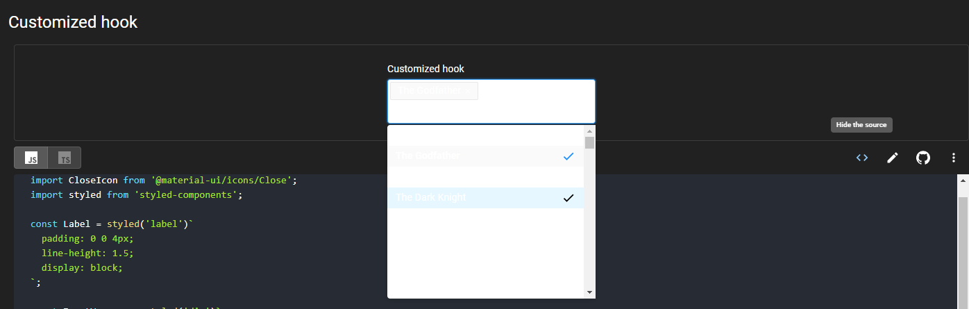
- Go to https://material-ui.com/components/autocomplete/#customized-hook
- Change to dark theme
- Click on the input
- Choose a value and click on it
Context 🔦
Your Environment 🌎
| Tech | Version |
| ----------- | ------- |
| Material-UI | v4.8.3 |
| Browser | chrome 79 |
 eladmotola
All 6 comments
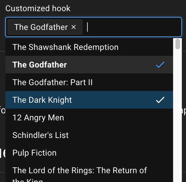
Interesting, while there is no intention to support dark mode for this customization example, I think that it's valuable to keep it open and solve it at some point, as a constraint to guarantee the quality of our integration with styled-components in v5.
 oliviertassinari
on 17 Jan 2020
oliviertassinari
on 17 Jan 2020
What about this diff?
diff --git a/docs/src/pages/components/autocomplete/CustomizedHook.tsx b/docs/src/pages/components/autocomplete/CustomizedHook.tsx
index 93c4f6beb9..75e66356cd 100644
--- a/docs/src/pages/components/autocomplete/CustomizedHook.tsx
+++ b/docs/src/pages/components/autocomplete/CustomizedHook.tsx
@@ -2,9 +2,10 @@
 import * as React from 'react';
 import useAutocomplete from '@material-ui/lab/useAutocomplete';
 import NoSsr from '@material-ui/core/NoSsr';
+import { useTheme, createMuiTheme } from '@material-ui/core/styles';
 import CheckIcon from '@material-ui/icons/Check';
 import CloseIcon from '@material-ui/icons/Close';
-import styled from 'styled-components';
+import styled, { ThemeProvider } from 'styled-components';

 const Label = styled('label')`
   padding: 0 0 4px;
@@ -13,9 +14,10 @@ const Label = styled('label')`
 `;

 const InputWrapper = styled('div')`
+  ${({ theme }) => `
   width: 300px;
-  border: 1px solid #d9d9d9;
-  background-color: #fff;
+  border: 1px solid ${theme.palette.type === 'dark' ? '#434343': '#d9d9d9'};
+  background-color: ${theme.palette.type === 'dark' ? '#141414': '#fff'};
   border-radius: 4px;
   padding: 1px;
   display: flex;
@@ -31,6 +33,8 @@ const InputWrapper = styled('div')`
   }

   & input {
+    background-color: ${theme.palette.type === 'dark' ? '#141414': '#fff'};
+    color: ${theme.palette.type === 'dark' ? '#fff': '#000'};
     font-size: 14px;
     height: 30px;
     box-sizing: border-box;
@@ -42,21 +46,21 @@ const InputWrapper = styled('div')`
     margin: 0;
     outline: 0;
   }
-`;
+  `}`;

 const Tag = styled(({ label, onDelete, ...props }) => (
   <div {...props}>
     <span>{label}</span>
     <CloseIcon onClick={onDelete} />
   </div>
-))`
+))`${({ theme }) => `
   display: flex;
   align-items: center;
   height: 24px;
   margin: 2px;
   line-height: 22px;
-  background-color: #fafafa;
-  border: 1px solid #e8e8e8;
+  background-color: ${theme.palette.type === 'dark' ? 'rgba(255,255,255,0.08)' : '#fafafa'};
+  border: 1px solid ${theme.palette.type === 'dark' ? '#303030' : '#e8e8e8'};
   border-radius: 2px;
   box-sizing: content-box;
   padding: 0 4px 0 10px;
@@ -79,15 +83,16 @@ const Tag = styled(({ label, onDelete, ...props }) => (
     cursor: pointer;
     padding: 4px;
   }
-`;
+`}`;

 const Listbox = styled('ul')`
+  ${({ theme }) => `
   width: 300px;
   margin: 2px 0 0;
   padding: 0;
   position: absolute;
   list-style: none;
-  background-color: #fff;
+  background-color: ${theme.palette.type === 'dark' ? '#141414': '#fff'};
   overflow: auto;
   max-height: 250px;
   border-radius: 4px;
@@ -108,7 +113,7 @@ const Listbox = styled('ul')`
   }

   & li[aria-selected='true'] {
-    background-color: #fafafa;
+    background-color: ${theme.palette.type === 'dark' ? '#2b2b2b': '#fafafa'};
     font-weight: 600;

     & svg {
@@ -117,14 +122,16 @@ const Listbox = styled('ul')`
   }

   & li[data-focus='true'] {
-    background-color: #e6f7ff;
+    background-color: ${theme.palette.type === 'dark' ? '#003b57': '#e6f7ff'};
     cursor: pointer;

     & svg {
-      color: #000;
+      color: currentColor;
     }
   }
-`;
+`}`;
+
+const defaultTheme = createMuiTheme();

 export default function CustomizedHook() {
   const {
@@ -139,6 +146,7 @@ export default function CustomizedHook() {
     focused,
     setAnchorEl,
   } = useAutocomplete({
     id: 'customized-hook-demo',
     defaultValue: [top100Films[1]],
     multiple: true,
@@ -146,8 +154,13 @@ export default function CustomizedHook() {
     getOptionLabel: (option) => option.title,
   });

+  const theme = useTheme() || defaultTheme;
+
   return (
     <NoSsr>
+      <ThemeProvider theme={theme}>
       <div>
         <div {...getRootProps()}>
           <Label {...getInputLabelProps()}>Customized hook</Label>
@@ -169,6 +182,7 @@ export default function CustomizedHook() {
           </Listbox>
         ) : null}
       </div>
+      </ThemeProvider>
     </NoSsr>
   );
 }
can I work on a PR for this? :)
 hmaddisb
on 15 Sep 2020
hmaddisb
on 15 Sep 2020
maybe this is a somewhat stupid question, but I need to check (very new to this, my first issue). Isn't the changes supposed to be applied to CustomizedHook.js and not .tsx? Applying them to .tsx doesn't seem to result in any changes.
hmaddisb
on 15 Sep 2020
@hmaddisb Good point, we should probably have the TSX demo used by default in development. The JS demos are only meant to be decorative. You can switch between the two with the toggle.
oliviertassinari
on 15 Sep 2020
Okay! Thank you for the quick reply! Just so I don't misunderstand, the changes should only be applied to TSX? Even though the same issue behavior is showing in JS?
hmaddisb
on 15 Sep 2020
Related issues
 reflog
·
3Comments
reflog
·
3Comments
 newoga
·
3Comments
newoga
·
3Comments
 ryanflorence
·
3Comments
ryanflorence
·
3Comments
 anthony-dandrea
·
3Comments
anthony-dandrea
·
3Comments
 sys13
·
3Comments
sys13
·
3Comments
Most helpful comment
What about this diff?