Material-ui: Improve Font Awesome support
- [x] The issue is present in the latest release.
- [x] I have searched the issues of this repository and believe that this is not a duplicate.
Current Behavior 😯
When we add a chip with MatherialUI icon (e.g. <Phone/> from '@material-ui/icons') all works fine.
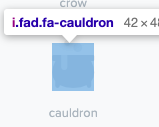
But when we'd add a chip with custom icon (e.g. from Font Awesome) inside the Icon component (Icon from '@material-ui/core') we see that the icon looks a bit ugly.
Examples here: https://codesandbox.io/s/material-ui-n4nhw?fontsize=14
Expected Behavior 🤔
I expect that all of a another icons will looks like a MU icons.
Steps to Reproduce 🕹
Steps:
- Create
<Chip icon={<Phone />} label="test"/>
and
<Chip icon={<Icon className="fas fa-phone-alt"/>} label="test"/> - Compare their icons.
Context 🔦
I'm just trying to use chips with FA's icons.
Your Environment 🌎
| Tech | Version |
| ----------- | ------- |
| Material-UI | v4.5.0 |
| React | 16.10.1 |
| Browser | FF 70.0b11, Google Chrome 76.0.3809.100 |
| TypeScript | 3.6.3 |
| Fontawesome | 5.11.2 |
 Vestrond
All 11 comments
@Vestrond Material Design icons and Font Awesome icons use a different strategy to "frame" the vectorial paths.
Font Awesome: variable ratio, 0px padding
Material Design: 1:1 ratio, 3px padding
I'm not sure how we should address the concern. I can advise you to add a padding 3px to the font awesome icons. Could you confirm it looks better with this diff?
diff --git a/docs/src/pages/components/icons/FontAwesome.tsx b/docs/src/pages/components/icons/FontAwesome.tsx
index 94b4f7cfe..7b6738d3e 100644
--- a/docs/src/pages/components/icons/FontAwesome.tsx
+++ b/docs/src/pages/components/icons/FontAwesome.tsx
@@ -3,12 +3,12 @@ import clsx from 'clsx';
 import { loadCSS } from 'fg-loadcss';
 import { makeStyles, createStyles, Theme } from '@material-ui/core/styles';
 import { red } from '@material-ui/core/colors';
-import Icon from '@material-ui/core/Icon';
+import Icon, { IconProps } from '@material-ui/core/Icon';

 const useStyles = makeStyles((theme: Theme) =>
   createStyles({
     root: {
-      '& > .fa': {
+      '& > span': {
         margin: theme.spacing(2),
       },
     },
@@ -21,28 +21,50 @@ const useStyles = makeStyles((theme: Theme) =>
   }),
 );

+const faUseStyles = makeStyles((theme: Theme) =>
+  createStyles({
+    root: {
+      padding: 3,
+      height: 'auto',
+      width: 'auto',
+      fontSize: theme.typography.pxToRem(24 - 3 * 2),
+    },
+    fontSizeSmall: {
+      fontSize: theme.typography.pxToRem(20 - 3 * 2),
+    },
+    fontSizeLarge: {
+      fontSize: theme.typography.pxToRem(36 - 3 * 2),
+    },
+  }),
+);
+
+function FaIcon(props: IconProps) {
+  const classes = faUseStyles();
+  return <Icon classes={classes} {...props} />;
+}
+
 export default function FontAwesome() {
   const classes = useStyles();

   React.useEffect(() => {
     loadCSS(
       'https://use.fontawesome.com/releases/v5.1.0/css/all.css',
-      document.querySelector('#font-awesome-css'),
+      document.querySelector('#font-awesome-css') || document.head.firstChild,
     );
   }, []);

   return (
     <div className={classes.root}>
-      <Icon className="fa fa-plus-circle" />
-      <Icon className="fa fa-plus-circle" color="primary" />
-      <Icon className="fa fa-plus-circle" color="secondary" />
-      <Icon className="fa fa-plus-circle" color="action" />
-      <Icon
+      <FaIcon className="fa fa-plus-circle" />
+      <FaIcon className="fa fa-plus-circle" color="primary" />
+      <FaIcon className="fa fa-plus-circle" color="secondary" />
+      <FaIcon className="fa fa-plus-circle" color="action" />
+      <FaIcon
         className={clsx(classes.iconHover, 'fa fa-plus-circle')}
         color="error"
         style={{ fontSize: 30 }}
       />
-      <Icon className="fa fa-plus-circle" color="disabled" fontSize="large" />
+      <FaIcon className="fa fa-plus-circle" color="disabled" fontSize="large" />
     </div>
   );
 }
 oliviertassinari
on 6 Oct 2019
oliviertassinari
on 6 Oct 2019
- Set
width: autoandheight: autowas good idea: icons like thefab fa-apple-paywill looks fine. - As I see (may be I do something wrong) padding 3px looks ugly. 1px is Ok. However I'm not sure.
By setting height and width to auto we have a bit pretty picture:

Padding-top: 1px at .MuiIcon-root make more pretty (only for small sizes):
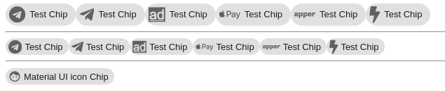
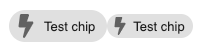
Only problems with Bolt (fas fa-bolt) and AD (fab fa-adversal) icons cuz their size's proportion is abnormal. Idk what to do with this.
Vestrond
on 6 Oct 2019
Maybe we could have something like a fixedRatio prop on the Icon component that forces the icon in a square div with automatic margins on the sides? This would maintain the flexibility if someone is purposefully adding non-square icons while also providing an easier way to use other libraries while maintaining the look and feel of the Material-UI components.
 el1f
on 11 Oct 2019
el1f
on 11 Oct 2019
Did you arrive at any "best practice" regarding this? Also - the SVG icon use case (FontAwesome) is highly interesting to us as well:
import { faExclamationCircle } from "@fortawesome/pro-light-svg-icons";
import { FontAwesomeIcon } from "@fortawesome/react-fontawesome";

<Chip
    icon={<FontAwesomeIcon icon={faExclamationCircle} />}
    label="Warning!"
/>
 SweVictor
on 23 Mar 2020
SweVictor
on 23 Mar 2020
 thorn0
on 2 Jun 2020
thorn0
on 2 Jun 2020
I've been using a custom replacement component for the @fortawesome/react-fontawesome FontAwesomeIcon component that uses the raw SVG path data to populate an SvgIcon component:
https://gist.github.com/chrislambe/062bfc12aeecd7502b39c8dafe19f185
It's essentially an SvgIcon component with an icon prop that accepts a Font Awesome icon (or anything that fulfills the IconDefinition type):
import { faBolt } from '@fortawesome/free-solid-svg-icons/faBolt';
import { FontAwesomeSvgIcon } from './FontAwesomeSvgIcon';

const boltIcon = <FontAwesomeSvgIcon fontSize="large" color="primary" icon={faBolt} />;
It's missing all the fancy transform/stacking features of FontAwesomeIcon but so far it renders correctly everywhere I've tried it.
Colors/sizes:
Bolt in Chip:
Bolt in IconButton (ink is no longer an ellipse instead of a circle):

Not sure how this should/could be applied to either library, though.
 chrislambe
on 31 Aug 2020
chrislambe
on 31 Aug 2020
@chrislambe Thanks for sharing. While we have been exploring the issue with fonts, its the first time we cover SVG. What do you think about adding a FontAwesome section in https://material-ui.com/components/icons/#svgicon. How about using your gist as a starting point? https://codesandbox.io/s/happy-engelbart-1hke8?file=/src/App.tsx
It's missing all the fancy transform/stacking features
I have been wondering about this for a while. Which feature do you miss?
oliviertassinari
on 1 Sep 2020
Nice.
For reference the very simplistic approach we use, using FontAwesomes own icon wrappers can be seen below. Can't promise it's perfect in all cases, but so far it has worked well. We have not tried any duo-tone things, however duo-tone icons are a separate lib with FA. https://fontawesome.com/how-to-use/on-the-web/styling/duotone-icons
https://codesandbox.io/s/still-architecture-zdr81?file=/src/App.tsx
SweVictor
on 1 Sep 2020
@SweVictor This approach looks interesting. Did you experience any issue with it?
oliviertassinari
on 1 Sep 2020
@oliviertassinari sure! I'll try and write up a Font Awesome section for the docs this week. As for the "fancy features," I've really only used the stacking/transforms once in creating a compound icon. I layered the robot icon with an offset and rotated exclamation icon as an error icon. Otherwise I don't have a need for it.
@SweVictor I was doing something similar for a while, using fixedWidth to try and account for the difference in dimensions. The fact that the IconButton ink isn't perfectly circular even with fixedWidth is what eventually drove me to write that component.
chrislambe
on 1 Sep 2020
I see, sounds good @chrislambe.
I haven't seen many issues so far, but we have very few IconButtons so that could be it. I see now (since you pointed it out) that the IconButton is indeed elliptical in my example. We did however notice some issues initially (hence the interest in this thread) with for example the Chip component and some other sub-elements. Each case can be fixed with custom margins/paddings or shrink/grow, but I agree a "real" bridge would be a better solution so I appreciate the effort.
I think it would be good to contrast "normal" FA use (with their wrapper) with the "MUI" bridge to show what you actually gain.
The FA transforms are quite nice to have sometimes, but most can of course fixable with very little CSS as well (edit: I realize this is not really in scope, more of a note for MUI in general). https://fontawesome.com/how-to-use/on-the-web/using-with/react#features
SweVictor
on 1 Sep 2020
Related issues
 ghost
·
3Comments
ghost
·
3Comments
 rbozan
·
3Comments
rbozan
·
3Comments
 mb-copart
·
3Comments
mb-copart
·
3Comments
 reflog
·
3Comments
reflog
·
3Comments
 ericraffin
·
3Comments
ericraffin
·
3Comments
Most helpful comment
Maybe we could have something like a
fixedRatioprop on theIconcomponent that forces the icon in a square div with automatic margins on the sides? This would maintain the flexibility if someone is purposefully adding non-square icons while also providing an easier way to use other libraries while maintaining the look and feel of the Material-UI components.