Material-ui: valueLabels in the slider component are overlapping
- [x] This is not a v0.x issue.
- [x] I have searched the issues of this repository and believe that this is not a duplicate.
Expected Behavior 🤔
Maybe show the values inside of a tooltip-like component with a specific margin.
Current Behavior 😯
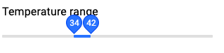
https://codesandbox.io/s/material-demo-h63rn

Context 🔦
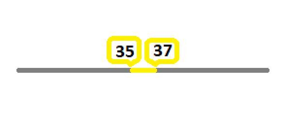
I am using the slider component only to display a range with no user interaction. But if the min and max-values are too close to each other the labels are overlapping (see codesandbox link above). Ideally, inorder to be readable, they should not overlapp, and look like what is shown in the figure (with better css ;) ).
I have seen in the API docs, that we are able to pass an array for "marks", which can contain different marking styles for individual instances (https://material-ui.com/components/slider/#discrete-sliders). If it were possible to pass a rich-array for "values", it would do the trick.
Many thanks for your support and the wonderful project you have running.
 oulfik
All 6 comments
@krupniok Reducing the size of the label helps a bit:
What visual output do you have in mind with the marks path?
 oliviertassinari
on 10 Jul 2019
oliviertassinari
on 10 Jul 2019
Hi @oliviertassinari, thanks for answering. But, your solution will not help in generalizing my problem. Because, many times I am showing about 1% of the total range. In such cases, I will end up overlapping the two labels, even if I reduce the size.
I was a bit wrong about the "marks path". What I intented to say was, it would be good to somehow pass styling object along with the values, so that each value label can be styled differently. In my specific case, I would make the min-value left-aligned and the max-value right-aligned -- thereby, preventing overlapp.
oulfik
on 11 Jul 2019
it would be good to somehow pass styling object along with the values, so that each value label can be styled differently. In my specific case, I would make the min-value left-aligned and the max-value right-aligned -- thereby, preventing overlapp.
@krupniok You can provide your own ValueLabelComponent prop. I have done a quick hack with the internal module. Maybe we could consider a stable solution to the problem
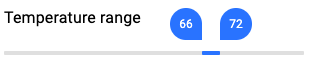
https://codesandbox.io/s/material-demo-y76cj
import React from "react";
import { withStyles, makeStyles } from "@material-ui/core/styles";
import Typography from "@material-ui/core/Typography";
import Slider from "@material-ui/core/Slider";
import ValueLabel from "@material-ui/core/Slider/ValueLabel";

const StyledValueLabel = withStyles({
  offset: {
    top: -28,
    left: props => props.index === 0 ? "calc(-50% + -20px)" : "calc(-50% + 12px)"
  },
  circle: {
    transform: props => props.index === 0 ? "rotate(-90deg)" : "rotate(0deg)"
  },
  label: {
    transform: props => props.index === 0 ? "rotate(90deg)" : "rotate(0deg)"
  }
})(ValueLabel);

const useStyles = makeStyles({
  root: {
    width: 300
  }
});

const MySlider = withStyles({
  root: {
    color: "#3880ff",
    height: 2,
    padding: "15px 0"
  },

  track: {
    height: 4
  },
  thumb: {
    background: "transparent",
    "&:focus,&:hover,&$active": {
      boxShadow: "inherit"
    }
  },
  rail: {
    height: 4,
    opacity: 0.5,
    backgroundColor: "#bfbfbf"
  },
  mark: {
    backgroundColor: "#bfbfbf",
    height: 8,
    width: 1,
    marginTop: -2
  }
})(Slider);

function valuetext(value) {
  return `${value}°C`;
}

export default function RangeSlider() {
  const classes = useStyles();
  const [value] = React.useState([31, 37]);

  return (
    <div className={classes.root}>
      <Typography id="range-slider" gutterBottom>
        Temperature range
      </Typography>
      <MySlider
        defaultValue={value}
        valueLabelDisplay="on"
        ValueLabelComponent={StyledValueLabel}
        aria-labelledby="range-slider"
        getAriaValueText={valuetext}
      />
    </div>
  );
}
In this case, it's probably best to display both values on the side.
oliviertassinari
on 2 Dec 2019
When implementing this in TypeScript you'll get the error, "Could not find a declaration file for module '@material-ui/core/Slider/ValueLabel'" and will need to add a .d.ts file for ValueLabel.
I think this works:
import { ValueLabelProps } from '@material-ui/core/Slider';
declare const ValueLabel: React.ComponentType<ValueLabelProps>;
export default Slider;
 Aadmaa
on 15 Feb 2020
Aadmaa
on 15 Feb 2020
The component is private, my demo isn't correct.
oliviertassinari
on 15 Feb 2020
Related issues
 revskill10
·
3Comments
revskill10
·
3Comments
 sys13
·
3Comments
sys13
·
3Comments
 iamzhouyi
·
3Comments
iamzhouyi
·
3Comments
 ghost
·
3Comments
ghost
·
3Comments
 activatedgeek
·
3Comments
activatedgeek
·
3Comments
Most helpful comment
@krupniok You can provide your own
ValueLabelComponentprop. I have done a quick hack with the internal module. Maybe we could consider a stable solution to the problemhttps://codesandbox.io/s/material-demo-y76cj