Material-ui: Lists and Tables don't have same horizontal padding
- [x] This is not a v0.x issue.
- [x] I have searched the issues of this repository and believe that this is not a duplicate.
This is a v3 issue only, it is fixed in next
Feel free to close this, I just thought I'd point it out in case no one had thought about whether alignment of List and Table content should be desirable.
Expected Behavior 🤔
The default horizontal padding of lists and tables matches. Maybe it's the material design guidelines' fault that this isn't the case?
Current Behavior 😯
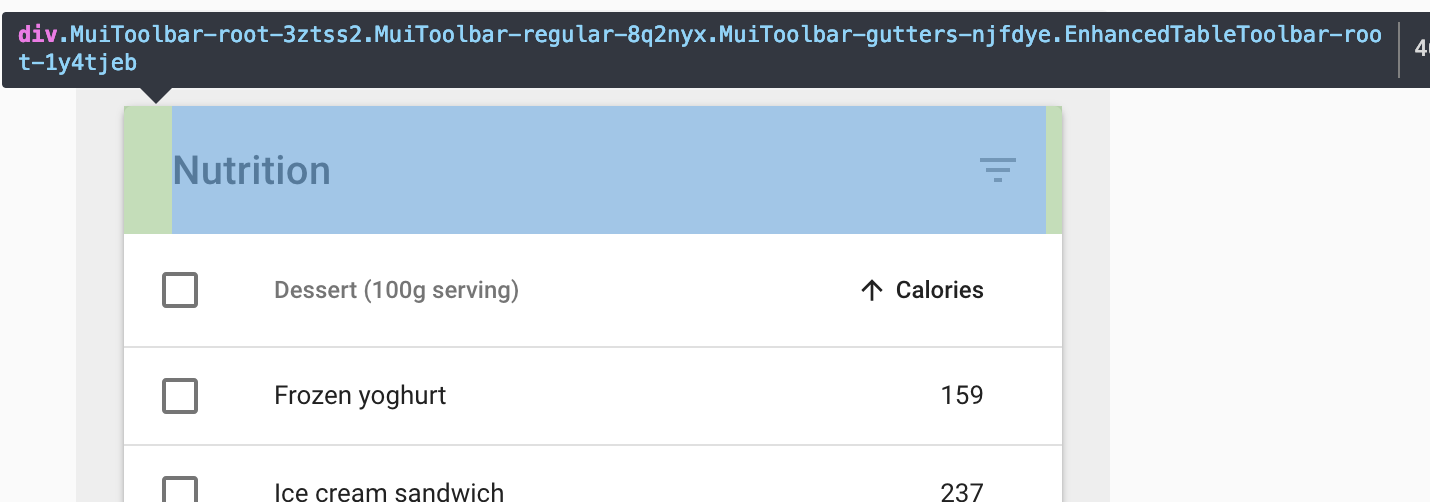
When a List is rendered above a Table or vice versa, the horizontal padding of the list and table content doesn't match.

Steps to Reproduce 🕹
Link: https://codesandbox.io/s/zq96j3vm3m
Context 🔦
I haven't actually needed to render a List and a Table that align with each other, yet. But I imagine it could happen someday and it seems to me that it's generally desirable for Lists and Tables to look good together by default.
Your Environment 🌎
| Tech | Version |
|--------------|---------|
| Material-UI | v3.9.2 |
 jedwards1211
All 10 comments
Looks like it should be 16px as well: https://material.io/design/components/data-tables.html#specs
12px seems to be the right margin of the checkbox.
 eps1lon
on 5 Mar 2019
eps1lon
on 5 Mar 2019
ah good, that makes things easier for all of us. I can work on a PR for this
jedwards1211
on 5 Mar 2019
I'd like to reiterate that in sympathy for developers who are already using a padding of 24px in components above and below a table in their app, I encourage you to postpone releasing a fix for this until v4.
jedwards1211
on 5 Mar 2019
I'd like to reiterate that in sympathy for developers who are already using a padding of 24px in components above and below a table in their app, I encourage you to postpone releasing a fix for this until v4.
master is currently for important bug fixes only anyway.
eps1lon
on 5 Mar 2019
@eps1lon the checkbox's own padding of 12px is causing it not to match the spec:

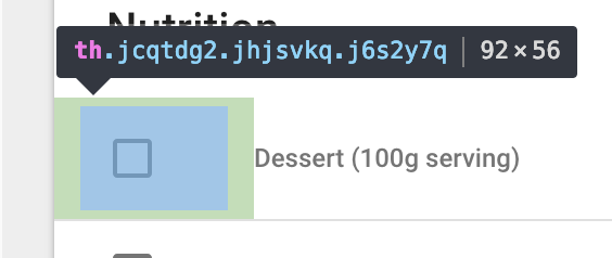
Currently TableCell has
  paddingCheckbox: {
    padding: '0 12px',
    '&:last-child': {
      paddingRight: 12,
    },
  },
Do you think this would be better?
  paddingCheckbox: {
    padding: 0,
    '&:first-child': {
      paddingLeft: 4,
    },
    '&:last-child': {
      paddingRight: 4,
    },
  },
FWIW, I've had to override Checkbox padding a lot in my own projects to left-align the border of the checkbox with other content in a lot of places.
jedwards1211
on 5 Mar 2019
Another awkward thing is that the Toolbar used above the Table in the demos has a horizontal padding of 24px. How do you think we should solve this? (I didn't see anything about "Toolbars" in the Material UI specs, I assume you're just using it as an internal component?)
jedwards1211
on 5 Mar 2019
(I didn't see anything about "Toolbars" in the Material UI specs, I assume you're just using it as an internal component?)
https://material.io/design/components/data-tables.html#specs: The very first table uses this toolbar. The spec is actually pretty good for tables. Not much ambiguity here as far as I can tell.
Do you think this would be better?
Let's discuss this in a PR with actual code. My capabilities are pretty limited without devtools.
eps1lon
on 5 Mar 2019
Yeah the spec is good, what I mean is, the horizontal padding of 24px used by the Toolbar component in this project isn't compatible with the padding shown in those specs, and I don't see anything about sizing of a "Toolbar" component in the sidebar of the specs page. So should we change the horizontal padding of the Toolbar in this project to 16px or?
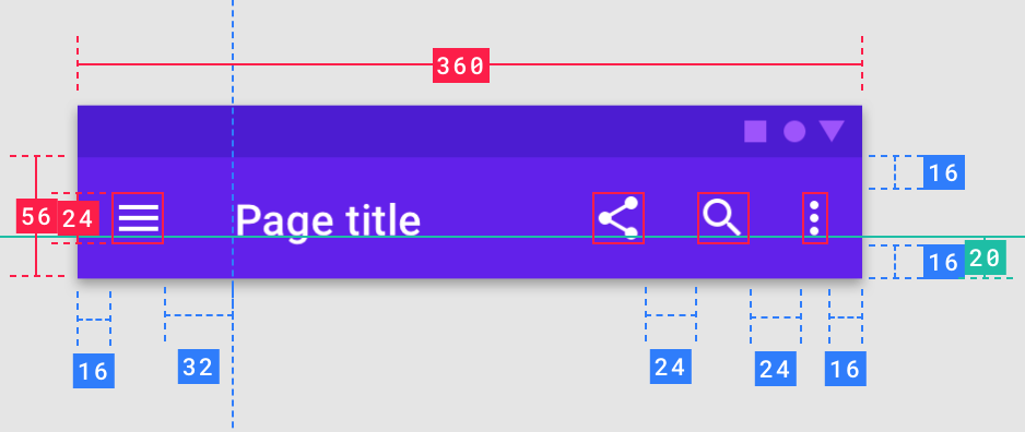
I assume we should because the AppBar specs in the material design guidelines show 16px padding (maybe this has changed since earlier versions of the guidelines):
jedwards1211
on 5 Mar 2019
I can make changes to Toolbar in my PR as well, it just seems like this issue actually has a bigger scope than just Tables...
jedwards1211
on 5 Mar 2019
@eps1lon now that I look at the next branch, a lot of the stuff in tables has already been fixed. However, Toolbar is still using theme.margins.gutters(), so I can make that fix.
jedwards1211
on 5 Mar 2019
Related issues
 illogikal
·
75Comments
illogikal
·
75Comments
 chadobado
·
119Comments
chadobado
·
119Comments
 kybarg
·
164Comments
kybarg
·
164Comments
 nathanmarks
·
100Comments
nathanmarks
·
100Comments
 sjstebbins
·
71Comments
sjstebbins
·
71Comments
Most helpful comment
Looks like it should be 16px as well: https://material.io/design/components/data-tables.html#specs
12px seems to be the right margin of the checkbox.