Material-ui: Buttons, cards, and text field styling updates to match new material-release
- [x] This is not a v0.x issue.
- [x] I have searched the issues of this repository and believe that this is not a duplicate.
Expected Behavior 🤔
The newer updates to Google Docs, and other Google products have updated designs that aren't reflected in the current iteration of material-ui
Current Behavior 😯
Current material-ui components use older styling
Examples 🌈
Here is a screenshot of what the new design looks like: a comment card on the redesigned Google Docs
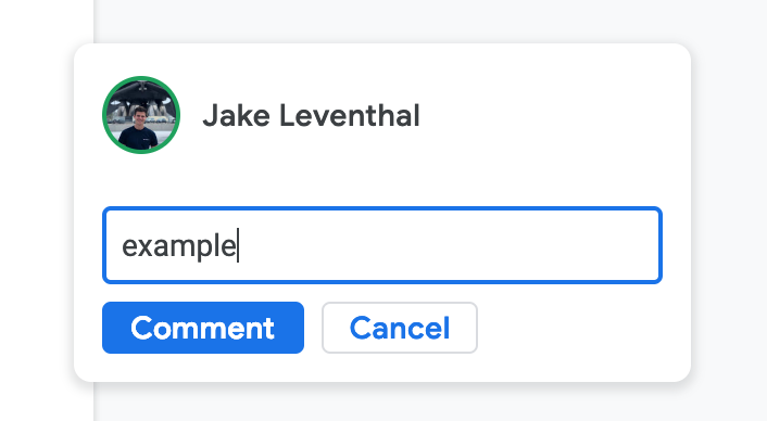
In this comparable sandbox that I made, there are many noticeable differences in default styling behavior. The styling differences are apparent everywhere throughout most all of Google's software tools as of the January 15, 2019 updates to material.
- New cards have more of shadow/elevation
- New Corners on everything are more rounded
- New default paper color is white
- New default primary color is lighter
- New Text font is different (more rounded)
- New Buttons don't have drop shadows
- New Buttons are more compact
- New Buttons are outlined (see the cancel button)
- New buttons are not all caps
- New buttons have different color behavior when clicking & holding (see GIF)

I am aware that a lot of these changes can be achieved through styling but these changes seem to be the _DEFAULT_ behavior in material design
 jakeleventhal
All 6 comments
@jakeleventhal Just to be clear, we are implementing Material Design, not Google's product line. Google Products are taking liberties with the specifications. I think that we can close the issue for #14521, we miss a size="small" implementation of our text field (we already have it for the button, you can use it).
By the way, if you want to create a theme for Google Docs, we would be happy to integrate it in the documentation!
 oliviertassinari
on 25 Feb 2019
oliviertassinari
on 25 Feb 2019
Is there a way to apply styles that override the default styles in a theme file?
For example, if I wanted to make all
jakeleventhal
on 25 Feb 2019
@jakeleventhal Yes, I'm glad you asked. You can use the theme.overrides feature. The Chrome dev tools can help too. Some of our free premium themes are leveraging this feature.
oliviertassinari
on 25 Feb 2019
You can start from here: https://codesandbox.io/s/7z9lqqwqq0.

import React from "react";
import { MuiThemeProvider, createMuiTheme } from "@material-ui/core/styles";
import Button from "@material-ui/core/Button";

const theme = createMuiTheme({
  typography: { useNextVariants: true },
  palette: {
    primary: {
      main: "#496590"
    }
  },
  props: {
    MuiButtonBase: {
      disableRipple: true
    }
  }
});

theme.overrides = {
  // Name of the component ⚛️ / style sheet
  MuiButton: {
    // Name of the rule
    outlined: {
      "&:active": {
        boxShadow: theme.shadows[2]
      }
    },
    sizeSmall: {
      paddingTop: 0,
      paddingBottom: 0
    },
    label: {
      textTransform: "none"
    }
  }
};

function OverridesCss() {
  return (
    <MuiThemeProvider theme={theme}>
      <Button size="small" color="primary" variant="outlined">
        Cancel
      </Button>
    </MuiThemeProvider>
  );
}

export default OverridesCss;
@oliviertassinari is there a way to apply this sort of global prop settings with size breakpoints?
i.e.
const theme = createMuiTheme({
  typography: { useNextVariants: true },
  palette: {
    primary: {
      main: "#496590"
    }
  },
  props: {
    MuiGrid: {
    [theme.breakpoints.up('lg')]: {
      spacing: 16
    },
    [theme.breakpoints.only('md')]: {
      spacing: 8
    },
    [theme.breakpoints.down('sm')]: {
      spacing: 2
    }
    }
  }
});
@jakeleventhal You can't change JavaScript values with CSS. No, not like this.
import React from "react";
import { MuiThemeProvider, createMuiTheme } from "@material-ui/core/styles";
import Grid from "@material-ui/core/Grid";

const theme = createMuiTheme({
  typography: { useNextVariants: true },
  palette: {
    primary: {
      main: "#496590"
    }
  }
});

theme.overrides = {
  MuiGrid: {
    container: {
      [theme.breakpoints.up("lg")]: {
        margin: -16 / 2,
        width: "calc(100% + 16px)"
      },
      [theme.breakpoints.only("md")]: {
        margin: -8 / 2,
        width: "calc(100% + 8px)"
      },
      [theme.breakpoints.down("sm")]: {
        margin: -2 / 2,
        width: "calc(100% + 2px)"
      },
      "& > $item": {
        [theme.breakpoints.up("lg")]: {
          padding: 8 / 2
        },
        [theme.breakpoints.only("md")]: {
          padding: 16 / 2
        },
        [theme.breakpoints.down("sm")]: {
          padding: 2 / 2
        }
      }
    }
  }
};

function OverridesCss() {
  return (
    <MuiThemeProvider theme={theme}>
      <Grid container>
        <Grid item>1</Grid>
        <Grid item>2</Grid>
      </Grid>
    </MuiThemeProvider>
  );
}

export default OverridesCss;
Related issues
 kybarg
·
164Comments
kybarg
·
164Comments
 iceafish
·
62Comments
iceafish
·
62Comments
 tdkn
·
57Comments
tdkn
·
57Comments
 aranw
·
95Comments
aranw
·
95Comments
 illogikal
·
75Comments
illogikal
·
75Comments
Most helpful comment
@jakeleventhal Just to be clear, we are implementing Material Design, not Google's product line. Google Products are taking liberties with the specifications. I think that we can close the issue for #14521, we miss a
size="small"implementation of our text field (we already have it for the button, you can use it).By the way, if you want to create a theme for Google Docs, we would be happy to integrate it in the documentation!