Material-ui: Better RTL support (specifically for Card Headers)
It would be great if things that typically use margin-left or margin-right to provide correct spacing could instead be empty flex-items that take up the same amount of space. This would result in automatic RTL compatibility for CardHeaders.
An example use-case for visual aide:


 mmartha
All 5 comments
Are CardHeaders currently not supporting RTL or are you asking for RTL behavior without adding jss plugins?
Would be nice to have markup + css for the two approaches to properly judge them.
 eps1lon
on 30 Jan 2019
eps1lon
on 30 Jan 2019
CardHeaders do _mostly_ support RTL (at least much better than the beta version, which we were using until recently). The second screenshot is using the out-of-the-box CardHeader component with the page direction switched to 'rtl'. The issue specifically is that the spacing around the avatar is hard-coded with margin-right, so does not adjust correctly when the page is flipped.
.MuiCardHeader-avatar-95 {
    flex: 0 0 auto;
    margin-right: 16px;
}
I might not have dug far enough into the documentation, but is there a jss plugin I could use that would adjust these details like spacing for MaterialUI components automatically?
mmartha
on 30 Jan 2019
I haven't tested it, but I believe step 3 here will solve your issue: https://material-ui.com/guides/right-to-left/
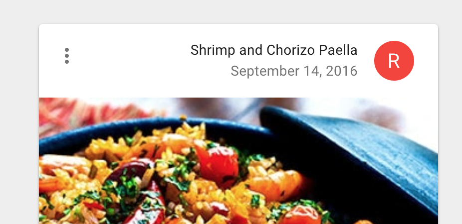
Edit, actually, if you take a look at the demo here: https://material-ui.com/demos/cards/#complex-interaction and switch the docs to RTL:

it does appear to work correctly:
 mbrookes
on 30 Jan 2019
mbrookes
on 30 Jan 2019
I agree with @mbrookes. It's very likely an issue with step 3 of the guide. @mmartha This should solve your problem :).
 oliviertassinari
on 31 Jan 2019
oliviertassinari
on 31 Jan 2019
It did indeed, thank you for your help!
mmartha
on 31 Jan 2019
Related issues
 finaiized
·
3Comments
finaiized
·
3Comments
 TimoRuetten
·
3Comments
TimoRuetten
·
3Comments
 rbozan
·
3Comments
rbozan
·
3Comments
 ryanflorence
·
3Comments
ryanflorence
·
3Comments
 ghost
·
3Comments
ghost
·
3Comments