Material-ui: Native Select when using Dark theme on Windows Browsers has white text on white background
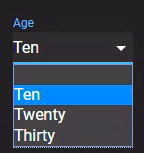
When using the Native Select from Material-UI if you use the dark theme then the select dropdown has white text on a white background.
This is seen on the component demo page too when in dark mode:
Can you change the background color without changing the actual select background color?
Thanks!
 Davsadi
All 6 comments
@Davsadi Thank you for reporting the problem. I think that we can fix the problem like this:
--- a/packages/material-ui/src/NativeSelect/NativeSelect.js
+++ b/packages/material-ui/src/NativeSelect/NativeSelect.js
@@ -31,7 +31,7 @@ export const styles = theme => ({
     cursor: 'pointer',
     '&:focus': {
       // Show that it's not an text input
-      background:
+      backgroundColor:
         theme.palette.type === 'light' ? 'rgba(0, 0, 0, 0.05)' : 'rgba(255, 255, 255, 0.05)',
       borderRadius: 0, // Reset Chrome style
     },
@@ -45,6 +45,9 @@ export const styles = theme => ({
     '&[multiple]': {
       height: 'auto',
     },
+    '& option, & optgroup': {
+      backgroundColor: theme.palette.background.paper,
+    },
   },
   /* Styles applied to the `Input` component if `variant="filled"`. */
   filled: {
What do you think about it? Do you want to submit a pull-request? :)
 oliviertassinari
on 29 Jan 2019
oliviertassinari
on 29 Jan 2019
@oliviertassinari - thanks so much for the response. Unfortunately, I'm a total noob and just playing with material-ui and react for the first time to build a web app so not sure how to go about submitting a pull-request!
ps - great job on material-ui - it's an awesome framework!
Davsadi
on 29 Jan 2019
@oliviertassinari What kind of test expectations would you have on a change like this?
 ryancogswell
on 30 Jan 2019
ryancogswell
on 30 Jan 2019
@ryancogswell We don't have any test for this. I doubt we can. I have tried the changes on Browserstack.
oliviertassinari
on 30 Jan 2019
@Davsadi despite the size of the codebase, it's honestly pretty straightforward: https://github.com/mui-org/material-ui/blob/master/CONTRIBUTING.md
 mbrookes
on 30 Jan 2019
mbrookes
on 30 Jan 2019
@oliviertassinari That's what I figured -- just wanted to make sure there wasn't a testing approach you use for something like this that I was unaware of. I had independently come up with a similar fix when responding to Davsadi's StackOverflow question. I'll take care of the pull request.
ryancogswell
on 30 Jan 2019
Related issues
 amcasey
·
70Comments
amcasey
·
70Comments
 mnajdova
·
105Comments
mnajdova
·
105Comments
 iceafish
·
62Comments
iceafish
·
62Comments
 kybarg
·
164Comments
kybarg
·
164Comments
 HZooly
·
63Comments
HZooly
·
63Comments