Material-ui: How to access and overide div element of menuitem component?
So, here is my code snippet :
{options.map(({ label, value }) => (
        <MenuItem className={classes.root} key={value} value={value}>{label}</MenuItem>
     ))}
and the above code generates an output like this.

having a div followed by unordered list.
but what if, If someone want to overide properties of the div element here.
I have tried passing className={classes.root} to it what it is doing is applying modification to first unordered list instead of applying it to div elment that is the parent of all unordered list.
but what it is doing is applying my modified properties to the ul element instead of the parent div.
see screenshot below.

 divyanshu-rawat
All 9 comments
@divyanshu-rawat The div comes from this element:
https://github.com/mui-org/material-ui/blob/c7eae1d12b5b7b24b2758bc4262ef5ca9905e172/packages/material-ui/src/Popover/Popover.js#L330
There is a PaperProps property on the Menu to access the element. If you are using the Select component, it's a bit tricker, you need to use something like:
<Select MenuProps={{ PaperProps: {} }} />
 oliviertassinari
on 29 Sep 2018
oliviertassinari
on 29 Sep 2018
@oliviertassinari but I am not making use of Popover.js in my application.
Here the code snippet now I want to access div element or to be specific modify css of div element.
const styles = () => ({
  root: {
    top:65
  },
});

const Picker = ({
  classes, identifier, topLabel, onSelection, options, selectedValue,
}) => (
  <form  autoComplete="off">
    <TextField
      name={identifier}
      select
      label={topLabel}
      value={selectedValue}
      onChange={onSelection}
    >
      {options.map(({ label, value }) => (
        <MenuItem className={classes.root} key={value} value={value}>{label}</MenuItem>
      ))}
    </TextField>
  </form>
);

Picker.propTypes = {
  classes: PropTypes.shape().isRequired,
  identifier: PropTypes.string.isRequired,
  onSelection: PropTypes.func.isRequired,
  options: PropTypes.arrayOf(PropTypes.shape({
    label: PropTypes.string.isRequired,
    value: PropTypes.string.isRequired,
  })).isRequired,
  selectedValue: PropTypes.string.isRequired,
  topLabel: PropTypes.string.isRequired,
};

export default withStyles(styles)(Picker);
So, can you please let me know what should be the right startegy to modify the css?
divyanshu-rawat
on 29 Sep 2018
@divyanshu-rawat In this case:
<TextField SelectProps={{ MenuProps: { PaperProps: {} } }} />
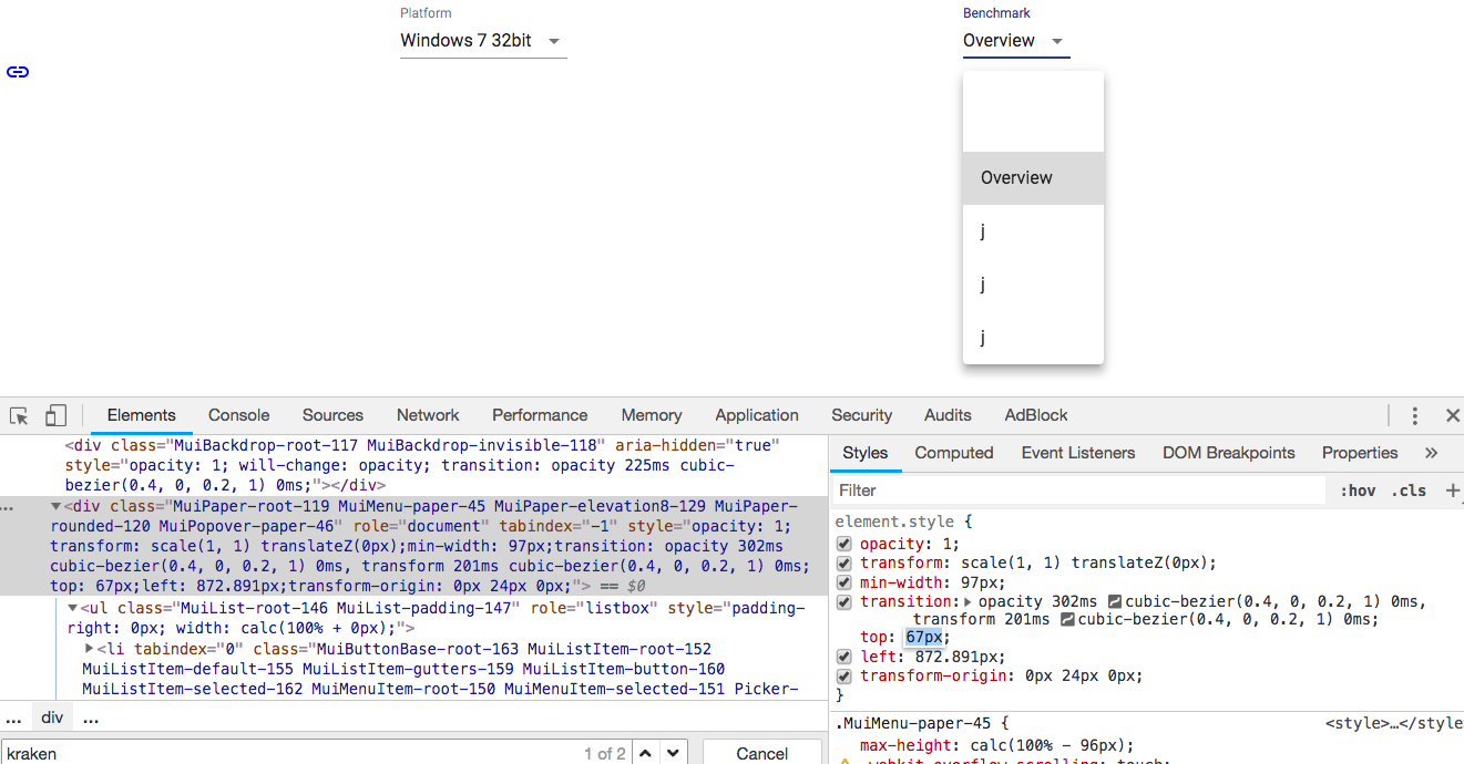
@oliviertassinari I tried doing this
<TextField SelectProps={{ MenuProps: { PaperProps: { style : { opacity: .8, top: 95} }} }}
but weird thing is that all properties are chnging except the top one, like as we can see opacity is changed/ overided but top is still intact even after setting it to 95 in the above
See screenshot:
divyanshu-rawat
on 30 Sep 2018
@divyanshu-rawat If you want to change the popover position, check the property available on this end.
oliviertassinari
on 30 Sep 2018
@oliviertassinari sorry to say, I didn't get this thing, _property available on this end_?
divyanshu-rawat
on 30 Sep 2018
sorry to say, I didn't get this thing, property available on this end?
https://material-ui.com/utils/popover/#anchor-playground
Next time, please submit support requests and questions to StackOverflow using the tag material-ui. StackOverflow is better suited for this kind of support. The issue tracker is for bug reports and feature discussions. See also our CONTRIBUTING guidelines.
oliviertassinari
on 30 Sep 2018
Sure will do that 👍
divyanshu-rawat
on 30 Sep 2018
@oliviertassinari , Achorposition is the property available on this end , but how to pass it to selectprops, I tried passing it in this way but it didn/t worked.
<TextField SelectProps={{ MenuProps: { PaperProps: { style : { opacity: .9 , anchorPosition:{ top: 700, left: 400 }} }} }}
divyanshu-rawat
on 30 Sep 2018
Related issues
 cfilipov
·
55Comments
cfilipov
·
55Comments
 nathanmarks
·
100Comments
nathanmarks
·
100Comments
 iceafish
·
62Comments
iceafish
·
62Comments
 tdkn
·
57Comments
tdkn
·
57Comments
 aranw
·
95Comments
aranw
·
95Comments