Material-ui: [Grid] a 1+1+1+1+2+6 row doesn't fit anymore for small width
Not sure if it's a bug
The Grid below, when the window width is below 642px, wraps in 2 rows, it should not.
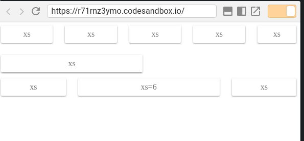
<Grid container spacing={24}>
        <Grid item xs>
          <Paper className={classes.paper}>xs</Paper>
        </Grid>
        <Grid item xs>
          <Paper className={classes.paper}>xs</Paper>
        </Grid>
        <Grid item xs>
          <Paper className={classes.paper}>xs</Paper>
        </Grid>
        <Grid item xs>
          <Paper className={classes.paper}>xs</Paper>
        </Grid>
        <Grid item xs={2}>
          <Paper className={classes.paper}>xs</Paper>
        </Grid>
        <Grid item xs={6}>
          <Paper className={classes.paper}>xs</Paper>
        </Grid>
      </Grid>
https://codesandbox.io/s/r71rnz3ymo
Possibly due to the padding in paper items (removing it, the issue doesn't occur)
version: v1.0.0-beta.34
 caub
caub
All 3 comments
⚠️ xs=true is different to xs=1.
xs=true:
    flex-grow: 1;
    max-width: 100%;
    flex-basis: 0;
xs=1:
    max-width: 8.33333%;
    flex-basis: 8.33333%;
By the way, I think that we miss the xs="auto" option:
    flex: 0 0 auto;
    width: auto;
    max-width: none;
 oliviertassinari
on 22 Feb 2018
oliviertassinari
on 22 Feb 2018
@oliviertassinari thanks, you're too fast
Was wondering too, why the Grid system uses percentages, instead of flex (https://codesandbox.io/s/r71rnz3ymo). It's not for browser support, since IE11+ is ok with flex
Probably answered here https://github.com/mui-org/material-ui/issues/6140
caub
on 22 Feb 2018
why the Grid system uses percentages
Good question, maybe we can remove it: https://github.com/twbs/bootstrap/blob/8fccaa2439e97ec72a4b7dc42ccc1f649790adb0/scss/mixins/_grid.scss#L43-L46
oliviertassinari
on 22 Feb 2018
Related issues
 FranBran
·
3Comments
FranBran
·
3Comments
 newoga
·
3Comments
newoga
·
3Comments
 ghost
·
3Comments
ghost
·
3Comments
 rbozan
·
3Comments
rbozan
·
3Comments
 ryanflorence
·
3Comments
ryanflorence
·
3Comments
Most helpful comment
⚠️
xs=trueis different toxs=1.xs=true:xs=1:By the way, I think that we miss the
xs="auto"option: