Material-ui: Input adornment with IconButton incorrectly positioned on Internet Explorer 11
- [x] I have searched the issues of this repository and believe that this is not a duplicate.
Expected Behavior
Positioning of the IconButton as an InputAdornment should be the same on IE11 as it is on other browsers.
Current Behavior
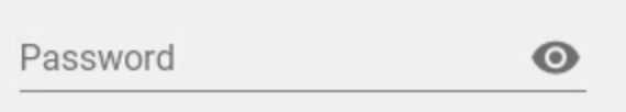
The IconButton is rendered too low and further to the right (for a right adornment).
Steps to Reproduce (for bugs)
- An example of this is on the material-ui-pickers doc site (https://material-ui-pic.firebaseapp.com/)
- Source to produce this is here: https://github.com/dmtrKovalenko/material-ui-pickers/blob/master/lib/src/_shared/DateTextField.jsx

The horizontal positioning issue can also be seen on the example on material-ui-next.com. However, the vertical positioning seems to come from using an IconButton.
The horizontal issue is because width: 100% is set on the input element. Removing this and setting flex-grow: 1 fixes this.
The vertical issue can be fixed by setting a fixed height of 48px on the input adornment.
Context
Your Environment
| Tech | Version |
|--------------|---------|
| Material-UI | 1.0.0-beta.33 |
| React | 16.2.0 |
| browser | IE11 |
| etc | |
 lexanth
All 9 comments
It's working on Material-UI side on IE 11. I'm not sure I can help. Maybe it's a JSS issue?
 oliviertassinari
on 19 Feb 2018
oliviertassinari
on 19 Feb 2018
Even there, it's right up against the right hand edge of the text field, whereas on chrome there is more padding:
The vertical difference is a bigger issue, and seems to be from using a material-ui/Icon rather than something from material-ui-icons?
lexanth
on 19 Feb 2018
Oops, this issue hasn't be resolved.
oliviertassinari
on 22 Feb 2018
Ok, so the documentation issue with IE11 was solved. Now I can confirm that it's working fine with IE11 with the server side generated CSS and with the client side generated CSS.
IE 11
oliviertassinari
on 22 Feb 2018
on beta.41 IE11 renders as follows:
seems to be broken again to me
 FranBran
on 11 Apr 2018
FranBran
on 11 Apr 2018
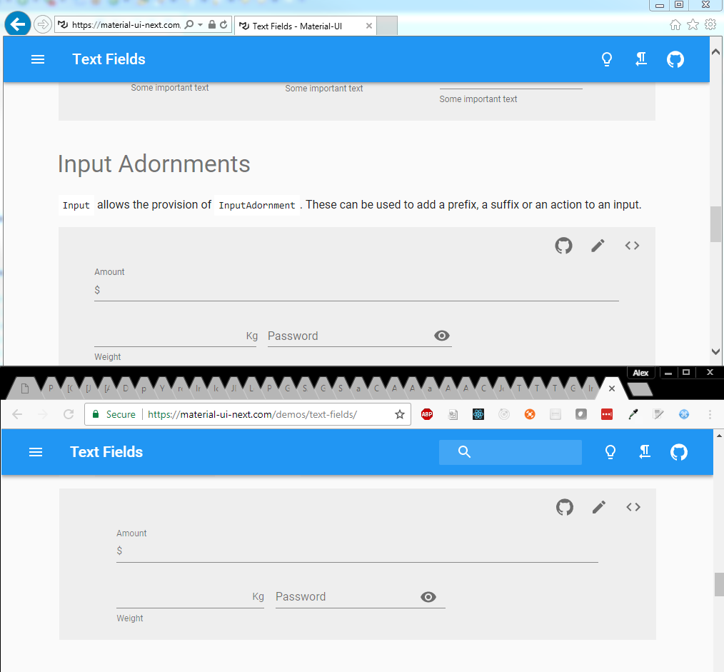
@FranBran It renders correctly on my end (v1.0.0-beta.41):


oliviertassinari
on 15 Apr 2018

FranBran
on 16 Apr 2018
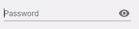
@oliviertassinari Your screenshot shows the password field adornment in the wrong place - it isn't inside the field.
lexanth
on 19 Apr 2018
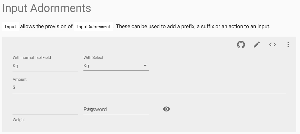
I find that adding width: 100% to the HTML input element fix this.
See sandbox https://codesandbox.io/s/zqz6nyxvr3
Screen shot in IE 11:

 hongyuan1306
on 17 May 2018
hongyuan1306
on 17 May 2018
Related issues
 pola88
·
3Comments
pola88
·
3Comments
 zabojad
·
3Comments
zabojad
·
3Comments
 revskill10
·
3Comments
revskill10
·
3Comments
 mb-copart
·
3Comments
mb-copart
·
3Comments
 finaiized
·
3Comments
finaiized
·
3Comments
Most helpful comment
I find that adding
width: 100%to the HTML input element fix this.See sandbox https://codesandbox.io/s/zqz6nyxvr3
Screen shot in IE 11: