Material-ui: [next] Tooltips breaks line on spaces on a container with position: 'absolute'
- [x] I have searched the issues of this repository and believe that this is not a duplicate.
Expected Behavior
The tooltip with a title of "Test Title" to be shown without line breaks:
Current Behavior
The tooltip adds a line break for every space in the title:

At first I thought it was a length issue, but it doesn't break when there's no spaces:

Steps to Reproduce (for bugs)
https://codesandbox.io/s/2wnv5jw2xj
- Container should have position: 'absolute'
- Add an
IconButtonsurrounded by aTooltip - Set
Tooltip's title toTest Title
Context
I'm making a floating menu with absolute positioning, that moves around the screen to line up with an active component.
Your Environment
| Tech | Version |
|--------------|---------|
| Material-UI | ^1.0.0-beta.22 |
| React | ^15.5.4 |
| browser | Chromium Version 63.0.3239.84 (Official Build) Built on Ubuntu , running on Ubuntu 16.04 (64-bit) |
 desktp
All 10 comments
@desktp It seems as though your test case was changed in some way, it doesn't seem to match what's in your description. Can you check?
 evantrimboli
on 27 Dec 2017
evantrimboli
on 27 Dec 2017
Hmm I don't really know what happened, but here's it again: https://codesandbox.io/s/2wnv5jw2xj. I've edited the issue with the fixed link.
desktp
on 27 Dec 2017
@desktp I think issue boils down to the container div that Popper uses to show the Tooltip.
Because that container has a certain width the text inside will get squished and you end up with what appears as line breaks. Simple way around this is to just set the tooltip to be 100% width of that container
I forked your codesandbox was able to get it to work by utilizing the classes prop on Tooltip.
https://codesandbox.io/s/8yj6ryzjx2
1) modify styles to provide width 100% for tooltip
const styles = {
  root: {
    textAlign: 'center',
    paddingTop: 200,
    position: 'absolute',
  },
  tooltip: {
    width: '100%'
  }
};
2)
<Tooltip
  placement="right-end"
  title="Title with spaces"
  classes={{
    tooltip: this.props.classes.tooltip
  }}
>

 gregnb
on 2 Jan 2018
gregnb
on 2 Jan 2018
Thanks for the workaround! I've tried messing with the positioning and widths, but it didn't occur to me to override the internal classes.
desktp
on 8 Jan 2018
@desktp Cool man, glad it helped! Lets close this ticket then :)
gregnb
on 8 Jan 2018
Shouldn't it remain open? There's a workaround, but it's still something that should be fixed.
desktp
on 8 Jan 2018
Well, IMO this is something that should be addressed by the user via styling. If you look at your screenshot here:
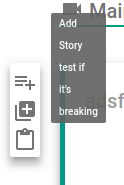
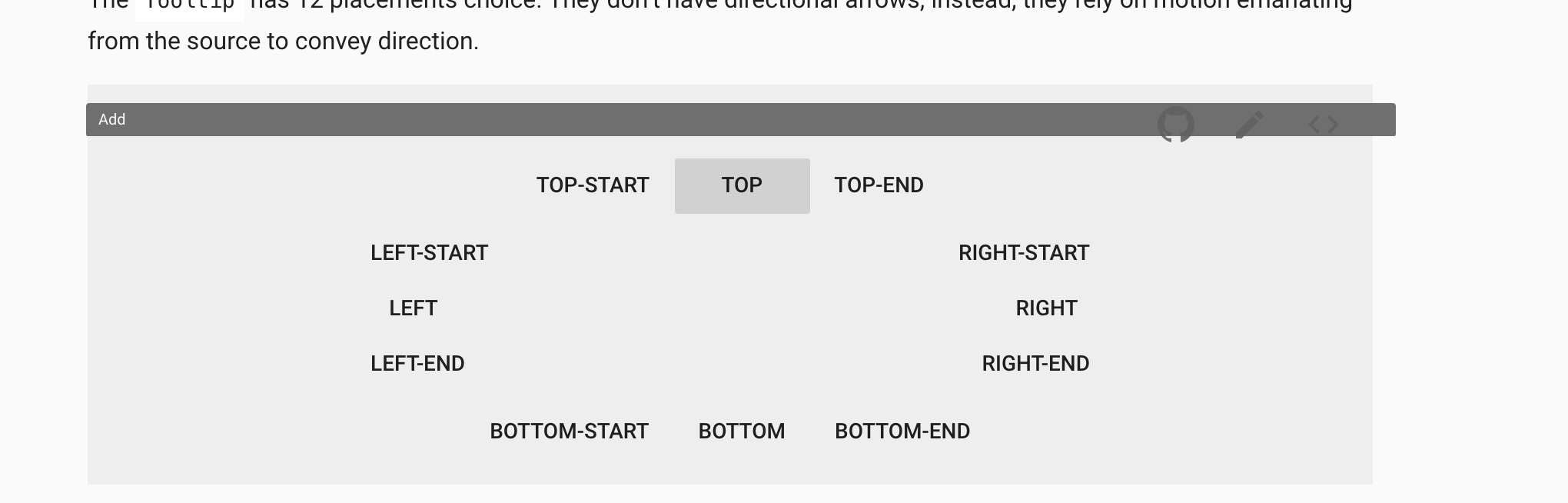
How is the library supposed to determine what is an appropriate width for the Tooltip? Let's say it's always made to be 100% of the container it's in - well, what if that doesn't look great for some examples like this below:
gregnb
on 8 Jan 2018
This behavior occurs in a very specific circumstance, and has an occluded enough behavior to make it hard for the user to tell what's causing it (took me a couple of days of on-and-off investigation to figure out it was the absolute positioned parent). I'm not skilled enough in my CSS-fu to claim this with 100% certainty, but it should be possible to set up the styling so this doesn't happen out of the box.
A small note in the docs could also suffice.
EDIT:
How is the library supposed to determine what is an appropriate width for the Tooltip?
It should (IMO) always fit the text inside it.
Still, if you stand by your opinion, I'll close this.
desktp
on 8 Jan 2018
@desktp A note is a good idea. Or maybe a prop for setting fullWidth? I still see this boiling down to a CSS issue mainly. I mean, just looking at this again take a look at what would happen the Tooltip were made 100% width of the container by default.

I'm pretty sure you will then get complaints from people asking why is the Tooltip filling the width of the container by default but I could be wrong. Either way, you're right, maybe keep this up for now someone else another idea on improving it?
gregnb
on 8 Jan 2018
actually, I have the same one, I found one solution to set overflow: unset or initial to root container. any idea
https://codesandbox.io/s/k9v6oxzp7
 palaniichukdmytro
on 23 Feb 2018
palaniichukdmytro
on 23 Feb 2018
Related issues
 mattmiddlesworth
·
3Comments
mattmiddlesworth
·
3Comments
 ryanflorence
·
3Comments
ryanflorence
·
3Comments
 iamzhouyi
·
3Comments
iamzhouyi
·
3Comments
 ghost
·
3Comments
ghost
·
3Comments
 chris-hinds
·
3Comments
chris-hinds
·
3Comments