Material-ui-pickers: helperText equivalent
Is your feature request related to a problem? Please describe.
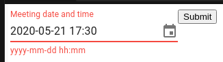
When the date has a valid format but is invalid for other reasons, the text displayed under the TextField shows the date format in red. That doesn't help the user figure out what's wrong.
Describe the solution you'd like
A helperText attribute would enable displaying specific errors instead of the format.
Describe alternatives you've considered
renderInput={props => <TextField helperText="test" {...props} />} didn't show the helper text.
 dandv
dandv
All 2 comments
helperText was moved to renderInput
renderInput={props => <TextField {...props}  helperText={null} />}
renderInput={({ helperText, ...props }) => <TextField {...props} />}
 dmtrKovalenko
on 25 May 2020
dmtrKovalenko
on 25 May 2020
@dandv The issue is with the order of the spreading, always spread the props first, as it's done in the demos: https://next.material-ui-pickers.dev/demo/datepicker#different-views.
-renderInput={props => <TextField helperText="test" {...props} />}
+renderInput={props => <TextField {...props} helperText="test" />}
This would have made a great StackOverflow question! I'm sure somebody else will fall into this trap, I have seen it a couple of time with the Autocomplete.
 oliviertassinari
on 25 May 2020
oliviertassinari
on 25 May 2020
Related issues
 danmce
·
3Comments
dandv
·
3Comments
danmce
·
3Comments
dandv
·
3Comments
 filipenevola
·
4Comments
danmce
·
3Comments
filipenevola
·
4Comments
danmce
·
3Comments
 StevenRasmussen
·
3Comments
StevenRasmussen
·
3Comments
Most helpful comment
helperTextwas moved torenderInput