Material-ui-pickers: RFC: material-ui-pickers v4
Breaking changes
We are on the way to v4. It is required to make another major release independently of @material-ui/core team. Here what I am planning to release
Material design v2 update
Material design guidelines was updated with new reference for date/time pickers reference
Here is new UI sneak peek
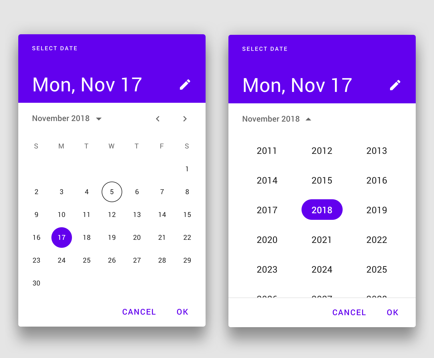
This looks really strange:

Also as you can see this spec contains a design for the date-range picker. So possible new release should also include #364

P.S. It looks like we need to redesign literally everything. So will need as many help as possible
Improved mask and keyboard mode
Updating to the new rifm version will allow us to resolve #1144 and #1289. And also new release will make possible to make a major update of date-io library with an automatic insert of keyboard-friendly formats
Changes for variants
Right now we have inline and dialog option. Due to changes in material design spec I propose to have variants mobile and desktop and accept them automatically, on the flight.
And also we want to make inline or desktop variant to be primarily supported instead of the mobile one.
Any discussion is appreciated :) @oliviertassinari
 dmtrKovalenko
All 49 comments
If you do not mind please react to the issue, so I know what do you think :)
dmtrKovalenko
on 30 Aug 2019
@dmtrKovalenko Thank you for including me in the discussion. The new specification is awesome, I'm super excited about it 😍. There is an opportunity to significantly increase the adoption of the package. There is a lot of new material to cover. It might make sense to completely rethink the implementation and API at this point, given how diverse and new the specifications are. I'm not sure how to structure my thoughts on the topic, I'm gonna let it flow as a single flow of dots:
- Did they remove the time pickers from the specification? To be honest, the date pickers are significantly more used that the time pickers. Maybe by an x3 order. I would need to look at some metrics to give a more accurate number, but it's the idea. Maybe they didn't have the time and decided to ship what was more important first. I hope they will provide material for the time picker
- I'm really really happy to see a specification for desktop. It's in my opinion significantly more important than the mobile case. 1. I expect more people using React for a desktop app than for a mobile one. 2. The UX of the desktop version on mobile is better than the UX of the mobile version on desktop. I hate the UX of the mobile version on desktop, thank god we have an inline version in v3 🙏.
- it could make sense to expose multiple components. It would help with tree shaking for people that don't need everything.
 oliviertassinari
on 30 Aug 2019
oliviertassinari
on 30 Aug 2019
Hmm. Getting back to InlineDatePicker and MobileDatePicker can help with treeshaking but will cost.
Anyway we need to consider a better tree shaking of mobile/desktop code
dmtrKovalenko
on 30 Aug 2019
I have developed bunch of sites for tour, auto/moto, accomodation rental companies. all these companies requires date-time range picker. I'm really upset of this new spec
 TrejGun
on 4 Sep 2019
TrejGun
on 4 Sep 2019
Love the Date Range Picker 😉. @dmtrKovalenko Any chance of a rough eta?
 williamluke4
on 4 Sep 2019
williamluke4
on 4 Sep 2019
@dmtrKovalenko Love the new look and feel. I just wanted to know if this new date picker will support time-ranges ( aka: hours, minutes and seconds ) as well? my use case for this is to allow users to select events between two different points in time.
 ZNackasha
on 9 Sep 2019
ZNackasha
on 9 Sep 2019
Can we have week numbers please? Currently that is primary reason why we can't use material ui date picker.
 ttv86
on 12 Sep 2019
ttv86
on 12 Sep 2019
@dmtrKovalenko : Are there any news?
 Angelk90
on 26 Sep 2019
Angelk90
on 26 Sep 2019
Given the date picker was our number one requested focus on the last developer survey.
Take this example, a good date picker can be an entry point for the adoption of Material-UI.
I'm determined to make sure that we allocate enough resources to this problem.
Most notably, I have proposed that Material-UI financially support @dmtrKovalenko to push the concern forward.
(Notice that we evaluate a similar effort for the datatables problem,
A significant difference is that Material-UI can directly monetize paid advanced features like ag-grid, dev-express, syncfusion, kendo, sencha, etc do.)
Benchmark
I have used the following sources to benchmark:
- https://github.com/YouCanBookMe/react-datetime
- http://react-day-picker.js.org/
- http://react.carbondesignsystem.com/?path=/story/datepicker--range-with-calendar
- https://ads.google.com/
- https://analytics.google.com/
- https://ant.design/components/date-picker/
- https://blueprintjs.com/docs/#datetime/datepicker
- https://bootstrap-datepicker.readthedocs.io/
- https://calendar.google.com/
- https://ej2.syncfusion.com/react/demos/#/material/datepicker/default
- https://github.com/airbnb/react-dates
- https://jqueryui.com/datepicker/
- https://mail.google.com/
- https://material.io/components/pickers/
- https://reactdatepicker.com/
- https://vuetifyjs.com/en/components/date-pickers
- https://www.airbnb.com/
- https://www.booking.com/
- https://www.google.com/flights
- https://www.telerik.com/kendo-react-ui/components/dateinputs/datepicker/
Proposal
I would recommend the following:
- Change react peer dependency from "^16.8.4" to "^16.8.0".
- A strong focus on the desktop version. Consider the mobile version later on, for 2020 or 2021.
- Consider not implementing a mobile landscape mode. I hope that we can get away without.
- Move the project to /mui-org/material-ui/. I expect the usage of the same documentation to provide a better experience for the developers. We would rely on the same conventions.
I expect hosting the effort on the main repository will consolidate the integration of the component with the others. For instance, it will help contributors. - Evaluate if the pickers should be published under @material-ui/core or @material-ui/pickers. I'm not sure about this one. I'm hesitating, my preference is with @material-ui/pickers, if possible. A developer survey could help us pick the best option.
- Start from the ground-up leveraging the past learnings.
- Remove
MuiPickersUtilsProvider, depend on dayjs or date-fns by default, depending on what's smaller by default. - Allow the usage of
theme.props.MuiDatePicker.dateUtilsto provide an adapter for moment or date-fns with @date-io. - Write the sources in TypeScript.
- Keyboard navigation. The focus should stay on the input. If the Calendar is used, standalone, the focus should stay on the root div. Among the different solutions I have benchmarked, I have found the keyboard support of Kendo interesting for the timepicker: arrow up and down + text selection. Otherwise, when
disabledKeyboard=false, I think that the Calendar should take precedence for the handling of the arrow keys over the input. - Implement the code as a monolith:
DatePicker. Then, consider how to break it down is reusable pieces. - The supported props & features:
DatePicker.propTypes = {
  /**
   * The date engine to use, default to X.
   * You can use moment or else following https://github.com/dmtrKovalenko/date-io.
   *
   * It contains the locale.
   * Want to change the first day of the week? Change the locale.
   */
  dateUtils: PropTypes.object,
  /**
   * If `true`, a column is added to show the week numbers of the year.
   *
   * default false
   */
  showWeekNumbers: PropTypes.bool,
  /**
   * Format used to display the date in the input.
   * The format is used to parse the input string and stringify date object internally.
   * The format should match the supported behavior of the provided style engine.
   */
  inputFormat: PropTypes.string,
  /**
   * Parsable date, e.g. new Date() or moment().
   * The support value type depends on the date engine used, see the `dateUtils` prop.
   */
  value: DateIOType,
  /**
   * The default value. Use when the component is not controlled.
   */
  defaultValue: DateIOType,
  /**
   * Specify the dates that are disabled.
   *
   * @param {DateIOType} date The date to consider
   * @returns {boolean}
   */
  disabledDate: PropTypes.func
  /**
   * Specify the times that are disabled.
   *
   * @param {DateIOType} date The time to consider
   * @returns {boolean}
   */
  disabledTime: PropTypes.func
  /**
   * The minimum selectable date.
   */
  minDate: DateIOType,
  /**
   * Whether shortcuts to quickly select a range of dates are displayed or not.
   * If true, preset shortcuts will be displayed.
   * If false, no shortcuts will be displayed.
   * If an array is provided, the custom shortcuts will be displayed.
   */
  rangeShortcuts: PropTypes.oneOfType([PropTypes.bool, PropTypes.array]),
  /**
   * The maximum selectable date.
   */
  maxDate: DateIOType,
  /**
   * The maximum time the user can select.
   * The year, month, and day parts of the Date object are ignored.
   */
  maxTime: DateIOType
  /**
   * The minimum time the user can select.
   * The year, month, and day parts of the Date object are ignored.
   */
  minTime: DateIOType
  /**
   * Callback fired when the value changes.
   *
   * @param {object} event The event source of the callback
   * @param {DateIOType} value
   */
  onChange: PropTypes.func,
  /**
   * Control the popup open state.
   */
  open: PropTypes.bool,
  /**
   * Callback fired when the popup requests to be opened.
   * Use in controlled mode (see open).
   *
   * @param {object} event The event source of the callback.
   */
  onOpen: PropTypes.func,
  /**
   * Callback fired when the popup requests to be closed.
   * Use in controlled mode (see open).
   *
   * @param {object} event The event source of the callback.
   */
  onClose: PropTypes.func,
  /**
   * Date that will be initially highlighted if null was passed.
   *
   * from (initialFocusedDate)
   * default today
   */
  defaultHighlight: DateIOType,
  /**
   * Number of months to show. Supported value between 1 and 3.
   *
   * default 1
   */
  monthsShown: PropTypes.number,
  /**
   * Disable the arrow keyboard navigation.
   *
   * from (allowKeyboardControl)
   * default false
   */
  disabledKeyboard: PropTypes.bool,
  /**
   * If `true`, the current day shouldn't be highlighted in the calendar.
   *
   * default false
   */
  disableHighlightToday: PropTypes.bool,
  /**
   * If `true`, the popup won't close when a value is selected.
   *
   * from (autoOk)
   * default false
   */
  disableCloseOnSelect: PropTypes.bool,
  /**
   * Props applied to the [`TextField`](/api/text-field/) element.
   */
  TextFieldProps: PropTypes.object,
  /**
   * If `true`, the clear button is visible.
   *
   * default false
   */
  showInputClear: PropTypes.bool,
  /**
   * If `true`, the clear button is visible.
   *
   * default false
   */
  showCalendarClear: PropTypes.bool,
  /**
   * If `true`, the today button is visible.
   *
   * default false
   */
  showCalendarToday: PropTypes.bool,
  /**
   * An object containing all the translation keys.
   *
   * Default:
   *
   * - today: Today
   * - clear: Clear
   * - selectMonth: Select a month
   * - selectYear: Select a year
   */
  labels: PropTypes.object,
  /**
   * If `true`, the user needs to confirm his choice.
   *
   * default false
   */
  confirm: PropTypes.bool,
  /**
   * If `true`, the user should select a range.
   *
   * default false
   */
  range: PropTypes.bool,
  /**
   * Whether to use a 12 hour format with an AM/PM choice or a 24 hour format.
   *
   * Default to the browser preference.
   *
   * ?
   * https://stackoverflow.com/questions/27647918/detect-with-javascript-if-users-machine-is-using-12-hour-clock-am-pm-or-24-cl/27648032
   */
  useAmPm: PropTypes.bool,
  /**
   * Allow the user to pick a value between:
   *
   *  - year
   *  - month
   *  - day
   *  - week
   *  - time
   *
   * default ['year', 'month', 'day']
   */
  mode: PropTypes.array,
}
References
I have kept track of some visual clue for the above proposal.
You fill find features or components that have associated link with the benchmark sources.
YearPicker

material.io

antd
TimePicker

kendo

antd
- switch between date and time

kendo

antd
showWeekNumbers=true

bootstrap

antd
showInputClear=true

gmail
showCalendarToday=true

antd

blueprint

syncfusion
showCalendarClear=true

blueprint
rangeShortcuts=true

blueprint

google ads

airbnb
range=true

material.io

less important feature
MonthPicker

disableHighlightToday=false

bootstrap

material.io
DayPicker

material.io
confirm=true

antd

google analytics

google ads
Calendar

material.io
monthsShown=2

material.io
monthsShown=3

google analytics
This is meant as a sketch of what the next steps could look like. Feedback appreciated.
cc @mui-org/core-contributors
oliviertassinari
on 4 Oct 2019
I remember finding a date range picker where you could just define the flow of the views..
For example:
<DateRange views={['year', 'month' 'day']} />
<DateRange views={['week']} />
<DateRange views={['time']} />
If i need to clarify some more let me know :)
williamluke4
on 4 Oct 2019
As for moving the project to /mui-org/material-ui/. I think this is a great idea!! as it would remove the issues with versioning
williamluke4
on 4 Oct 2019
I agree with limiting the # of date libraries available. I vote for dayjs because it has real TimeZone support. date-fns I have used and is great but it does not have good TimeZone support. My use case is that we need to show all dates and times in UTC regardless of where the user is. I am still in-process implementing dayjs with this library and so far it seems good. date-fns did not have what I needed so I had to skip away from it (unfortunately).
edit: dayjs does not work correctly now when typing datetimes directly. The last minute digit cannot be typed by the user. An issue is logged for it. With this issue dayjs is unusable.
 spudcud
on 9 Oct 2019
spudcud
on 9 Oct 2019
I switched my business' app from moment to luxon because we wanted to use this library - please don't make me switch again! :(
 alexplumb
on 15 Oct 2019
alexplumb
on 15 Oct 2019
@dmtrKovalenko , @alexplumb , @williamluke4 , @oliviertassinari :
Is there anything new when this component is ready?
Take a look at the input field with the multiple selection, as they set the way to also select the time between the two dates.
Link: date-time-picker
Angelk90
on 21 Oct 2019
May I suggest introducing a native prop that render the input as a standard type="date"? Mobile devices have an acceptable support for date and time inputs these days.
This would naturally come with some drawbacks, i.e.:
Partial support in iOS Safari refers to not supporting the week input type, nor the min, max or step attributes
but would greatly improve the UX on mobile devices anyway.
 designorant
on 30 Oct 2019
designorant
on 30 Oct 2019
So are we finally getting a "Today" button in inline pickers? Because the rationale in https://github.com/mui-org/material-ui-pickers/pull/782 is so bad it hurts my brain, especially in an otherwise brilliant library (except the fact it comes compiled, which is dumb and makes debugging and figuring the internals out absolutely impossible, but that's another matter).
 zefj
on 6 Nov 2019
zefj
on 6 Nov 2019
@dmtrKovalenko @oliviertassinari Are there any plans to have major version parity with the core library? As by the time @material-ui/pickers V4 is released, I would expect the core lib to be at V5. Would it not make sense that the major version of @material-ui/pickers mirror that of @material-ui/core?
williamluke4
on 3 Dec 2019
@williamluke4 just yesterday we have been discussing this with @oliviertassinari. Still we are not sure about moving pickers to the core, but versions will mirror the core version 100%.
Also (likely) documentation and source code of pickers will be moved to the core repository
dmtrKovalenko
on 3 Dec 2019
I'm personally in favor of keeping @material-ui/pickers as a different npm package because:
- It's an opportunity to experiment with something we don't do with the other packages.
- User-land: I'm particularly interested in seeing the impact it has on adoption 1. inside Material-UI 2. outside Material Design (as a design spec) and 3. outside Material-UI (as a framework).
- Maintainer-land: we can experiment with different tools: e.g. writing the sources in TypeScript, using different testing tools, etc.
- It gives Dmitriy a success feedback loop metric: how many downloads do the components get? Do people inside Material-UI use it, or do they go use something else in the React ecosystem? Do people outside Material-UI use it? Because there is nothing even close to the quality of the component? I'm particularly interested in setting incentives that can make it possible to get a better component than what you will find if you pay for a date picker component, e.g. https://www.telerik.com/kendo-react-ui/components/dateinputs/.
But yeah, I think that the package major version should match to make it feels like a single entity that moves forward. I think that using a mono git repository would help in the matter.
oliviertassinari
on 3 Dec 2019
Yeah 100% agree that it should remain a separate package :)
williamluke4
on 3 Dec 2019
Is there a pre-release version of the date range picker right now that we can use?
 MrBokeh
on 9 Dec 2019
MrBokeh
on 9 Dec 2019
@MrBokeh Pretty sure that is here https://github.com/mui-org/material-ui-pickers/tree/feature/redesign-md2
williamluke4
on 13 Dec 2019
@dmtrKovalenko canary/alpha release?
 stunaz
on 31 Dec 2019
stunaz
on 31 Dec 2019
First prerelease is still in progrsss
dmtrKovalenko
on 31 Dec 2019
Can you also added a props to make it multi days select (like what we have with select and multi-select in material-ui https://material-ui.com/components/selects/#multiple-select). My use case is I need to have an array of selected days which are discontinuous.
 trung-ung
on 13 Jan 2020
trung-ung
on 13 Jan 2020
@dmtrKovalenko I see that https://github.com/mui-org/material-ui-pickers/pull/1433 is merged. Congratulations 🎉and thank you for the effort.
The preview on https://next.material-ui-pickers.dev/ doesn't have a date range selection demo (or at least I couldn't find it). Does this mean that it isn't supported?
 Misiu
on 17 Jan 2020
Misiu
on 17 Jan 2020
@Misiu It's the next big feature I will focus on. For now going to make first prerelease with current changes
dmtrKovalenko
on 17 Jan 2020
@dmtrKovalenko thanks for the info! Looking forward to this feature
Misiu
on 17 Jan 2020
The first prerelease is ready! https://github.com/mui-org/material-ui-pickers/releases/tag/v4.0.0-alpha.1
Would like to hear any feedback ❤️
dmtrKovalenko
on 17 Jan 2020
@dmtrKovalenko : How do I go about selecting a range?
Angelk90
on 20 Jan 2020
@Angelk90 if you read the previous comments you will find out that they are still working on it
@Misiu It's the next big feature I will focus on. For now going to make first prerelease with current changes
williamluke4
on 20 Jan 2020
@williamluke4 :
Being that there is no news and the request was made in 2018, I wanted to understand where we were. #364
Angelk90
on 29 Jan 2020
I switched my business' app from moment to luxon because we wanted to use this library - please don't make me switch again! :(
I'd also strongly prefer it if mui/pickers did not switch to hardcoding a single date library.
It doesn't matter if the date library in question is small. If the project is using a different date library a whole library of extra code that doesn't need to be there is still being added.
There are also good reasons not to use date-fns/dayjs. Both date-fns/dayjs use bespoke localization. i18n is done inside the project itself, you are subject to what locales people have contributed to that specific library (not a universal i18n library everyone uses like CLDR), and you are stuck downloading this locale data even if you don't need it to do date localization. Luxon meanwhile uses the date localization functionality built in to the browser, no custom locale data needed if you are only supporting modern browsers.
So there are very good reasons for different projects to use different date libraries and it doesn't make sense for mui/pickers to start contradicting this when the work to support multiple has already been done.
 dantman
on 27 Mar 2020
dantman
on 27 Mar 2020
@dmtrKovalenko , @oliviertassinari :
Trying the version on: https://v4-0-0-alpha-5.material-ui-pickers.dev/demo/daterangepicker
Clicking on the month does not allow me to select the years as shown in the figure on the right:
Angelk90
on 10 Apr 2020
When can we expect this to be released to production. How can I contribute to speed up the development process?
 mihilmy
on 7 May 2020
mihilmy
on 7 May 2020
@mihilmy We plan to release the changes in multiple steps. v4 with a focus on the desktop UX (hosted under material-ui-pickers.dev).
Then v5 with a focus on advanced features (e.g. date range) and tight integration with the other components (hosted under http://material-ui.com/components/).
oliviertassinari
on 7 May 2020
Hi, @oliviertassinari @dmtrKovalenko
I updated my project from v3 to v4.0.0-alpha.7 of @material-ui/pickers.
I do not use TS in my project, and I am noticing that the ES6 imports are returning "undefined" for all the modules.
e.g.
import DateRangePicker from "@material-ui/pickers"; // undefined
import { DateRangePicker } from "@material-ui/pickers"; // undefined
import * as MaterialPickers, { DateRangePicker } from "@material-ui/pickers"; // undefined
const MaterialPickers = require('@material-ui/pickers/index'); // undefined
react, and material-ui are using latest release versions.
v3 was working just fine. How do I import the new modules?
 xtgrant
on 3 Jun 2020
xtgrant
on 3 Jun 2020
@xtgrant Please see: #1822.
oliviertassinari
on 3 Jun 2020
Hey, so I can't find anywhere does v4 alpha support latest version of date-io adapters or still not? Thanks
 SanjiKir
on 12 Jun 2020
SanjiKir
on 12 Jun 2020
@SanjiKir Yes, it does.
oliviertassinari
on 12 Jun 2020
Thanks for the great package and hard work!
I was reading through the v4 prerelease docs, and saw this on the DateRangePicker page:
The date range picker will be made available in the coming months for production use as part of a paid extension to the community edition (MIT license) of Material-UI. This paid extension will include advanced components (rich data grid, date range picker, tree view drag & drop, etc.). Pricing for early access will start with an affordable plan.
When are you planning on giving more info about this? This is the only place I can find it being mentioned.
 SEI-John
on 29 Jun 2020
SEI-John
on 29 Jun 2020
@SEI-John We will have more to share before September 2020.
oliviertassinari
on 29 Jun 2020
We're at the end of September, any updates here?
It would help to know what is the status of works and realistic end dates, or obstacles, or anything.
 mifrej
on 25 Sep 2020
mifrej
on 25 Sep 2020
I am working on moving pickers into the core repository https://github.com/mui-org/material-ui/pull/22692
I will try to fix all ci warns today and once it will be merged this repo will be archived and pickers will live in the lab.
dmtrKovalenko
on 25 Sep 2020
You meant "live" instead of "leave" right 😄 Thanks for the great work
mifrej
on 25 Sep 2020
Yes :) thanks
dmtrKovalenko
on 25 Sep 2020
Regarding the date range picker:
If I select a date range, the selected end date is effectively not included (at least using Moment.js). I wonder if this is specified by Material Design somehow. This can be a bit confusing to both users and developers.
Let's say I have a use case like "Show me all events within the selected date range October 1st - October 5th, this translates to 2020-10-01T00:00:00 - 2020-10-05T00:00:00 (instead of 2020-10-05T23:59:59), meaning all events on October 5th would be included.
 florianbepunkt
on 8 Oct 2020
florianbepunkt
on 8 Oct 2020
Any update on the merge?
 Jenselme
on 14 Oct 2020
Jenselme
on 14 Oct 2020
Any updates on this?
 iakovosvo
on 2 Nov 2020
iakovosvo
on 2 Nov 2020
Related issues
 aditya81070
·
3Comments
aditya81070
·
3Comments
 Lysander
·
3Comments
Lysander
·
3Comments
 katy6514
·
3Comments
katy6514
·
3Comments
 brett-patterson
·
3Comments
brett-patterson
·
3Comments
 StevenRasmussen
·
3Comments
StevenRasmussen
·
3Comments
Most helpful comment
Given the date picker was our number one requested focus on the last developer survey.
Take this example, a good date picker can be an entry point for the adoption of Material-UI.
I'm determined to make sure that we allocate enough resources to this problem.
Most notably, I have proposed that Material-UI financially support @dmtrKovalenko to push the concern forward.
(Notice that we evaluate a similar effort for the datatables problem,
A significant difference is that Material-UI can directly monetize paid advanced features like ag-grid, dev-express, syncfusion, kendo, sencha, etc do.)
Benchmark
I have used the following sources to benchmark:
Proposal
I would recommend the following:
I expect hosting the effort on the main repository will consolidate the integration of the component with the others. For instance, it will help contributors.
MuiPickersUtilsProvider, depend on dayjs or date-fns by default, depending on what's smaller by default.theme.props.MuiDatePicker.dateUtilsto provide an adapter for moment or date-fns with @date-io.disabledKeyboard=false, I think that the Calendar should take precedence for the handling of the arrow keys over the input.DatePicker. Then, consider how to break it down is reusable pieces.References
I have kept track of some visual clue for the above proposal.
You fill find features or components that have associated link with the benchmark sources.
YearPickermaterial.io
antd
TimePickerkendo
antd
kendo
antd
showWeekNumbers=truebootstrap
antd
showInputClear=truegmail
showCalendarToday=trueantd
blueprint
syncfusion
showCalendarClear=trueblueprint
rangeShortcuts=trueblueprint
google ads
airbnb
range=truematerial.io
less important feature
MonthPickerdisableHighlightToday=falsebootstrap
material.io
DayPickermaterial.io
confirm=trueantd
google analytics
google ads
Calendarmaterial.io
monthsShown=2material.io
monthsShown=3google analytics
This is meant as a sketch of what the next steps could look like. Feedback appreciated.
cc @mui-org/core-contributors