Material-ui-pickers: Feature Request: Ability to select a date range
Thank you for this amazing component. Your work and contributions are very much appreciated.
It would be amazing if this component could also work to select a date range (similar to https://ipiz.herokuapp.com/md-date-range-picker-demo/index.html).
 tgBryanBailes
All 123 comments
I have think about that. We are now a little bit stack with a new features. So I will do it ASAP.
 dmtrKovalenko
on 20 Apr 2018
dmtrKovalenko
on 20 Apr 2018
Any chance this will be implemented soon?
 RedHatter
on 6 Jul 2018
RedHatter
on 6 Jul 2018
+1
 vdmkotai
on 12 Jul 2018
vdmkotai
on 12 Jul 2018
I implemented this feature as well as multiple selection here. Anyone that's interested can try it out. Bugs can be reported on the pull request #508.
RedHatter
on 13 Jul 2018
+1, eagerly waiting for this
 bellini666
on 15 Sep 2018
bellini666
on 15 Sep 2018
@dmtrKovalenko Not to be a bother, but any chance you'll get to implementing this soon?
RedHatter
on 7 Nov 2018
+1 i need this
 jakeleventhal
on 11 Nov 2018
jakeleventhal
on 11 Nov 2018
+1 This feature will be much valued
 marjan2k
on 14 Jan 2019
marjan2k
on 14 Jan 2019
+1
 vdv73rus
on 4 Feb 2019
vdv73rus
on 4 Feb 2019
+1
 KlimkinaD
on 4 Feb 2019
KlimkinaD
on 4 Feb 2019
+1
 gabrielweich
on 12 Feb 2019
gabrielweich
on 12 Feb 2019
+100
 frankbolviken
on 5 Mar 2019
frankbolviken
on 5 Mar 2019
I've written a quick and dirty wrapper making use of renderDay prop to provide range and multi select.
import React, { useState, useContext, useRef } from 'react'
import { DatePicker } from 'material-ui-pickers'
import { MuiPickersContext } from 'material-ui-pickers'

function DateRangePicker({
  value,
  onChange,
  labelFunc,
  format,
  emptyLabel,
  autoOk,
  onClose,
  ...props
}) {
  const [begin, setBegin] = useState(value[0])
  const [end, setEnd] = useState(value[1])
  const [hover, setHover] = useState(null)
  const picker = useRef()
  const utils = useContext(MuiPickersContext)

  const min = Math.min(begin, end || hover)
  const max = Math.max(begin, end || hover)

  function renderDay(day, selectedDate, dayInCurrentMonth, dayComponent) {
    const style = {
      margin: 0,
      width: '40px'
    }

    if (day >= min && day <= max) {
      style.backgroundColor = '#3f51b5'
      style.color = 'white'
    }

    if (utils.isSameDay(day, min)) style.borderRadius = '50% 0 0 50%'
    else if (utils.isSameDay(day, max)) style.borderRadius = '0 50% 50% 0'
    else style.borderRadius = '0'

    return React.cloneElement(dayComponent, {
      onClick: e => {
        e.stopPropagation()
        if (!begin) setBegin(day)
        else if (!end) {
          setEnd(day)
          if (autoOk) {
            onChange([begin, end].sort())
            picker.current.close()
          }
        } else {
          setBegin(day)
          setEnd(null)
        }
      },
      onMouseEnter: e => setHover(day),
      style
    })
  }

  const formatDate = date => utils.format(date, format || utils.dateFormat)

  return (
    <DatePicker
      {...props}
      value={null}
      renderDay={renderDay}
      onClose={() => {
        onChange([begin, end].sort())
        onClose()
      }}
      onChange={() => {}}
      ref={picker}
      labelFunc={(date, invalid) =>
        labelFunc
          ? labelFunc([begin, end].sort(), invalid)
          : begin && end
          ? `${formatDate(begin)} - ${formatDate(end)}`
          : emptyLabel
      }
    />
  )
}

function DateMultiPicker({
  value,
  onChange,
  labelFunc,
  format,
  emptyLabel,
  onClose,
  ...props
}) {
  const [dates, setDates] = useState(value)
  const utils = useContext(MuiPickersContext)

  function renderDay(day, selectedDate, dayInCurrentMonth, dayComponent) {
    return React.cloneElement(dayComponent, {
      onClick: e => {
        e.stopPropagation()
        const i = dates.findIndex(d => utils.isSameDay(d, day))
        if (i >= 0) {
          const nextDates = [...dates]
          nextDates.splice(i, 1)
          setDates(nextDates)
        } else {
          setDates([...dates, day])
        }
      },
      style: dates.find(d => utils.isSameDay(d, day))
        ? {
            backgroundColor: '#3f51b5',
            color: 'white'
          }
        : {}
    })
  }

  const formatDate = date => utils.format(date, format || utils.dateFormat)

  return (
    <DatePicker
      {...props}
      value={dates[0]}
      renderDay={renderDay}
      onClose={() => {
        onChange(dates)
        onClose()
      }}
      onChange={() => {}}
      labelFunc={(date, invalid) =>
        labelFunc
          ? labelFunc(dates, invalid)
          : dates.length > 0
          ? dates.map(formatDate).join(', ')
          : emptyLabel
      }
    />
  )
}
I like it!
dmtrKovalenko
on 5 Mar 2019
I've put up a gist to share any changes I make. Gist
RedHatter
on 6 Mar 2019
Great to see the power of the community here! Kudos for @RedHatter! Sad to see that the repo owner rejected PR #508
 rhuanbarreto
on 9 Apr 2019
rhuanbarreto
on 9 Apr 2019
I will start work on this issue in a few days 🔥🔥🔥
dmtrKovalenko
on 30 Apr 2019
@dmtrKovalenko When we can take result of this feature?
 Alexzanderk
on 2 May 2019
Alexzanderk
on 2 May 2019
@dmtrKovalenko Thanks for the amazing component, when can we have this feature
 milindR
on 7 May 2019
milindR
on 7 May 2019
I suppose 1-2 weeks
dmtrKovalenko
on 7 May 2019
@dmtrKovalenko That's great news!!
milindR
on 7 May 2019
@dmtrKovalenko thanks for the great work you've done so far.. we are eagerly waiting for this feature...
 arulprakashv
on 20 May 2019
arulprakashv
on 20 May 2019
@RedHatter can you please fix your code to work in new version while we are waiting for this feature?
 TrejGun
on 25 May 2019
TrejGun
on 25 May 2019
so far i have this
import React, {useContext, useState} from "react";
import PropTypes from "prop-types";
import {DateTimePicker, MuiPickersContext} from "@material-ui/pickers";
import classNames from "classnames";
import {FormattedMessage} from "react-intl";
import {checkInTime, checkOutTime, dateTimeFormat} from "holymotors-constants-date";
import {useStyles as useOriginalStyles} from "@material-ui/pickers/DatePicker/components/Day";

import useStyles from "./styles";


function DateRangeWrapper({value, onChange, labelFunc, format, emptyLabel, onClose, ...props}) {
  const [begin, setBegin] = useState(value[0]);
  const [end, setEnd] = useState(value[1]);
  const [hover, setHover] = useState(undefined);
  const originalClasses = useOriginalStyles();
  const classes = useStyles();
  const utils = useContext(MuiPickersContext);

  const min = Math.min(begin, end || hover);
  const max = Math.max(begin, end || hover);

  function renderDay(day, selectedDate, dayInCurrentMonth, dayComponent) {
    return React.cloneElement(dayComponent, {
      onClick: e => {
        e.stopPropagation();
        if (!begin) setBegin(day);
        else if (!end) {
          setEnd(day);
        } else {
          setBegin(day);
          setEnd(undefined);
        }
      },
      onMouseEnter: e => setHover(day),
      className: classNames(originalClasses.day, classes.day, {
        [originalClasses.hidden]: dayComponent.props.hidden,
        [originalClasses.current]: dayComponent.props.current,
        [originalClasses.dayDisabled]: dayComponent.props.disabled,
        [originalClasses.daySelected]: utils.isSameDay(day, min) || utils.isSameDay(day, max) || (day >= min && day <= max),
        [classes.beginCap]: utils.isSameDay(day, min),
        [classes.endCap]: utils.isSameDay(day, max),
      }),
    });
  }

  const formatDate = date => utils.format(date, dateTimeFormat);

  return (
    <DateTimePicker
      {...props}
      fullWidth
      value={begin}
      renderDay={renderDay}
      onClose={onClose}
      onChange={date => {
        onChange([begin, end].sort((a, b) => a - b));
      }}
      onClear={() => {
        setBegin(undefined);
        setEnd(undefined);
        setHover(undefined);
        onChange([]);
      }}
      labelFunc={(date, invalid) =>
        labelFunc
          ? labelFunc([begin, end].sort((a, b) => a - b), invalid)
          : date && begin && end
          ? [begin, end].sort((a, b) => a - b).map(formatDate).join(" - ")
          : emptyLabel || ""
      }
    />
  );
}

DateRangeWrapper.propTypes = {
  value: PropTypes.array,
  onChange: PropTypes.func,
  labelFunc: PropTypes.func,
  format: PropTypes.string,
  emptyLabel: PropTypes.string,
  onClose: PropTypes.func,
};

export default DateRangeWrapper;
import {makeStyles} from "@material-ui/styles";


export default makeStyles(() => ({
  day: {
    margin: 0,
    width: 40,
    borderRadius: 0,
  },
  beginCap: {
    borderTopLeftRadius: "50%",
    borderBottomLeftRadius: "50%",
  },
  endCap: {
    borderTopRightRadius: "50%",
    borderBottomRightRadius: "50%",
  },
}), {name: "DateRangeWrapper"});
@trejgun but that doesn't work well.. there's a length error which I can't seem to catch.
@dmtrKovalenko is someone on this yet or should I fork and try to make it myself?
 w3nda
on 4 Jun 2019
w3nda
on 4 Jun 2019
Have you guys had a look at this https://github.com/jonas-arkulpa/material-date-range-picker Don't know if it would help? Though I would share it just in case
 williamluke4
on 5 Jun 2019
williamluke4
on 5 Jun 2019
@w3nda not sure about length error, i just extract this example from my code
@williamluke4 i like this better especially since it bacame official
@dmtrKovalenko can we help somehow?
TrejGun
on 7 Jun 2019
I have forked https://github.com/jonas-arkulpa/material-date-range-picker and converted the styled components to the MUI API https://bit.dev/atto-byte/components/date-range
williamluke4
on 9 Jun 2019
@williamluke4 you example looks a bit broken
also dates are not clickable
TrejGun
on 9 Jun 2019
@TrejGun Dates should now be clickable but there are still a lot of issues
williamluke4
on 9 Jun 2019
I guess we would have to makedo till @dmtrKovalenko gives us an update on his work
 talhatahir
on 10 Jun 2019
talhatahir
on 10 Jun 2019
Most Issues should now be fixed https://bit.dev/atto-byte/components/date-range
williamluke4
on 12 Jun 2019
@williamluke4 yeah looks good now, but what I need is a date-time picker
TrejGun
on 13 Jun 2019
+1
Unsure of what final design might look like, but the originally linked example is _exactly_ what we need. @williamluke4 build is great, but our clients really love the simplicity/straight-forward UX of two side-by-side datepickers with some default ranges (1 month ago, 3 months ago, etc)
Thanks again for all your hard work! Loving v3!
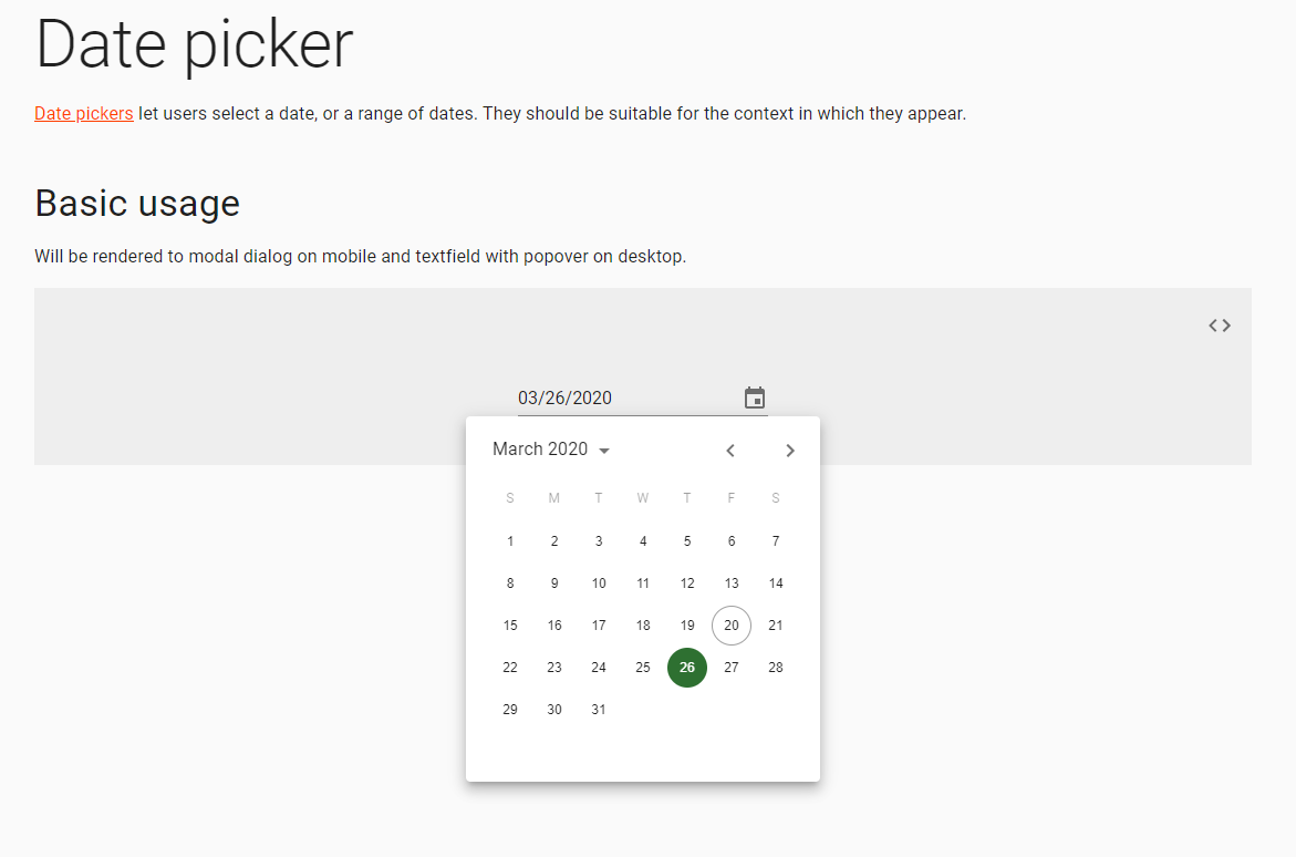
Original example:
https://ipiz.herokuapp.com/md-date-range-picker-demo/index.html
 td-ideabox
on 13 Jun 2019
td-ideabox
on 13 Jun 2019
Any update guys? currently neither of the examples are working..
@dmtrKovalenko we'd appreciate an update.
w3nda
on 24 Jun 2019
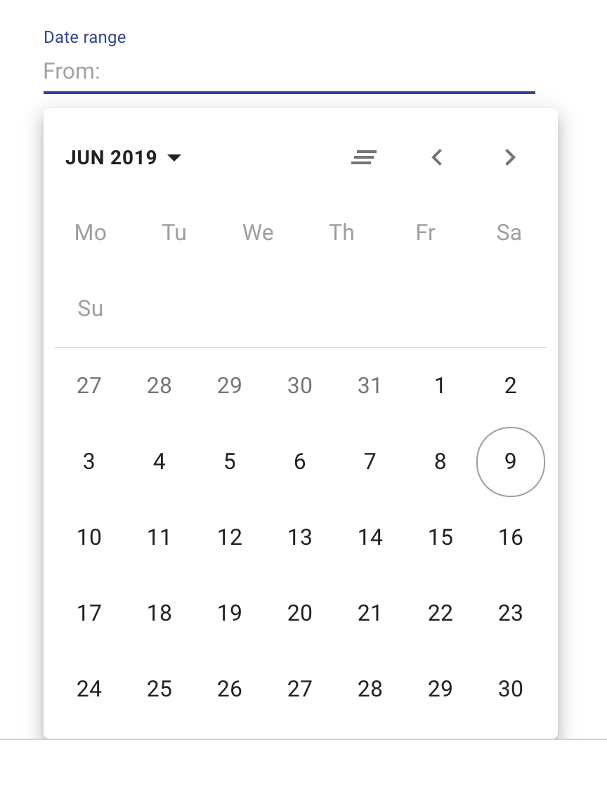
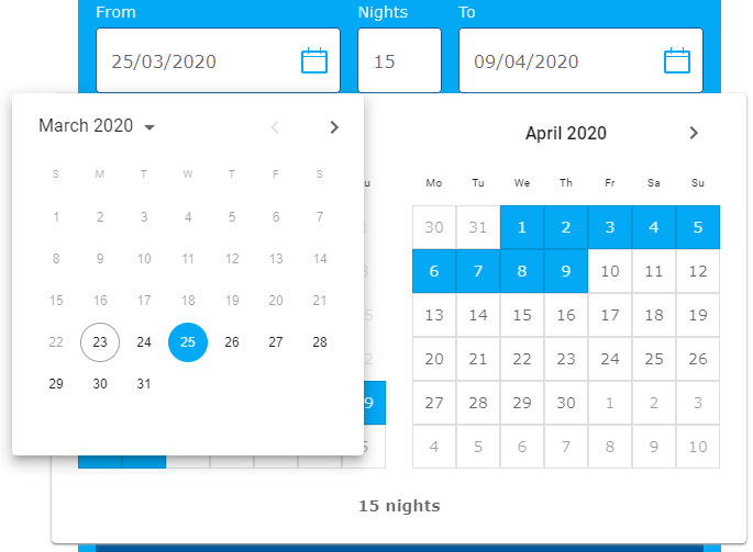
I`ve started working on this. But still considering the main design. There are so many variants of range pickers.
1) Two calendars
2) Different pre-defined ranges as menu
3) With or without year/month displaying
😩
dmtrKovalenko
on 24 Jun 2019
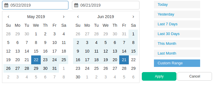
@dmtrKovalenko
The image below contains all the use cases.
Maybe start just with an implementation of two calendars with two date input fields ( this i feel is strongly needed from a UX perspective to be able to select a date range)
Point 2 can be done is some future iteration.
Point 3 would be nice to have with year/month displaying ( upto u :) )
talhatahir
on 24 Jun 2019
But I hate 2 calendars :)
Hard to make responsive. Really not a problem to change the month if you need bigger range
dmtrKovalenko
on 24 Jun 2019
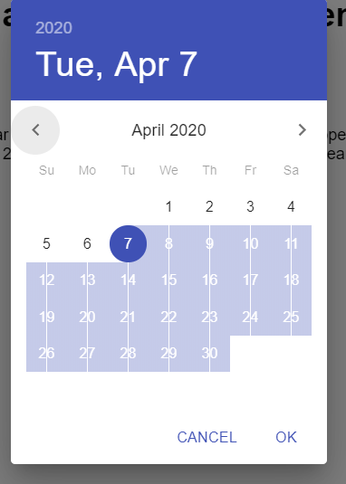
Id like smth like that
dmtrKovalenko
on 24 Jun 2019
Yea the responsive part gets tricky then. This is nice!
With just this amount of information and controls it looks great! Go for it! :+1:
talhatahir
on 24 Jun 2019
@dmtrKovalenko the last example looks great, and it's the most common.
And there are plenty of ideas in this issue just for making something like what you mentioned, work.
Really looking forward this feature 💃
w3nda
on 24 Jun 2019
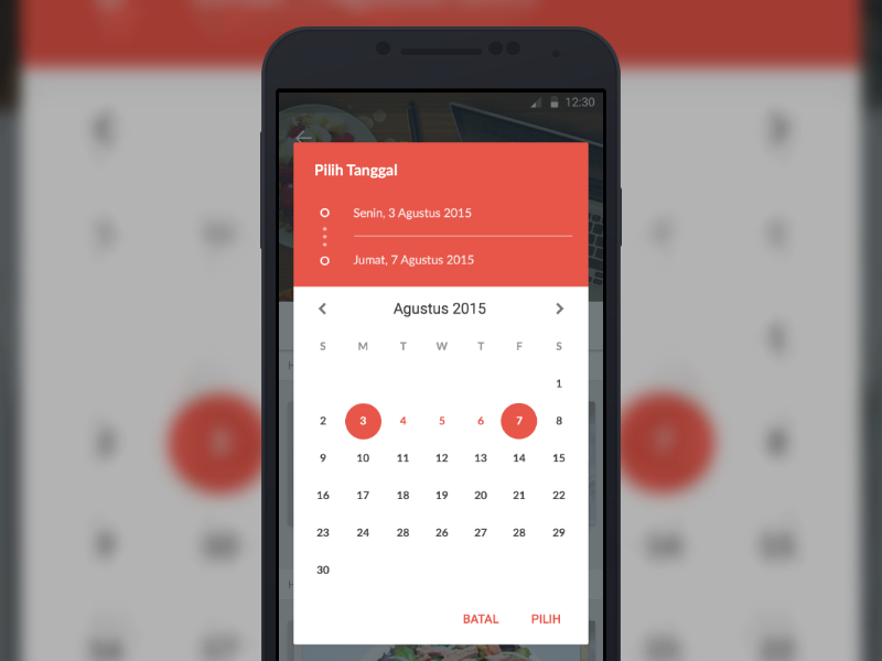
@dmtrKovalenko another idea for date range:
https://airbnb.io/react-dates/?path=/story/daterangepicker-drp--default
 DTupalov
on 25 Jun 2019
DTupalov
on 25 Jun 2019
Has there been any movement on this? I'm willing to help out if anyone has start work on it
williamluke4
on 10 Jul 2019
I have started work on that but it is still not even ready to make a PR :(
Promise to make a PR this week, even in draft state
dmtrKovalenko
on 10 Jul 2019
Just a friendly reminder just in case you forgot. No hurry, I'm just looking forward for this.
 bbigras
on 17 Jul 2019
bbigras
on 17 Jul 2019
Is there already a PR with this work that we can look into?
 sabriskay
on 25 Jul 2019
sabriskay
on 25 Jul 2019
@dmtrKovalenko did you created the PR? If you need help, I would be glad to help you.
 Princezhm
on 7 Aug 2019
Princezhm
on 7 Aug 2019
Getting back to this one....

Updating:
This one was blocked by treeshaking issue, so I was focused on releasing that one
dmtrKovalenko
on 9 Aug 2019
There is already a pretty great material ui range picker (date and time).
https://demo.mobiscroll.com/react/range/datetime#theme=material
 aeroxy
on 15 Aug 2019
aeroxy
on 15 Aug 2019
There is already a pretty great material ui range picker (date and time).
[crapware link]
Please don't use issues in an open-source project as a way to promote your ridiculously overpriced software.

tgBryanBailes
on 15 Aug 2019
When this gets added is it going to include data and time ranges or simply data ranges?
 ZNackasha
on 16 Aug 2019
ZNackasha
on 16 Aug 2019
It's actually open source. Just not very obvious...
aeroxy
on 16 Aug 2019
We should thank them for a great job and trying very hard to work on this one. Thank you!!
 aaesis
on 19 Aug 2019
aaesis
on 19 Aug 2019
Are there any news?
 Angelk90
on 26 Sep 2019
Angelk90
on 26 Sep 2019
Are there any news?
Version 3.2.3 still on progress for date range in Changelog
 consciousnessdev
on 2 Oct 2019
consciousnessdev
on 2 Oct 2019
@consciousnessdev : What graphic will the input field and calendar have?
Angelk90
on 2 Oct 2019
We have added the date picker range in the roadmap of Material-UI. I can't say when or where it will happen, but we will make sure it happens.
 oliviertassinari
on 2 Oct 2019
oliviertassinari
on 2 Oct 2019
Anybody knows how to use @williamluke4 's package? I'm trying to install it with yarn but I can't seem to get the right package.
 reinvanimschoot
on 3 Oct 2019
reinvanimschoot
on 3 Oct 2019
any news about this feature? :)
 amaia00
on 9 Oct 2019
amaia00
on 9 Oct 2019
@oliviertassinari , @dmtrKovalenko, @consciousnessdev :
What news are there on the development of the possibility of having the date range?
What graphics will you have?
In the possibility of having the date range, you have also considered the possibility to also select the time between the two dates, for example:
4/10/2019 18:10 - 6/10/2019 9:20
Angelk90
on 4 Nov 2019
Any update on this feature?
 jeffsupancic
on 15 Nov 2019
jeffsupancic
on 15 Nov 2019
@oliviertassinari , @dmtrKovalenko, @consciousnessdev :
Look at this module it is very interesting the way in which it has graphically implemented the possibility to add also the time.
Even if at the moment it only works within 12 hours, it would be very interesting on the 24.
react-range-picker
codesandbox

Angelk90
on 15 Nov 2019
does anybody has an updated gist of this one https://gist.github.com/RedHatter/482d6370f9f9546498890b348636aacb
using the latest version of material-ui-pickers?
can someone show an example of this on codesandbox?
 sibelius
on 19 Nov 2019
sibelius
on 19 Nov 2019
if no one is working on this, I would like to contribute to this feature.
 ashifa454
on 26 Nov 2019
ashifa454
on 26 Nov 2019
Any update on this would be appreciated!
 Jurge92
on 2 Dec 2019
Jurge92
on 2 Dec 2019
Working on material-ui-pickers v4. Range picker will be a part of it.
Plans is to release this version in January
dmtrKovalenko
on 2 Dec 2019
January 2220 :)
TrejGun
on 2 Dec 2019
Yes
TrejGun
on 4 Dec 2019
Google flights:

 mbrookes
on 24 Dec 2019
mbrookes
on 24 Dec 2019
does anybody has an updated gist of this one https://gist.github.com/RedHatter/482d6370f9f9546498890b348636aacb
using the latest version of material-ui-pickers?
can someone show an example of this on codesandbox?
Here you go with range picker:
https://gist.github.com/Skitionek/006f1f16aa26cf7cc576c901cffd1600
 Skitionek
on 7 Jan 2020
Skitionek
on 7 Jan 2020
I took RadHatters example and modified it for a similar look to google flights. It's pretty bad:
 ckeboss
on 8 Jan 2020
ckeboss
on 8 Jan 2020
Looking forward to this. Is there an ETA on release date for January?
 10SPD
on 14 Jan 2020
10SPD
on 14 Jan 2020
@ckeboss :
Can I ask you in your example if you could make any changes?
Angelk90
on 15 Jan 2020
@dmtrKovalenko
It's already mid-January and the future in-development url https://material-ui-pickers.mui-org.now.sh/ does not show any progress on a dateRangePicker component.
Is this feature still in scope for January?
 xtgrant
on 17 Jan 2020
xtgrant
on 17 Jan 2020
@xtgrant Q2 2020.
oliviertassinari
on 17 Jan 2020
@Angelk90 what do you mean?
ckeboss
on 18 Jan 2020
@ckeboss :
In the possibility of having the date range, you have also considered the possibility to also select the time between the two dates, for example:
4/10/2019 18:10 - 6/10/2019 9:20
Angelk90
on 20 Jan 2020
I'm using @ckeboss version and it is working great
I've made a tiny change to make sure it handles well initial begin,end values like this
const [accepted, setAccepted] = useState(!!begin && !!end);
do you think it makes sense to enable selecting only the initial or final date as well?
sibelius
on 20 Jan 2020
Hi guys, great component! Is the release of date range feature any time soon?
 develanton
on 20 Feb 2020
develanton
on 20 Feb 2020
Eagerly awaiting this feature so I can say adios to react-dates !
 jayaramkasi
on 25 Feb 2020
jayaramkasi
on 25 Feb 2020
@oliviertassinari Hi, Is there any release date? estimated.
 oktaykose
on 26 Feb 2020
oktaykose
on 26 Feb 2020
For who search a lib with this, using the material ui style and date-fns, here is one lib:
https://flippingbitss.github.io/react-daterange-picker/
https://github.com/flippingbitss/react-daterange-picker
 vensauro
on 1 Mar 2020
vensauro
on 1 Mar 2020
Does this work with material ui v4?
 GTDev87
on 1 Mar 2020
GTDev87
on 1 Mar 2020
Does this work with material ui v4?
I am making a pull to this lib to update the dependencies, but it yet works in v4 now
here is the link of the pull request, you can use the npm to download the branch while this is not in the main package
edit3:
npm install "vensauro/react-daterange-picker#asPackage"
yarn add "https://github.com/vensauro/react-daterange-picker#asPackage"
vensauro
on 1 Mar 2020
I took RadHatters example and modified it for a similar look to google flights. It's pretty bad:
Made typescript version
https://codesandbox.io/s/naughty-pasteur-d2pjc
Also fixed some bugs.
 Demonell
on 5 Mar 2020
Demonell
on 5 Mar 2020
@Demonell :
You could add the following features:
- The inability to select dates higher than the current date
- When selecting a date, the possibility to also select a 24 hour format time
Angelk90
on 6 Mar 2020
@Demonell
I agree with @Angelk90
Those two features are much needed.
aeroxy
on 9 Mar 2020
@Demonell Looks great! Just a minor issue: When the page is zoomed to 90% or 110%, a white line appears in the middle of the days:
 knutmarius
on 10 Mar 2020
knutmarius
on 10 Mar 2020
I understand the enthusiasm for this feature is BIG, but every once in a while, I get a notification that something happened on this issue, only to find out, that most of the time it is something off-topic, different package etc. I suggest moving all non-related commenting into a separate platform, maybe Stack Overflow, or a different repo, and keep this issue to the discussion around the actual name bearer material-ui-pickers, and its progress on implementing this feature!
 balazsorban44
on 10 Mar 2020
balazsorban44
on 10 Mar 2020
https://material-ui-pickers.mui-org.now.sh/demo/daterangepicker
is daterangepicker is ready to test guys? want to try it.
 chrisk8er
on 20 Mar 2020
chrisk8er
on 20 Mar 2020
No, it was not included in alpha.4 release. PR with final rangepicker will be a little bit later
dmtrKovalenko
on 20 Mar 2020
If there (https://material-ui-pickers.mui-org.now.sh/demo/daterangepicker) is demo for date range picker, then it doesn't work for me, or I don't understand how to use it like date range (see screenshot)
 TomasLight
on 20 Mar 2020
TomasLight
on 20 Mar 2020
Date range was removed from release. So this is basically datepicker. In the next PR we will change demo to show range picker
dmtrKovalenko
on 20 Mar 2020
@dmtrKovalenko could you explain, how I can use only my custom calendar with your date picker field?
I can't prevent the opening of your calendar. Before I thought that onOpen property will help me, but it doesn't.
For example, I have own calendar-popup and I want to open it from DesktopDatePicker. How it can be implemented?
This question is relevant, because date range picker is not ready yet and I want to use my cheep clone and it looks bad
TomasLight
on 20 Mar 2020
@dmtrKovalenko : When does the version with the range picker also come out in demo mode?
Angelk90
on 27 Mar 2020
What do you mean under the demo? You can try it on deploy preview of linked PR, related to the version with working range picker — soon
dmtrKovalenko
on 27 Mar 2020
Hey,
Props to you guys for getting this up!! This feature is going to be a lifesaver for me, since react-dates' styling doesn't work well with @material-ui ( cannot use MuiThemeProvider, lot of css overrides, need to use airbnb's styling library etc). I saw the tweet that styling will be changed on prod release, so I hope the size and gap between the two TextFields are lesser in 4.0.0.
But importantly, functionality wise, would like it if the input focus to shift automatically to endDate, once startDate is selected. This is the default behaviour of most range pickers.
jayaramkasi
on 28 Mar 2020
@dmtrKovalenko : You talk about https://dev.material-ui-pickers.dev/demo/daterangepicker, but don't you do anything yet?
Angelk90
on 28 Mar 2020
It’s time to PR my Twitter 😆
Find the link to the deploy preview in linked pull request or in my tweet
dmtrKovalenko
on 28 Mar 2020
@dmtrKovalenko this looks good, but i think we will want to be able to see all the dates highlighted after the user clicks. i.e. once the range is chosen, the dates in the range should all show up as green rather than just the last selected single date
jakeleventhal
on 28 Mar 2020
Make sure that in the initial example you first choose the start date and then the end

Did you notice any issues with displaying the final range?
dmtrKovalenko
on 28 Mar 2020
@dmtrKovalenko i see, it works but i have to click both text fields first in order for it to show up
jakeleventhal
on 28 Mar 2020
ideally, you would just be able to
- open date pick via a button
- click a date then click another date and have the range appear
If the first date picked is before the second date, the first date picked is the start date
if the first date picked is after the second date, the first date picked is the end date.
jakeleventhal
on 28 Mar 2020
⬆️ this is how it is working now in chrome
@jakeleventhal could you please record a video how it works for you? Thanks to you I just found a bug in safari
dmtrKovalenko
on 28 Mar 2020

jakeleventhal
on 28 Mar 2020
it was tricky to get it working
jakeleventhal
on 28 Mar 2020
@jakeleventhal in your case it is a problem just because for now we have a prefilled date range for the first example. The initial value is [new Date(), null] – so when you are clicking on the first date it is treated like you want to change the first date and then choose the end. (you can click on inputs to switch from start to end selection)
This must be more obvious in the second example :) Yeah I will change examples and docs structure
In safari it works really weird will take a look at the issue
dmtrKovalenko
on 28 Mar 2020
@dmtrKovalenko : I have a list of suggestions, the problem and if I wrote them here they would be lost among all the comments, so if I wrote them then what you think are valid would you consider them?
Angelk90
on 29 Mar 2020
Yes please, I’d like to hear anything :)
dmtrKovalenko
on 29 Mar 2020
@dmtrKovalenko :
- Ability to select only dates prior to the current including the current one.
- Ability to select only dates after the current one including the current one.
- When selecting a start and end date, the possibility of selecting a 24 hour format time, showing it in a single input field.
example: 24/03/2020 13:00 ~ 27/03/2020 14:00

Angelk90
on 29 Mar 2020
Is there a release timeline? Trying to get a sense of when this will be available so I can let our PO know. Thanks!
 jvdownie
on 1 Apr 2020
jvdownie
on 1 Apr 2020
@jvdownie first betas in Q2, stable maybe in v5, Q4.
oliviertassinari
on 1 Apr 2020
Yes please, I’d like to hear anything :)
Hey bro, it's all right?
Would it be possible to add two optional buttons?
(CANCEL) (APPLY)
Thanks!
 georgebias
on 2 Apr 2020
georgebias
on 2 Apr 2020
@dmtrKovalenko https://dev.material-ui-pickers.dev/demo/daterangepicker work like charm! One feature request though, is it possible to select same date to make one day range? It currently gives validation error...

 kirill-konshin
on 8 May 2020
kirill-konshin
on 8 May 2020
@kirill-konshin Could you open a new issue about the same day range?
oliviertassinari
on 8 May 2020
@oliviertassinari https://github.com/mui-org/material-ui-pickers/issues/1759 done
kirill-konshin
on 8 May 2020
I have added the enterprise label, we will look into how we can publish the range features as part of the enterprise version of Material-UI. The current plan is to have it released as unstable_ in v4, with a warning that it will go enterprise in v5. This should leave us enough time to explore the implications before moving further.
oliviertassinari
on 18 May 2020
@oliviertassinari
I have added the
enterpriselabel, we will look into how we can publish the range features as part of the enterprise version of Material-UI. The current plan is to have it released asunstable_in v4, with a warning that it will go enterprise in v5. This should leave us enough time to explore the implications before moving further.
Does this mean that selecting a date range won't be free? Just curious.
balazsorban44
on 19 May 2020
@balazsorban44 the high-level strategy is as follow:
- bring the best possible MIT date picker component. This is the continuation of the work we have started 6 months ago. There will be a couple of milestones to get there: merge the picker in the mono repository, move the documentation to the main site, provide a desktop-first experience, fix performance issues, fix inconsistencies with core, improve docs. Handle users' feedback. We will know we have succeeded once we get to rank
#1on the queryreact datepickeron Google. We are still far from it (10-12), but getting closer. The simple fact that a full paid date picker components can rank before our component in the US is a major issue we will address :). - bring the most/best position feature-rich date picker, under a GPLv3 or paid enterprise license. To match the existing competitors. Initially, we won't make the date range or date-time range MIT and see how that goes (we can't do it the other way around).
Regarding the pricing, that would likely be approachable and come with a bunch of advances features spread among all the components, e.g tree view drag and drop, data grid virtualization, etc.
oliviertassinari
on 21 May 2020
I wish this feature too!.
 mauricioaznar
on 2 Sep 2020
mauricioaznar
on 2 Sep 2020
Is there a blog post or something about which material-ui features will only be available in the enterprise version?
bbigras
on 3 Sep 2020
@bbigras So far, advanced data grid, date range picker. Then likely, advanced scheduler, advanced tree view, advanced charting, advanced layouts (like in jupyterlab)
oliviertassinari
on 4 Sep 2020
Thank you very much.
bbigras
on 4 Sep 2020
Related issues
 StevenRasmussen
·
3Comments
StevenRasmussen
·
3Comments
 benneq
·
3Comments
benneq
·
3Comments
 katy6514
·
3Comments
katy6514
·
3Comments
 brett-patterson
·
3Comments
brett-patterson
·
3Comments
 dandv
·
3Comments
dandv
·
3Comments
Most helpful comment
Getting back to this one....
