Material-table: How to remove padding from the Toolbar (Title)
I can't manage to remove the toolbar padding so that the title is left aligned with the table.
The component <MTableToolbar /> creates the Material UI component <Toolbar /> as a child. To remove the padding there, the property disableGutters: true must be passed. This is not done by the parent component. Is there another way to remove the padding?
I have read the documentation but I cannot remove the padding via style classes.
 g3n35i5
All 19 comments
I don't recommend this but you can totally modify the way MTableToolbar behaves. You only have to make a copy of it and use it as a custom component. There you can modify everything you want.
jsx
<MaterialTable
components={{
Toolbar: props => <CustomMTableToolbar {...props} />
}} />
 jonasanx
on 25 Feb 2020
jonasanx
on 25 Feb 2020
Many thanks for your reply!
The problem with your solution is that I have to re-implement the complete behaviour of the MTableToolbar (actions, search, title, ...). I am looking for a way to use the toolbar as it is. Just stop with the property disableGutters: true on the Material-UI Toolbar.
g3n35i5
on 25 Feb 2020
It is not neccesary to re-implement the complete behaviour of the components. After overriding Toolbar actions keeps the same, searchs keeps the same. This way you can set the title you want and css it as you want. Don't forget to pass the {...props} to the MtableToolbar. Example:
<MaterialTable
components={
Toolbar: props => (
<MTableTooolbar {...props} />
//Your Box, Buttons, etc.
)
}
/>
 Androsv96
on 25 Feb 2020
Androsv96
on 25 Feb 2020
I'm thinking of something like this:
const components = {
Toolbar: props => (<MTableToolbar disableGutters={true} {...props} />)
};
This only works if I apply this patch in this file, isn't it?
- <Toolbar className={classNames(classes.root, { [classes.highlight]: this.props.showTextRowsSelected && this.props.selectedRows && this.props.selectedRows.length > 0 })}>
+ <Toolbar {{...classes}} className={classNames(classes.root, { [classes.highlight]: this.props.showTextRowsSelected && this.props.selectedRows && this.props.selectedRows.length > 0 })}>
Try this:
import MaterialTable, { MTableToolbar } from 'material-table';
then
<MaterialTable
components={
Toolbar: props => (
<MTableTooolbar {...props} />
//Your Box, Buttons, etc.
)
}
/>
Using MTableToolbar helps you to not to lose search and actions functions and you will be able to modify the title as you want.
Androsv96
on 25 Feb 2020
@Androsv96 I tried, but this only renders the default toolbar with additional elements.
g3n35i5
on 25 Feb 2020
I think I misunderstood your question so I was offering a wrong solution. After trying for a few minutes I don't see how to get rid of the padding in the title. :'/
Androsv96
on 25 Feb 2020
So, is there any other solution?
g3n35i5
on 28 Feb 2020
@g3n35i5 what do you mean by
so that the title is left aligned with the table.
Is it not already aligned with the table on the left hand side?
 oze4
on 21 Mar 2020
oze4
on 21 Mar 2020
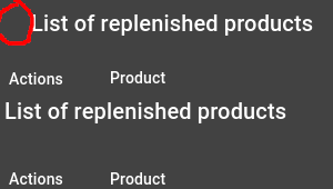
@oze4 i want to remove the padding (red circle) so that the title is left aligned with the first column title so that it looks like the bottom example:
g3n35i5
on 21 Mar 2020
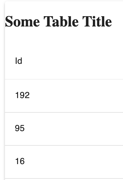
@g3n35i5 You may need to play with the styling but something like this should do the trick..
The key is to grab the MTableToolbar props prior to passing them into the component, and setting propsCopy.showTitle = false;. This way MTableToolbar does not show the default title and you can supply your own. It is easiest to put the title in a Grid with the MTableToolbar so they still appear next to eachother.
You can find a live demo here
Please let me know if you have any questions.
import React, { useState } from "react";
import MaterialTable, { MTableToolbar } from "material-table";
import tableIcons from "./TableIcons.js";
import { Grid } from '@material-ui/core';

const originalData = ["Rock", "Paper", "Scissors"].map(word => ({
  id: Math.floor(Math.random() * 300),
  name: word
}));

export default function AppTable() {
  const [data, setData] = useState(originalData);

  return (
    <MaterialTable
      data={data}
      icons={tableIcons}
      columns={[
        {
          title: "Id",
          field: "id"
        },
        {
          title: "Name",
          field: "name"
        }
      ]}
      components={{
        Toolbar: props => {
          // Make a copy of props so we can hide the default title and show our own
          // This let's us use our own Title while keeping the search
          const propsCopy = { ...props };
          // Hide default title
          propsCopy.showTitle = false;
          return (
            <Grid container direction="row">
              <Grid item xs={6}>
                <h2>Some Table Title</h2>
              </Grid>
              <Grid item xs={6}>
                <MTableToolbar {...propsCopy} />
              </Grid>
            </Grid>
          );
        }
      }}
    />
  );
}
It works, wonderful! Thank you very much for your answer @oze4. I don't think this is the most elegant solution (the padding should be configurable in my opinion...), but so far it's enough for my purposes.
So I leave the issue open, so that the developers might look at it again sometime :)
g3n35i5
on 21 Mar 2020
@g3n35i5 I most certainly agree - having some native, built-in way to edit the styling on the Toolbar would be ideal. Unfortunately, this 'hack' is all I could find. (Keep in mind material-table is meant to be 'hacky' and extensible like this)..
It does appear there are native ways to edit styling, just not for the Toolbar, sadly.
oze4
on 21 Mar 2020
You can override styles. Toolbar has these classes
MuiToolbar-root MuiToolbar-regular MuiToolbar-gutters there might be a problem if class names will change in the future.
const useStyles = makeStyles((theme) => ({
    toolbarWrapper: {
        '& .MuiToolbar-gutters': {
            paddingLeft: 0,
            paddingRight: 0,
        }
    },
}))
Components settings
Toolbar: (props) => <div className={classes.toolbarWrapper}><MTableToolbar {...props}/></div>,
 alex-enchi
on 25 Mar 2020
alex-enchi
on 25 Mar 2020
@alex-enchi well yeah, you can "override styles" like that but it's really no different than my example. Still have to provide a custom component.
Material table allows you to easily override styles for certain items via props, etc without having to override an entire component. That's the point we were making.
oze4
on 25 Mar 2020
@oze4 , not arguing here. Passing styles and class names to components would be a much preferable solution. I would love to pass Toolbar props, since it is the main wrapper in MTableToolbar
I just decided to write out a workaround with styles + small wrapper component instead of hiding part of the toolbar and re-render it. It is opinionated though.
alex-enchi
on 25 Mar 2020
@alex-enchi but you must realize your example also "re-renders" the toolbar... Anyhow, thanks for the example!
oze4
on 25 Mar 2020
Thanks for all the answers and your feedback! Both solutions work very well, as long as the developers do not implement the possibility to customize the toolbar, these are definitely good ways.
As far as I understand it, issues are prioritized by the number of reactions so everybody leave a thumb up/down/left/right so the issue will be processed at some point :smile:
g3n35i5
on 25 Mar 2020
@g3n35i5 Material Table was designed to allow for this "overriding" type of behavior. You can currently completely customize the Toolbar (or any main component).
There are currently multiple solutions for this issue from what I can see.
oze4
on 31 May 2020
Related issues
 lazeebee
·
3Comments
lazeebee
·
3Comments
 ModPhoenix
·
3Comments
ModPhoenix
·
3Comments
 balibou
·
3Comments
balibou
·
3Comments
 KKrisu
·
3Comments
KKrisu
·
3Comments
 behrouz-s
·
3Comments
behrouz-s
·
3Comments
Most helpful comment
@g3n35i5 You may need to play with the styling but something like this should do the trick..
The key is to grab the
MTableToolbarprops prior to passing them into the component, and settingpropsCopy.showTitle = false;. This wayMTableToolbardoes not show the default title and you can supply your own. It is easiest to put the title in aGridwith theMTableToolbarso they still appear next to eachother.You can find a live demo here
Please let me know if you have any questions.