Material-components-web: MDC Menu readme instructions are missing import statement
What MDC Web Version are you using?
0.36.1
What are the steps to reproduce the bug?
View the MDC Menu readme here. The Javascript instructions include the following:
 // Instantiation
  ...
  var menu = new mdc.menu.MDCMenu(menuEl);
  ...
new mdc.menu.MDCMenu(menuEl) cannot be instantiated without importing an external module, which is not provided. This is done on other components, such as the ripple effect on the button component:
import {MDCRipple} from '@material/ripple';
const buttonRipple = new MDCRipple(document.querySelector('.mdc-button'));
What is needed
Please provide the missing import statement or clarify how this is supposed to work. Thanks!
 endigo9740
All 2 comments
I've made headway on this. Here's the fix:
import { MDCMenu, Corner } from '@material/menu';
Plus changing the instantiation line to:
...
const menu = new MDCMenu(menuEl);
...
The menu now works, but with some gotchas:
- The corner position is not adhering to the setting provided. The top-left of the menu is always attached to the top-right of the trigger element.
- Using the .mdc-menu-anchor wrapping classes breaks the styling of the entire page when attached to a wrapping element. Adding it to the body element does nothing.
- The menu itself seems to have other style issues, such as no padding on the left side
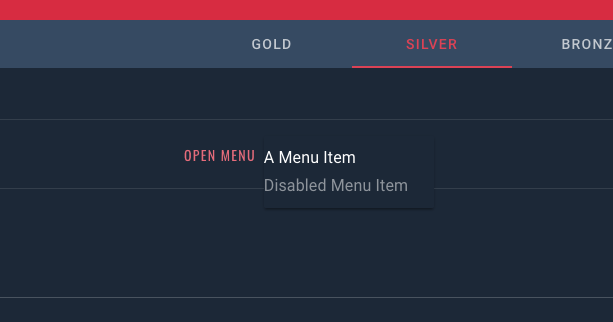
Note, this is being wrapped in an angular component but here's the full code:
HTML:
<!-- <div id="demo-menu" class="mdc-menu-anchor"> -->

    <span #button id="menu-button">
        <app-jrm-button >Open Menu</app-jrm-button>
    </span>

    <div #menu class="mdc-menu" tabindex="-1">
        <ul class="mdc-menu__items mdc-list" role="menu" aria-hidden="true">
            <li class="mdc-list-item" role="menuitem" tabindex="0">
                A Menu Item
            </li>
            <li class="mdc-list-item" role="menuitem" tabindex="-1" aria-disabled="true">
                Disabled Menu Item
            </li>
        </ul>
    </div>

<!-- </div> -->
SCSS (CSS):
@import '~src/sass/theme-jr';
@import "~@material/menu/mdc-menu";
Note: disabling the theme import and root stylesheet styles does not affect the issues illustrated.
Controller (JS):
import { MDCMenu, Corner } from '@material/menu';
import { Component, AfterViewInit, ViewChild, Input } from '@angular/core';

@Component({
    selector: 'app-jrm-menu',
    templateUrl: './menu.component.html',
    styleUrls: ['./menu.component.scss']
})
export class MenuComponent implements AfterViewInit {
    @ViewChild('menu') menu; // #menu
    @ViewChild('button') button; // #button

    constructor() {}

    ngAfterViewInit() {
        // Dom Selection
        const menuEl = this.menu.nativeElement;
        const menu = new MDCMenu(menuEl);
        const button = this.button.nativeElement;

        // Toggle menu open
        button.addEventListener('click', function() {
            menu.open = !menu.open;
        });

        // Listen for selected item
        menuEl.addEventListener('MDCMenu:selected', function(evt) {
            const detail = evt.detail;
        });

        // Set Anchor Corner to Bottom End
        menu.setAnchorCorner(Corner.BOTTOM_LEFT); // BOTTOM_END

        // Turn off menu open animations
        menu.quickOpen = true;
    }
}
Allso, where are the Corner docs? What does it provide and how do you describe which corner you want to choose?
 elliottregan
on 9 Jul 2018
elliottregan
on 9 Jul 2018
Related issues
 trimox
·
4Comments
trimox
·
4Comments
 abhiomkar
·
3Comments
abhiomkar
·
3Comments
 cintaccs
·
3Comments
cintaccs
·
3Comments
 kimurakenshi
·
3Comments
kimurakenshi
·
3Comments
 16rajumane
·
3Comments
16rajumane
·
3Comments
Most helpful comment
Allso, where are the
Cornerdocs? What does it provide and how do you describe which corner you want to choose?