Material-components-android: [Alert Dialog] Padding added on bottom when the positive button's text is a little long
Description: When creating a MaterialAlertDialog with the positive button's text a little long, padding gets added to the bottom of the dialog making it look out of place.

Expected behavior: There should be no padding added.

Source code:
MaterialAlertDialogBuilder(requireContext()).apply {
                    setTitle("Dialog title")
                    setMessage("Dialog body")
                    setPositiveButton("Agree and continue") { _, _ ->

                    }
                    setNeutralButton("No") { _, _ ->

                    }
                    show()
                }
Devices: OnePlus 6, Xiaomi Mi A2, Motorola G5 Plus
Android API versions: OnePlus 6 - 29, Xiaomi Mi A2 - 28, Motorola G5 Plus - 27
Material Library version: 1.2.0
 aryanarora180
All 5 comments
Hi, I'm not able to reproduce it, could you provide a sample app where the issue happens?
 leticiarossi
on 31 Aug 2020
leticiarossi
on 31 Aug 2020
I have created a repository. I made it completely from scratch, only added Material components dependency in the gradle files and changed the app theme to inherit from MaterialComponents. Then I displayed the dialog.
aryanarora180
on 1 Sep 2020
The issue can be replicated using an emulator with these specs:
https://www.gsmarena.com/oneplus_6-9109.php


It doesn't happen with the appcompat AlertDialog.Builder.

 gabrielemariotti
on 1 Sep 2020
gabrielemariotti
on 1 Sep 2020
It does also appear on AlertDialog.Builder, just make the buttons labels larger and you can reproduce
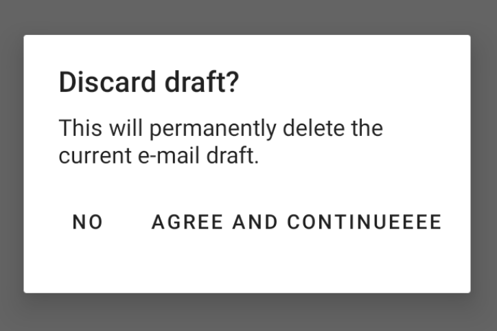
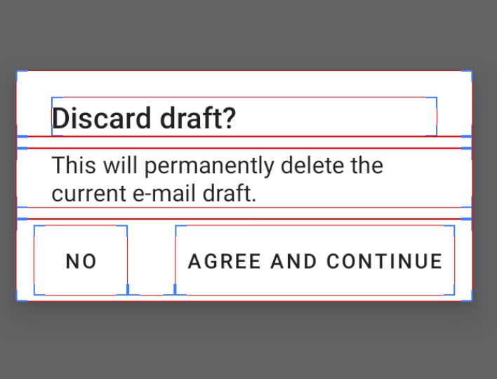
AlertDialog.Builder(this)
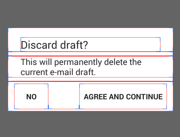
.setTitle("Discard draft?")
.setMessage("This will permanently delete the current e-mail draft.")
.setPositiveButton("Agree and continueeee") { _, _ -> }
.setNeutralButton("No") { _, _ -> }
.show()
And depending on the version, we have different behaviors:
v19 extra top padding on the button panel
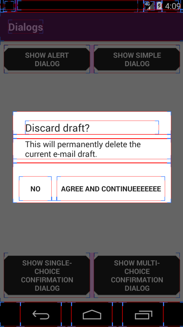
v29 parent panel has extra height
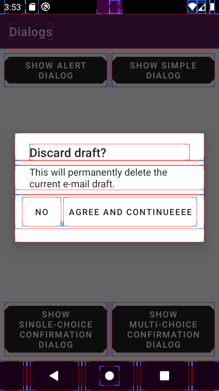
When there is enough space for the buttons, the dialogs look like this:
v19
v29
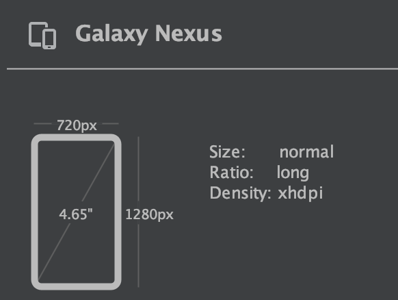
Emulator used:
Galaxy Nexus
 ivannarino
on 10 Oct 2020
ivannarino
on 10 Oct 2020
Good find! While I wasn't able to reproduce the same thing for the AlertDialog.Builder, this shows that there is inconsistency across all types of devices.
aryanarora180
on 11 Oct 2020
Related issues
 aarontwf
·
3Comments
aarontwf
·
3Comments
 TdevM
·
3Comments
gabrielemariotti
·
3Comments
TdevM
·
3Comments
gabrielemariotti
·
3Comments
 Mirmuhsin
·
3Comments
Mirmuhsin
·
3Comments
 Sanusy
·
3Comments
Sanusy
·
3Comments
Most helpful comment
The issue can be replicated using an emulator with these specs:
https://www.gsmarena.com/oneplus_6-9109.php
It doesn't happen with the appcompat
AlertDialog.Builder.