Material-components-android: [SwitchMaterial] On-Off state are not vertically aligned
Description: By using multiple SwitchMaterial components in multiple rows you will see they are not vertically aligned when one of them is on and another is off.
Expected behavior:
I think that thumb of SwitchMaterial should stand in a position (in both on/off) that looks vertically aligned like this image (created by a photo editing app) :

Current implementation of SwitchMaterial does not consider vertical alignment as you see:

Source code:
<?xml version="1.0" encoding="utf-8"?>
<LinearLayout xmlns:android="http://schemas.android.com/apk/res/android"
    xmlns:tools="http://schemas.android.com/tools"
    android:layout_width="match_parent"
    android:layout_height="match_parent"
    android:orientation="vertical"
    tools:context=".MainActivity">

    <com.google.android.material.switchmaterial.SwitchMaterial
        android:layout_width="wrap_content"
        android:layout_height="wrap_content"
        android:layout_margin="8dp"
        android:checked="true" />

    <com.google.android.material.switchmaterial.SwitchMaterial
        android:layout_width="wrap_content"
        android:layout_height="wrap_content"
        android:layout_margin="8dp" />

</LinearLayout>
Android API version: 29
Material Library version: 1.1.0
Device: All devices, also in design mode of android studio
 ftabashir
All 6 comments
Hi ftabashir, this is as designed due to the thumb design being slightly larger than the underlying track. However, compared to the live examples of switches on material.io https://material.io/components/selection-controls/ the example screenshot appears to have an exaggerated offset, as well as alternate coloring.
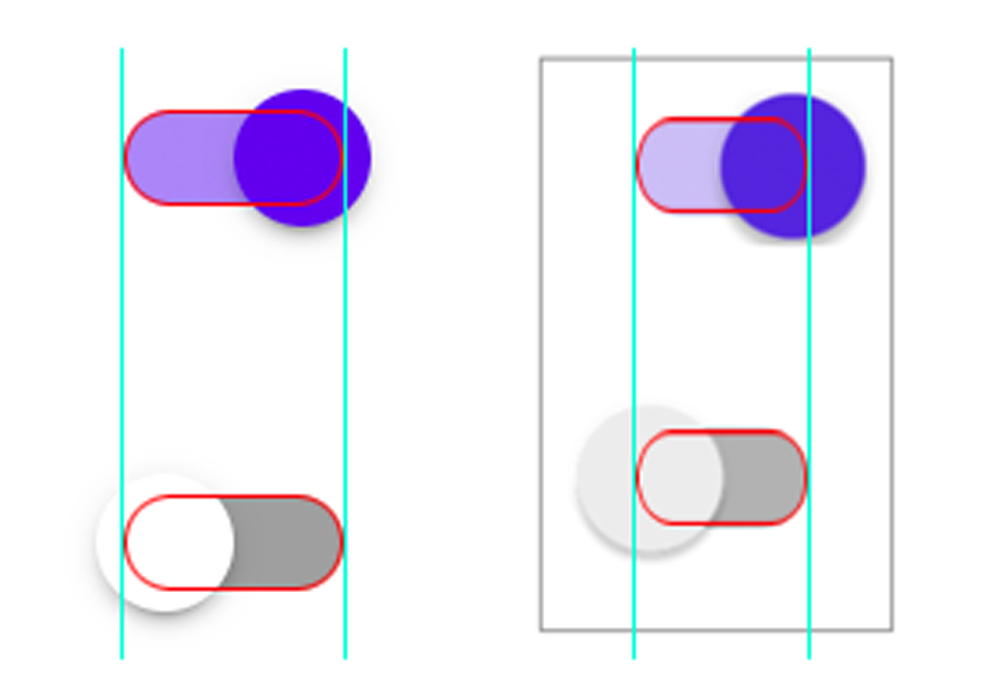
(on the left is Material, compared to the screenshot on the right)
 angdesign
on 14 Feb 2020
angdesign
on 14 Feb 2020
Hi @angdesign
I did not try to exaggerate.
Second image I posted is the screenshot of using android material switch component. Source code shows the elements I used. I did not alter any attribute to increase thunb size.
Let me know If you think I did something wrong.
ftabashir
on 15 Feb 2020
Hi @angdesign
The example of material is good and the screenshot is real. I am facing the same problem here. So as I see this is an implementation bug, which means it is behaving the way (as in the screenshot) other than how it should behave (as in the material example).
 hqzxzwb
on 11 Sep 2020
hqzxzwb
on 11 Sep 2020
Same issue here,

SwitchMaterial appears unaligned (tried using 1.2.1, 1.3.0-alpha02 and 1.3.0-alpha03 but every version has the same issue).
 Mathbl
on 17 Nov 2020
Mathbl
on 17 Nov 2020
In the exemple, they also look weirdly aligned https://github.com/material-components/material-components-android/blob/master/docs/components/assets/switch/switch_example.png
Is it just me or it looks off?
Mathbl
on 17 Nov 2020
Following up, acknowledging the staggered effect, and we have an update in the works for Switches to align toggle position to follow the pattern below.

angdesign
on 17 Nov 2020
Related issues
 JakeWharton
·
3Comments
JakeWharton
·
3Comments
 ahmaducg
·
3Comments
ahmaducg
·
3Comments
 jaychang0917
·
3Comments
jaychang0917
·
3Comments
 TdevM
·
3Comments
TdevM
·
3Comments
 JavierSegoviaCordoba
·
3Comments
JavierSegoviaCordoba
·
3Comments
Most helpful comment
Following up, acknowledging the staggered effect, and we have an update in the works for Switches to align toggle position to follow the pattern below.
