Mastodon: Request: Notifications design rework
Related: #14468
Pitch
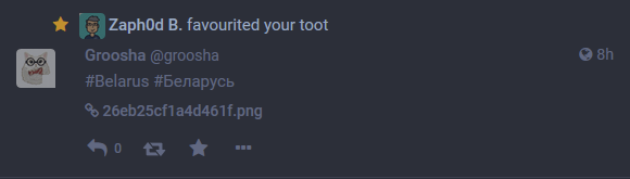
Let's take a look at a simple notification:
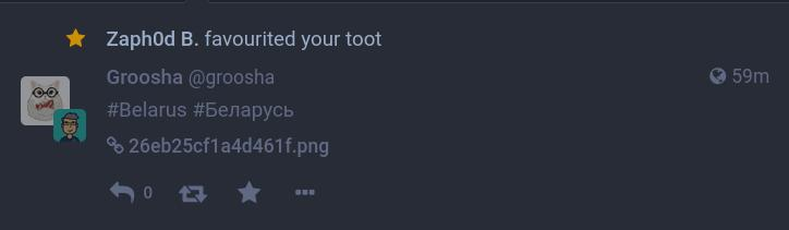
Its active zones are:
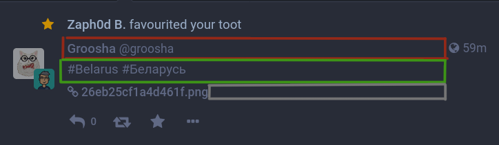
Click on RED zone opens user profile.
Click on GREEN zone opens toot itself.
Click on GREY zone does nothing.
Click on image name opens image in a separate tab.
Motivation
What's wrong?
- Timestamp tells datetime when original toot was posted, not when someone interacted with it (counter-intuitive for me).
- Too small zone (or none at all) to click/tap to view toot.
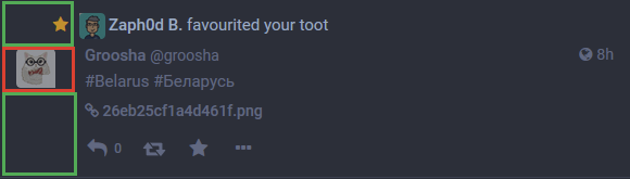
Suggestion
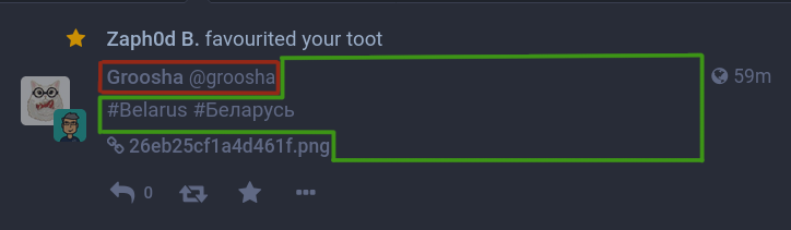
- Resize zones described above the way as I showed on the following screenshot.
- Show notification time, not toot time (I can view toot time when I go to toot).
 MasterGroosha
All 9 comments
You forgot the zone below the userpic. I'm using it as most consistent for me 😐
 skobkin
on 22 Aug 2020
skobkin
on 22 Aug 2020
Thanks, @skobkin, I completely forgot about the left area. It's not as bad as the central one, but I see possible improvements too.
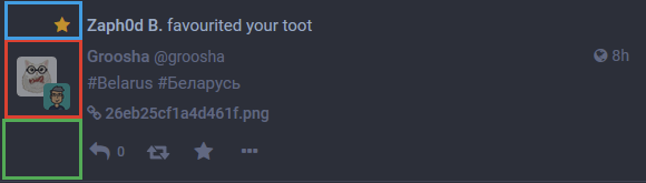
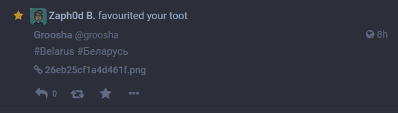
Click on GREEN zone opens toot.
Click on RED zone opens my (!) profile.
Click on BLUE zone does nothing
But hey, why would I need to go to my profile from notifications? I can already switch to my profile page by clicking the avatar above toot compose field or click hamburger menu -> my avatar (in mobile version).
Luckily when your toot has lots of text that GREEN zone becomes bigger but with short toots it consumes as little as 33% of left side of notification.
I'm not sure what to suggest this time, maybe it can be done like this:
- Move avatar next to another user's name (looks better and gives slightly more space for tap on touchscreens)
- This also makes GREEN zone (open toot) up to 2/3 of left side space and you can still go to your profile.
Or completely remove your avatar from the left side, leaving it empty. This allows to make the whole left side to open toot, but in this case everything can be moved left to enlarge green space from a third screen of my first post.
MasterGroosha
on 22 Aug 2020
Better suggestion: remove redundant username, timestamp and actions (reply/boost/fav) for your own posts, make the whole notification clickable to redirect to the post. Adding actor's avatar as above in the action line is a very nice thing to do too.
 Brawaru
on 22 Aug 2020
Brawaru
on 22 Aug 2020
@Sasha-Sorokin I think timestamp is still needed, but it should tell "interaction" time, not original toot time.
MasterGroosha
on 22 Aug 2020
Better suggestion: remove redundant username, timestamp and actions (reply/boost/fav) for your own posts
It'll make the feed less consistent.
It's not as bad as the central one, but I see possible improvements too.
I'm not saying that it's good. It's still bad UX, but a bit more consistent between different posts.
skobkin
on 23 Aug 2020
@skobkin
It'll make the feed less consistent.
How's that a problem?
Brawaru
on 23 Aug 2020
@Sasha-Sorokin How that's not a problem?
When your eyes getting used to seeing something in a certain place, they will get confused if it's not there. Or do you like when every app has different interface look?
skobkin
on 23 Aug 2020
@skobkin I like when interface is clutter free. I really see no point seeing my display name and avatar (I know how I look like, thanks!) or reading my post over and over again (which is partially covered by #14458, but long text still need to be truncated). The notification body itself says it's my post (“Somebody favourited your toot”). Not only this change cleans up interface a little, but also makes actual replies from others to stand out. I'm sorry your eyes getting confused somehow, but that they used to something, does not mean it's actually good.
Brawaru
on 23 Aug 2020
but that they used to something, does not mean it's actually good.
It's not about "getting used to something" in particular, but about showing the same thing when you need to see a toot in different cases if it's not really necessary to do the other way.
Showing favorites themselves without the post data would be OK from that perspective. But it'd be almost useless.
Showing only part of the text is worse, but better than showing only "Somebody favorited your toot". Doing that without changing the rest of the markup would be a good compromise. Making more of the toot block to be a link to the toot is good idea too.
But we also should consider how it'll impact mobile devices with touch interfaces.
skobkin
on 24 Aug 2020
Related issues
 lauramichet
·
3Comments
lauramichet
·
3Comments
 ghost
·
3Comments
ghost
·
3Comments
 hugogameiro
·
3Comments
hugogameiro
·
3Comments
 hidrarga
·
3Comments
hidrarga
·
3Comments
 golbette
·
3Comments
golbette
·
3Comments