Mastodon: Not all hashtags are shown on a smaller screen < 1080p
Smaller screens like those on a laptop is unable to show all the trending hashtags.
Expected behaviour
It should show all the trending hashtags like on a bigger screen (like >=1080p)
Actual behaviour
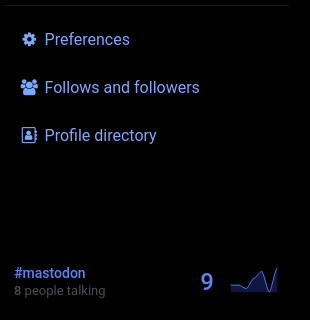
Only one hashtag is shown and rest are hidden.
Steps to reproduce the problem
- Open mastodon on a smaller screen (< 1080p)
- Make sure more than two hashtags are trending
- Observe the position of the hashtags.
Specifications
2.9.3 + commit: https://github.com/tootsuite/mastodon/commit/26c229e6ed1dc3f0620937c9c000494385cb8c47
Browser: chrom{e,ium} , OS : Fedora 30
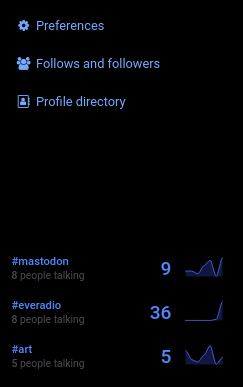
Screenshots:
On default zoom:
On zoomed out:
 akarshanbiswas
All 5 comments
This is intentional since they should not displace the more important navigation.
 Gargron
on 14 Aug 2019
Gargron
on 14 Aug 2019
@Gargron I wish the navigation panel could be scrollable atleast. :(
Edit: Nevermind. If this was intentional,I guess, we can close this issue.
akarshanbiswas
on 14 Aug 2019
I'm sorry , I have to reopen this issue because it's a major problem. Shouldn't the UI adjust itself to different screens sizes and densities in the first place? The new menu "Profile directory" further hid the hastags and now not even a single hashtags is displayed. Can you please move hastags on the top right corner of the screen with a scrollable menu bar (home,notification,.....)?
@Gargron
Edit: Looks like moving the trends container to the top doesn't do any good. :/
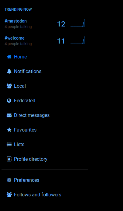
On a full HD screen:
On a 1366x768 resolution screen:

Now I have to find a different approach! :/
akarshanbiswas
on 16 Sep 2019
Floating this issue up - a user on my instance literally didn't know that trending hashtags were a thing because their display resolution was such that a maximised Safari window didn't have the height needed for trending hashtags to be displayed. There should definitely be a better option than just yeeting it entirely from the things the user can see.
 Maffsie
on 27 Jul 2020
Maffsie
on 27 Jul 2020
I'm on an 11-inch MacBook Air, I have my dock at the bottom and I use the bookmarks bar. It's a normal laptop, not a particularly tiny one! I already have to scroll the Getting Started column anyway. Why not include the trending tags?
 Cassolotl
on 27 Jul 2020
Cassolotl
on 27 Jul 2020
Related issues
 renatolond
·
3Comments
renatolond
·
3Comments
 hugogameiro
·
3Comments
hugogameiro
·
3Comments
 almafeta
·
3Comments
almafeta
·
3Comments
 golbette
·
3Comments
golbette
·
3Comments
 ccoenen
·
3Comments
ccoenen
·
3Comments
Most helpful comment
Floating this issue up - a user on my instance literally didn't know that trending hashtags were a thing because their display resolution was such that a maximised Safari window didn't have the height needed for trending hashtags to be displayed. There should definitely be a better option than just yeeting it entirely from the things the user can see.