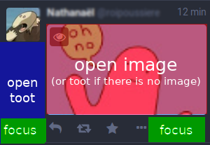
Mastodon: Open toot when clicking on the blank zone below profile picture
When a user posts a toot containing only a picture, it's annoying to open the toot, because when you click on it, it just opens the picture.
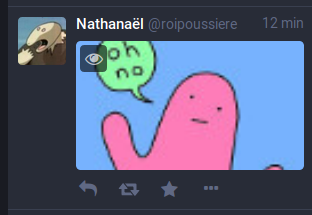
User: hmm, where I'm supposed to click to open this toot?
Of course you can open it by clicking on the three-dot button, then open toot. But many users don't know this trick and it's two clicks instead one: maybe we can improve the usability for this scenario.
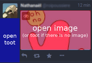
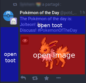
My suggestion is to open the toot when the user clicks on the blank zone below the profile picture:
In this way it's still possible to open any toot, with or without text, with or without image.
- [x] I searched or browsed the repo’s other issues to ensure this is not a duplicate.
 roipoussiere
All 18 comments
This would especially be an improvement on mobile, where it's nearly impossible to open some posts with one tap.
 zcdunn
on 30 Aug 2018
zcdunn
on 30 Aug 2018
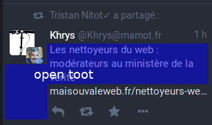
This is a duplicate of image-only toots don't have any space to click on to load them in the 4th column #564, which was closed. It's also related to On toots with only URLs, there is nowhere in the toot area to click to expand the toot #4314, which I opened because I didn't like that the first one was closed!
 Cassolotl
on 30 Aug 2018
Cassolotl
on 30 Aug 2018
Ok, thanks, I didn't find these issues.
But here I propose a concrete suggestion.
roipoussiere
on 30 Aug 2018
I would note that the post date (in the upper right corner) is a reliable place to open the toot's permalink page. Maybe make the hitbox for that link a little larger?
 Down10
on 31 Aug 2018
Down10
on 31 Aug 2018
That opens the toot in a new tab, which you can't interact with, rather than expanding it in the last column
Cassolotl
on 31 Aug 2018
One problem: the current "blue area" you highlighted is for selecting and focusing a certain toot already. If clicking in that area is made to open the toot instead, then navigating the column by keyboard shortcuts would become a lot harder, as you would have to click Tab 23 different times just to select the top toot in the Home column, and then who knows how many times down to reach some arbitrary position.
 trwnh
on 1 Sep 2018
trwnh
on 1 Sep 2018
Couldn't "expand" be moved out of the '...' menu and into its own button? Or at least that could be done when there's no text...
 yaomtc
on 2 Sep 2018
yaomtc
on 2 Sep 2018
Ok, I understand the problem, I didn't know that this area was already dedicated to a "focus" feature.
What about this?
roipoussiere
on 5 Sep 2018
Or maybe a new dedicated button to expand the toot, like this?
roipoussiere
on 5 Sep 2018
One problem: the current "blue area" you highlighted is for selecting and focusing a certain toot already. If clicking in that area is made to open the toot instead, then navigating the column by keyboard shortcuts would become a lot harder, as you would have to click Tab 23 different times just to select the top toot in the Home column, and then who knows how many times down to reach some arbitrary position.
In fact, I think these 2 behaviors are compatible: a click on a blank zone could focus the toot and open it, it's not so annoying for keyboard shortcuts users.
roipoussiere
on 6 Sep 2018
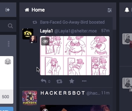
This is extremely annoying. None of these clicks expand the post in the fourth column, they just change the background colour of the post. Since there is only an image and no text, there is nowhere I can possibly click that will expand the post. Since any post with text can be clicked to expand it, this post doesn't behave as expected and the user doesn't think to check the post's menu because they have never needed to do that before.
Cassolotl
on 7 Oct 2018
@Cassolotl Technically right now, the next step after clicking the blank area is to hit Enter on your keyboard. That expands the toot without having to use the ... menu. Which I guess is the reason this issue exists, because that's non-obvious unless you know how keyboard shortcuts work.
trwnh
on 7 Oct 2018
Yeah, if you're clicking with your mouse then you're probably not going to expect to have to switch to keyboard commands when you don't have to do that for posts with text! (Edit: thanks for the useful info though, learned a thing!)
Cassolotl
on 7 Oct 2018
I'd like to point out that on toots containing text, there is no gap between the username and the text that isn't clickable.
On image-only posts, there is a gap with no interactivity.
 BenLubar
on 21 Oct 2018
BenLubar
on 21 Oct 2018
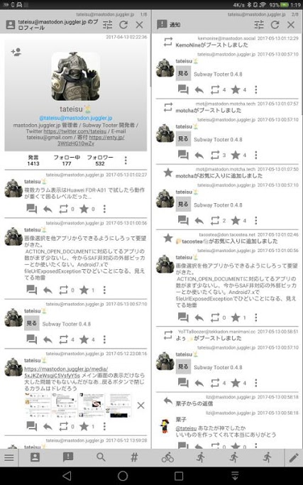
Subway Tooter uses an icon with two speech bubbles for this, I like its position as the left-most icon.
 ryliejamesthomas
on 16 Dec 2018
ryliejamesthomas
on 16 Dec 2018
Another possible solution is to auto-insert a new line above a link or image, so that there is one line available above the link/image that can be hovered over to open the toot
 crockwave
on 5 Feb 2019
crockwave
on 5 Feb 2019
I'm pretty sure that clicking on a blank zone should be sufficient, because it's not so annoying for keyboard shortcuts users: the toot is just displayed on a column and they can continue to use their keyboard to navigate.
And it's probably the most instinctive way for a user to open a toot.
roipoussiere
on 6 Feb 2019
This should have been fixed with Adds click-able div that expands status (#10733), right?
Cassolotl
on 15 May 2019
Related issues
 hugogameiro
·
3Comments
hugogameiro
·
3Comments
 selfagency
·
3Comments
selfagency
·
3Comments
 almafeta
·
3Comments
almafeta
·
3Comments
 cumbiame
·
3Comments
cumbiame
·
3Comments
 marrus-sh
·
3Comments
marrus-sh
·
3Comments
Most helpful comment
Subway Tooter uses an icon with two speech bubbles for this, I like its position as the left-most icon.