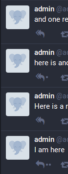
Mastodon: dots indicator instead of numeric replies counter
Maybe a dot(s) indicator instead of a numeric replies counter would show the same info as (0, 1, 1+) counter do, but keeping the not number-focused Mastodon's style.

- [x] I searched or browsed the repo’s other issues to ensure this is not a duplicate.
All 11 comments
it would be too unclear what the meaning is. why do you think something else is required?
Because many people don't like this number-focused approach Mastodon has made. Now every toot is marked as "0 replys"... I find this a little unnecessary.
Something like this was commented on #8181 too.
hmm. that's definitely a valid complaint, but there's a lot of value in knowing if a person has already replied to a question, or using this as a reminder to check what other people have said before replying to another user (an extremely common complaint, both here and on Twitter!)
we specifically didn't add a counter to favs or boosts to avoid a "numbers focus", and I think a limited 0/1/1+ counter avoids most of the problems people have articulated (people see numbers and are incentivized to drive them up as high as possible)
what specific problems do you think having a "numbers focus" might bring that the 0/1/1+ indicator encourages?
Now every toot is marked as "0 replys"... I find this a little unnecessary.
Maybe an option to try here is to remove the "0 replies" and just keep a plain reply button, but show the numbers when it's at 1/1+?
Maybe the dots are not the best solution but they are a good starting point IMO. A similar approach can be used for this. Symbols? Colored dots? I don't know.
But I agree in the fact that the numbers are not a great solution because it's exactly what we tried to avoid from the beginning.
A little button to indicate you're asking a question, another to mark as answered. Like all those Q&A sites.
- Knowing a toot has 0 replies is useful because if it's a question, you know you should maybe reply. Also replies are not trophies.
- Showing other numbers but not 0 makes for a bad layout unless you want the buttons to not be aligned, because then the space between reply and boost is empty and the margin is clearly larger than between boost and favourite. I tried this.
And changing the icon itself?
Alternative icons for the answer button can be made, one for "no answer yet", another one for "answered once" and another for "multiple answers" and choose the icon depending on that.
Or it can be just an small icon on top of the standard reply button.
I believe that the meaning of an icon cannot be overloaded and the current design is the most intuitive variant.
I think I said somewhere before that dots are usually an indicator of "more" or "look inside", used to draw attention, especially on iOS and Android homescreens. The iOS ones are technically notification badges and include numbers, but Google went with simple colored dots whenever an app has notifications.
Now that the numbers have gone live on mastodon.social, my thoughts are the following:
- A dot would indeed be the most visually simple, but if concerns about its vague meaning are anything, then perhaps it should simply be a +.
- It does seem a bit weird to explicitly mark things with a 0, when the absence of a number can do the same cognitively. Although, I suppose having a 0 is an explicit reminder that "this does not have replies", as opposed to a subtle or implicit one.
- The distinction between '1' and '1+' is ambivalent for me, but if the distinction is to be kept, it seems like '1+' is the odd one out as it takes 2 characters. At the very least, I'd ask for a consideration in changing it to simply '+' for uniformity in layout.
Hi,
Should the numbers be displayed in arabic numbers only ? :p
Most helpful comment
Maybe an option to try here is to remove the "0 replies" and just keep a plain reply button, but show the numbers when it's at 1/1+?