Mastodon: [Confuse] Filtered words in timelines are confusing
When I added stuff to /filters I was pleased to see that they had been collapsed into a sort of placeholder:
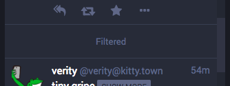
But the placeholder is confusing. When you click it it changes colour, but doesn't do anything. And you can't get the colour to change back again.

I would like to see the filtered word it contains, to know roughly how much good the filter is doing. I'd also be curious to see who made the post.
Maybe it could just say "filtered", and when you click it it shows the username of the person who posted it, plus the word it contains that you have in your filters list? And then clicking again puts it back to just saying "filtered"? That way we can see how much good our filters are doing, who's posting stuff we're not really into, etc.
If not, maybe just making it so that it doesn't change colour when you click? That way we're not like "did that do anything? this is buggy and weird".
- [x] I searched or browsed the repo’s other issues to ensure this is not a duplicate.
 Cassolotl
All 13 comments
I have received a lot of positive feedback for the fact that the filter does not let you click to see what's underneath, or reveal which of the filters it is. According to them it's good for their mental health because it would be too tempting to click otherwise and it would defeat the point.
 Gargron
on 17 Aug 2018
Gargron
on 17 Aug 2018
Alright, if it's for people's MH then I can understand not wanting to change it. I hope there will be a fork that adds the option to show which word it's being filtered for.
What about the weird clicky colour thing? Edit: Like, is it meant to do something and it's not working, or is it not meant to change colour when you click it?
Cassolotl
on 17 Aug 2018
I have received a lot of positive feedback for the fact that the filter does not let you click to see what's underneath, or reveal which of the filters it is.
I agree with this reason, but if so, then why show the "filtered" word at all? As a reminder that something was filtered? Personally, I would prefer if the placeholder was removed, because it's pretty useless to me and just takes up space.
 trwnh
on 17 Aug 2018
trwnh
on 17 Aug 2018
The placeholder is required for pagination to work properly.
The color is the styling of the focused element, it serves a purpose for keyboard navigation.
Gargron
on 17 Aug 2018
Alright, that satisfies my confusion! I'd like to leave this open though because I'll bet this is confusing other people.
Cassolotl
on 17 Aug 2018
I want to second @trwnh here. There is no point in showing the word "Filtered" if it is not interactive. Maybe you need the placeholder in the code, but could it not be zero height?
 wimvanderbauwhede
on 20 Aug 2018
wimvanderbauwhede
on 20 Aug 2018
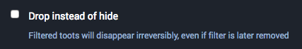
I would like to see how well my filters are working, so I like the option to keep the placeholder visible. It can currently be made totally invisible with the "drop instead of hide" option on the create filter page:
Edit: Seeing the "filtered" placeholder is also particularly useful in conversations and notifications - I need to be able to see when I can't see something! I want to know when someone is talking to me and I might be ignoring them, and I need to see when something has been omitted that might make a conversation nonsensical.
Cassolotl
on 20 Aug 2018
I agree, making it a user-controllable option is preferred. But "drop" is often a bit too harsh for me, as it's irreversible. I'd like to have the option to make it totally invisible when choosing "hide" as well.
wimvanderbauwhede
on 20 Aug 2018
I also agree to enable the "Filtered" posts completely invisible. Why should we be made to show "Someone is talking about what you dislike!" ?? It's really INSANE.
 fvh-P
on 27 Aug 2018
fvh-P
on 27 Aug 2018
agreed that showing "filtered" banners is silly
i don't see why the placeholder would be required for pagination. i get how keeping track of the filtered posts could be necessary but i don't see why they also have to be shown
(e: sorry for the five notification emails, github went down just as i was posting this but still took my comment. several times)
 codl
on 28 Aug 2018
codl
on 28 Aug 2018
consider this negative feedback, then. seeing the word "filtered" is too tempting to ignore. at the same time, i don't like the idea of toots being dropped forever as a result of a temporary mute.
 sireebob
on 3 Sep 2018
sireebob
on 3 Sep 2018
In revisiting this, ideally there would be the following options:
- Drop instead of hide
- Show "filtered" stub (since some want to disable display without it being irreversible)
- Show which filter was triggered (imo should be enabled, but there is disagreement here)
- Click to show (disabled by default, but effectively allows setting your own dynamic auto-CW)
trwnh
on 17 Oct 2019
This issue has too many things in it so I opened Clicking "Filtered" in timelines changes the colour of the background but does nothing #12444 to talk about my one remaining issue from my original post.
If folks would like to open issues for removing the filtered banners, for example, they can do that. :)
Cassolotl
on 22 Nov 2019
Related issues
 psychicteeth
·
3Comments
psychicteeth
·
3Comments
 cumbiame
·
3Comments
cumbiame
·
3Comments
 KellerFuchs
·
3Comments
KellerFuchs
·
3Comments
 hidrarga
·
3Comments
hidrarga
·
3Comments
 lauramichet
·
3Comments
lauramichet
·
3Comments
Most helpful comment
I agree with this reason, but if so, then why show the "filtered" word at all? As a reminder that something was filtered? Personally, I would prefer if the placeholder was removed, because it's pretty useless to me and just takes up space.