Mastodon: Not a lot of space in that third column now!
I'm on 1366 x 768 and this is how the Getting Started / Trending Tags column looks to me now:
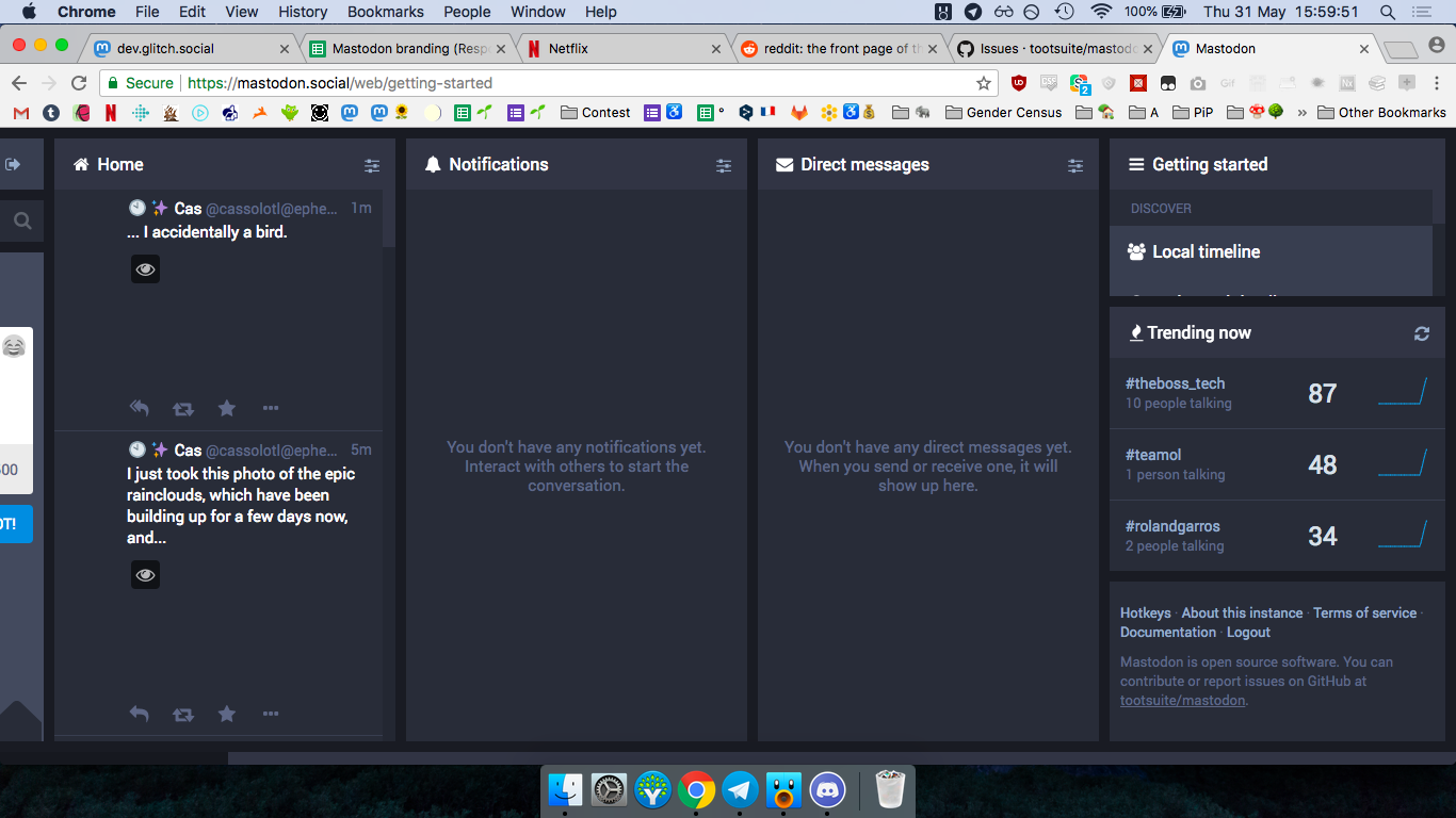
It seems so cramped!
- [x] I searched or browsed the repo’s other issues to ensure this is not a duplicate.
 Cassolotl
All 6 comments
I really want the ability to remove the trending tab. The getting started menu is nearly unusable because of it taking space, and I actually use it.
That it is taking a permanently fixed space on the page instead of it being its own section like the rest seems questionable
 churine
on 31 May 2018
churine
on 31 May 2018
I was originally preferring it to have its own column/section, too - maybe combined with the search bar because people often don't realise it's there above the new-toot box. Then it'd be consistent with the progressive web app, too. :) I could just pin it and scroll sideways. It's still scrolling but at least I can see everything without having to put my cursor in a small box before scrolling!
Edit: I can see people being worried that if trending topics is hidden in the top left menu then it won't get seen, but also, when people turn up they're gonna be like "okay let's search and find people to follow, see what people are up to" - and they will look for a magnifying-glass-symbol, and then hopefully they'll click some tags or type some things...
Cassolotl
on 31 May 2018
The issue with that right column is that the scrollbar is for the menu, instead of the whole column
 ProgVal
on 31 May 2018
ProgVal
on 31 May 2018
Yeah, it makes trends seem too in-your-face. I know the argument was that they should be visible to new users, but this is perhaps a bit much -- would be better to have them in the search dropdown or to have them nested behind a button, in the same way hotkeys are.
There's also much the opposite problem on desktop now -- it looks weird to have a column that isn't full-height.
Here's what I think should be done to make it better:
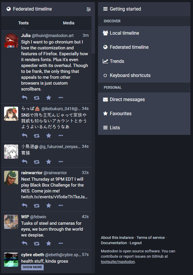
- I've added a button for "Trends" under the Discover subheading -- upon clicking this, the button should load a column of trends.
- I've also moved keyboard shortcuts back up under the Discover subheading, because it's the only link in the footer that doesn't load a new page upon clicking it. Links to webapp pages should not be in the footer, only external links should be there.
- I applied
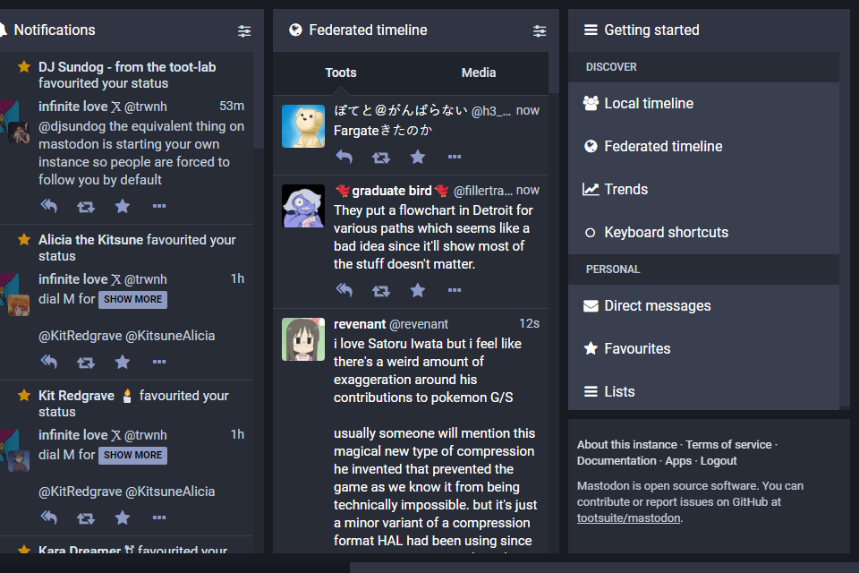
margin-bottom: autotogetting-started__wrapperto make it look more visually balanced -- the dimensions of a column should be constant.
For smaller screens, it would be unwise to attempt to fill that empty space -- any attempt to display additional elements there should be a) for optional content, b) behind a @media (min-height) query.
[ EDIT: while we're at it (and because I don't want to make a separate issue for this little tangent), we should add a link to "apps" back to the footer because it's still helpful to include it even if not everyone sees it -- arguing that it should be removed for invisibility is like saying the about/terms/documentation links are invisible and should be removed. ]
Here's what that might look like at 640px height:
 trwnh
on 1 Jun 2018
trwnh
on 1 Jun 2018
For me it's very unconfortable to read this toots with the column so thin.
I come from Twitter, you can improve very fast just doing the column where we read the toots bigger. I will return to Twitter, just for this.
 ghost
on 10 Aug 2018
ghost
on 10 Aug 2018
@albert013 You may be interested in trying an alternative client like https://pinafore.social, which uses a single-column layout. Or maybe Halcyon, which is a clone of the Twitter Web UI (https://itter.photog.social)?
trwnh
on 14 Aug 2018
Related issues
 flukejones
·
3Comments
flukejones
·
3Comments
 phryk
·
3Comments
phryk
·
3Comments
 ccoenen
·
3Comments
ccoenen
·
3Comments
 Lewiscowles1986
·
3Comments
Lewiscowles1986
·
3Comments
 thomaskuntzz
·
3Comments
thomaskuntzz
·
3Comments
Most helpful comment
Yeah, it makes trends seem too in-your-face. I know the argument was that they should be visible to new users, but this is perhaps a bit much -- would be better to have them in the search dropdown or to have them nested behind a button, in the same way hotkeys are.
There's also much the opposite problem on desktop now -- it looks weird to have a column that isn't full-height.
Here's what I think should be done to make it better:
margin-bottom: autotogetting-started__wrapperto make it look more visually balanced -- the dimensions of a column should be constant.For smaller screens, it would be unwise to attempt to fill that empty space -- any attempt to display additional elements there should be a) for optional content, b) behind a
@media (min-height)query.[ EDIT: while we're at it (and because I don't want to make a separate issue for this little tangent), we should add a link to "apps" back to the footer because it's still helpful to include it even if not everyone sees it -- arguing that it should be removed for invisibility is like saying the about/terms/documentation links are invisible and should be removed. ]
Here's what that might look like at 640px height: