Mastodon: Responsive image being cropped when increasing the browser window
On latest commit https://github.com/tootsuite/mastodon/commit/4ca60c665e02103b8730748c9b82b52bcd0d8d1c
I'm using Firefox 58
When i open an image, it show me the picture well
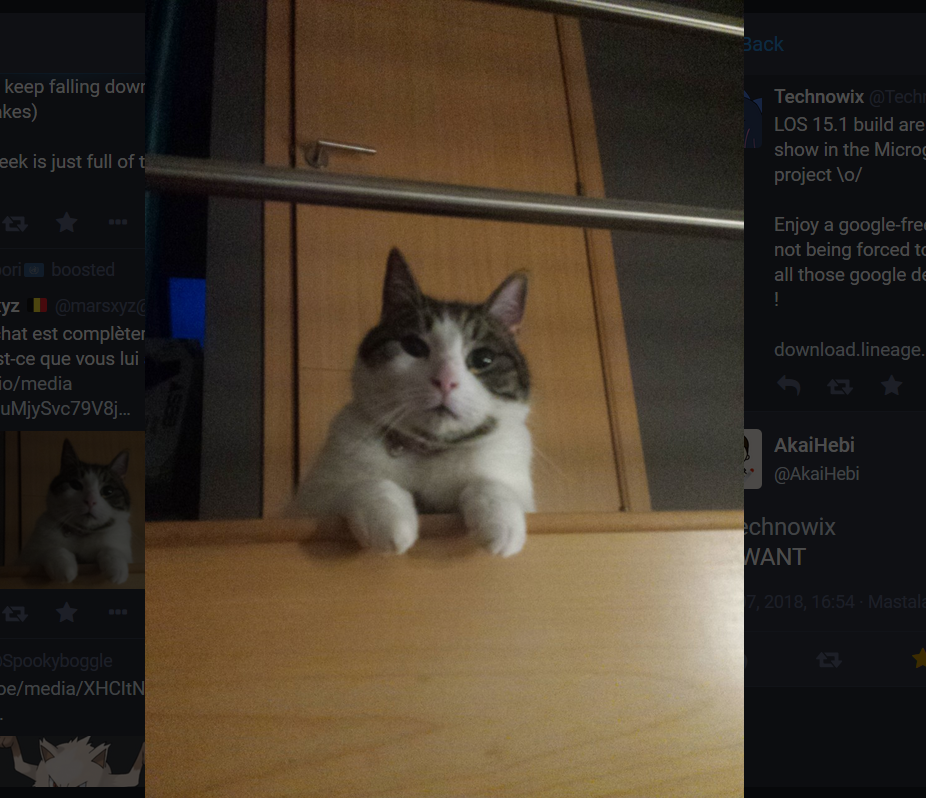
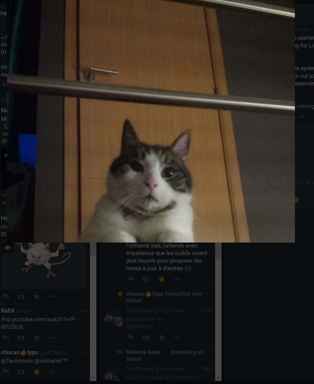
But when I increase the size of the browser windows, the image try to fit in the new space / is rightly being responsive, but got hidden behind an invisible layer
 Miaourt
All 7 comments
cc @yuntan
 ykzts
on 7 Mar 2018
ykzts
on 7 Mar 2018
As a side note, can you link to that cat toot @Technowix? I like that cat
 Gargron
on 8 Mar 2018
Miaourt
on 8 Mar 2018
Gargron
on 8 Mar 2018
Miaourt
on 8 Mar 2018
Confirmed.
 yuntan
on 8 Mar 2018
yuntan
on 8 Mar 2018
I suspect it has something to do with using document.clientHeight instead of CSS with vh. I would argue it's better to use a height smaller than 100vh to account for browser title bar on mobile to avoid setting the height in JS. My impression from using the RCs for a few days is that pictures that stretch the entire screen on desktop are very overwhelming (I have a large screen)
Gargron
on 9 Mar 2018
Same, maybe profit for the screen-space when the size of the windows became to be small, but put some limits.
In addition, when we reduce the size of the window, the picture also get cropped :
Miaourt
on 9 Mar 2018
I suspect it has something to do with using document.clientHeight instead of CSS with vh. I would argue it's better to use a height smaller than 100vh to account for browser title bar on mobile to avoid setting the height in JS.
OK, I'll try to use another method to avoid using JS.
My impression from using the RCs for a few days is that pictures that stretch the entire screen on desktop are very overwhelming (I have a large screen)
In other respects, some users complain that the modal is more difficult to close than before when aspect ratio of screen and image is almost same (there is no margin). I think that putting margins at the sides of an image is wrong because screen width of mobile devices is narrow. Thus I'll put margins on top and bottom of image by max-height: 80vhmax-height: 80%.
Edit vh unit should not be used because it makes narrower margin when the address bar is visible.
yuntan
on 11 Mar 2018
Related issues
 lauramichet
·
3Comments
lauramichet
·
3Comments
 selfagency
·
3Comments
selfagency
·
3Comments
 golbette
·
3Comments
golbette
·
3Comments
 almafeta
·
3Comments
almafeta
·
3Comments
 cumbiame
·
3Comments
cumbiame
·
3Comments
Most helpful comment
As a side note, can you link to that cat toot @Technowix? I like that cat