Mastodon: Allow more layout adjustments
I wrote about this in a post on Mastodon, and the curator of that instance suggested I submit it here.
Tweetdeck, Twitter's "high end" client, sorts timelines and content into columns that can be added, removed, and rearranged just like Mastodon. However, they allow three other adjustments to their layout as well:
- Adjustment of column widths. If you have many columns, you can set them to Narrow to maximise the number of them on your screen at once. Alternatively if you only have two or three, you can set them to Wide to minimise empty, unused space on your screen, and hopefully, show more tweets on a timeline to reduce scrolling.
- Adjustment of font size. If you deal with a lot of long tweets, text size can be made Smaller to fit more tweets in a column (which may be handy for Mastodon's 500+ character limits). If you are visually impaired, the Largest text size would be most beneficial. The font adjustments do not affect the sidebar tweet composer, just the columns.
- Adjustment of thumbnail sizes. The sizes of thumbnail previews of images or videos can be adjusted to span the entire width of the column, or maybe only half the width of the text area, or even hidden altogether. On the Art instance I'm on, this would be quite beneficial.
I think allowing users to better adjust Mastodon's user interface to best suit their needs without relying on third-party tools would make it more accessible and simple to use for new (or existing) users.
 Kavaeric
All 16 comments
Related to #5341, and nolan's comment would apply to those adjustments.
 unarist
on 19 Nov 2017
unarist
on 19 Nov 2017
It wouldn't be prohibitively difficult to use CSS vw or vh instead of set em or px dimensions for the columns, would it? that might alleviate some of the display strain for high DPI displays
Kavaeric
on 2 Dec 2017
Agreed. Even on a laptop I have lots of wasted horizontal space. I need a wider main column, and the ability to remove the third column completely.
 elharo
on 31 Mar 2018
elharo
on 31 Mar 2018
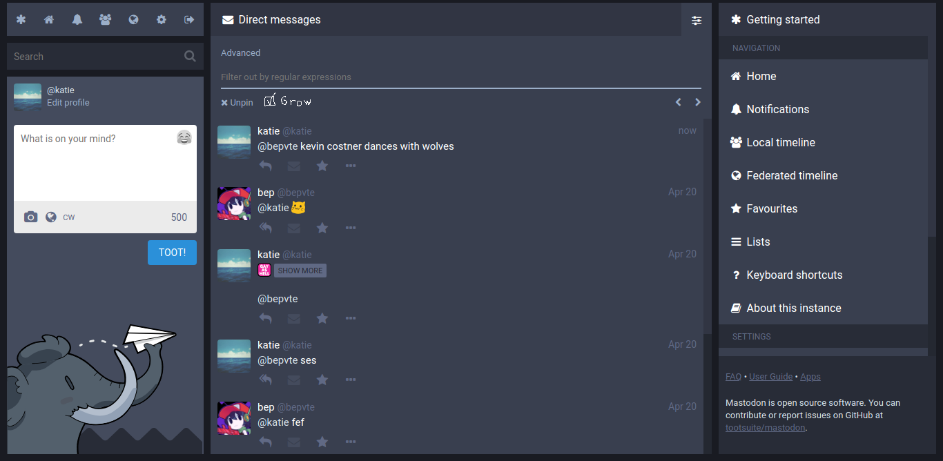
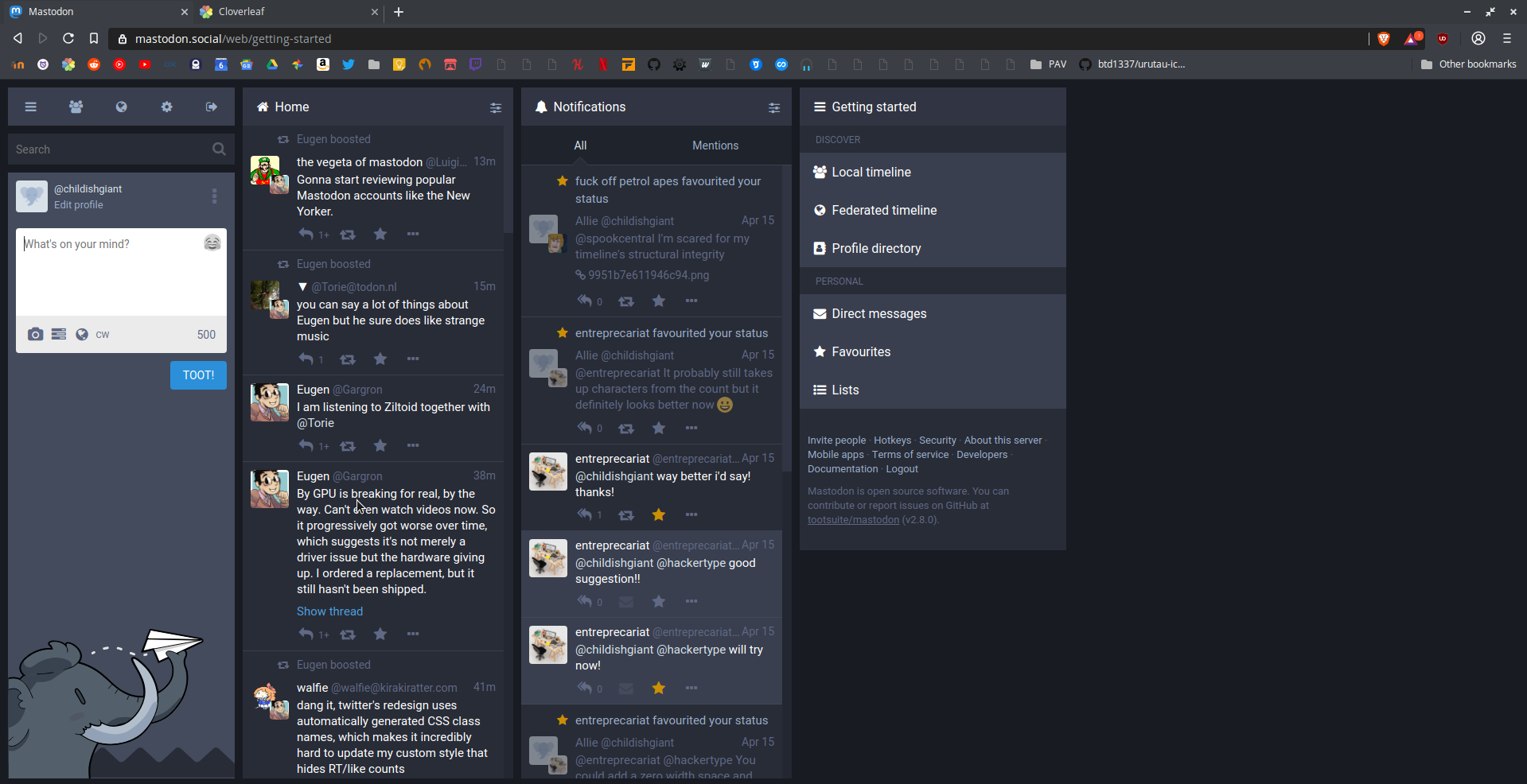
Hello, i agree in particular for the "Adjustment of column widths".
I'm using a 32" 4k monitor and even with pinned columns i have a lot of empty space on the right.
Anyway to improve the usability and readability the "Adjustment of column widths" is important for Desktop and HiDPI monitors.
My example ( I switch "getting started" to the timeline then ) :
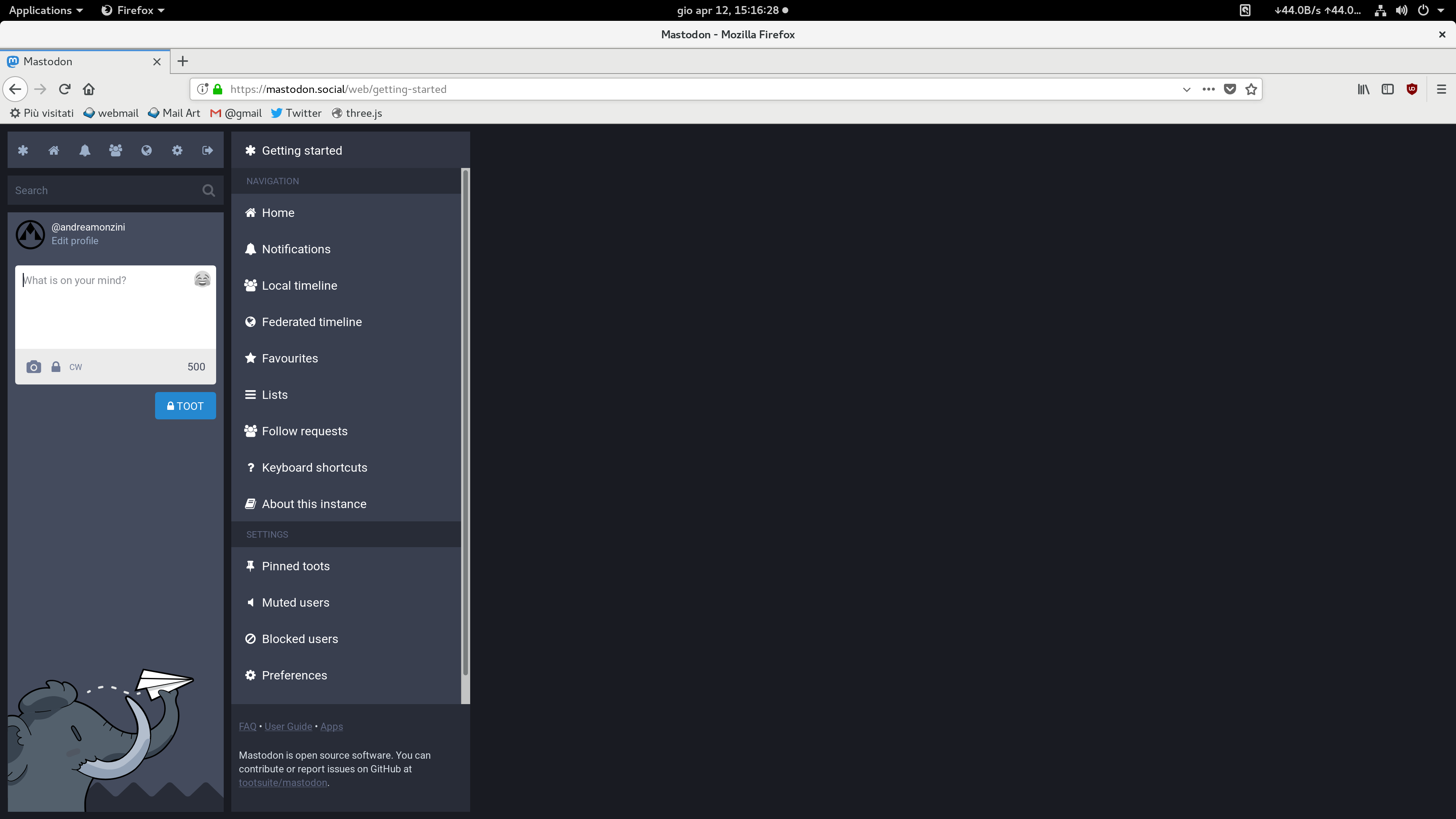
 AndreaMonzini
on 12 Apr 2018
AndreaMonzini
on 12 Apr 2018
It would be super nice if this could be done with dragging the column borders for simpler interaction, but already options in the column options would be nice. Especially on .art I'd love to be able to have a reaaally wide column to display the mastoart hashtag column on a big portion on my screen.
 EmergencyBattle
on 24 May 2018
EmergencyBattle
on 24 May 2018
Note that a "wide" option could be easily implemented by setting flex-grow: 1 on a column. This could be a setting next to the "unpin" setting and could look like this:
Being able to set this option per-column (rather than having every column grow) is especially useful for high-resolution screens where you might want to have many wide columns, but you don't want, say, the getting started panel to be full-width.
For anyone wanting to do this client-side, I've been using this lil CSS injection with Stylish:
.column:nth-child(2) {
    flex-grow: 1;
}
 k80w
on 16 Jun 2018
k80w
on 16 Jun 2018
Similarly, for smaller screens, it would be very helpful to conserve screen real-estate:
- hide Getting Started column (it should be able to un-pin it as well) (alternatively #3872)
- make "main" (left column) collapsible (either something like hamburger menu or collapse up to an item on the top and if someone would like to toot something it would extend it and enter toot)
- ideally each column could/should has it's own distinct id to make styling with userCSS easier
 woj-tek
on 27 Jun 2018
woj-tek
on 27 Jun 2018
I'm a big fan of the multi-column view, but also find a lot of screen real estate is lost. I would love @woj-tek 's suggestions, and I'd even be happy with the option of removing the compose column and getting started columns completely, and providing their functionality via a popout menu or in modal boxes.
 imathew
on 21 Aug 2018
imathew
on 21 Aug 2018
IMO, @dnaf has what looks to be an optimal one-column solution; I'd just add that it should have a max-width of no more than 80ch so that the content inside it remains legible without getting too wide. Given the growing number of users who find the multi-column layout confusing, it should at least be an option or alternative bundled in by default so that we don't keep having to point people over toward Pinafore as the de-facto only option, which is basically a requirement for certain people.
 trwnh
on 21 Aug 2018
trwnh
on 21 Aug 2018
I have been using this Stylus user style to great satisfaction, so it would be nice if it were incorporated into the site itself.
I would also appreciate the ability to see the full [email protected] address when hovering over names.
 Down10
on 25 Aug 2018
Down10
on 25 Aug 2018
make "main" (left column) collapsible
seconding this, because it doesn't make sense to have the post-creation box open 100% of the time when I spend most of my time reading. Having an icons-only sidebar like tweetdeck would help me fit an entire extra column on screen.
 ywwg
on 3 Sep 2018
ywwg
on 3 Sep 2018
Note that a "wide" option could be easily implemented by setting
flex-grow: 1on a column. This could be a setting next to the "unpin" setting and could look like this:
Being able to set this option per-column (rather than having every column grow) is especially useful for high-resolution screens where you might want to have many wide columns, but you don't want, say, the getting started panel to be full-width.
For anyone wanting to do this client-side, I've been using this lil CSS injection with Stylish:
.column:nth-child(2) {
    flex-grow: 1;
}
its just that im waiting of Mastodon. But also the text should to expand til the end.
Adjustment of column widths please ! At least the double of the actual, like all social networks!
 duven87
on 30 Sep 2018
duven87
on 30 Sep 2018
An option to resize the columns would be nice but I think the end goal should be the option to open x columns and change what each contains.
 ChildishGiant
on 24 Apr 2019
ChildishGiant
on 24 Apr 2019
Also, having the columns centred would also be very nice.
 KopfKrieg
on 24 Apr 2019
KopfKrieg
on 24 Apr 2019
thumbnail sizes
A temporary user script workaround: https://openuserjs.org/scripts/Frederick888/Mastodon_Larger_Preview
Usage:
- Install Tampermonkey (or Greasemonkey, etc.)
- Download my script via the link above
- Open Tampermonkey dashboard, click
Mastodon Larger Preview - Settings -> Includes/Excludes
- Add your server
Tested using Firefox on Mastodon v3.1.2.
 Frederick888
on 6 Mar 2020
Frederick888
on 6 Mar 2020
In my opinion, the best option would be to fit by default the screenwidth, specially for HiDPI displays, and also have the option to resize the columns manually.
This way a default solution would avoid odd displays but also leave freedom to modify by user.
Also, toot-composing and searching column being collapsable to a lateral bar seems a great option!
This post is 3 years old. I think it's time to fix this problem.
 Porrumentzio
on 22 Oct 2020
Porrumentzio
on 22 Oct 2020
Related issues
 renatolond
·
3Comments
renatolond
·
3Comments
 marrus-sh
·
3Comments
marrus-sh
·
3Comments
 ghost
·
3Comments
ghost
·
3Comments
 thomaskuntzz
·
3Comments
thomaskuntzz
·
3Comments
 hugogameiro
·
3Comments
hugogameiro
·
3Comments
Most helpful comment
Note that a "wide" option could be easily implemented by setting
flex-grow: 1on a column. This could be a setting next to the "unpin" setting and could look like this:Being able to set this option per-column (rather than having every column grow) is especially useful for high-resolution screens where you might want to have many wide columns, but you don't want, say, the getting started panel to be full-width.
For anyone wanting to do this client-side, I've been using this lil CSS injection with Stylish: