Mastodon: Higher-contrast accessibility option
As noted on this toot, Mastodon's default style is not accessible to all. There are technical work-arounds (userstyles and such), but they may imply the help from other people or a certain technical knowledge to be useful.
An option to a higher-contrast, higher-visible interface would be nice, especially if offered from the get-go through the welcome screens.
Reference: https://computerfairi.es/users/maunzikation/updates/2884
- [ * ] I searched or browsed the repo’s other issues to ensure this is not a duplicate.
 citizenk
All 4 comments
This should definitely be added in when there's a theme engine available (see #2028)
 wxcafe
on 22 Apr 2017
wxcafe
on 22 Apr 2017
This could be added with #1587 too.
 expenses
on 24 Apr 2017
expenses
on 24 Apr 2017
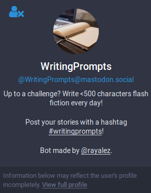
Reviving this thread to note that in the default theme, the text "Information below may reflect the user's profile incompletely. View full profile" is still too low-contrast.
 nevillepark
on 16 Nov 2017
nevillepark
on 16 Nov 2017
High contrast theme has been added recently in #7213
 Gargron
on 17 May 2018
Gargron
on 17 May 2018
Related issues
 sorin-davidoi
·
3Comments
sorin-davidoi
·
3Comments
 Lewiscowles1986
·
3Comments
Lewiscowles1986
·
3Comments
 hidrarga
·
3Comments
hidrarga
·
3Comments
 renatolond
·
3Comments
renatolond
·
3Comments
 almafeta
·
3Comments
almafeta
·
3Comments