Marktext: Low-contrast text is not accessible
Description
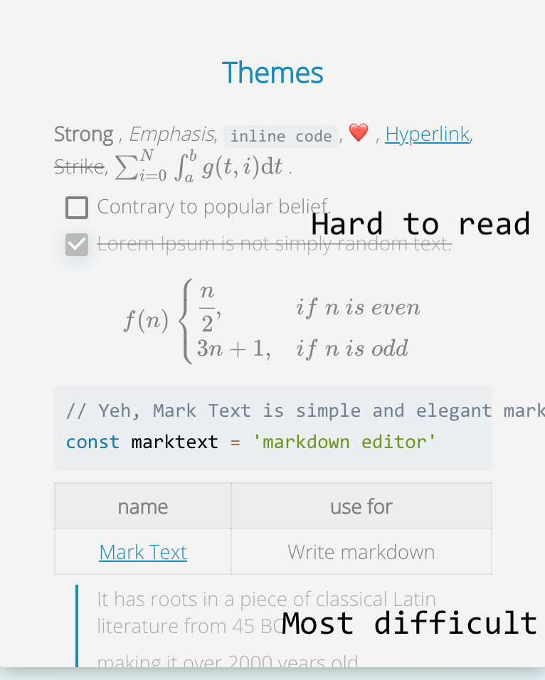
The theme examples on https://marktext.app/ have very low-contrast text that does not seem to be accessible.
See also:
https://webaim.org/articles/contrast/
and
https://webaim.org/resources/contrastchecker/
 jrobbins
All 3 comments
Thanks for you advice, we'll take a look at the links you given and improve the UI (contrast) in the future, could you please give us more info about which text has low-contrast?
 Jocs
on 7 Nov 2019
Jocs
on 7 Nov 2019
Here's a quick annotation showing what appears to me to be the lowest contrast text.
 marhar
on 7 Nov 2019
marhar
on 7 Nov 2019
I tried adjusting the css under src/renderer/assets/themes and recompiling but it didn't seem to make any changes. If anyone could give some pointers that would be great! I agree that the low contrast makes some themes hard to use.
I like this theme, "material dark". But as you can see, the contrast is a lot lower than the next screenshot of the "dark" theme.

Dark:

 Menn1s
on 8 May 2020
Menn1s
on 8 May 2020
Related issues
 CeroProgramming
·
3Comments
CeroProgramming
·
3Comments
 barlowliu
·
3Comments
barlowliu
·
3Comments
 arty-name
·
3Comments
arty-name
·
3Comments
 stefnotch
·
4Comments
stefnotch
·
4Comments
 fxha
·
3Comments
fxha
·
3Comments
Most helpful comment
Here's a quick annotation showing what appears to me to be the lowest contrast text.