Markbind: User docs: fix right-aligned search bar example
In the user guide, the two examples of the search bar look the same. The second one should be right-aligned?
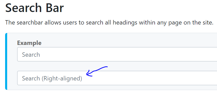
On a related note, this link needs fixing too.

 damithc
All 2 comments
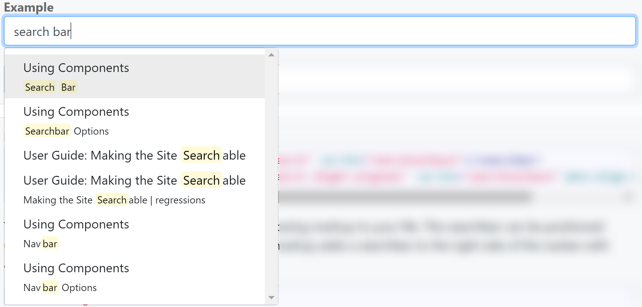
The right alignment refers to the alignment of the dropdown, _not_ the text in the search bar. In the regular search bar, the results dropdown is aligned to the left:
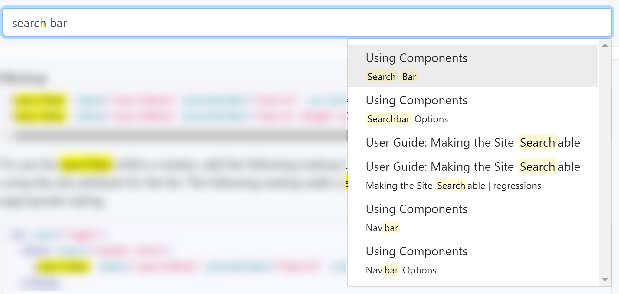
The right-aligned variant aligns the dropdown to the right instead:
Perhaps we can make the description more specific eg. Search (Right-aligned dropdown)?
 Xenonym
on 5 Jan 2019
Xenonym
on 5 Jan 2019
👍2
Perhaps we can make the description more specific eg.
Search (Right-aligned dropdown)?
Yes, let's make the documentation more specific. We can suggest a keyword the user type in the box to see the dropdown.
damithc
on 6 Jan 2019
👍1
Was this page helpful?
0 / 5 - 0 ratings
Related issues
 yamgent
·
5Comments
damithc
·
3Comments
yamgent
·
5Comments
damithc
·
3Comments
 ang-zeyu
·
4Comments
ang-zeyu
·
4Comments
 jamos-tay
·
4Comments
damithc
·
4Comments
jamos-tay
·
4Comments
damithc
·
4Comments
Most helpful comment
The right alignment refers to the alignment of the dropdown, _not_ the text in the search bar. In the regular search bar, the results dropdown is aligned to the left:
The right-aligned variant aligns the dropdown to the right instead:

Perhaps we can make the description more specific eg.
Search (Right-aligned dropdown)?