Maptool: Rework zone (map) selection to make it simpler and behave like a normal popup
Describe the bug
The zone (map) selection component behaves unusual for a swing component and doesn't work well with LnF
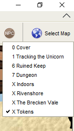
- the popup hides the button
- the entries are rendered complicately with a button signalling the current zone
|  |
|  |
|
To Reproduce
Click on the zone selection button in top right corner - observe the popup handling and how the items are rendered
Expected behavior
Make it a simple menu - checkbox on current zone
MapTool Info
- Version: 1.6/1.7 beta
Desktop (please complete the following information):
- OS: Windows
 nmeier
All 26 comments
PR coming
nmeier
on 11 May 2020
Be sure to test with a lot of maps. It was recently changed to give it a scrollbar.
 JamzTheMan
on 11 May 2020
JamzTheMan
on 11 May 2020
@nmeier This change doesn't handle more than 20 maps. Needs the scroll bar.
Here's a campaign file with 50+ maps.
 Phergus
on 11 May 2020
Phergus
on 11 May 2020
Also it does this:
      BufferedImage thumb =
          MapTool.takeMapScreenShot(new PlayerView(MapTool.getPlayer().getRole()));
But doesn't use it.
Phergus
on 11 May 2020
Sounds like an image that should appear on hover that didn't eventuate
 bubblobill
on 11 May 2020
bubblobill
on 11 May 2020
yeah, sorry, that was not a good PR. I was playing with a thumbnail but didn't get it to work yet. And scrolling is broken. Looking into it.
nmeier
on 11 May 2020
Scrolling is fixed and now noticed that the Hidden maps no longer have "highlighting" to indicate they are hidden.
I know. Never happy. ;)
Phergus
on 11 May 2020
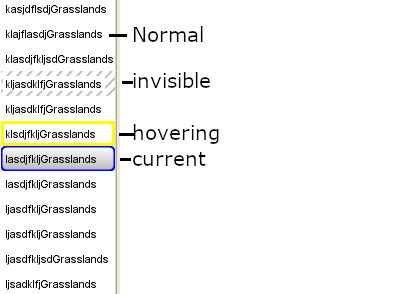
That's fine - I have to catch up what's possible in MT - hidden maps, can indicate that. checking how that looked in 1.6. That component has a lot of custom art to it atm
nmeier
on 11 May 2020
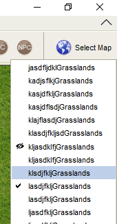
I think it's best to keep standard elements like that popup fairly plain and adhering to it's function: a list to pick from. Without going much further into custom rendering I'm thinking this could work:
- The menu works as a natural LnF component
- checkbox denotes current renderer
- highlight as per LnF shows current selection being considered
- if not the current renderer (checkbox) a little symbol denotes that map is not visible
- if the current selected map is also not visible to players one only sees the checkbox
Alternative
- The menu works as a natural LnF component
- item that can't be selected denotes current renderer (no reason to select the current renderer anyways)
- highlight as per LnF shows current selection being considered
- a little symbol denotes that map is not visible for current or any renderer
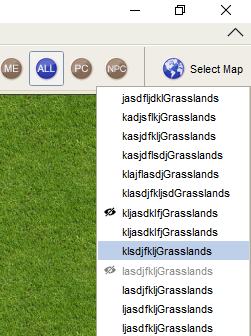
Does one of those work?
nmeier
on 11 May 2020
I think that first one is the most intuitive. Very clear which one is current, which one is pending selection and which ones are hidden.
So this one:
Phergus
on 11 May 2020
I think it looks a lot better now.
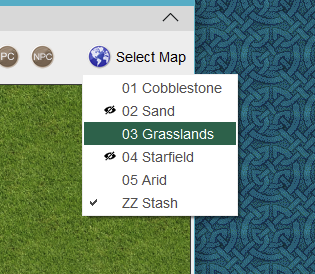
Your map selector list stays inside the MT frame for you? Mine doesn't and didn't before either.
Phergus
on 12 May 2020
It seems that the more maps the wider the dropdown.
Default
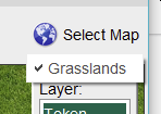
2 Maps

50ish Maps
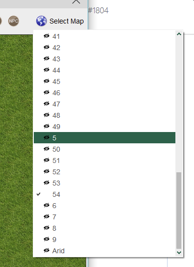
Phergus
on 12 May 2020
Hmm, just one map changing from long name to short name doesn't shrink the popup. Something with the preferred size on the contained menu item that doesn't work. Investigating.
nmeier
on 12 May 2020
ok, I know what's going on - holding on to a JPopupMenu with menuitems where the length of the items inside change over time doesn't jive as the component remembers old text value stats. Swing is fun.
The old design had less Swing/LNF to hit this. I'll have a fix shortly.
nmeier
on 12 May 2020
So 1.6.1 does a bit better with the popup staying in the frame, it doesn't take the scrollbar into account though
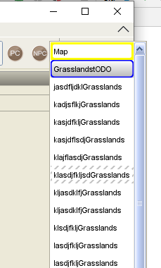
I'm going to push a change that adresses these remaining issue
- make popup right align with the button to not go beyond the window
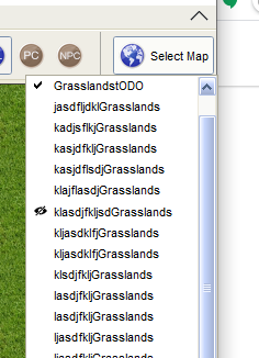
- use minimum amount of space - whether map names are long, short, changing
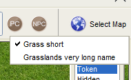
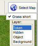
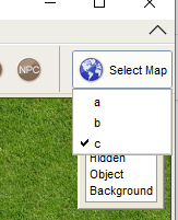
- use minimum the button width - if there were super short map names by chance
nmeier
on 13 May 2020
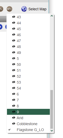
Still going slightly out-of-bounds for me when it is a mix of short and long names. The longer names were added after the menu had already been viewed once.
Phergus
on 14 May 2020
I assumed the checkbox was in a separate column so that current map could also be marked with the slash/eye.
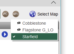
To clarify, all three maps are hidden.
Phergus
on 14 May 2020
ok, just really keyed in that you have to columns for the checkbox/eye - I only have one. Which theme is that? Those couple of pixels might not be accounted for when the preferred size is calculated.
nmeier
on 14 May 2020
Found the theme that enables Theme.menuAllowTwoIcons. The preferred size calculation seems wrong for the tinylf, worse with two icons. Debugging what result is generated.
nmeier
on 14 May 2020
Hmm. A theme issue.
I'm using this one:
MT_Flat_Green_Sans_14_TableRows.zip
Probably some weird setting in TinyLaF.
Phergus
on 14 May 2020
Wait when did we get an eye column lol, does that replace the hash marks over the map name?
JamzTheMan
on 14 May 2020
So some of the LnF themes can chose to show two columns - checkbox column for selection - eye for visible. It's a little bit of wasted space imo but hey.
I found an issue with inset calculation that makes this an issue for those cases. One more PR coming.
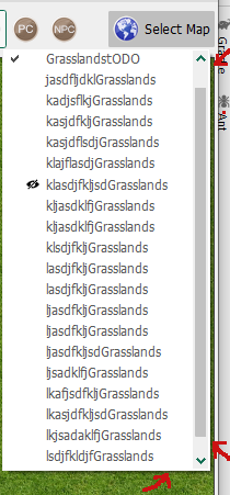
Note that the shadow of the menu is part of the inset (pixel peeping taught me that) - so the menu is not snug with the right side. Don't want to further play with that so there will be a little bit of (deterministic at least) gap
nmeier
on 14 May 2020
I found the theme setting. Not sure why that is turned on. Probably because I modified one of Rod's themes to make the base theme for it. A little gap on the side/bottom for the shadow looks fine to me.
@JamzTheMan Yes. The eye symbol replaces the hashing.
Phergus
on 14 May 2020
Tested with a couple different themes. No layout issues seen. Map selection working correctly. Current and hidden map indicators working.
Phergus
on 16 May 2020
The updated 'Select Map' functionality has been documented:
https://lmwcs.com/rptools/wiki/MapTool_User_Interface#Select_Map_Dropdown
 melek
on 16 May 2020
melek
on 16 May 2020
Additionally updated Introduction to Mapping article (had reallly old images):
https://lmwcs.com/rptools/wiki/Introduction_to_Mapping#Selecting_Maps
melek
on 16 May 2020
Related issues
nmeier
·
9Comments
 si-lang
·
4Comments
si-lang
·
4Comments
 Lovewyrm
·
4Comments
Lovewyrm
·
4Comments
 cwisniew
·
9Comments
cwisniew
·
6Comments
cwisniew
·
9Comments
cwisniew
·
6Comments
Most helpful comment
So 1.6.1 does a bit better with the popup staying in the frame, it doesn't take the scrollbar into account though
I'm going to push a change that adresses these remaining issue