Maptool: Tweak window decorations in Dialogs and Frames
Describe the bug
So this is a bigger one. All dialog/windows in MT seem to be using the native window decoration (unless without all decoration,, e.g. Handout/AssetViewerDialog) - this means the titlebar doesn't match the theme - that bites my dark experience. Here's how the before/after looks like
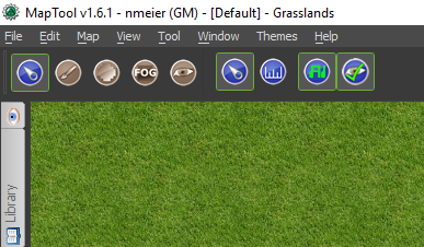
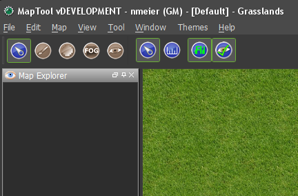
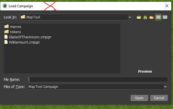
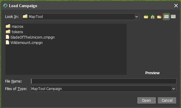
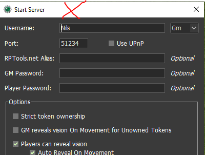
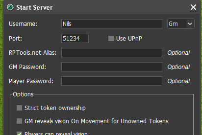
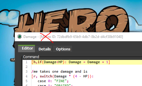
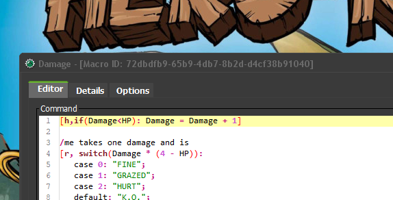
Since I'm in the same code right now I'm also thinking that when the main window is maximized (not set to fullscreen) the titlebar takes up a lot of space.
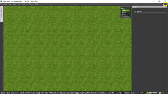
If I'm DMing, and use hide/unhide toolbar to gain space (keeping my dockables and menu) I'd suggest to control the visibility of the titlebar for the maximized window. This gives me more space.
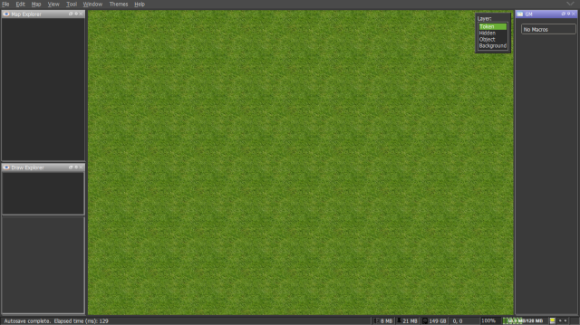
To Reproduce
Apply a non windows theme, check frame/dialog title bars. Maximize main window (not full screen) and use hide/unhide toolbar button. Notice that the titlebar of the maximized window is controlled as well.
Expected behavior
Better Titlebar experience.
Screenshots
See above
MapTool Info
- Version: 1.6.1/develop
- Install: All
Desktop (please complete the following information):
- OS: Windows
- Version 10
Additional context
The discussion about hiding the titlebar when maximized can be divorced from the theme issue. The tooltip at least of the little menubar hide/unhide chevron "Hide the Toolbar" would have to be updated.
I'm pushing a change that can be tested. Especially on Mac I can't test whether the swing titlebar would cause an issue.
 nmeier
All 46 comments
I'm all for fixing the various dialogs so that they use theme colors.
Not as sure about the title bar nor what impact that has on Macs.
@Azhrei @cwisniew @JamzTheMan thoughts?
 Phergus
on 20 Apr 2020
Phergus
on 20 Apr 2020
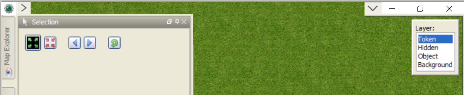
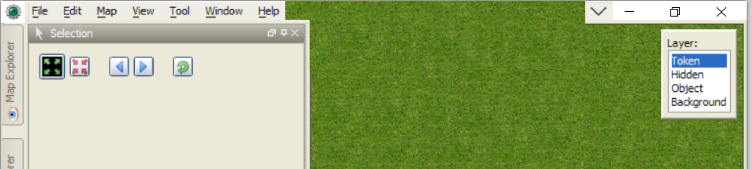
As a laptop user, screen real estate is precious. I can't use fullscreen as that removes the functionality I need in the various frames. If there are options to maximise the window that would allow minimising things like title bars and menu bars I would be all in favour. Alternately a variety of full-screen with added bits would be groovy.
Something like this with flyouts to access menus and bars.
 bubblobill
on 20 Apr 2020
bubblobill
on 20 Apr 2020
@bubblobill that's a more complicated change :)
With what I have you get 50+% there. One bar remains at the top for the menu - that allows all activity with your power tools. One could add window related buttons to the menu bar I assume, but that's more tricky work.
Is there someone with a mac who can test how the behavior I have with titlebar manipulation works out on that platform? That's a big concern.
nmeier
on 20 Apr 2020
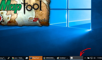
Since I'm looking at windows and system elements - also removing the taskbar java popup during enjoyment of splash screen
nmeier
on 20 Apr 2020
Tested in Linux, and the title bars are correctly colored now, and opening/closing the top bar functions as expected. At least on Linux, this PR seems to check out, pending verification on Mac and Windows.
:+1:
 kayila
on 27 Apr 2020
kayila
on 27 Apr 2020
No issues seen on Windows. Working as described.
Phergus
on 28 Apr 2020
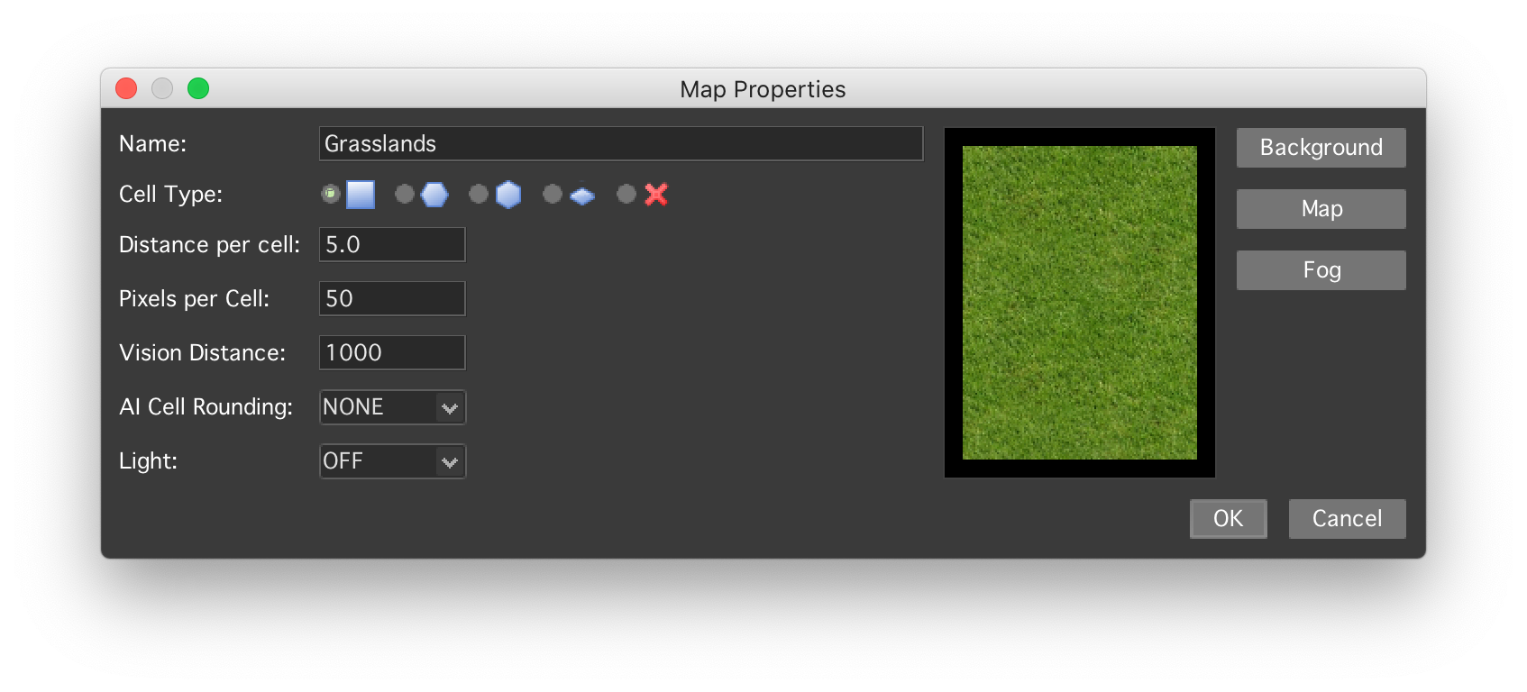
I tested i1636-test-build. I’m not sure what is supposed to happen on Macs, but the title bar is still in the default grey in every dialog I tested and the main window. This happens in both light and dark mode (just in case this would impact how the title bar is rendered). But after a quick(!) test, it didn’t seem to break anything.
Was the expectation that the title bar is also black there?
 mrkwnzl
on 28 Apr 2020
mrkwnzl
on 28 Apr 2020
Thanks for testing, Mac is special, I wish I could test this out directly but have no such device.
I found some evidence that the window decorations provided by the OS might or might not show up based on the look and feel, That you don't have two titlebars is already a win I guess.
https://stackoverflow.com/questions/139088/jframe-setdefaultlookandfeeldecoratedtrue
Reference setDefaultLookAndFeelDecorated
How does the main window look like? I'm curious about the menu bar, and how it looks when you click the arrow on the right to hide the toolbar.
nmeier
on 28 Apr 2020
Thanks for testing this out @mrkwnzl . First priority is that this change doesn't break anything on MacOS and secondarily that the MapTool window decorations follow the theme. Assuming that's possible under the MacOS.
Phergus
on 28 Apr 2020
I’ll provide some more screenshots tomorrow. Anything else I should test specifically?
mrkwnzl
on 28 Apr 2020
Mostly checking that the menus and title bars remain readable. Various dialogs like Edit Token, Preferences, Campaign Properties and such are still usable.
Phergus
on 28 Apr 2020
I would like to add that calling setUndecorated(true) on a JFrame etc. is generally a bad idea. It completely undermines all features the os offers for frames e.g. on Windows aero snap, frame shadows, etc. is lost.
If you want to have the title bar follow the theme I can offer you to check out darklaf. It’s a LookAndFeel I am developing which offers multiple themes and offers nicely coloured title bars without giving up on OS features.
 weisJ
on 28 Apr 2020
weisJ
on 28 Apr 2020
@weisJ - Thanks for the post!
The use of setUndecorated(true) is only for when MT is running full screen with the toolbar hidden. Otherwise all the normal OS features are there to be used.
Will take a look at your project.
Phergus
on 29 Apr 2020
To clarify there are two things here -
1) the change makes all windows use the Look and Feels' rendering for the title bar - the result is that the window looks styled nicely, e.g. in dark. This does indeed mean the OS doesn't render the titlebar (not sure what exactly is going on with Mac as that OS doesn't like replacing the OS titlebar unless there's a certian LnF in place I think). If your LnF offers something that leaves OS titlebar in place with color management, that could a compromise. Don't get yet how that works.
2) Fully undecorated windows are as before - there's no OS or LnF titlebar for certain viewers (e.g. Asset/Handout) and when the main frame is maximized.
As soon as you go LnF with a Java application you're entering this question - consistent look or a mix. It's in the eye of beholder.
nmeier
on 29 Apr 2020
To clarify there are two things here -
- the change makes all windows use the Look and Feels' rendering for the title bar - .... Don't get yet how that works.
It's rather involved and requires to change the window on the OS level.
- Fully undecorated windows are as before - there's no OS or LnF titlebar for certain viewers (e.g. Asset/Handout) and when the main frame is maximized.
You might want to take a look at the full screen api.
weisJ
on 29 Apr 2020
Full screen and maximized are not the same thing.
Phergus
on 29 Apr 2020
Full screen and maximized are not the same thing.
I see. As you are only moving the window buttons into the menubar then I'd say there are better solutions.
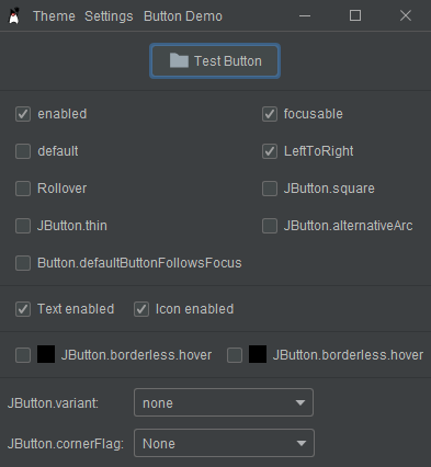
Windows: Darklaf already moves the menu bar into the title bar by default. This is how it looks:
macOS: The menubar sits in the native manu anyway and there is a native fullscreen mode.
Linux: Here darklaf doesn't change the titlebar (not implemented to this point), but on most desktop managers there is the option to disable the titlebar for maximized windows, so the OS can do that job.
Generally I think it is a bad idea to force disappearing titlebars onto the user. It's inconsistent with the rest of the OS and may be confusing. But that's just my opinion and its your decision what to do. I'm just offering a possible solution.
weisJ
on 29 Apr 2020
Sorry, for being a day late. Had to work late yesterday.
This is the main window maximised (not fullscreen):
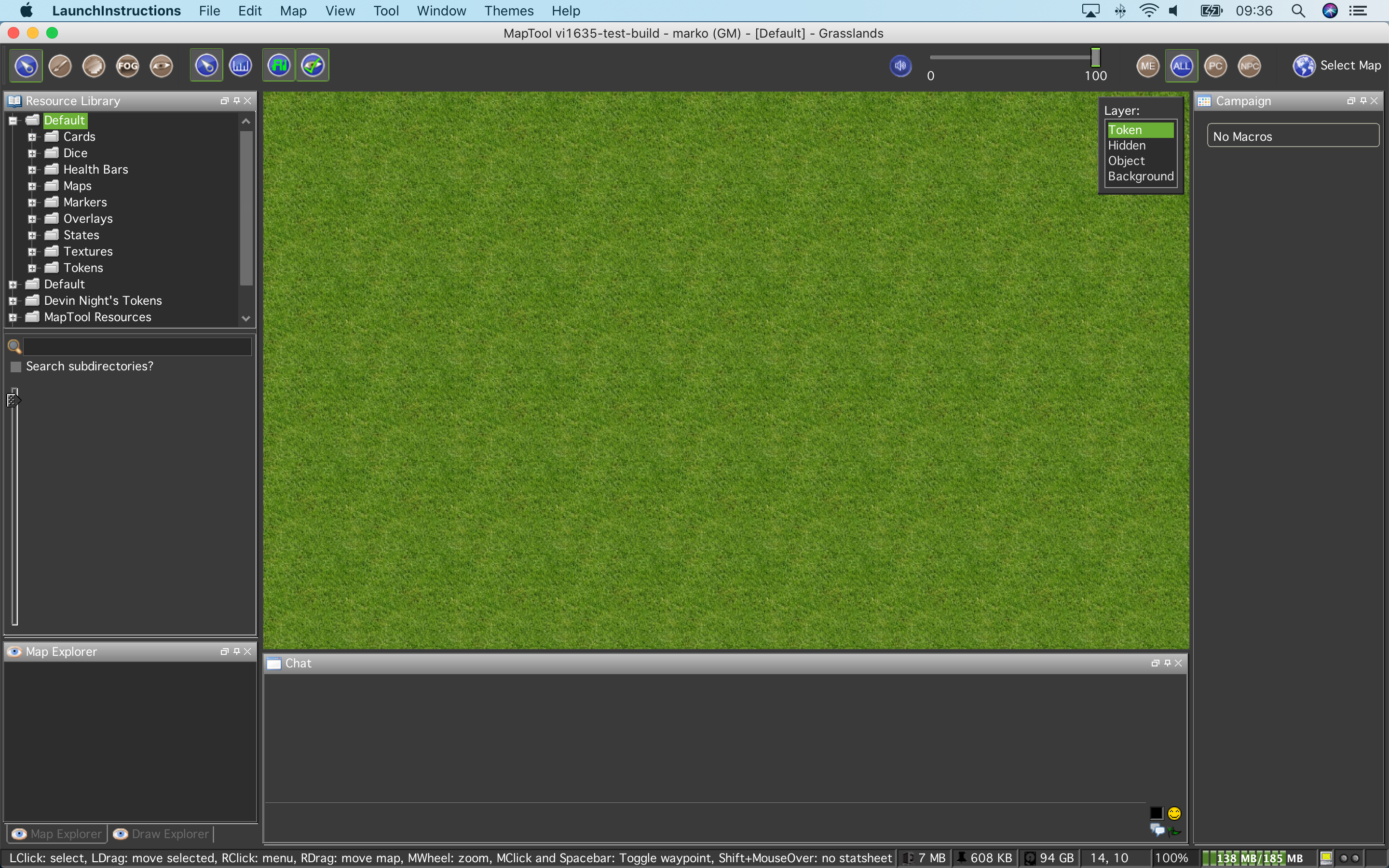
To be honest, since the title bar is grey already, I don’t find it too distracting. But for comparison, here’s how it loos with macOS in Dark Mode:
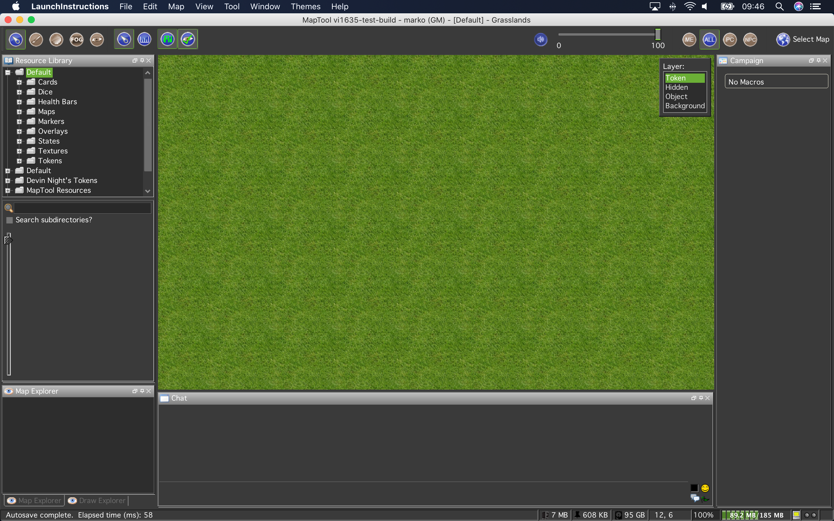
It’s a bit more distracting in Dark Mode, than it is in Light Mode, I think. The usual handling of this is that apps in Dark Mode have a dark title bar, even if the OS is in Light Mode.
There is not little arrow to hide the menu bar, as the menu bar is not part of the program window on macOS. But it’s also not needed. The native fullscreen mode works perfectly and already hides the menu bar.
This is the main window in fullscreen mode:
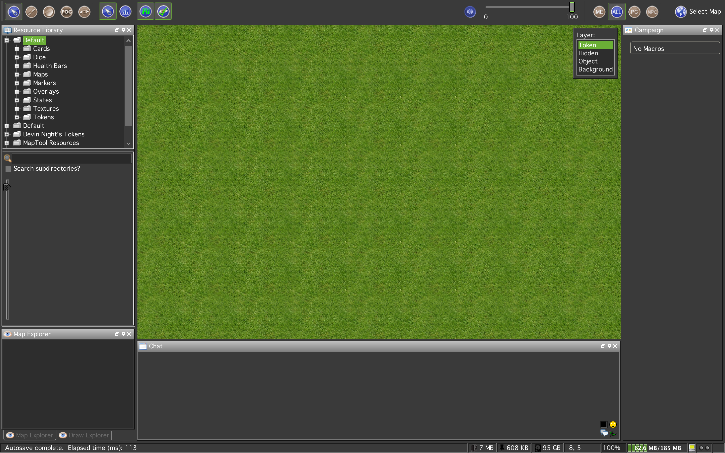
This is the main window in fullscreen mode when I move the mouse pointer to the upper edge to open the menu bar (note that the menu bar and title bar hovers over the MapTool window now; the windows does not get rendered anew):
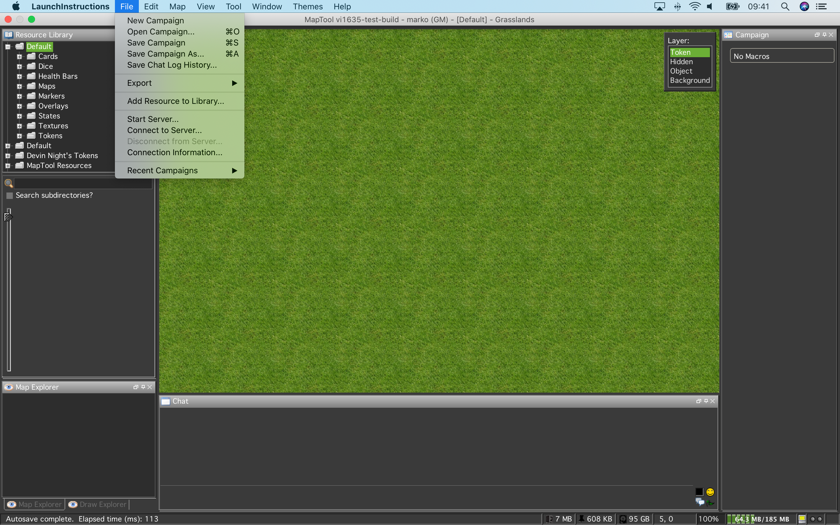
The menu bar disappears automatically when I move the mouse pointer back down. Please don’t do anything that disrupts the native handling of the fullscreen mode in macOS. It’s a very smooth experience and works in line with native apps.
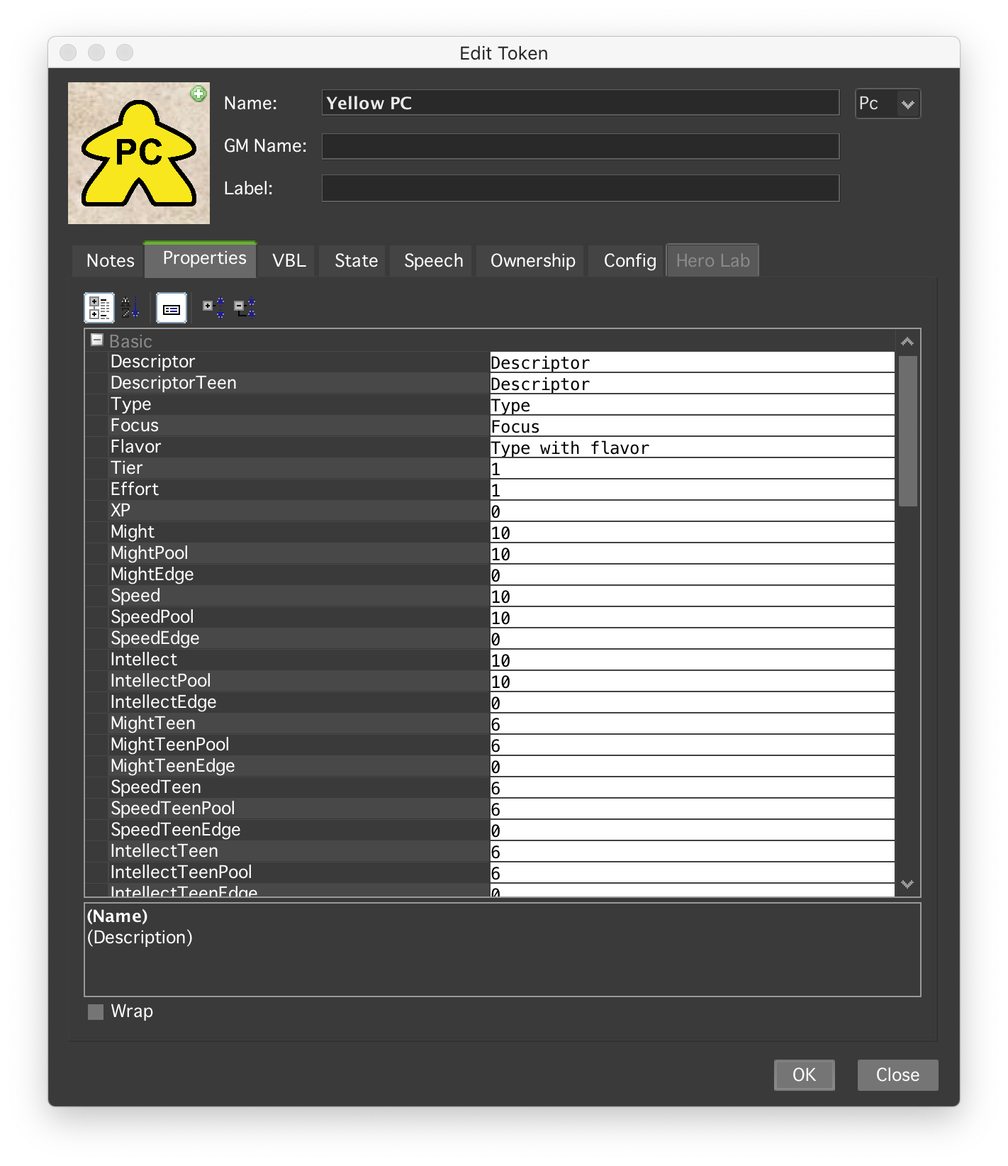
Edit Token window. Works great, but some buttons in the Properties tab aren’t dark, as are the Property values:
Now that I have loaded a campaign, I’m finding a few spots which could be improved:
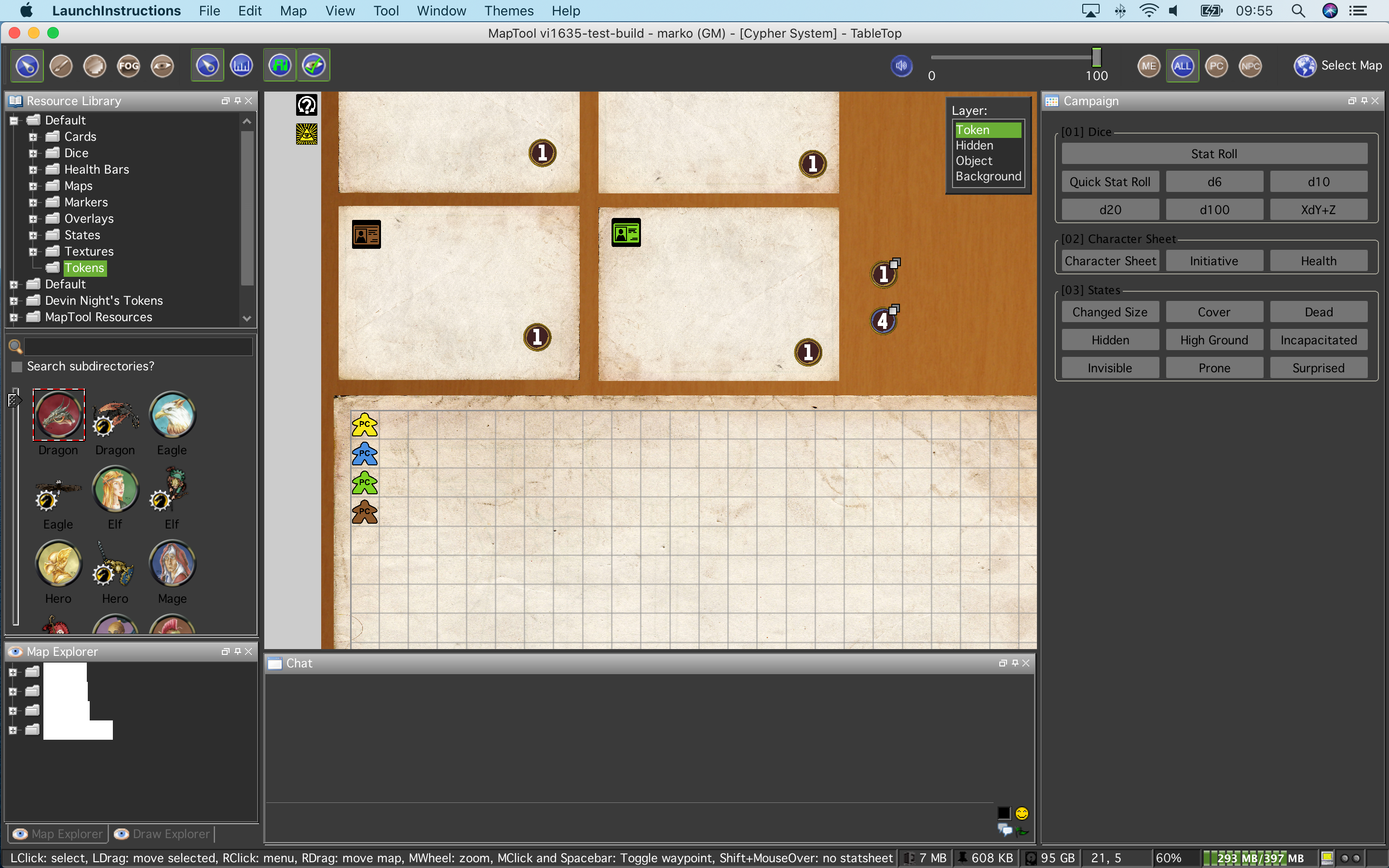
The Token Names in the Resource Library and the macro groups in all macro windows (Camapaign, Selected, GM) are black on grey, which is not ideal.
The items in the Map and Draw Explorer are white text on white bars, which makes it unusable.
The tabs to change between those Explorers (and presumably other tabs) are grey text on darker grey background. A lighter grey for the text would be better.

There’s a white bar behind each token in the Initiative window. The buttons “Next” and “Round” are black text on dark grey background.

There’s something weird happening, when I hover the mouse pointer over the buttons. A border appears around each button which i hover over, and they all disappear when I click on the buttons. I haven’t seen this on 1.6.1 with a light theme.
I’ll do more testing after work. Let me know if you want to see something specific.
mrkwnzl
on 30 Apr 2020
Super, i'll go through your screenshots later today, and come back with suggestions.
Where the lnf clashes with color overrides, still, I should be able to fix.
nmeier
on 30 Apr 2020
Thanks a ton @mrkwnzl ! That will be a big help.
Here is a dark theme that Aliasmask tweaked. I think it will improve the explorer windows and maybe others.
Phergus
on 30 Apr 2020
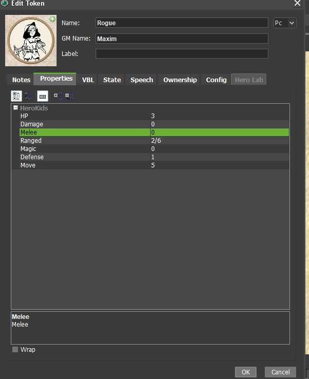
So the Edit Token dialog is interesting as it uses the (marco) syntax editing component to render the property values - If I switch that out for a default table renderer you get the expected result (see below).
The special renderer offers word wrap - @Phergus is that needed? Do token properties allow for multi line values?
nmeier
on 30 Apr 2020
I don't know about Phergus, but I have JSON elements stored in properties and I use the wrap checkbox all the time. I don't know whether newlines can be embedded inside property values, though.
 Azhrei
on 30 Apr 2020
Azhrei
on 30 Apr 2020
ok, I see, I didn't realize the little button on the right either. Thanks for clarifying, that explains why the text is rendered with the same component.
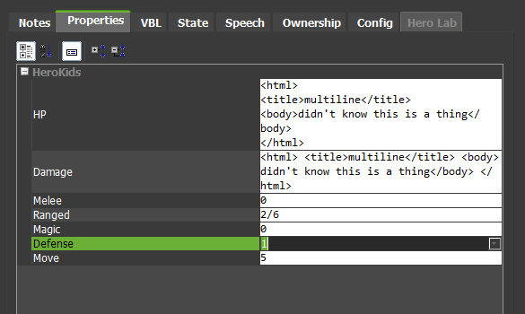
nmeier
on 30 Apr 2020
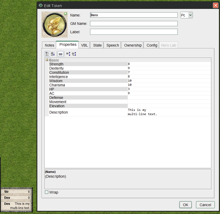
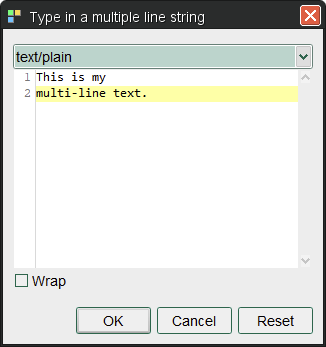
@nmeier Folks do use the multi-line and it is handy to have the syntax highlighting when you open the little editor window.
Phergus
on 30 Apr 2020
Okay, next round.
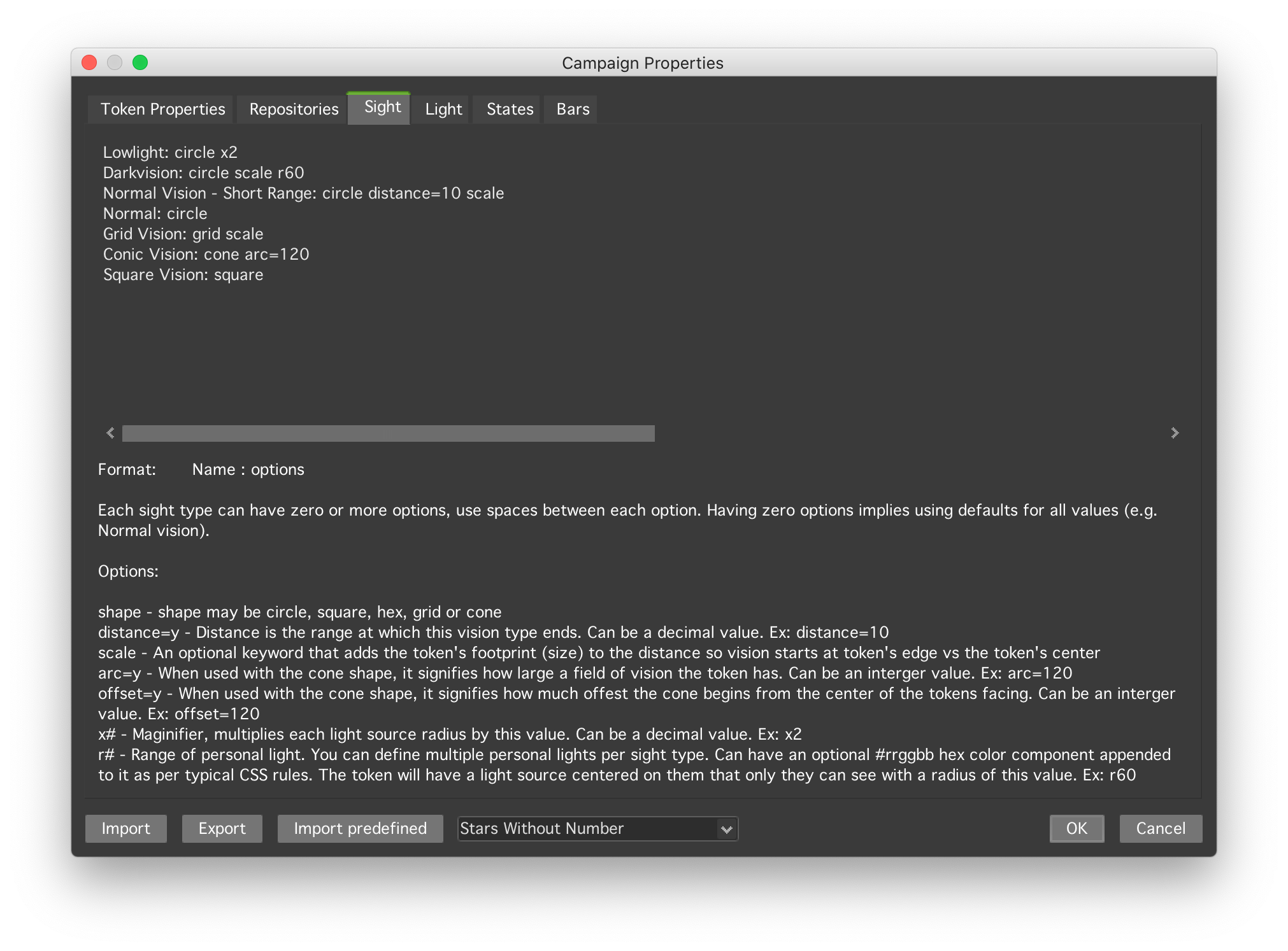
In Campaign Properties > Sight & Light, the text field isn’t discernible from the background.
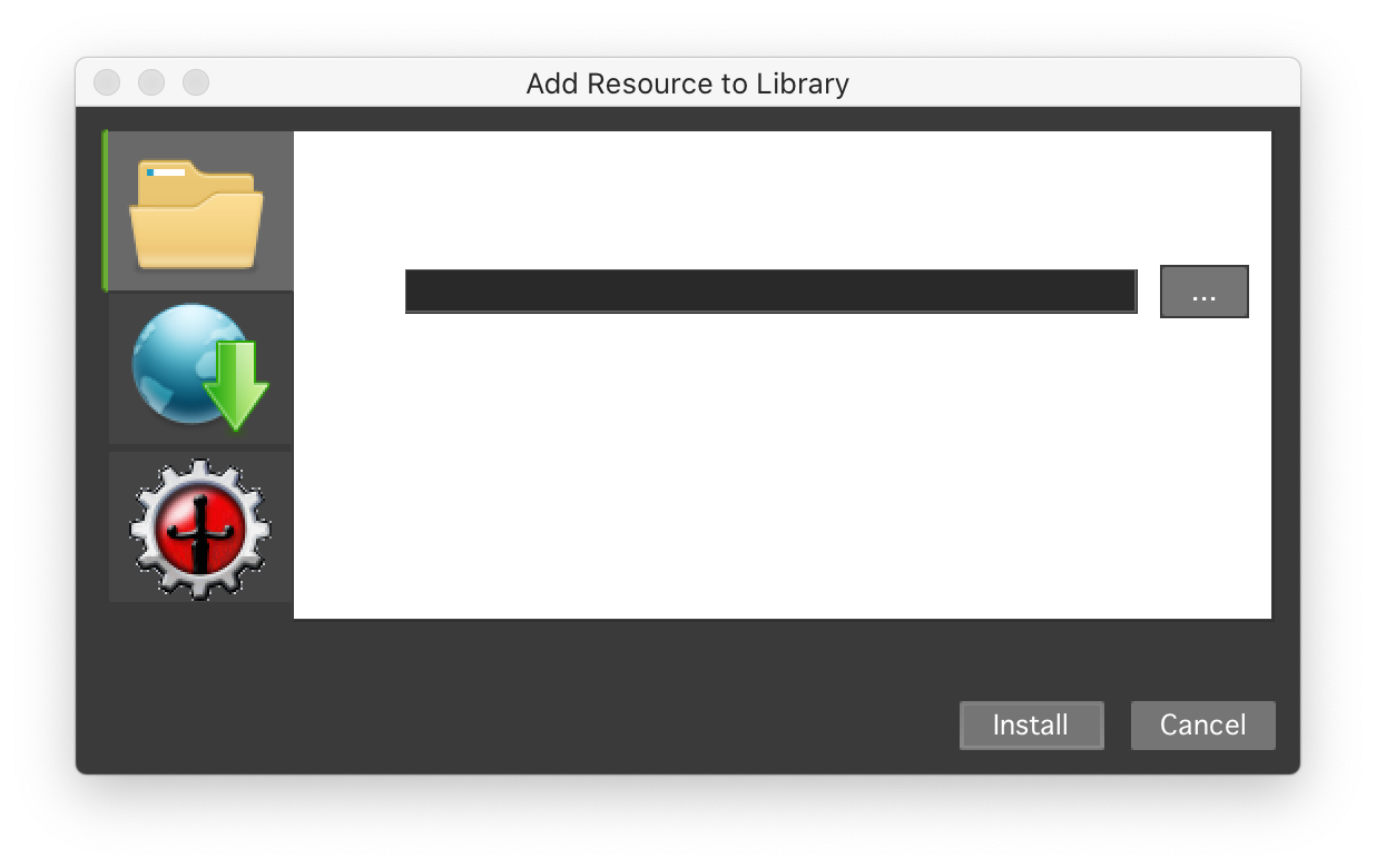
“Add Resource to Library” has white text on white background.
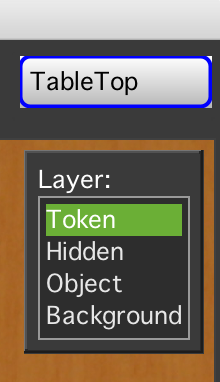
The map selection seems a bit out of place, and has white corners.
That’s all that I noticed. I think I went through most, if not all, dialogs through the menu, and most of them looked fine and the text was readable. Preferences, save dialogs, new/edit map, etc.
Let me know if there’s something I likely missed and which I could take a look at.
mrkwnzl
on 30 Apr 2020
Thanks! The Add Resource to Library issue has been fixed I believe.
Phergus
on 30 Apr 2020
Status below - overall the jide/lnf, customization leads to mixed results. We've tweaked it a little bit and didn't clearly regress. I feel like that's about all I can do there right now.
Edit Token - properties table cells have white background
The values can be multiline and uses the same component as for editing, that would mean it also could show syntax highlighting. Don't think it makes sense to change that rendering - it's a special component.
Resource Library and Macro WIndow - groups are black on grey
TBD
Map and Draw Explorer - items are white text on white bars
Panel tabs - grey text on darker grey shaded background
Couldn't figure out how to change that. Overall JIDE and the L&F remains problematic for a sleek UI imo.
Initiative window - white background, weird colored buttons
There is some JIDE specific weirdness on color. Even the buttons are looking black on black. The panel modifies the look and feel which is not fast nor wise
    LookAndFeelFactory.installJideExtension(LookAndFeelFactory.VSNET_STYLE_WITHOUT_MENU);
    menuButton = new JideSplitButton(I18N.getText("initPanel.menuButton"));
    LookAndFeelFactory.installJideExtension(LookAndFeelFactory.XERTO_STYLE);
Toolbar - sticky border indication on hover
TBD
nmeier
on 30 Apr 2020
FYI rsyntax component does have its own mechanism to change it's theme so simple one could be created to match the tiny laf theme. Maybe follow the same naming and load them in the properties panel.
Check the maco editor code for examples of needed.
 JamzTheMan
on 1 May 2020
JamzTheMan
on 1 May 2020
On the initiative window @mrkwnzl - it's using one of the worst L&F compatible components, the JIDESplitButton (which does some weird lnf unset/setting as well).
I'm tempted to replace it - that allows for normal components to control the fairly complex initiative panel. Would also go in direction of divorcing from JIDE if that's considered.
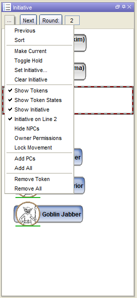
Simple looks - there's no button/menu combination in Swing so we could use a menu in a top toolbar-like panel. I've also changed how the selected (not current) item is indicated, instead of a hardcoded black border, reuse the selection border the other components use as well.
What do you guys think about that?
Dark
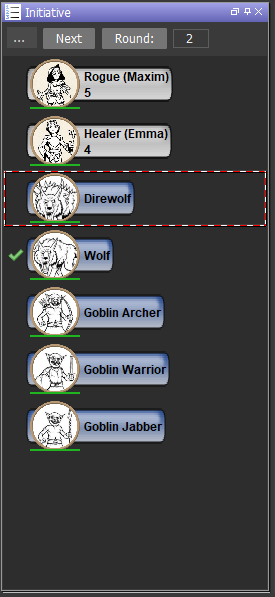
in default style, with menu opened
nmeier
on 2 May 2020
Add a "Previous"/"Back" button and I support your intent.
bubblobill
on 2 May 2020
That toolbar can certainly be modified. At the moment it offers next as a top-level action.
That button is replaced by Toggle Hold if the user can use their limited permission to control the token. I'm not sure why this action is elevated like this - switching out buttons is weird imo.
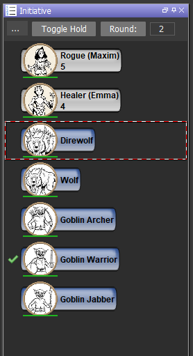
    // Set up the button
    if (ownerPermissions || hasGMPermission()) {
      NEXT_ACTION.setEnabled(true);
      nextButton.setAction(NEXT_ACTION);
    } else {
      TOGGLE_HOLD_ACTION.setEnabled(true);
      nextButton.setAction(TOGGLE_HOLD_ACTION);
    } // endif
I'm ok with switching out that combo button/menu. Less reliance on jide is better IMO.
JamzTheMan
on 2 May 2020
Ditto. As I don't use the Initiative window I don't know what any of the toggle hold stuff is about but agree that swapping out buttons is poor design.
Phergus
on 2 May 2020
I would suggest a further improvement. Replace the split-button yes. But revamp the available buttons to icons, a la

bubblobill
on 3 May 2020
I would suggest a further improvement. Replace the split-button yes. But revamp the available buttons to icons, a la
I like simple symbol better than text.
Really though, does anyone know what hold is supposed to do? IIRC 'next' just cycles through all tokens, whether on hold or not. So why put something on hold in the first place?
nmeier
on 3 May 2020
I can’t say if that is the proper use of “hold,” but many in may games, characters can break the usual initiative order by going on hold. I don’t think this function itself does something beyond signifying that the character is on hold. It can be used in macros, I believe.
mrkwnzl
on 3 May 2020
Yeah, ok, found something to that point
https://lmwcs.com/rptools/wiki/More_Roll_Initiative
nmeier
on 3 May 2020
Hold is just a visualization really. Because really, init panels has no logic other than round count and tracking current token that has initiative.
Usually people use it to denote a delayed action. But it has to be generic really, you could use it to denote teams i suppose or other things.
For Pathfinder we have Ready and Delay. If i were to put that logic into the init panel, it would automatically remove the Hold if it came around to that tokens init turn again. If the hold was pressed when it wasnt the tokens turn it would remove the hold and move the token in init order just before the current tokens position to denote interrupting the current token ala using a Ready action. Using delay would have to move it after the current init token so it goes next.
That is just one game system. Not sure you would want to force that logic on everyone. Hence it does "nothing"
JamzTheMan
on 3 May 2020
Further modification of Initiative Window should be moved to a new issue. Good to go ahead with the menu button change and current initiative highlighting.
Phergus
on 3 May 2020
@nmeier Any idea which change caused MT on MacOS to lose the native title bar?
Phergus
on 4 May 2020
looks related, checking in on #1752
nmeier
on 4 May 2020
moving the discussion around initiative to #1758
nmeier
on 5 May 2020
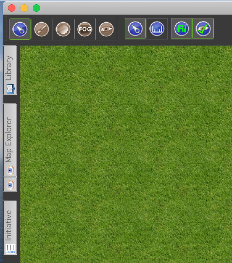
I just checked on the current develop branch. I noticed one thing more for the dark theme. The tabs for hidden windows might be darker to be less intrusive.
mrkwnzl
on 6 May 2020
Yeah, I had a quick look at at jide dockables but couldn't figure out how to have them styled as per look and feel. The gradient rendering they put everywhere in that library is tricky. Maybe a conversation for the future of the docking library used.
nmeier
on 6 May 2020
A move to JFX for all of the UI will require a different docking library so I'm sure we'll have a whole new set of _challenges_ to deal with then.
Phergus
on 6 May 2020
Further tweaks and corrections to the LaF implementation can be done under new tickets or #1758 for the Initiative window.
Closing.
Phergus
on 8 May 2020
Related issues
 jfranciscoap
·
8Comments
jfranciscoap
·
8Comments
 Merudo
·
4Comments
Merudo
·
4Comments
 melek
·
8Comments
Merudo
·
8Comments
nmeier
·
9Comments
melek
·
8Comments
Merudo
·
8Comments
nmeier
·
9Comments