Mail: Better separation between mail and answer field
I find it very hard to see the answer field after any email.
I think there should be some border between the actual mail and the answer field so you can easily see where the mail ends and where the reply part begins.
Furthermore I'd love to see an answer button somewhere in the header or at least fixed on the bottom of the screen so you do not need to "search it". I mean a button which will scroll down to the reply box when clicked and focus the box.
Want to back this issue? Post a bounty on it! We accept bounties via Bountysource.
 fsedarkalex
All 8 comments
cc @jancborchardt @skjnldsv
 ChristophWurst
on 11 Sep 2017
ChristophWurst
on 11 Sep 2017
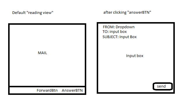
Err... Noticed the button is actually there I just did not see it :ashamed:
But an idea:
What about adding a fixed footer section which will open up when used?
See attached graphic... Not thinking about reloads just an overlay...
fsedarkalex
on 11 Sep 2017
Hm, this should actually be two separate issues.
(1) answer button - looks solved to me?!
(2) separation between received email and coposition of reply email.
I agree about (2), there should be some grey space or something.
 alexanderdd
on 3 Apr 2018
alexanderdd
on 3 Apr 2018
@jancborchardt please have a look
ChristophWurst
on 3 Apr 2018
@ChristophWurst I still think putting an additional "Reply" button in the header is fine, as in that other pull request (where I only disagreed with removing the direct reply field). Next to it could be a 3-dot-menu with Forward, Delete etc (to also make delete work on mobile in this view).
 jancborchardt
on 3 Apr 2018
jancborchardt
on 3 Apr 2018
to add to this issue:
the initial whitespace below the subject and sender down to the actual mail body is too big, the content is somehow lost on the page and there is a visual guide like a thin line missing.
Overall clean design is nice but the missing borders around header, mail, reply do not look right and are not intuitive. there is some visual ordering needed in this empty sea of whitespace!
 simonbuehler
on 17 Sep 2018
simonbuehler
on 17 Sep 2018
Several of our users get lost with the pre-filled answer section. They believe it is a duplication of the message. When we explain that you save another reload to answer then some understand the concept.
There should be at least a stronger border to the pre-filled answer section, with a headline Answer. The Forward button above should be also aligned right, like the Send button of the answer.
A more advanced solution would be like https://github.com/nextcloud/mail/pull/750#issuecomment-363900595 suggests that the pre-filled answer is collapsed and opens when pressing Answer.
 rasos
on 15 Feb 2020
rasos
on 15 Feb 2020
Could you try a more recent version of the app? The reply isn't displayed below a message anymore but there is a primary reply button in the top right corner that will get the user to a dedicated reply view.
Fixed with https://github.com/nextcloud/mail/pull/1774, I think.
ChristophWurst
on 17 Feb 2020
Related issues
 guzzisti
·
28Comments
guzzisti
·
28Comments
 doc75
·
34Comments
doc75
·
34Comments
 devcrafting
·
37Comments
devcrafting
·
37Comments
 zpintar
·
59Comments
zpintar
·
59Comments
 vasyugan
·
39Comments
vasyugan
·
39Comments
Most helpful comment
Err... Noticed the button is actually there I just did not see it :ashamed:
But an idea:
What about adding a fixed footer section which will open up when used?

See attached graphic... Not thinking about reloads just an overlay...