Share your beautiful desktop and MacType Profile here 😊
Many of the themes will use UltraUXThemePatcher, OldNewExplorer, and StartIsBack (as well as the latest release of MacType of course 😊)
If you are new to using these tools, please create a System Restore point before you begin.
 sammilucia
All 45 comments
I'll start... this is Win 10 with the BIB Dark Theme, and Clean Soft profile

sammilucia
on 22 Jun 2019
That's really nice! What is the 'BIB Dark Theme' and where can I get it? I'd love to give it a try! 😃
 ChicoThorn
on 22 Jun 2019
ChicoThorn
on 22 Jun 2019
@ChicoThorn sure, it's here https://www.deviantart.com/niivu/art/BIB-2-0-800970529 ... you'll need a few apps to get it working (in the theme description) make sure to create a System Restore point first
sammilucia
on 22 Jun 2019
Is this thread for all our screenshots instead of #550 like I've been posting too? Or is this for our showcase screenshots — that one you started with is a beauty @sammilucia! Are you running a 3rd party theme engine to display it, or is this just something you load directly into Windows using its native themes settings?
ChicoThorn
on 23 Jun 2019
嘿嘿嘿~

 cvuuhk
on 23 Jun 2019
cvuuhk
on 23 Jun 2019
@ChicoThorn I've updated the first post with more info 😊
sammilucia
on 24 Jun 2019
@cvuuhk wow!
sammilucia
on 24 Jun 2019


Demo cases for my settings (and trial and errors...)
MacType Core built from my repository
 extratype
on 1 Jul 2019
extratype
on 1 Jul 2019
I've never seen VS Code look so good 😊Is your core the same as the main core?
sammilucia
on 2 Jul 2019
It's based on beta5 without the color font support. For Chrome I also hooked SystemParametersInfo() to substitute the font for the title/address bar: https://github.com/extratype/mactype/commit/c52ec10113b0c0eaebf858fe60c31e928712464f
Chrome chooses Kaigen Sans K Regular from my system settings so If I substitutes it with FontSubstitutes then the font will not be available for webpages :(
Regarding VSCode you can find my DirectWrite parameters and CSS settings in https://github.com/snowie2000/mactype/issues/401
extratype
on 2 Jul 2019
Hi @sammilucia & @snowie2000! I've been tinkering with the DirectWrite settings some more with the ChicoThorn ini and think I've struck a pretty good balance between how Lite Mode and Dark Mode render at 113%! I'm posting these two samples, plus the .ini file for you to check out. The settings for the Sys32 app rendering (ClearType) remain the same as the original ChicoThorn; only the DirectWrite settings have been changed: [DirectWrite] - RenderingMode=5, GammaValue=1.77, Contrast=0.5,
ClearTypeLevel=0.5
🙂


beta6 ChicoThorn @ 113% scaling - LightMode - DW r5,g1.77,c5,t5.png.zip
beta6 ChicoThorn @ 113% scaling - DarkMode - DW r5,g1.77,c5,t5.zip
ChicoThorn
on 6 Jul 2019
@ChicoThorn that does look like a pretty good balance, though I still much prefer the dark mode with that font weight.
You know, we could have MacType support Windows Dark Mode by allowing you to specify a second set of some parameters that are automatically used when Windows is in Dark Mode 😊 @snowie2000 😁
sammilucia
on 7 Jul 2019
According to this https://stackoverflow.com/questions/51334674/how-to-detect-windows-10-light-dark-mode-in-win32-application
I think, yes, we can. But it can’t be changed midway, a program restart is necessary to reflect the change of the theme.
 snowie2000
on 7 Jul 2019
snowie2000
on 7 Jul 2019
I agree @sammilucia I think it's better in Dark Mode too (but then I LOVE Dark Mode, lol!) That's a fantastic idea about supporting auto light/dark mode! 😁
ChicoThorn
on 7 Jul 2019
Hi! Been messing around with the settings a bunch — took a bizillion screen shots and think I've found a real winner! I'm finishing up at work, so I can't post samples right now... but the only changes I made to the ChicoThorn.ini was to add more fonts to the font replacement list (I was having difficulty with a helvetica replacement in Edge Canary, but was able to fix it), and in DirectWrite. Here's the DirectWrite settings I used... give 'em a try. I'll post samples soon. 😊
[DirectWrite]
RenderingMode=5
GammaValue=1.8
Contrast=0.9
ClearTypeLevel=0.9
Oh! ... And I experimented with a lot of different scaling sizes and schemes. I've settled on a custom scaling factor of 125. Note: I did not set the 125 scaling using the dropdown menu on the first page of Display, but by using the Advanced scaling settings on the second page, same as for odd sizes... I found that doing it this way renders ALL text on ALL surfaces better than doing it the other way.... although I have no idea why... 😁
ChicoThorn
on 23 Jul 2019
Hi! My latest settings — and I think beyond a doubt they are the best yet! 😊 These settings work in BOTH Dark and Light mode, provide a soft, but clear rendering on even the most troublesome areas (The Settings home page, Jumplists, and the Start Menu).
Below are some Dark and Light mode screenshots. Note that these settings were tweaked to work best with 113% — I've found after a LOT of experimentation, that 113% provides a clearer overall rendering than 115%. Not only is the type rendering with 113% clearer, but the icons used in File Explorer ribbon and Quick Access Toolbar display much better as well, being crisp and clear. Whereas in 115% those same icons are fuzzy. Also the 113% size allows for more room on the display for multiple windows and processes — unlike 125%, for example, which renders beautifully, but everything is so large there's barely enough screen room to get any work done.
I made a change to the non-DirectWrite settings as well, which you can see below; they're the ones I marked in bold-italic. I've also included a copy of the .ini file which I've dubbed "ChicoThorn 113%.ini" Let me know what you think! 😃
; by ChicoThorn
; Version 1.0
[Preview]
Font=Segoe UI
Color=$000000
Text=ChicoThorn → Use 113% Scaling ← 01234567890!@#$%^&* AaBbCcDdEeFfGgHhIiKkLlMmNnOoPpQqRrSsTtUuVvWwXxYyZz
Size=9
[General]
_Name=ChicoThorn 113%_
HookChildProcesses=1
HintingMode=0
AntiAliasMode=2
NormalWeight=11
BoldWeight=2
ItalicSlant=0
Saturation=0
UseMapping=0
GammaMode=0
GammaValue=1.3
_Contrast=1.03_
_RenderWeight=1.3_
TextTuning=0
TextTuningR=2
TextTuningG=2
TextTuningB=2
BolderMode=0
FontLoader=0
FontLink=1
FontSubstitutes=1
LcdFilter=2
EnableKerning=1
HintSmallFont=0
Shadow=0,0,0,0x0,0,0x0
LoadOnDemand=1
CacheMaxFaces=256
CacheMaxSizes=12554432
CacheMaxBytes=12108864
MaxBitmap=12
DirectWrite=1
[Experimental]
ColorFont=1
[[email protected]]
; Make color fonts appear correctly in Chrome
InvertColor=1
[[email protected]]
; Workaround for IDEA/JAVA font rendering unverified as of 2018/10/19
clipboxfix=1
[FontSubstitutes]
_@Arial Unicode MS=Segoe UI
Arial Baltic=Segoe UI
Arial Black=Segoe UI Black
Arial CE=Segoe UI
Arial CYR=Segoe UI
Arial Greek=Segoe UI
Arial Narrow=Segoe UI
Arial TUR=Segoe UI
Arial Unicode MS=Segoe UI
Arial=Segoe UI
Calibri Light=Segoe UI Semilight
Calibri=Segoe UI
Helvetica Neue LT Std=Segoe UI
Helvetica Neue=Segoe UI
Helvetica=Segoe UI
Microsoft Sans Serif=Segoe UI
micross=Segoe UI
Sans Serif=Segoe UI
sans serif=Segoe UI
Sans-Serif=Segoe UI
sans-serif=Segoe UI
Segoe UI=Segoe UI
Segoe=Segoe UI
segoe=Segoe UI
SEGOEUISL=Segoe UI
Tahoma=Segoe UI_
[Individual]
[Exclude]
[ExcludeModule]
[ExcludeSub]
[DirectWrite]
RenderingMode=5
_GammaValue=2
Contrast=1.234
ClearTypeLevel=1_
[UnloadDll]
ChicoThorn 113% Screenshots.zip


ChicoThorn
on 30 Jul 2019
@ChicoThorn wow, that's really impressive, the Light/Dark and DirectWrite/GDI look as comparable as I've ever seen them ❤️ 😊
That desktop background is really pretty, what is that?
What does it mean when you put at @ in front of a font e.g:
@arial Unicode MS=Segoe UI
?
sammilucia
on 31 Jul 2019
@sammilucia Kindly remind you, "@ arial" is a valid github user name...🤣🤣
@ChicoThorn I was always wondering how did you get the magic number of 113%?
snowie2000
on 31 Jul 2019
Derp 😜
sammilucia
on 31 Jul 2019
@sammilucia — Thanks! I was really pleased when I compared the Light Mode to Dark Mode and found that they both worked! WooHoo!! 😃 I cast that .ini file in GOLD! Hahaha!
The desktop image is one of my own creating... You may have it to enjoy on your computer if you like, and a couple others of the same theme... ☺
The "@ arial" thing is because "@ Arial Unicode MS" was one of the font names presented to me in the MacTuner font replacement dialog... and I figured if it was an Arial font I wanted it replaced with Segoe UI. Not really sure why it has an "@" sign though... but I did notice a couple of other Windows system fonts that had that same designation. I took the approach with font replacement that more was better than less; figuring that if a certain font wasn't present it wouldn't hurt anything if it was there. Some of the fontnames in my list are there because of online screen rendering while using Edge Canary on certain pages. When I did an "inspect element" of the font I'd learn its name, then add it to my font replacement list. This has worked well so far! The weirdest font replacement I have is "Segoe UI=Segoe UI" That one's totally odd, isn't it? But if it's not there then for some unknown reason the Facebook page in Edge Canary renders the page in a Segoe UI font that doesn't come from my system at all (I know that because of the custom glyphs I have embedded in my own version of Segoe UI). But when I did the seemingly redundant font replacement, it solved the problem and it now uses my version of Segoe UI. — I gotta say, I'm learning a ton of stuff I never even thought about before! 😄
@snowie2000 — I came upon the 113% number purely by trial and error. I basically went through every size from 100% to 127%; setting the scaling factors using the "Advanced scaling settings" in Windows, then signing out and back in; then taking screenshots of the many surfaces text and type were rendered on (File Explorer, Context menu, Start Menu, Notification Panel, Taskbar Jumplists, Properties dialog, UWP apps, etc.)
Then after I had collected all the screenshots I created a comparison "tally-sheet" where I visually checked each one against the others. I checked for overall "font color" (the way the font appears in a block of text: is it even and uniform in overall appearance, or are some areas dark and blotchy and/or are other areas light and sketchy?).
Then I checked the same text string in each size against the others, looking more directly this time at the individual glyphs, their shape and formation and how well the strokes and bowls of each was rendered.
Then I checked for overall font size and its impact on day-to-day usefulness — It's easy to get clear type with the larger sizes since there are more pixels per glyph to go around, but for everyday use overly large sizes are difficult to work with since they take up so much screen space. So I was aiming for a size that was easy to read, but also easy to work with. I narrowed that range down to 110% to 121%. Then I lived with each of the settings from 110% to 121% for at least one day each during my regular work use of my computer. I wanted to see on the fly how well the rendering overall felt to me. When something would appear that jolted my eye, I made note of it.
As I began to narrow things down, I also paid attention to what effect the scaling factor was having on other system elements, particularly icons, emojis, favicons and the like. I found, for example, that at 115% File Explorer's Ribbon icons and the smaller Quick Access Toolbar icons were all unpleasantly fuzzy and out of focus. This was true for the Ribbon icons in Paint and other apps as well. After all was said and done it was the magic size of 113% that seemed to hit the nail on the head for all parameters: The font/text/type rendering was spot on, the icon displays were clear and crisp and the size was pleasing and easy to read, but still small enough as to not take up a lot of screen real estate. 😁
I've been using the 113% scaling and the most recent ini settings for a few days now, and I haven't stumbled upon any problems that I felt required further tinkering... I've also learned now that although it's possible to use the same .ini settings file between different scaling sizes, I found it's best to fine-tune each scaling size with its own .ini settings as slight nuances in how the text/type is rendered between sizes does occur.
I'll keep you posted as I go along should any new developments arise! 😊
Here are those Desktop images... enjoy! 😃
Thorn's TrekTrak.zip
ChicoThorn
on 1 Aug 2019
The "@ arial" thing is because "@ Arial Unicode MS" was one of the font names presented to me in the MacTuner font replacement dialog... and I figured if it was an Arial font I wanted it replaced with Segoe UI. Not really sure why it has an "@" sign though...
The "@" sign means vertical writing in Windows.1
I came upon the 113% number purely by trial and error. I basically went through every size from 100% to 127%;
Wow I just thought it was the midpoint of 100% and 125%.
extratype
on 1 Aug 2019


125% Configuration is using someone else's :D
 ghost
on 17 Dec 2019
ghost
on 17 Dec 2019
@domo891208 gorgous! 😊 😊
sammilucia
on 17 Dec 2019
I suppose I should post my latest effort.
Using Source Code Pro for the GUI, Lace NA theme by Niivu, "Clean Dark" MacType profile by me, 100% font scaling

sammilucia
on 17 Dec 2019
Too much jpeg artifacting.
 garoto
on 18 Dec 2019
garoto
on 18 Dec 2019
Oops, fixed! (I think - my eyesight's going)
sammilucia
on 18 Dec 2019
Ah, much better :smirk:
garoto
on 18 Dec 2019
Experimenting with MacType caused me to create five rendering engines.
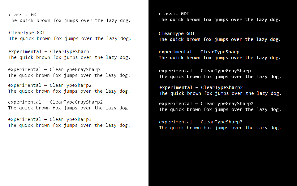
Here are the results of fontweighttest.netlify.com:
 PiotrGrochowski
on 27 Dec 2019
PiotrGrochowski
on 27 Dec 2019
@PiotrGrochowski wow
sammilucia
on 29 Dec 2019
@PiotrGrochowski I wonder what the results of running pure FreeType on Linux through fontgammatest would be
sammilucia
on 29 Dec 2019
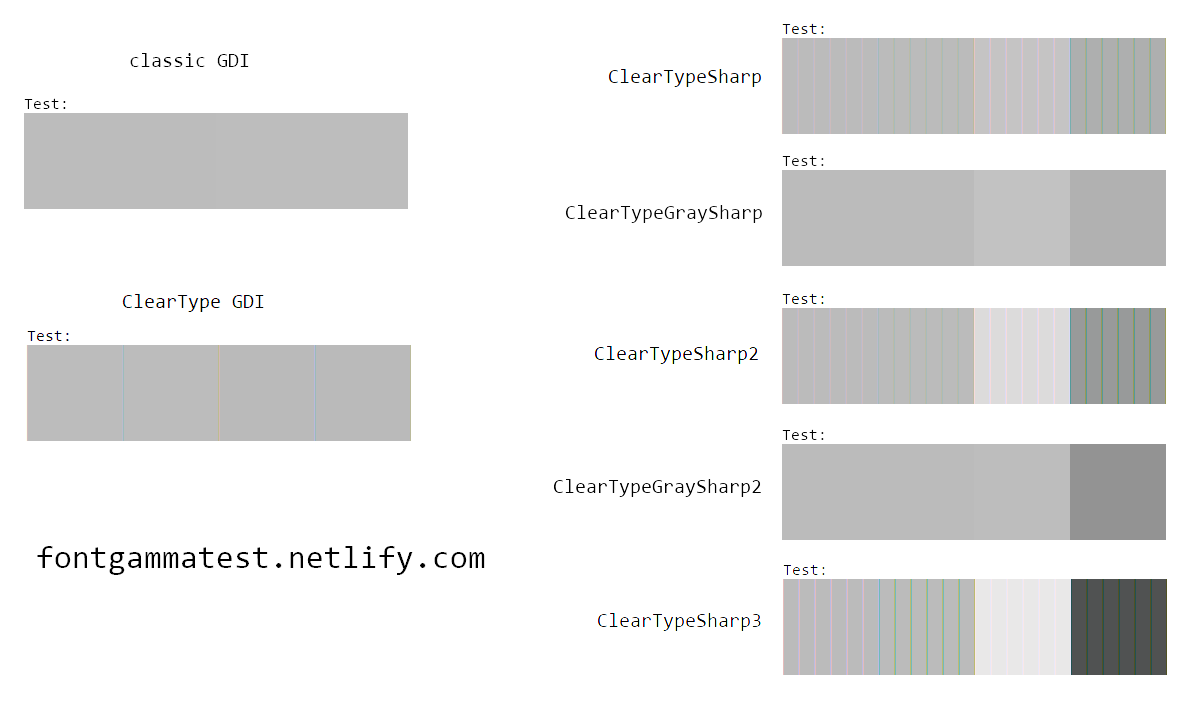
The darker the third square, the darker the black on white anti-aliasing is. The darker the fourth square, the darker the white on black anti-aliasing is. If they're roughly the same shade as the first and second squares, the anti-aliasing is gamma-correct (or whatever the term the font rendering engine guys use for this), meaning the rendered text will have the same overall shade as the font behind it, which is recommended for formal environments.
If you've seen the webpage of fontgammatest.netlify.com, you might find out that ClearType GDI doesn't have a single pass result as in the image, but rather six different results, one of them correct, as the ClearType Tuner allows changing the gamma, and unfortunately, one of the incorrect ones is the default (which is in my opinion a bad design).
DirectWrite is complicated. Applications can select any flavor of DirectWrite, and there are virtually infinitely many flavors. The Chromium flavor of DirectWrite consistently fails. Mozilla Firefox allows configuration of the flavor of DirectWrite in about:config, meaning the result will heavily vary from user to user. Microsoft Edge rendering (I don't really know if it's DirectWrite, or the successor of it, or the precursor) is actually customizable in the ClearType tuner as well, but this time the fourth and fifth screens control the darkness of the third square in subpixel rendering and grayscale rendering respectively, and the first option is the neutral one (combined with the sixth option in the second screen).
I know for sure Google Chrome on Android fails as well; its result is also included on the fontgammatest.netlify.com website. FreeType has plenty of customization options as seen in the MacType tuner, so applications using FreeType could as well be as inconsistent as those using DirectWrite. Right away, the font gamma test requires an HTML/CSS renderer.
Microsoft Office FrontPage 2003 uses GDI rendering, so it has the exact same results as Mozilla Firefox in GDI rendering. Unfortunately, CentBrowser does not really use GDI rendering the same way, as it always fails no matter what settings I use.
PiotrGrochowski
on 30 Dec 2019
@sammilucia tried the BIB Dark 2, absolutely stunning!

Also...

Did the gamma test in Arch, apparently failed :/ Didn't try Firefox, but Palemoon seems to be going for a heavier look bringing visible artifacts by default.
 cwriasir
on 7 Jan 2020
cwriasir
on 7 Jan 2020
A pass result in the font gamma test simply indicates that the anti-aliasing is correct and smooth. In my opinion this should have been the default in all anti-aliasing rendering engines.
A fail result indicates that the rendering engine utilizes distortions that bias the anti-aliasing towards black, towards white, towards background or towards foreground. In my opinion those distortions look unprofessional and therefore shouldn't be the default setting in any rendering engine. However, unfortunately, many renderers distort by default: ClearType GDI uses incorrect gamma by default but can be tuned to correct gamma, in DirectWrite applications choose their own rendering and therefore applications that chose distorting settings as the only rendering have fundamentally flawed text rendering. Due to the enormous amount of options in FreeType, many environments using FreeType either fail by default or always fail as well.
The most broken rendering is Android's text rendering. It has a hidden gamma setting by default set to 1.4. When set to 1.0, it directly interpolates sRGB values, which is incorrect. But here's where it gets really broken: increasing the gamma will make the white on black anti-aliasing closer to white, and the black on white anti-aliasing closer to black. In reality it's supposed to make it closer to white always. So normally when gamma 2.2 would be correct, in Android it is correct only for white on black text, but leads to more distortion for black on white text. This is a really awful implementation of text rendering, and I would rather have it not anti-aliased than this broken anti-aliasing.
PiotrGrochowski
on 7 Jan 2020
Note: I can't directly measure Android's text rendering with the font gamma test. That's because the Android's text rendering isn't used to display HTML documents.
PiotrGrochowski
on 7 Jan 2020
In MacType terms, the Android's internal gamma setting of n is actually a Gamma of 1.0 and a RenderWeight of n.
PiotrGrochowski
on 9 Jan 2020
125% Configuration is using someone else's :D
@domo891208 想請教您:
- Macytpe 的 ini 設定檔
- 左下開始功能表的軟體
- 工具列 icon 如何置中
謝謝😃😃
 vactiger
on 8 Jul 2020
vactiger
on 8 Jul 2020
125% Configuration is using someone else's :D@domo891208 想請教您:
- Macytpe 的 ini 設定檔
- 左下開始功能表的軟體
- 工具列 icon 如何置中
謝謝😃😃
1.我是使用糖果Mactype
2.Startisback
3.Startisback的功能
ghost
on 8 Jul 2020
@domo891208 yay it's so smooth and lovely 😊
sammilucia
on 8 Jul 2020
1.我是使用糖果Mactype
2.Startisback
3.Startisback的功能
@domo891208 Thank you.😁
vactiger
on 13 Jul 2020

Customized "~ChicoThorn Clear UI+FS - 2K v1.7": changed AA type to greyscale, disabled AA for Tahoma because that way it looks sharp at small sizes
Theme: Penumbra10 https://www.deviantart.com/scope10/art/Penumbra-10-Windows-10-visual-style-568740374
Theme loader: https://github.com/namazso/SecureUxTheme
 matoi974
on 20 Apr 2021
matoi974
on 20 Apr 2021
My most recent ini files. @sammilucia , @snowie2000 — Would it be possible to add this latest ini to the new 2021 release? That'd be awesome if you could! 😀 It's my best effort yet. The name could be 'ChicoThorn Sharp' .
I've attached both variations:
(ChicoThorn Sharp+FS-2021.06.02-0835 — contains all my current font substitutions
ChicoThorn Sharp-2021.06.02-0835 — contains a much smaller font substitution list
Other than the font substitution list the ini files are identical. Perhaps the one with the smaller font sub list would be the best for release? — Also I've tested these ini files with many different point sizes, so there's no need to classify it only for scaled up displays. They also render beautifully in both Dark and Light Modes.
Also, please let me know how I can help troubleshoot the new pre-release. I just downloaded it and will install it shortly! Excited to see how well it works! — Thanks @snowie2000 for all your hard work! 😊
ChicoThorn Sharp INIs-2021.06.02-0835.zip
ChicoThorn Sharp-Screenshots-2021.06.02-0835.zip


ChicoThorn
on 2 Jun 2021
Just installed the new MacType 2021.1-rc1... Wow! It really renders well! I used the same ini file I uploaded above (ChicoThorn Sharp-2021.06.02-0835) and compared Screenshots from 2021.1-rc1 with Screenshots from MacType beta6· 2019.06.21 and there is a subtle difference between the two. The new version seems to render sharper, crisper, and clearer than before; it's truly a remarkable difference! I really like it! I'm going to experiment with the new ArmBreaker setting and will be updating my ini file soon to reflect that change.
Here are the new Screenshots from 2021.1-rc1:
ChicoThorn Sharp-Screenshots-NEW MacType 2021.1-rc1-2021.06.02-0835.zip
ChicoThorn Sharp INIs-2021.06.02-0835.zip


ChicoThorn
on 2 Jun 2021
I have a new ini utilizing the ArmBreaker setting, and it's great! I'm moving my progress on my ini experiments back to #651 🙂
ChicoThorn
on 3 Jun 2021
Thank you for your great great work, and sure, I will release an "enhanced" version which will include your new profile and a bunch of hard work from @sammilucia. She was too busy on her work recently but still managed to optimize the default and global configs and profiles of mactype. But I released this version in a hurry because the crashes caused by CET are just exploding with the rolling out of the new Windows 10 update (update? version? build? whatever...), it has to be ceased. And now the major problem is solved, we have more time to polish it and push it final.
snowie2000
on 3 Jun 2021
sure, I will release an "enhanced" version which will include your new profile
That's awesome! Thank you so much @snowie2000 ! It's great to have a new version to experiment with! And thanks to @sammilucia for all her hard work as well! You guys rock!
ChicoThorn
on 3 Jun 2021
Related issues
 MariuzM
·
5Comments
MariuzM
·
5Comments
 AhaoAile
·
7Comments
AhaoAile
·
7Comments
 denysonique
·
7Comments
denysonique
·
7Comments
 zzrcxb
·
8Comments
zzrcxb
·
8Comments
 caulmseh
·
3Comments
caulmseh
·
3Comments
Most helpful comment
I'll start... this is Win 10 with the BIB Dark Theme, and Clean Soft profile