Mactype: Rendering changed in beta6
So I uninstalled β6 and reinstalled β5 just to see if I could get the same results I did originally before I installed β6, and was happy to see I did. In this screenshot you can see that the top and bottom samples are identical, both rendered with β5 and ChicoThorn-1.ini. The center samples are rendered with (β6) and ChicoThorn-1.ini. It's interesting that the larger sample fonts are clearer with β5, but the Segoe UI caption text is clearer with β6 — the color Segoe UI caption are also brighter with β6... Not sure where to go next to bring the best of both all together... ???

Older Thorn Fonts· Comparison of reinstalled b5 & b6 rendering with ChicoThorn-1.zip
_Originally posted by @ChicoThorn in https://github.com/snowie2000/mactype/issues/518#issuecomment-503781564_
 sammilucia
All 73 comments
Hi @ChicoThorn, I've split this into a new issue to make it easier to track.
Thaaattt'sss interesting.... Well caught! You could be our quality tester.
You are correct, to my eye the top and bottom samples are the same. If they are, and I sum the inverse of these two samples, we should expect to see grey. So let's do it...

Yep, 100%, featureless grey. They are the same.
Let's inverse and sum the beta6 rendering...

HMM! That's not intended. Assuming they were rendered in the exact same position on the screen, they should also sum to grey. But even if they're in different positions, the difference should not be that much. The stroke weight has changed (at least).
But is this FreeType or DirectWrite? The Windows Settings > Fonts looks to me to be DirectWrite. So has DirectWrite changed somehow?
@snowie2000 thoughts?
sammilucia
on 20 Jun 2019
That IS interesting... I've now reinstalled β6 so I can work on it too and keep up... do you think tweaking the DirectWrite settings in the ini file might help? Also, while I was looking for the "β" in Character Map I noticed the dialog box text was poorly rendered and that the font replacement I had set up in MacType (replace Tahoma with Segoe UI) wasn't working. If you have suggestions for me to try some different scenarios to help troubleshoot any or all of this I'm happy to help. 🙂

 ChicoThorn
on 20 Jun 2019
ChicoThorn
on 20 Jun 2019
That does look like Tahoma to me 😜
sammilucia
on 20 Jun 2019
As I expected, the font tab of the settings app is rendered with DirectWrite.
Not sure what has changed in between the two versions.
Never tried the ChicoThorn-1.ini profile. Trying it now.
 snowie2000
on 20 Jun 2019
snowie2000
on 20 Jun 2019
@ChicoThorn

You can clearly see that the font substitution is effective.
snowie2000
on 20 Jun 2019
For the font dialog part, could please share your testing font with me? In a way you believe is suitable, of course.
snowie2000
on 20 Jun 2019
Sure, I'd be happy to. It's a "customized" version of Segoe UI with glyphs I've created. I replaced some of the punctuation, math, symbol and diacritical glyphs with my own. (You'll notice both brace glyphs are mirrored lightning bolts, so don't let that throw you when you see them in your registry).
Most of the customized glyphs are proprietary, so please don't share the font publicly (in house between testers is fine — I will email you the font rather than posting it here). I try to keep this font current with the latest Microsoft update on the Segoe UI font, but right now I'm one version behind (mine is 5.61, the most current is 5.62)... in the past changes in the version number usually means Microsoft added new language glyphs; rarely are the English alpha-numeric glyphs altered. I just checked both and there are 49 new language glyphs in 5.62; all of which appear to be Middle Eastern and/or Asian language additions.
A couple of things to keep in mind: I've given my font a filename that's different, but the internal font name remains "Segoe UI." Therefore, installing my font will "replace" your standard Segoe UI font (which is why it shows up throughout the UI once installed.) So keep a copy of your original Segoe UI so you can go back to it when you want. Also when I designed the glyphs I used a grid that would maximize their appearance in the ClearType Windows environment. I've noticed since experimenting with MacType that I will need to retweak some of the glyph positions to better match the scheme used by MacType to pixelate the glyphs.
ChicoThorn
on 20 Jun 2019
I rechecked how Character Map is displaying after seeing your screenshots and mine is still incorrect — displaying Tahoma with very poor spacing (referring only to the dialog box text, not the sample text in the main window). 🤔

ChicoThorn
on 20 Jun 2019

Is this what you expected?
If it is, it should be wrong from the begin, because Microsoft is playing a bad joke on us.
Do you know that there is also a built-in official fontsubstitutes function inside Windows? I never knew that before, and here it is:

The fonts in the charmap dialog are MS Shell Dlg and MS Shell Dlg 2 instead of Microsoft Sans Serif and Tahoma.
I'll take care of it in the next version.
snowie2000
on 21 Jun 2019
While the kinks are being worked out with beta6, I've gone back to beta5 for daily use. The results I'm getting with the ChicoThorn-1 settings and beta5 are about 95% perfect (IMHO). There are some weird things here and there; for example Character Map looks better in beta5 than the sample I showed you earlier using beta6, but it's still not quite right as you can see in the screenshot below.
Check out the two side by side comparisons between beta5 and beta6 of some of my round glyphs on the desktop and similar glyphs as displayed in the blue jumplist to their right. In beta5 both the glyphs on the desktop and those in the jumplist are near right on the mark! But you can see in beta6 the jumplist glyphs just aren't being rendered at all.
It's interesting to me that we're all getting so many different results... I wonder why that is? Computer hardware differences? Configuration? Software? OS versions? —— Oh, and speaking of OS versions, just yesterday we Windows Insiders in the Fast ring got the latest 20H1 build: 18922. The screenshots below were all taken after installing 18922.


beta5-ChicoThorn-1 Jumplist & Desktop Comparison of b5 & b6.zip
ChicoThorn
on 21 Jun 2019
Is this what you expected?
If it is, it should be wrong from the begin, because Microsoft is playing a bad joke on us.The fonts in the charmap dialog are
MS Shell DlgandMS Shell Dlg 2instead ofMicrosoft Sans SerifandTahoma.I'll take care of it in the next version.
Yes! That Character Map is totally what I expected! That's so much better! Did you get that result just by making that change in the Registry? I'm gonna give 'er a go! Thanks Snowie! 😊
ChicoThorn
on 21 Jun 2019
These are not the changes I made. They are there from the beginning.
To archive the result, you need to add substitutions for MS Shell Dlg and
MS Shell Dlg 2 together with Tahoma
On Fri, Jun 21, 2019 at 12:44 Thorn Hart notifications@github.com wrote:
Is this what you expected?
If it is, it should be wrong from the begin, because Microsoft is playing
a bad joke on us.Do you know that there is also a built-in official fontsubstitutes
function inside Windows? I never knew that before, and here it is:
[image: fs]
https://user-images.githubusercontent.com/11767189/59894523-71708600-9413-11e9-9d93-9b5f5c29b5a0.png
The fonts in the charmap dialog are MS Shell Dlg and MS Shell Dlg 2
instead of Microsoft Sans Serif and Tahoma.I'll take care of it in the next version.
Yes! That Character Map is totally what I expected! That's so much better!
Did you get that result just by making that change in the Registry? I'm
gonna give 'er a go! Thanks Snowie! 😊—
You are receiving this because you were mentioned.
Reply to this email directly, view it on GitHub
https://github.com/snowie2000/mactype/issues/550?email_source=notifications&email_token=ACZY3FIA4FLJ7D3DOH6CBC3P3RMBHA5CNFSM4HZOHRWKYY3PNVWWK3TUL52HS4DFVREXG43VMVBW63LNMVXHJKTDN5WW2ZLOORPWSZGODYHM6GQ#issuecomment-504287002,
or mute the thread
https://github.com/notifications/unsubscribe-auth/ACZY3FNX2K2PLKU3HS6ODMLP3RMBHANCNFSM4HZOHRWA
.
snowie2000
on 21 Jun 2019
Yes, DirectWrite is not working for me in beta6 either
This is DirectWrite settings of:
GammaValue=1.4
Contrast=0
ClearTypeLevel=1.0
RenderingMode=5
and
RenderingMode=5
GammaValue=1.4
Contrast=0.625
ClearTypeLevel=0.75
Inverted then added together ... the result is pure grey, so I don't think DirectWrite settings are doing anything ... 🤔

sammilucia
on 21 Jun 2019
Did you delete the svchost.exe from Mactype.ini? It shouldn’t be there
after all.
On Fri, Jun 21, 2019 at 13:03 Samantha Glocker notifications@github.com
wrote:
Yes, DirectWrite is not working for me in beta6 either
This is DirectWrite settings of:
GammaValue=1.4
Contrast=0
ClearTypeLevel=1.0
RenderingMode=5
and
RenderingMode=5
GammaValue=1.4
Contrast=0.625
ClearTypeLevel=0.75
Inverted then added together ... the result is pure grey, so I don't think
DirectWrite settings are doing anything ... 🤔[image: image]
https://user-images.githubusercontent.com/3295286/59898681-0fbf1480-9431-11e9-9415-7faadd709a83.png—
You are receiving this because you were mentioned.
Reply to this email directly, view it on GitHub
https://github.com/snowie2000/mactype/issues/550?email_source=notifications&email_token=ACZY3FLTLBH3MR2ISNMYEJLP3ROJNA5CNFSM4HZOHRWKYY3PNVWWK3TUL52HS4DFVREXG43VMVBW63LNMVXHJKTDN5WW2ZLOORPWSZGODYHNXVY#issuecomment-504290263,
or mute the thread
https://github.com/notifications/unsubscribe-auth/ACZY3FJVQJXDO6DEAWQTUTDP3ROJNANCNFSM4HZOHRWA
.
snowie2000
on 21 Jun 2019
Nope! svchost.exe is in MacType.ini ... how did that get in there??
sammilucia
on 21 Jun 2019
Is there anything else that shouldn't be in there?
sammilucia
on 21 Jun 2019
From your “final commit”ヘ😈ヘ
On Fri, Jun 21, 2019 at 13:06 Samantha Glocker notifications@github.com
wrote:
Nope! svchost.exe is in MacType.ini ... how did that get in there??
—
You are receiving this because you were mentioned.
Reply to this email directly, view it on GitHub
https://github.com/snowie2000/mactype/issues/550?email_source=notifications&email_token=ACZY3FLY6LAULSGYT3FBNGLP3ROUZA5CNFSM4HZOHRWKYY3PNVWWK3TUL52HS4DFVREXG43VMVBW63LNMVXHJKTDN5WW2ZLOORPWSZGODYHN3PI#issuecomment-504290749,
or mute the thread
https://github.com/notifications/unsubscribe-auth/ACZY3FMZSTMWHDNBAXKVDNDP3ROUZANCNFSM4HZOHRWA
.
snowie2000
on 21 Jun 2019
I checked the whole list and I think that other exclusions are fine.
snowie2000
on 21 Jun 2019
Yep that was it!
Dammit that's in the pinned exclusions Issue #523

sammilucia
on 21 Jun 2019
So I made changes in the FontSubstitutes in Registry — and it worked! 😃 Check out Character Map now! Also included a screenshot of my Registry changes...


beta5-ChicoThorn-1 After FontSubstitutes Change - Character Map.zip
ChicoThorn
on 21 Jun 2019
So how do we call the hotfix version? Beta 6.1?🙃
snowie2000
on 21 Jun 2019
beta7 .... Or I just make a note in the release notes?
Can you please let me know anything else that should (or shouldn't) be in the default mactype.ini
sammilucia
on 21 Jun 2019
Or just re-release the beta6. I think it’s not a big deal.
I think it’s fine to leave all the other processes in the list.
snowie2000
on 21 Jun 2019
@sammilucia, since you're going to do some changes in the beta6 release, would you mind changing the name of my ini file to "ChicoThorn.ini" (I don't think it really needs the -1)... Thank you! 😊
ChicoThorn
on 21 Jun 2019
@ChicoThorn it is done 😊
sammilucia
on 21 Jun 2019
@sammilucia , Thank you!
ChicoThorn
on 21 Jun 2019
@snowie2000 it is done, O great leader 😊
sammilucia
on 21 Jun 2019
@snowie2000 i've unpinned the MacType.ini exclusions #523 because it's dangerous to list lots of software in there in my opinion for exactly this reason.
Closing issue!
sammilucia
on 21 Jun 2019
Thanks again @ChicoThorn for alerting to this issue so quickly 😊 😊
sammilucia
on 21 Jun 2019
My pleasure! — And thank you @sammilucia and @snowie2000 for tackling such a monumental project! So many folks in the PC world are going to be overjoyed when they finally have options to the awful font rendering provided by our buddies at Microsoft! 😉
ChicoThorn
on 21 Jun 2019
It's a pleasure 😊. I've been using this since like, GDI++ (or something) lol. I can't live without it 😂
Your attention to detail and eye for detail is so great - I was wondering if you'd like to join our little dev team of 2 (to make it 3) and be MacType's quality tester?
sammilucia
on 21 Jun 2019
I would be honored! Wow! Sure! Count me in! 😃 Just let me know what/how you'd like me to help out and I will do my best!
ChicoThorn
on 21 Jun 2019
@sammilucia ...just curious, will you be posting when the updated beta6 will be ready to download and try out? I'm excited to see how it works now!
ChicoThorn
on 21 Jun 2019
It's already done ;) https://github.com/snowie2000/mactype/releases/tag/2019.1-beta6
sammilucia
on 21 Jun 2019
Awesome! Downloading now! 😁
ChicoThorn
on 21 Jun 2019
Please let me know how it goes?
sammilucia
on 21 Jun 2019
I will! (I feel like a kid at Christmas! lol!) — Back in a bit after installing and testing... 🙂
ChicoThorn
on 21 Jun 2019
Waiting for the final "judgment"... and dealing with the font substitution now.
snowie2000
on 21 Jun 2019
Drum roll please...
Okay! Break out the Champagne! We have a winner!! Check out this screenshot showing four of the trouble spots: Character Map, Jumplist, Settings App and Notifications Panel — ALL look great! 🎉🎈😃

beta6-NEW -ChicoThorn CharMap, Jumplist, Settings, NavPane .zip
ChicoThorn
on 21 Jun 2019
The jumplist is the "chunkiest" — you can still see hard-edged artifacts here and there — but the circle-shaped glyphs are no longer flattened, they're the proper shape overall... so maybe a little more fine-tuning to the profile ini's DirectWrite settings will correct that?
ChicoThorn
on 21 Jun 2019
Could you do a side by side comparison with the default Windows Cleartype rendering?
PS: I found an official article talking about fontlinking and fontsubsititution:
https://docs.microsoft.com/en-us/globalization/input/font-technology
snowie2000
on 21 Jun 2019
Sure!
ChicoThorn
on 21 Jun 2019
I really do like your INI @Thorn!
On Fri, 21 Jun 2019 at 16:26, Thorn Hart notifications@github.com wrote:
Sure!
—
You are receiving this because you were mentioned.
Reply to this email directly, view it on GitHub
https://github.com/snowie2000/mactype/issues/550?email_source=notifications&email_token=AAZEQNVFPXBZADUDBGEALLDP3R3TVA5CNFSM4HZOHRWKYY3PNVWWK3TUL52HS4DFVREXG43VMVBW63LNMVXHJKTDN5WW2ZLOORPWSZGODYHTXPI#issuecomment-504314813,
or mute the thread
https://github.com/notifications/unsubscribe-auth/AAZEQNR7S7OD75MITMEBYMLP3R3TVANCNFSM4HZOHRWA
.
sammilucia
on 21 Jun 2019
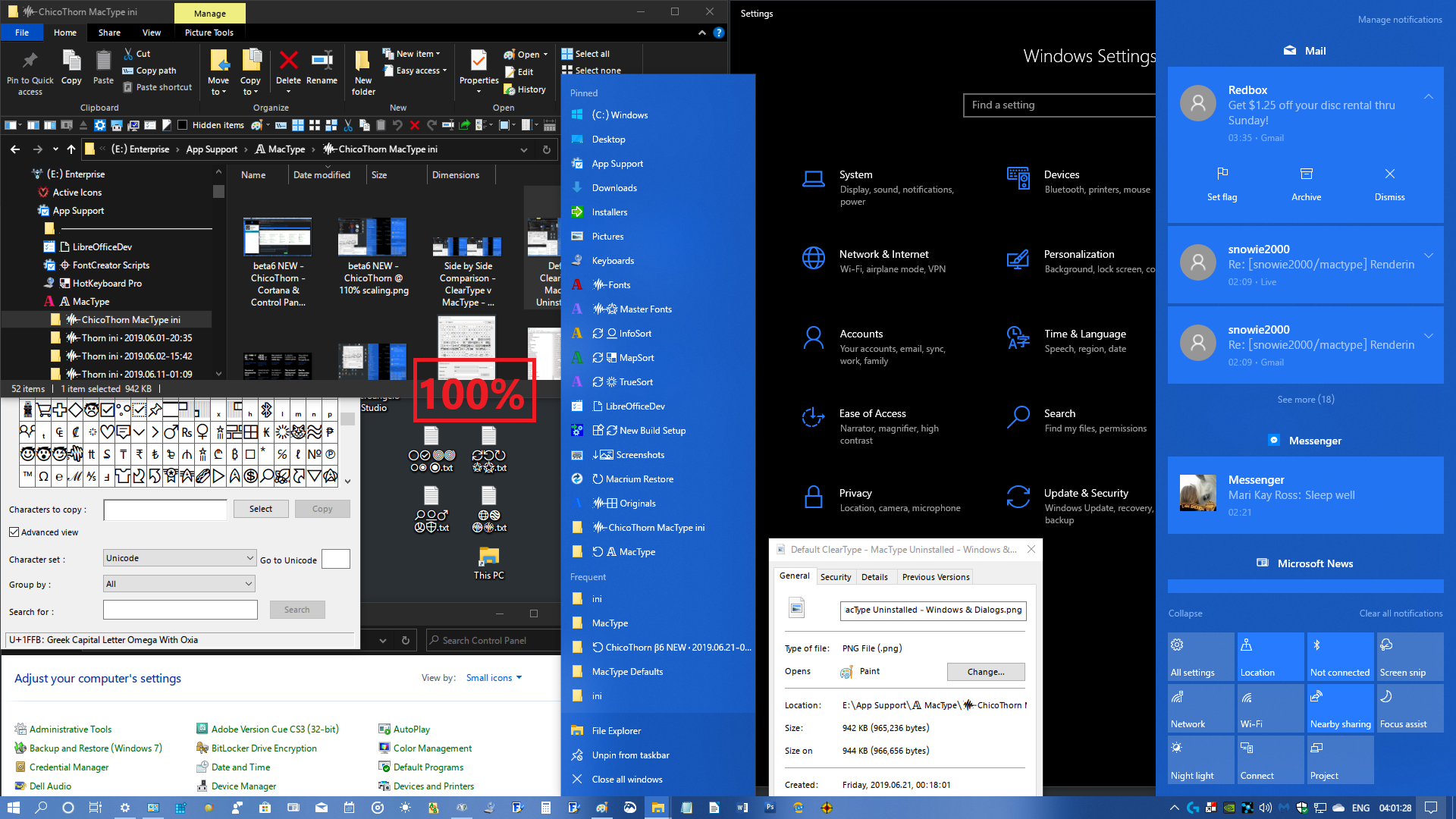
Thanks @sammilucia ! — Here is the side by side comparison of the default ClearType (MacType was uninstalled when I took this screenshot) versus the new beta6 ChicoThorn.ini...
I look at the ClearType now and wonder two things: 1) How could I have put up with such ugly text rendering for so long... and 2) Why would Microsoft dare call their scheme "Clear"Type? More like "ClunkyType" to me! lol!

Side by Side Comparison - ClearType v MacType - Windows & Dialogs.zip
ChicoThorn
on 21 Jun 2019
@ChicoThorn Thank you, your profile looks great
ClearType is very clear if you know what I found when I was looking for information about the fontsubtitution in the registry:
https://answers.microsoft.com/en-us/windows/forum/windows_7-desktop/how-to-change-system-default-font-in-all-parts/dfce15db-7337-420a-a42e-517521a8502e
A group of people was talking about completely disabling the ClearType and replace everything back to Tahoma, yeah, the font you hate.
If ClearType is BS, Windows without ClearType is genuinely a big chunk of LED display. I mean, this kind of thing:

snowie2000
on 21 Jun 2019
😂 That's hilarious and so true!
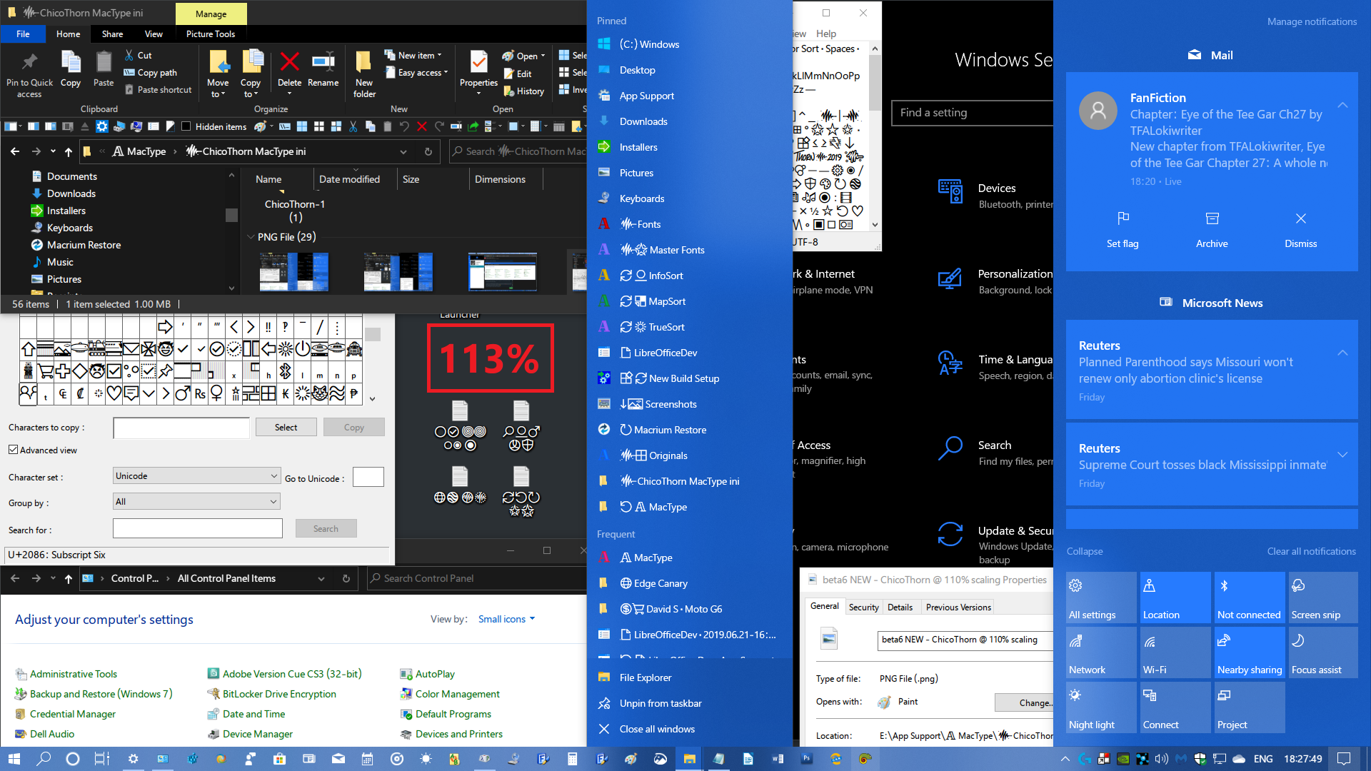
Just for the fun of it, I changed my scaling to 110 to see how it rendered... here is the result... it's not too bad, but gets a little 'foggy' around the small bowls on the "e" and "a" especially. But I kinda like it... 🙂

ChicoThorn
on 21 Jun 2019
Just out of curiosity ... which time zone are you guys in? I'm in PDT (Pacific Daylight Time — UTC -07:00) It just turned 1am here...
ChicoThorn
on 21 Jun 2019
Windows DirectWrite has improved a lot but still struggles with small sized fonts.
snowie2000
on 21 Jun 2019
@sammilucia and I were in the same time zone, and it's 4pm in GMT+8. She should be in EST or the like now, and also midnight there I believe.
snowie2000
on 21 Jun 2019
Good to know! We overlap a bit then! I tend to be a night owl, so I'm often burning the midnight petroleum (as Data was fond of saying).
I can't get over how FANTASTIC all the text looks on my screen now! I like using dark mode pretty much everywhere I can, but certain windows are still light anyway (Control Panel), Cortana's pop-out pane, etc. And the rendering on those surfaces is excellent as well! 😊

ChicoThorn
on 21 Jun 2019
Edge dev? That actually looks great. I like the auto-shrink feature of tabs. The way chrome does it is fairly ordinary and inefficient.
snowie2000
on 21 Jun 2019
I'm loving the new Edge dev (aka Canary) too! So much better than their original attempt at Edge I think. I like the tabs too; overall it's a lot slicker than Chrome, and they're slowly adding all the bells and whistles they eventually got into the original Edge — but this time they actually work! 😅
ChicoThorn
on 21 Jun 2019
I've been experimenting with different scaling factors and discovered that with beta6 and ChicoThorn even at 100% scaling (9 pt text), the glyphs are clear, even and pleasing. I'm stoked! When I originally designed my custom SegoeUI glyphs I aimed for clarity at 9 pt. So now with MacType doing the rendering they're nearly spot on! Shapes are truer to the actual glyph outlines. I'm really impressed! Here's another screenshot to show you what I mean...
ChicoThorn
on 21 Jun 2019
@ChicoThorn @snowie2000 that said I'm about to move to the US so I'll be UTC -05:00 from next week 😊
sammilucia
on 21 Jun 2019
Something interesting I just noticed, I find heavier fonts look nicer on Dark Mode ... e.g. Clean Sharp looks better to my eyes on Light Mode, and Clean Soft looks better on Dark Mode. Same as your Profile @ChicoThorn, I prefer it much more in Dark Mode.
sammilucia
on 21 Jun 2019
I agree — Dark Mode is the better one for my profile. Although I can live with the slight "softness" I see on light surfaces as well... but I'm never really through trying to fine-tune and tweak stuff, so I'll see if I can't find that sweet spot where both look great! 😃
Late last night (early this morning?) while I was experimenting with scaling factors I came upon something I found interesting: I set the Settings > Display > Advanced scaling settings back to 100%, then went to Settings > Ease of Access > Make text bigger where I could visually see as I moved the slider bar how the scaling would affect the text rendering (with MacType beta6/ChicoThorn running).
I noticed a pattern (sort of); at first I thought the odd-numbered scaling factors (103, 105, 107, 109, 111, etc.) were rendering a better fit to the pixels (I focused primarily on how strong vertical strokes were being rendered)... but upon further examination this morning I found more interesting results: I went through each scaling factor from 100 to 125. Of those possibilities these factors were the most focused (both pixel-wise and visually): 101, 103, 106, 108, 110, 112, 115, 117, 120, 122, 125. I didn't research any further sizes figuring who would want screen text the size of Manhattan? 😄 I then reset the Ease of Access scaling back to 100% then changed the Settings > Display > Advanced scaling settings to 109.
After calculating these possibilities I tried a few out... At first I thought 109 was better than 110 so I used that for a while and it produced a soft rendering. I'm going to try a few of these settings, I'll post screenshots of the best ones. The screenshot below is at the 109% setting.

ChicoThorn
on 21 Jun 2019
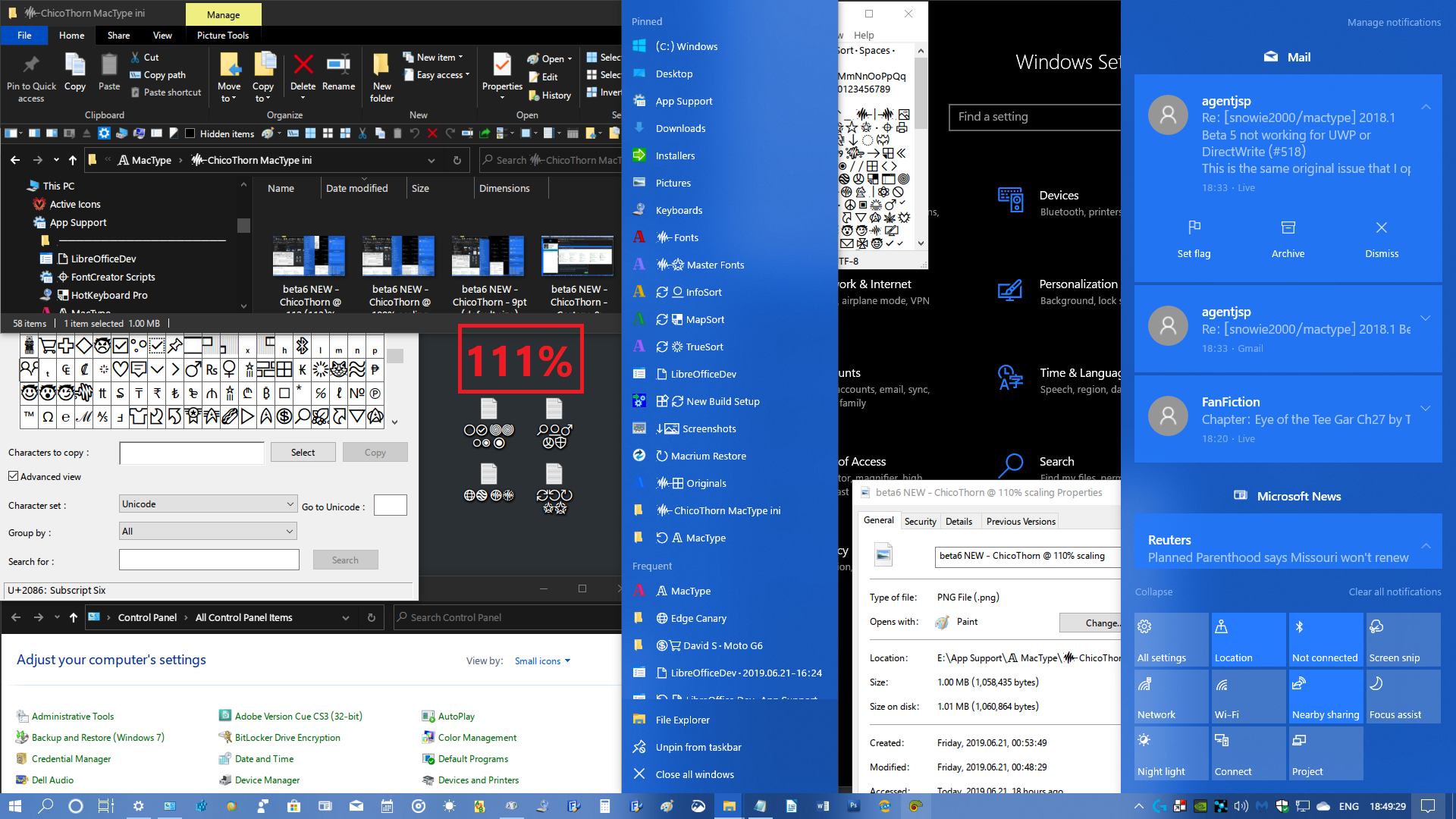
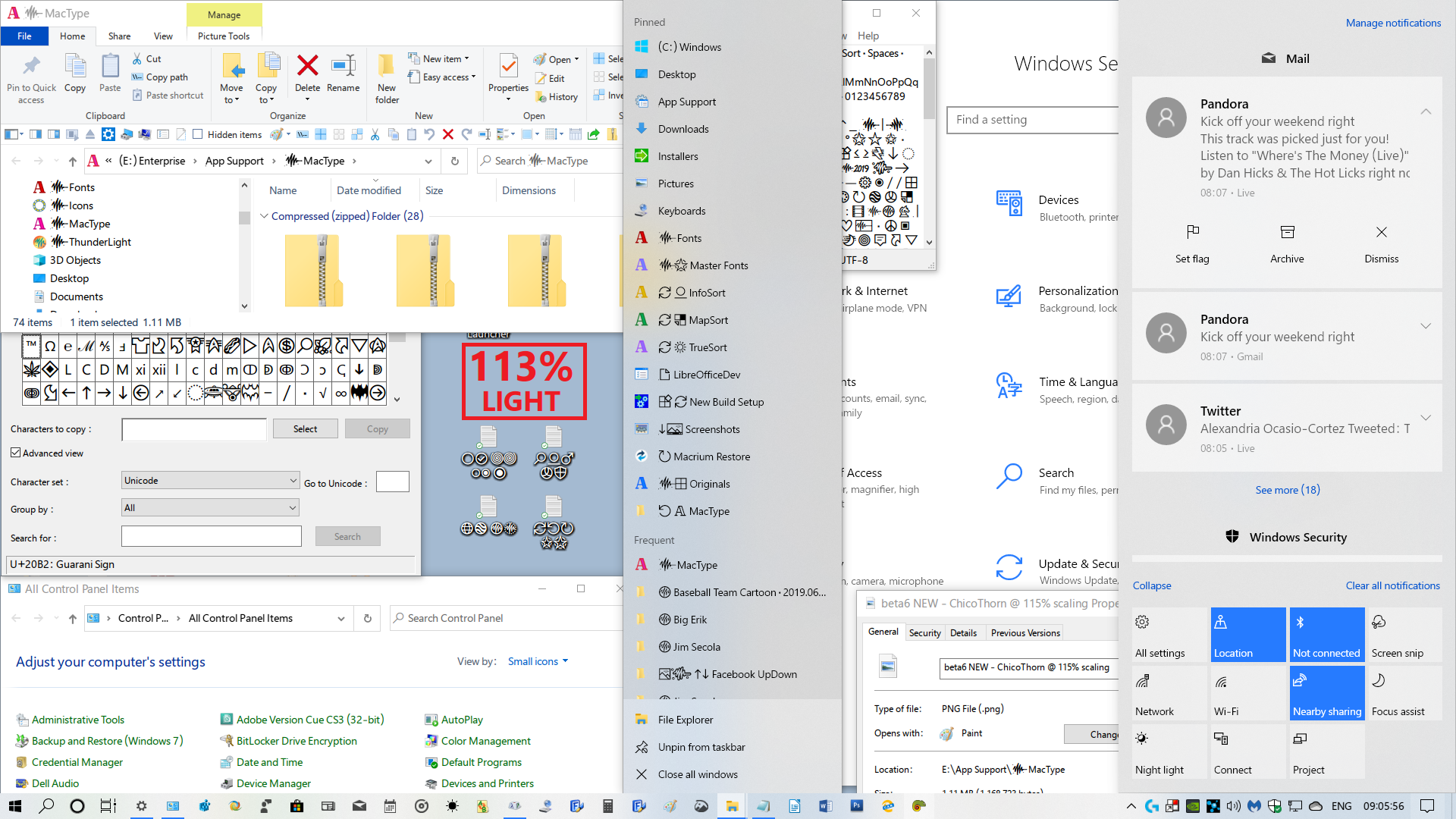
So I just learned something new... apparently the Ease of Access scaling tool doesn't match up exactly with how Windows does the "Scale everything" scaling... I wanted to test out 112% since that was one of the ones that seemed more focused to me using the Ease of Access tool... but when I set 112 in the Scale Everything setting it changed it to 113. Even when I changed it back to 112 and signed out and in, it changed it to 113. This screenshot was the result:
beta6 NEW - ChicoThorn @ 112 (113)% scaling.zip
Actually, I'm really pleased with everything in this size... Things fit better on my screen and in my windows, the text is still a bit larger than default so it's easy to read, even the jumplist is better defined at this setting (jumplists seem to be one of the worst offenders at not rendering well for some reason). Overall, I'm gonna try this size out as my go-to size for a while. 😊
ChicoThorn
on 22 Jun 2019
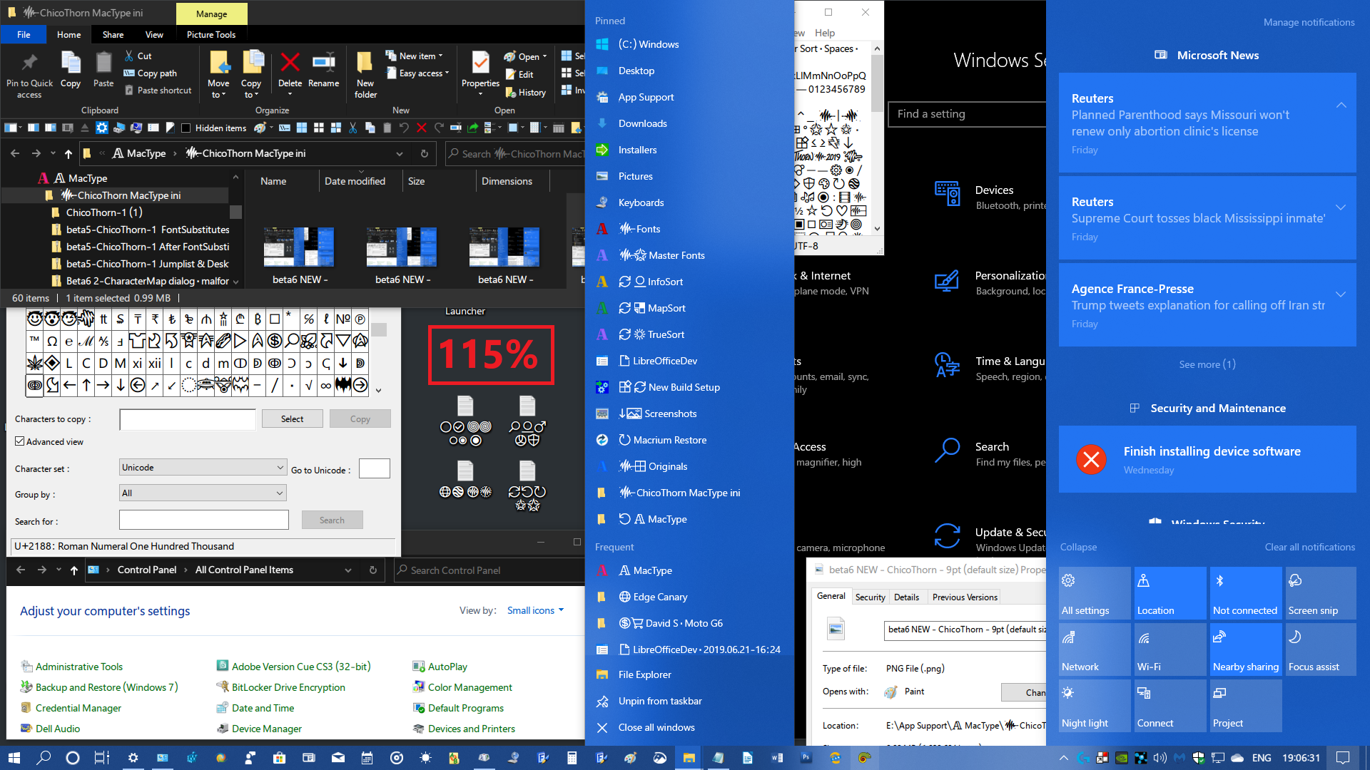
This screenshot is how 111% renders. I'm not a fan of this one. The jumplist text is a bit unfocused, same with the small text on the Settings page...
ChicoThorn
on 22 Jun 2019
@snowie2000
Do you know that there is also a built-in official fontsubstitutes function inside Windows? I never knew that before, and here it is:
I've often wondered why font substitution is in MacType because it's already in Windows ... do we actually need this feature?
sammilucia
on 22 Jun 2019
@sammilucia
Maybe MacType's font replacement feature could just perform the Windows registry tweak so the average user doesn't have to go into Regedit to do it manually? — At the moment I still have the font replacements set in MacType as well as the replacements done in Regedit, and it all seems to coexist okay...
ChicoThorn
on 22 Jun 2019
This is rendering at 115% — Now this one I really like! — Text is a pleasant size and seems well rendered on all the surfaces, even the jumplists! 🙂
ChicoThorn
on 22 Jun 2019
@sammilucia the built in font substitution is more like aliases for the existing fonts.
It allows you to create virtual fonts based on charset and name. It does not work for installed fonts.
@ChicoThorn this feature has two big disadvantages. first it needs a reboot to take affect, second as I said, it’s a virtual alias, it doesn’t work for installed fonts.
snowie2000
on 22 Jun 2019
@snowie2000
Okay... good to know. So do you think I should remove the font replacement stuff from my ini file since I made the font substitute changes in the registry (a fantastic hack, by the way! Thanks for that! 😊)?
ChicoThorn
on 22 Jun 2019
Summing up my scaling research so far, I can easily recommend these scaling factors with the ChicoThorn ini: 100, 113, 115, 117. I haven't tested larger than that yet...
ChicoThorn
on 22 Jun 2019
@ChicoThorn font replacement in Mactype is more versatile, while font replacement in windows is more stable
snowie2000
on 22 Jun 2019
Maybe MacType's font replacement feature could just perform the Windows registry tweak so the average user doesn't have to go into Regedit to do it manually? — At the moment I still have the font replacements set in MacType as well as the replacements done in Regedit, and it all seems to coexist okay...
Yes .. I'm also wondering, if MacType does the substitution, does it have to deal with different glyph sizes, hinting, (i.e., it could clause glyph clipping?) ... whereas with Windows substitution, it doesn't? @snowie2000 ?
font replacement in Mactype is more versatile, while font replacement in windows is more stable
how is MacType's more versatile?
sammilucia
on 22 Jun 2019
I went through each scaling factor from 100 to 125. Of those possibilities these factors were the most focused (both pixel-wise and visually): 101, 103, 106, 108, 110, 112, 115, 117, 120, 122, 125
@ChicoThorn haha you're a total nerd in the best way 😊
sammilucia
on 22 Jun 2019
Out of interest here's my Windows ... I'm using the BIB Dark Theme (for Windows 10 1903)

sammilucia
on 22 Jun 2019
@ChicoThorn you might be interested in #557 😊
sammilucia
on 22 Jun 2019
@sammilucia The theory behind font substitution is generally cheating the application, hijack the font creation and create the alternative font for the application and return fake information to make it believe that it has the right font.
The difference is that with Windows font substitution, Windows creates a target font with a virtual name you designed and fake everything for you which is obviously seamless (but not flawless) because, you know, it is Windows, the god of everything to the application. The only problem is that it is coded in such a low level that it needs a reboot to take effect and it also doesn't allow you to remap an existing font such as Tahoma to Segoe UI unless you uninstall the Tahoma first. You are only allowed to create a new name for it, like mapping Sam for Arial. Interestingly, this is not supported by MacType.
The reason why font substitution causes so many problems is mainly that there are too many applications which are only designed with the font they are programmed with. The UI size, the text layouts, and everything sensitive to fonts could be predefined and won't change along with the font.
For example, many code editors are designed to use monospaced fonts only and only display text in a fixed letterspacing. If you force it to use a non-monospaced font (it still thought it is a monospaced font due to the fake font information) texts would overlay with each other.
snowie2000
on 22 Jun 2019
Hi! I was working the past 36 hours or so — but I gotta tell you what a real JOY it was because the text & type and fonts were so PERFECT! I'm sold on the 113% scaling factor with my ini file! Even in my older version of Photoshop CS3 which has light gray surfaces and tiny type, especially in the dialogs and pallets (before the font substitution it displayed in Tahoma, my nemesis font, lol! ). Now it displays in Segoe UI like I want, and for me it's a real pleasure! Take a look at this screenshot of my Photoshop work area... Even the light grayed out text is rendered beautifully — and check out that tiny tiny text in the Layers pallet on the Right, even at that size it looks great! And the font substitution really seems to be complete — After a day of working the system, I was continually impressed with how all the rendering everywhere has come together — each window, dialog, popup, and dropdown menu is just pure delight to see and use! Damn! I feel like I'm on a Mac again, lol! I may be gushing a bit, but THANKS AGAIN @snowie2000 and @sammilucia ! 🤩

ChicoThorn
on 22 Jun 2019
I figured I'd give Light Mode a try with my ini file... here's the result: Overall I think it's pretty good! Better than I thought it would be! Although I can see that some of the lighter thinner characters could be darker... but I think if I tweak the settings a bit here and there maybe I can get it better... 😉
ChicoThorn
on 22 Jun 2019
Hi! I've been experimenting with changing the DirectWrite values in ChicoThorn to see if I could get better resolution/rendering in light mode while still maintaining good rendering in dark mode... I've made some samples... but I'm sorta confused by the results I got... so I'd like to hold off sharing what I came up with because I'd like to better understand what each of the DirectWrite values mean and/or how they affect the display of a glyph. I kinda feel like I'm shooting in the dark... For example, what does RenderingMode do, what does it change when I change the value larger or smaller? — I figure the GammaValue must be similar to other gamma settings I've come across, higher number = lighter shades or more lightness and vice versa. — Contrast I figure is similar to any contrast value where a low number tends to create a fuzzy or soft image and a high number a more stark and black and white image. — The ClearTypeLevel setting throws me though, I'm guessing at what that does exactly, but I figure it has something to do with sharpening and focus? — I appreciate any guidance you can give me.
Afterwards I'll tinker around with it a bit then post my results. 😀
ChicoThorn
on 30 Jun 2019
Related issues
 11igors11
·
6Comments
11igors11
·
6Comments
 cricrazy
·
4Comments
cricrazy
·
4Comments
 kiravi
·
8Comments
kiravi
·
8Comments
 kyler719
·
4Comments
kyler719
·
4Comments
 l19980623
·
5Comments
l19980623
·
5Comments
Most helpful comment
Hi! I was working the past 36 hours or so — but I gotta tell you what a real JOY it was because the text & type and fonts were so PERFECT! I'm sold on the 113% scaling factor with my ini file! Even in my older version of Photoshop CS3 which has light gray surfaces and tiny type, especially in the dialogs and pallets (before the font substitution it displayed in Tahoma, my nemesis font, lol! ). Now it displays in Segoe UI like I want, and for me it's a real pleasure! Take a look at this screenshot of my Photoshop work area... Even the light grayed out text is rendered beautifully — and check out that tiny tiny text in the Layers pallet on the Right, even at that size it looks great! And the font substitution really seems to be complete — After a day of working the system, I was continually impressed with how all the rendering everywhere has come together — each window, dialog, popup, and dropdown menu is just pure delight to see and use! Damn! I feel like I'm on a Mac again, lol! I may be gushing a bit, but THANKS AGAIN @snowie2000 and @sammilucia ! 🤩
beta6 - ChicoThorn @ 113% scaling· Poster.zip