Lunie: When you sign in with an address, Lunie directly connects you to that address network
Is your feature request related to a problem? Please describe.
Now (or very very soon) we can sign in with different networks addresses.
Still, when we sign in with an address, if we weren't previously connected to that address network, we get very ugly errors that the user will not even see and it will certainly be utterly confusing for them.
Describe the solution you'd like
It is the title of this feature request :smiley_cat:
Describe alternatives you've considered
Warning messages when you are signing in with other networks addresses (which is not even a solution) or, another option would be that you can only sign in with addresses from the network you are currently connected to.
But this last option I don't like as much as the one I propose here, which just makes the UX a breeze.
Additional context
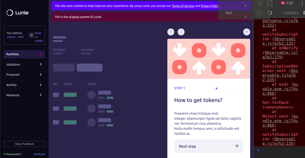
This is what happens now when you sign in with another network address. Not ideal.
 Bitcoinera
All 7 comments
very important. thanks for flagging.
to clarify your proposal — when a user signs in with an address, lunie should select the network that address belongs to and select that network for them?
 jbibla
on 9 Jan 2020
jbibla
on 9 Jan 2020
very important. thanks for flagging.
to clarify your proposal — when a user signs in with an address, lunie should select the network that address belongs to and select that network for them?
Yes, that's exactly what I am proposing here :ok_hand:
Bitcoinera
on 9 Jan 2020
Easiest fix for now is maybe to just only to use the addresses for this network.
 faboweb
on 18 Jan 2020
faboweb
on 18 Jan 2020
alternatively, we could add the network selector component to this screen and display addresses from that network.
whatever is simplest!
jbibla
on 20 Jan 2020
alternatively, we could add the network selector component to this screen and display addresses from that network.
whatever is simplest!
Too much information for one screen I think.
It looks like we are going for what Fabo proposed: show only addresses of the network you are currently connected to.
Bitcoinera
on 20 Jan 2020
This will anyway be rewritten in the new design. Let's go for the simplest thing that works.
faboweb
on 20 Jan 2020
This will anyway be rewritten in the new design. Let's go for the simplest thing that works.
You mean from the UI perspective or how rewritten? The flow is planned to stay the same right?
Bitcoinera
on 20 Jan 2020
Related issues
faboweb
·
3Comments
jbibla
·
4Comments
 okwme
·
3Comments
okwme
·
3Comments
 nylira
·
3Comments
jbibla
·
4Comments
nylira
·
3Comments
jbibla
·
4Comments