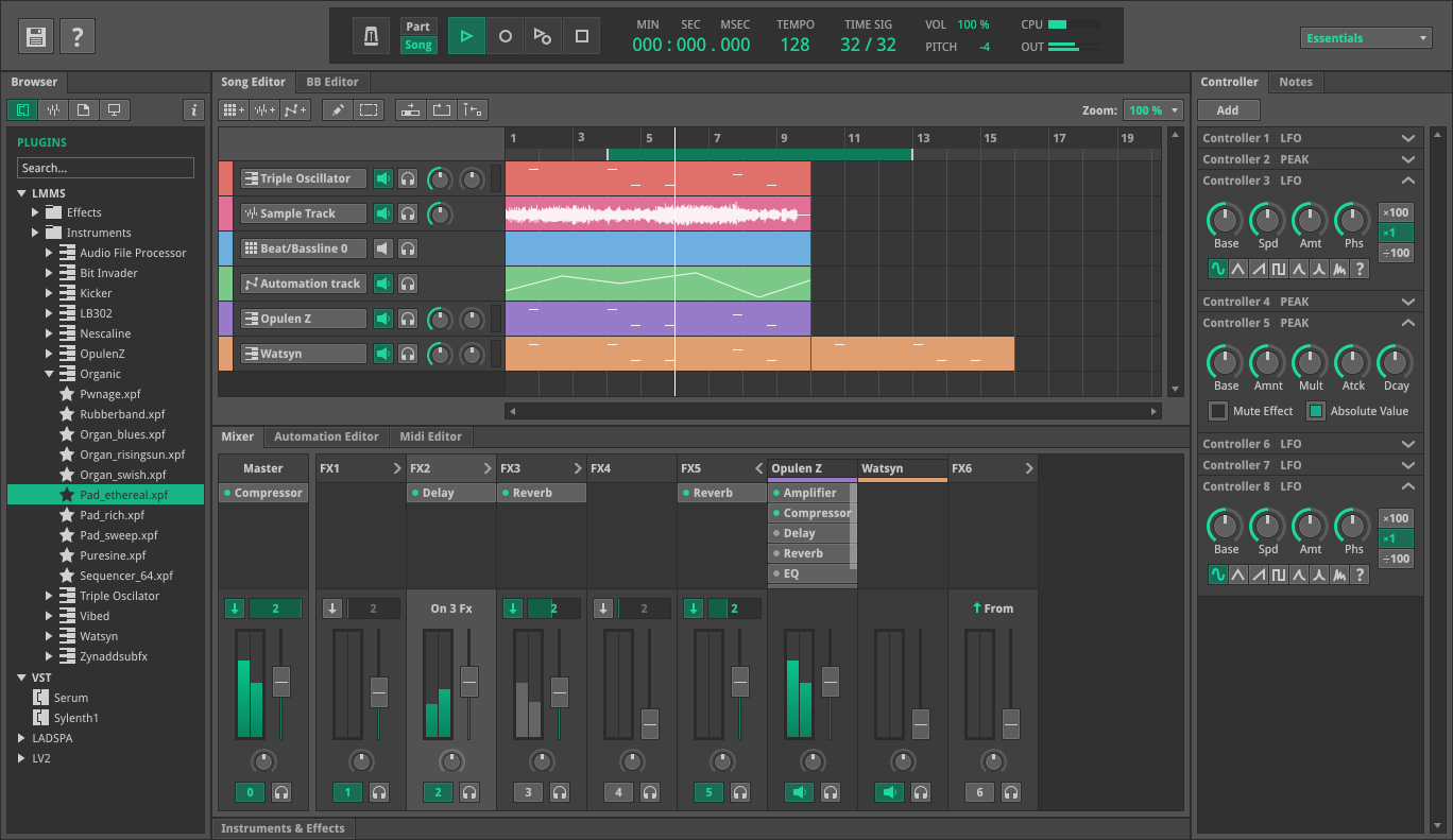
Lmms: Proposal for a bigger, modern looking time display
I have reactivated some old branch where I have experimented with a more modern looking time display. If you want to check out the current state for yourself you can find the branch at https://github.com/michaelgregorius/lmms/tree/timedisplay.
New look
Here's how it looks when showing the time:

Here's how it looks when showing beats, bars and ticks:

As you can see the tempo widget was moved to the right which makes the layout less cluttered.
Current look
For comparison here's the old implementation showing time:

And the old implementation showing beats, bars and ticks:

Caveat
However, there's still one caveat with the new implementation. Because it uses several labels the font used by the application must have numbers which are of equal width. Otherwise the layout will jump around when the time is updated. I think this might be fixed by putting a font into the resources of the application and using this font to display the time. That way it should work the same everywhere.
What do you think?
All 15 comments
I don't really like it. Maybe it's because it shares the same color of the icons, but it blends in to the background too much. To be honest though, I prefer the current look already and not sure why it needs to change.
If it's a matter of size and readability, what if we just stretched the existing counters to be larger? I think we could make the time-counters similar in size to your proposed New Look while squeezing everything within the 800px width still.
At the very least, put a dark-background color behind the counter text that makes it easier to focus on than the taskbar background.
Now thay you've mentioned it, I can see that the current layout might look a bit cluttered. That said, I don't find this particular style to improve it, and i share the readability concerns. In particular, I think it's an odd choice to simply have the numbers on the toolbar without any frame/bg/visual element to delineate it from the rest.
@Spekular Maybe we can approach the design of @budislav ?

@Spekular, when I tried to set the background of the TimeDisplayWidget to black only the child widgets in the layout had a black background for some reason:

I used the following code in the constructor of TimeDisplayWidget:
this->setStyleSheet("background-color:black;");
Anyone have an idea how to render the full background as black? Do I have to override the onPaint method of TimeDisplayWidget and paint the background manually black (or whatever color the background should be)?
Perhaps there's some sort of Area/Box/Frame/Rectangle/etc widget you could add? Otherwise I guess editing onPaint would be a solution
I think it'll probably be hard to make this style look good if the background still has a gradient. And if you remove the gradient in the top menu, suddenly there's a cascade of other gradients to remove. That might be harder than it seems to do while maintaing legibility, as right now the gradients play a role in highlighting things like hovers and pushed in buttons. There's also some skeumorphism in some design elements that could clash with a flatter theme.
Essentially, updating the display might look out of place unless another big theme overhaul happens, or it would be constrained by the current theme's look.
I'd like to make the following suggestions:
- Keep the green text color for the numbers to make them stick out better.
- Put the labels above the numbers because all languages I know read from top to bottom.

Technical details:
- label font size: 12px
- numbers font size: 32px
- numbers text color:
#0bd556
Optionally we can keep the dark green text color (#02200d) for leading zeros:

Or just entirely remove them:

The change in context:

...and maybe we can do a similar transformation for the tempo and time scale? :thinking:
I have created https://github.com/LMMS/lmms/pull/5118 now with my suggestion.
i prefer same font & color for digit info on main. A thing to remember is that the main-realestate maby could be used for some of the other new feature-related additions, that tracker already have received.
i prefer same font & color for digit info on main.
You mean white for labels and numbers?
the main-realestate maby could be used for some of the other new feature-related additions
Do you have an example of for those?
In my opinion the current play position is quite an important information that deserves a good amount of realestate. :smiley:
Do you have an example of for those?
387 uses the toolbar in a different configuration
Do you have an example of for those?
387 uses the toolbar in a different configuration
@musikBear Thank you for the link! :bowing_man: I think we can achieve this by reducing the font size. Maybe we can even make the toolbar resizeable and adjust the font size of the time display dynamically.
I think it's a bit absurd to try to leave room for every potential feature. If someone wants to implement #387, why not let them also rework the new time display? They would have to rework the current one as it stands.
Most helpful comment
@Spekular Maybe we can approach the design of @budislav ?