Lmms: Melody patterns do not make good use of height when enlarged
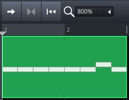
The current implementation draws the notes of melody patterns as lines regardless of the pattern's size:
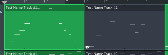
Also the notes are always painted underneath the text label even if the pattern is enlarged.
 michaelgregorius
All 11 comments
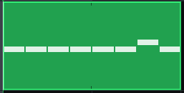
Fixed with #3699. The pattern above looks as follows at larger heights:
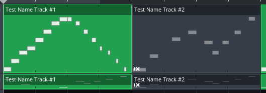
Please note that at larger heights the notes are moved completely below the text label. For patterns with a small height like in the second track the notes are drawn underneath the text label to make best use of the constrained space. #3699 also has an animated GIF that shows the dynamic aspects when the pattern is resized.
michaelgregorius
on 15 Jul 2017
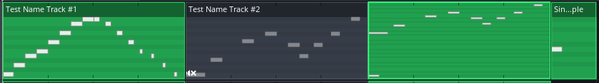
Here's a variation where the black keys are indicated in the pattern as well (only drawn when the notes are drawn as rectangles):
michaelgregorius
on 15 Jul 2017
Nice idea!
 BaraMGB
on 15 Jul 2017
BaraMGB
on 15 Jul 2017
It seems like the notes gain more opacity the bigger they get. Was that intended?
 Mark-Agent003
on 15 Jul 2017
Mark-Agent003
on 15 Jul 2017
@Mark-Agent003 I think what you observe is caused by the fact that for the notes in the third pattern you see more of their darker border than their inner fill. The code does not change the color or opacity depending on the note height.
michaelgregorius
on 15 Jul 2017
@michaelgregorius I find the black keys idea would just add unneeded complexity, and can't figure out a valid usecase for it. I like what you've done with the drawing, but I think the rectangles shouldn't have any border, just be plain single-colored, it will look sharper and nicer
 Umcaruje
on 15 Jul 2017
Umcaruje
on 15 Jul 2017
@Umcaruje I agree that showing the black keys rather adds clutter than useful information and that it might make the song editor very busy.
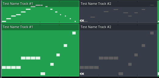
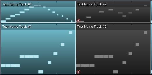
Regarding the note borders: my first implementation had notes without any borders. However, for some patterns the borders really help to convey a bit more information about whats happening in the pattern. Here's a pattern without borders:
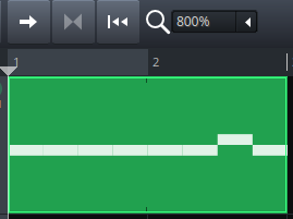
On first sight it looks like the pattern starts with one long note. Here's the same pattern with borders:
Here it's much more obvious that the pattern starts with several repeated notes.
I think the introduction of using a cosmetic pen (see this comment) in commit 4021db2468bc1e4790212c2c8906438e67999479 has also helped to make the rendering of the notes sharper.
michaelgregorius
on 16 Jul 2017
Perhaps if we do need the border, it can be green instead?
 RebeccaDeField
on 17 Jul 2017
RebeccaDeField
on 17 Jul 2017
@RebeccaLaVie I will give it a try. I guess it makes sense to expose these attributes in the CSS as well.
michaelgregorius
on 18 Jul 2017
@RebeccaLaVie With commit eae3a2ea5828c792bdd223af88e826c652f7b62e the properties for the note fill and border colors are now exposed to the style sheet. They are exposed for the muted and not muted cases. I have changed the style in the default theme such that the borders also use the background colors to yield as design as proposed by you.
Example for the default theme:
Example for the classic theme:
michaelgregorius
on 21 Jul 2017
Closed via merge of #3699.
michaelgregorius
on 26 Jul 2017
Related issues
 demmm
·
3Comments
demmm
·
3Comments
 Sawuare
·
3Comments
Sawuare
·
3Comments
 mikobuntu
·
4Comments
mikobuntu
·
4Comments
 Andrewer11
·
3Comments
Andrewer11
·
3Comments
 fentras
·
3Comments
fentras
·
3Comments
Most helpful comment
Fixed with #3699. The pattern above looks as follows at larger heights:
Please note that at larger heights the notes are moved completely below the text label. For patterns with a small height like in the second track the notes are drawn underneath the text label to make best use of the constrained space. #3699 also has an animated GIF that shows the dynamic aspects when the pattern is resized.