Lmms: Marked notes in the Piano Roll are hard to see
When selecting any scale and right-clicking on piano roll to mark the scale, the scale doesn't get marked in the Piano Roll editor view after clicking mark current scale. Windows version 64 bit.
 mundusnine
All 18 comments
@mundusnine I think you are doing it wrong.
First: Select a scale in the scale-dropdown
Then: Right-click on the key that you want for the already chosen scale!
LMMS correctly marks all notes belonging to the the chosen key in your scale.
I also explain more here:
https://www.youtube.com/watch?v=WhkwmABRtp4
 musikBear
on 22 Jun 2017
musikBear
on 22 Jun 2017
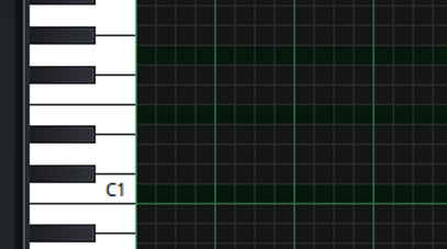
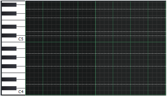
I also have an issue with this. It works in 1.1.3 and on stable 1.2.0 it does mark the notes but the marking is all black or very dark so it is a bit too hard to see. @RebeccaDeField code or theme?
Here is a C major marked.
 zonkmachine
on 22 Jun 2017
zonkmachine
on 22 Jun 2017
most probably theme, I'll look into this next week
 Umcaruje
on 22 Jun 2017
Umcaruje
on 22 Jun 2017
@mundusnine Can you follow the steps posted by MusicBear and send us a screenshot of what the result looks like on your end? I am curious to know if your issue is separate from what zonkmachine has posted.
@zonkmachine You're right, the marked notes are not bright enough. I will create a pull request for this.
 RebeccaDeField
on 22 Jun 2017
RebeccaDeField
on 22 Jun 2017
@RebeccaDeField Oh yes -I felt exactly the same as @zonkmachine -first i actually thought iy was broken, but then i realixed, that the marked notes was those that stood out the least :)
How about making then really deep grey (40,40,40)rgb would that look good? Again im always "usage first, design second" -but you know that by now :trollface:
musikBear
on 23 Jun 2017
So it basically gives me the same thing as zonkmachine. The marking works but the color isn't apparent enough, well for me. The devs can decide how they want it in the end but I think it will be easier for users to have a more apparent color like in 1.1.3 version 
mundusnine
on 3 Jul 2017
I totally agree that marked notes are hard to see. They should be a little bit brighter.
The issue here has to do with the GUI and the UX. The GUI and UX labels should be added.
The issue has to do with all marked notes Mark current scale is working, the issue's title should be changed to: Marked notes in the Piano Roll are hard to see.
 Sawuare
on 5 Aug 2017
Sawuare
on 5 Aug 2017
I totally agree that marked notes are hard to see. They should be a little bit brighter.
"They should be a little bit brighter."
Ehrr.. You do mean Darker -right? Current marked notes in scale are the darkest notes! Not those that are bright. Imo the marked notes should be very dark, almost 'black' rgb 80,80,80
musikBear
on 8 Aug 2017
@musikBear

Yes, marked notes should be a little bit brighter. I take back my "hard to see" statement as they are fine for me actually, but a little bit more of brightness would be better.
Sawuare
on 19 Aug 2017
I've already put some thought into this issue.
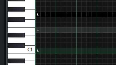
There are enough colors being used in the song editor grid that finding a combination with enough contrast is very difficult. Changing the marked notes to black as @musikBear mentioned does seem to help (1), but I'm afraid, not enough.
Optimal contrast could be achieved with a transparent overlay (2 and 3), which would require more work to implement, but I do not believe that lighter marked notes will work otherwise.
@Umcaruje
RebeccaDeField
on 15 Oct 2017
@RebeccaDeField Would it destroy design if marked notes used blue shades?
Green and blue usually goes well together, but then theres the issue of the color-blind. (jah i just sunk my own idea.. 🤡 )
I then vote for black i think it stands out enough, and im bat-visionary 👀
musikBear
on 16 Oct 2017
Is it possible to have a pattern drawn instead of a different color?
That would solve the color-blind issues.
 HummusSamurai
on 26 Dec 2017
HummusSamurai
on 26 Dec 2017
@HummusSamurai 'pattern' like hash-marked -It an idea, but i doubt it will be sufficient clear, and be stress-full for the eyes. I still think black is best as default
musikBear
on 27 Dec 2017
@musikBear I think @HummusSamurai suggests making stamping scales possible, just like how stamping chords is possible.
@HummusSamurai I will open an issue for that, but this issue here should still be fixed.
Sawuare
on 29 Dec 2017
I believe @musikBear actually understood what I'm going for.
HummusSamurai
on 30 Dec 2017
I will liken this to the children's books for practicing the writing of alphabets.
In those books, they have to move the pencil along a dashed line.
In other words, the dashed curved line is to guide them.
In LMMS, the marked notes serve the exact same purpose (of guiding the user where to place his notes).
If we look at those books, they have black dashed line on white pages (highest contrast).
In our case, the background is dark gray.
So why not have a dashed thin white line on it as marker?
 raindropsfromsky
on 28 Jan 2018
raindropsfromsky
on 28 Jan 2018
Here are some combination of white and gray lines (both solid and fine dashed).
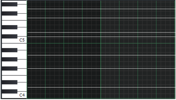
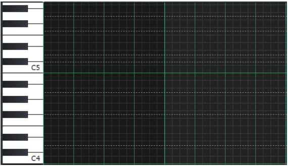
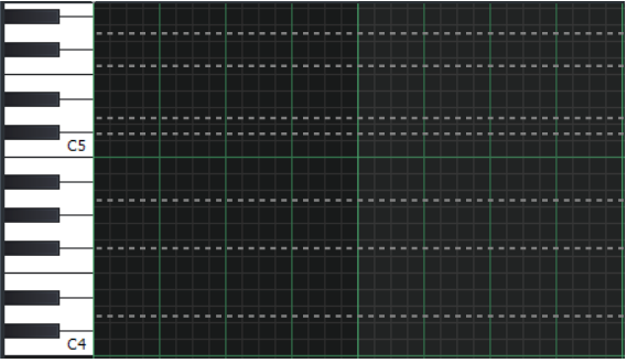
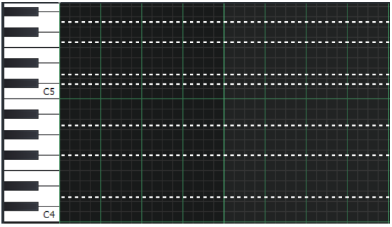
Finally, here is a comparison of thick/thin white/gray lines in a single image:
IMHO the thick white dashed line stands out against the grid lines.
All the other lines (especially the solid ones) look almost same as the grid lines.
raindropsfromsky
on 28 Jan 2018
@raindropsfromsky :'p if you had been a lmms 'vet', you would have known, that dashed lines is one of the things that has been disposed of, because it is
- very disruptive for eyes
- cause headache
- horrible ugly
Dashed lines gets a HUGE 👎 from me
musikBear
on 28 Jan 2018
Related issues
 Andrewer11
·
3Comments
Andrewer11
·
3Comments
 FigyTuna
·
3Comments
FigyTuna
·
3Comments
 Gabrielxd195
·
3Comments
Gabrielxd195
·
3Comments
 DeRobyJ
·
3Comments
DeRobyJ
·
3Comments
 Firepal
·
3Comments
Firepal
·
3Comments
Most helpful comment
@HummusSamurai 'pattern' like hash-marked -It an idea, but i doubt it will be sufficient clear, and be stress-full for the eyes. I still think black is best as default