Lmms: About track/FX channel mute automation
In automation of track(or FX channel) mute button, 0 means it isn't muted, and 1 means it is muted. In other LED controls, however, 0 means inactive state, 1 means active state.
Maybe people use track/FX channel mute automation very rarely, I think it can be confusing because the mute buttons of NOT muted tracks look like other LED toggles in ACTIVE state. First one has value 0 while second one has value 1. This issue also applies on controller connections.
How do you guys think about it?
 PhysSong
All 32 comments
I agree.
The problem here isn't in the automation itself, it's in the values of the button, you can check these values by right clicking on the button.
The values should be reversed to be 0 when it's inactive, and 1 when it's active.
I think that the button we are talking about here shouldn't be called the "_Mute_" button but called the "_Mute/Unmute_" button. People think that "_Mute_" button is the right name because the tooltip that the button displays when hovering over it (wether it's inactive or active) says: "_Mute this track_", which is false.
The tooltip should display "_Mute_" when it's active/unmuted & "_Unmute_" when it's inactive/muted.
The "_Solo_" button has the same problem as in the paragraph above. The tooltip that the button displays when hovering over it (wether it's inactive or active) says: "_Solo_", which is false.
The tooltip should display "_Solo_" when it's active/soloed & "_Solo_" when it's inactive/unsoloed.
 Sawuare
on 18 Jun 2017
Sawuare
on 18 Jun 2017
The text "mute" is fine, but I agree, it's a matter of context. You're right, the state is inverted in regards to the action. Making a negative state LED and an upgrade routine for backwards compatibility should be enough.
The solo button is logical and properly implemented/lit. More text is superfluous. This is an inverse-state problem, nothing more.
 tresf
on 18 Jun 2017
tresf
on 18 Jun 2017
I'd even take it a step further and say the mute should be lit up red. This would make it more obvious when a mute action has occurred, such as when the solo button is pressed on another track. Making all tracks go from green "audible" to red "muted" seems like better UI to me.
tresf
on 18 Jun 2017
setting the mute button's default state to off would make both LED's the same and the mute and solo buttons not distinguishable. I think we could switch to actual M and S buttons imho
 Umcaruje
on 18 Jun 2017
Umcaruje
on 18 Jun 2017
I think we could switch to actual M and S buttons imho
This idea was shot down before by one of our predecessors but this is consistent with other DAWs as well as @budislav's mockup. This would do just fine as well.
tresf
on 18 Jun 2017
cc @RebeccaDeField on the M/S buttons idea
Umcaruje
on 18 Jun 2017
How cross-lingual is "mute", BTW? Should we make the button translatable?
tresf
on 18 Jun 2017
Colored LEDS have the benefit of being easily distinguishable and allow users to visually understand what is enabled quite quickly. I saw this point repeated by other contributors in previous discussions as well, but don't believe this is a good reason to discard the M/S idea entirely. Perhaps the text can change color, a border could light up, or we add a pinstripe of color on the bottom for the best of both worlds?
My only real concern with switching a graphical element to text is the translation complications that Tres has already mentioned.
 RebeccaDeField
on 18 Jun 2017
RebeccaDeField
on 18 Jun 2017
No I'd actually have pixmaps with M and S on them that light up yellow and red when clicked on
Umcaruje
on 18 Jun 2017
I strongly disagree with changing the buttons to text. A single letter doesn't look bad, but it isn't descriptive.
As an Arabic translator, the text can be translated easily. It would look like this: "ك" for "M" & "إ" for "S"
I'd say we discard the red button and make the green button:
Mute/unmute when it's clicked. Green when unmuted and gray when it's muted.
Solo when it's double clicked.
Sawuare
on 19 Jun 2017
I don't see how a single letter that changes color is less descriptive than
just a LED that changes color.
M/S are also fairly standard and the user only needs to learn what they
mean once. If we're changing the LEDs I think it's a good way to go.
On Jun 19, 2017 00:36, "Hussam Eddin Alhomsi" notifications@github.com
wrote:
I strongly disagree with changing the buttons to text. A single letter
doesn't look bad, but it isn't descriptive.
As an Arabic translator, the text can be translated easily. It would look
like this: "ك" for "M" & "إ" for "S"I'd say we discard the red button and make the green button:
Mute/unmute when it's clicked. Green when unmuted and gray when it's muted.
Solo when it's double clicked.—
You are receiving this because you are subscribed to this thread.
Reply to this email directly, view it on GitHub
https://github.com/LMMS/lmms/issues/3639#issuecomment-309307428, or mute
the thread
https://github.com/notifications/unsubscribe-auth/AIgVmvA12DLqRBVEMHZFMb6Wf9B1vqjVks5sFaZWgaJpZM4N5thc
.
 Spekular
on 19 Jun 2017
Spekular
on 19 Jun 2017
Oh and double clicks aren't great either, they can add delay to a single
click action and some users actually struggle with them.
On Jun 19, 2017 00:41, wrote:
I don't see how a single letter that changes color is less descriptive
than just a LED that changes color.M/S are also fairly standard and the user only needs to learn what they
mean once. If we're changing the LEDs I think it's a good way to go.On Jun 19, 2017 00:36, "Hussam Eddin Alhomsi" notifications@github.com
wrote:I strongly disagree with changing the buttons to text. A single letter
doesn't look bad, but it isn't descriptive.
As an Arabic translator, the text can be translated easily. It would look
like this: "ك" for "M" & "إ" for "S"I'd say we discard the red button and make the green button:
Mute/unmute when it's clicked. Green when unmuted and gray when it's
muted.
Solo when it's double clicked.—
You are receiving this because you are subscribed to this thread.
Reply to this email directly, view it on GitHub
https://github.com/LMMS/lmms/issues/3639#issuecomment-309307428, or mute
the thread
https://github.com/notifications/unsubscribe-auth/AIgVmvA12DLqRBVEMHZFMb6Wf9B1vqjVks5sFaZWgaJpZM4N5thc
.
Spekular
on 19 Jun 2017
Design is updated #1911.
Headphones icon is for solo and speaker for mute.
In mixer mute is number of channel button.
 budislav
on 19 Jun 2017
budislav
on 19 Jun 2017

@budislav Cosmetically, this looks very nice, but I am wondering how standard these are for mute and solo? The speaker icon is pretty self-explanatory. Do any other DAWs use headphones for solo?
RebeccaDeField
on 22 Jun 2017
@RebeccaLaVie Any other DAW use m and s for mute and solo, and they also translate their interface but not those two letters I believe, someone should check that but I am pretty sure because they are usually raster or vector icons.
I found that speaker and headphone icons are the most common where letters aren't the rule. Yes headphones for solo.
budislav
on 22 Jun 2017
For what it's worth... I sort of like the headphones for solo. <3
tresf
on 22 Jun 2017
I don't think that speakers are good for mute/unmute.
I think that headphones are good for solo and speakers are good for unsolo.
Because using headphones usually means that the user doesn't want the sound to be heard by others "solo", and using speakers usually means that the user is ok with the sound being heard by others "not solo".
I don't really like the concept of speakers and headphones so my suggestion is a single button (the same green one currently) which mutes/unmutes with right clicks and solos with middle clicks (since left clicks are used for the context menu).
Sawuare
on 23 Jun 2017
so my suggestion is a single button (the same green one currently) which mutes/unmutes with right clicks and solos with middle clicks (since left clicks are used for the context menu).
No! Please not. That's really a user experience fail.
 BaraMGB
on 23 Jun 2017
BaraMGB
on 23 Jun 2017
@hussum-eddin-alhomsi I'm afriad that "middle click" would not work for people that don't use a standard mouse (trackballs and other types) such as myself.
I also want to point out that in budislav's proposal, the muted speaker and unmuted speaker icons are slightly different and I think that really adds clarity.
RebeccaDeField
on 23 Jun 2017
@BaraMGB @RebeccaLaVie
No! Please not. That's really a user experience fail.
Then removing a pattern from the song editor is a user experience fail too.
I'm afriad that "middle click" would not work for people that don't use a standard mouse (trackballs and other types) such as myself.
I forgot about that. Haven't used a non-standard mouse in a while. 😅
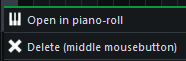
An easy workaround is a "Solo (middle mouse button)" option in the context menu of the green button.
Fl Studio has this method for soloing. It appears at the top of the context menu so it isn't uncomfotable.

Sawuare
on 23 Jun 2017
I don't find headphones for solo very intutive. What's worse is that
putting a headphone and a speaker icon next to each other looks like an
output device selection, which isn't what the buttons do at all.
Out-there idea: Figure out a new symbol/pictogram/whatever for solo/mute.
Maybe something like three/four bars. One with only stroke and the rest
with stroke+fill for mute, vice versa for solo. Probably not the best for a
tiny button and also very literal.
Otherwise I still think M/S buttons are the safest route.
On Jun 23, 2017 01:15, "Hussam Eddin Alhomsi" notifications@github.com
wrote:
@RebeccaLaVie https://github.com/rebeccalavie
I'm afriad that "middle click" would not work for people that don't use a
standard mouse (trackballs and other types) such as myself.I forgot about that. Haven't used a non-standard mouse in a while. 😅
An easy workaround is a "Solo (middle mouse button)" option in the context
menu of the green button.—
You are receiving this because you commented.
Reply to this email directly, view it on GitHub
https://github.com/LMMS/lmms/issues/3639#issuecomment-310527831, or mute
the thread
https://github.com/notifications/unsubscribe-auth/AIgVms80_tj7XGH097Ql4S2iCHtumhleks5sGvV8gaJpZM4N5thc
.
Spekular
on 23 Jun 2017
Out-there idea: Figure out a new symbol/pictogram/whatever for solo/mute.
Maybe something like three/four bars. One with only stroke and the rest
with stroke+fill for mute, vice versa for solo. Probably not the best for a
tiny button and also very literal.
This proposal is probably mockup worthy but I don't think the speaker is that confusing, since it's a push button, not a slider. People will figure it out. It represents more than just an LED and it's not misrepresented, just used elsewhere. I personally find chain links and paperclips confusing too, so I'm not opposed to setting our own standard, but some mockups will help that argument.
tresf
on 23 Jun 2017
Well you guys are just unbelievable. Someone should make a comic about this.
This is why I never ask anyone for opinion and I am just more sure about that every time.
So you guys finally decided to make a real mute and solo buttons after 20 years. Ok let's make it like the rest of the world this time, with simple letters m and s, the whole world knows what that means right, peoples who use DAW's especially they know that like they now what is music or what's their name.
Ok, you made a problem about that. Someone comes and say hey I can't translate that because I think it should be translatable. You are using DAW (digital audio workstation) and you don't know what letters m and s are. Two buttons that whole world knows what they are doing because you are using DAW. That will make a huge understanding problem when you are producing a music.
Ok let's make icons, the only solution here. So the most common symbols for mute and solo where letters are not welcome for some reasons nobody knows (I saw it in a lot of mobile apps and mixers and who knows where) are headphones and speaker.
No, that is not good, let's figure out a new symbol that whole world need to accept. Let's made a new standard because we don't like one that exist 40 years it's not good for us geniuses. Let's whole world knows that we really need to make everything totally different, even mute and solo buttons.
This is like a game make it totally different and it will never end. And this just goes level up. I remember this thing when I proposed a new mockup for the first time when I used Bitwig UI like system instead of tabs.
The main thing here is to make totally different from the best standard solutions that exist long time and really work. To make a problem where there are no problems, because why not. This does not lead to success I can tell you that.
And still the biggest problem with LMMS is UI workflow.
budislav
on 23 Jun 2017
And still the biggest problem with LMMS is UI workflow.
Wrong.
The main thing here is to make totally different from the best standard solutions that exist long time and really work. To make a problem where there are no problems, because why not. This does not lead to success I can tell you that.
Please back up a bit. The challenge to make a mockup was toward the person that disagreed with the proposal, not the one that made two perfectly valid proposals. If a better idea is proposed, it's worth entertaining. If not, we have three perfectly valid solutions: 1. Do nothing. 2. Use letters. 3. Use speakers.
If those proposing change can't improve upon what's already been offered, it will die. That's the nice thing about bad ideas, they have a way of working themselves out. :)
On the other hand, if something good is proposed, it would be silly not to consider it. As much as I agree that design is terrible for public discussion, it's not a whole lot of harm to keep a civil open forum. We have @RebeccaLaVie and @Umcaruje making final design decisions right now and that's been working just fine.
tresf
on 23 Jun 2017
@budislav Anyone can suggest or object to an idea and while that might provide some helpful feedback, we are well aware that it is impossible for every contributor to agree with one another on every issue. As tres mentioned, @Umcaruje and I have been heading up design decisions at the moment. Right now I see a few solid ideas regarding the mute and solo buttons so I wanted to do some research into the standards and usability of these options so that we can make an educated decision.
I asked about the translation complications and someone confirmed that it would not be a problem. I asked if the icons are used in other DAWs and you confirmed that it would not be a problem.
I would hope that the noise that can surround these decisions does not discourage you from participating. I value your feedback a lot.
RebeccaDeField
on 23 Jun 2017
Sorry for noise @tresf , everyone, just keep going.
Don't worry @RebeccaLaVie, have your back :)
budislav
on 23 Jun 2017
Idea:
We use the icons for the mute and solo buttons. If we receive complaints that users are unable to easily recognize the icons, we switch to the more standard M/S text.
RebeccaDeField
on 3 Jul 2017
I vote for M S. This is how it works in every DAW I know. I don't see why we should go a spezial way for this. The Icons don't have any benifit over M S.
BaraMGB
on 3 Jul 2017
I think it should be m s for English UI users, but who changes on other language it should automatically change to icons, also that should be in settings so user can change on what he prefer :)
budislav
on 3 Jul 2017
Settings is not a place to settle UI disputes. It's either, not both please.
tresf
on 4 Jul 2017
@BaraMGB makes a fair point. Maybe we should approach this the other way around. Switch to M/S text. If this causes problems for the users relying on the translated letters, we can implement the icons as we did with the artwork tabs. I think both are valid options and we have already laid out the pros and cons so we can really only know what works if we try.
If @Umcaruje doesn't already have something in mind, I'd be willing to work on some mockups for the updated buttons to move forward.
RebeccaDeField
on 4 Jul 2017
@tresf I agree.
I think M/S are known for the whole world. Anyone from music industry knows that. There is no need to make a science from this. I believe nobody have ever complained about this for any DAW, otherwise they would make something about that.
For the beginning let's not be different from the whole world.
budislav
on 4 Jul 2017
Related issues
 TrumpislikeCyrus
·
4Comments
Sawuare
·
3Comments
TrumpislikeCyrus
·
4Comments
Sawuare
·
3Comments
 softrabbit
·
3Comments
softrabbit
·
3Comments
 demmm
·
3Comments
demmm
·
3Comments
 DeRobyJ
·
3Comments
DeRobyJ
·
3Comments
Most helpful comment
I vote for M S. This is how it works in every DAW I know. I don't see why we should go a spezial way for this. The Icons don't have any benifit over M S.