Lighthouse: Visited links are unreadable in dark mode | CSS
Text is purple when visited this is an css bug
Provide the steps to reproduce
Click on an url for example the vulnerability link to synx
What is the current behavior?
Purple
What is the expected behavior?
white or other color
Environment Information
- Affected Channels: Lighthouse overview page
- Lighthouse version: 5.2.0
- Node.js version: v12.8.0
- Operating System: MAC
 TheHunterDog
All 7 comments
Thanks!
I notice that the light-theme has the same issue. Weird. I then jump to google.com and notice the same (devtools shows no default useragent stylesheets for . I find this SO post suggesting that link colors for a:visited):visited / not :visited have been standardized, and claims that Chrome does this, but I'm not seeing that ...
EDIT: nvm about google.com, turns out I just can't distinguish the colors. But still holds that Chrome doesn't provide a default style for a:visited?
 connorjclark
on 26 Sep 2019
connorjclark
on 26 Sep 2019
- We cover-up the default link styles with this:
.lh-audit-group a, .lh-category-header__description a, .lh-audit__description a, .lh-footer a {
    color: var(--color-informative);
}
- Disable the above, and you can apply the
:visitedstate in DevTools to see that Chrome does do what the SO post above suggests. I was looking for something like:visited, but Chrome implements it with:-webkit-any-link { color: -webkit-link}see blink internals
connorjclark
on 26 Sep 2019
@TheHunterDog you're saying that lighthouse has purple visited links in dark mode, right? I can't reproduce this. Can you share a screenshot?
 paulirish
on 26 Sep 2019
paulirish
on 26 Sep 2019
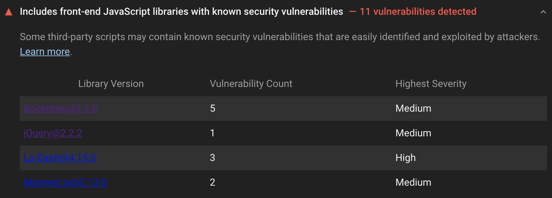
I had it on the link that links to synx jquery venerability's
TheHunterDog
on 7 Oct 2019
@paulirish @TheHunterDog. Same goes for non-visited links as well.
In best practices section, audit's for security vulnerability links are not readable in dark mode
Screenshot:

 gokulkrishh
on 10 Jun 2020
gokulkrishh
on 10 Jun 2020
Lighthouse 5.2 does have unreadable links in the vulnerabilities audit however these links have the correct coloring in LH 6.2.
In LH 5.2:
.lh-audit-group a, .lh-category-header__description a, .lh-audit__description a, .lh-footer a {
    color: var(--color-informative);
}
Links should be colored properly according to this CSS code, however this did not apply to the vulnerabilities audit table item links in LH 5.2 because that audit was not a part of an audit group and so .lh-audit-group a did not apply. The "Learn more" link does have proper coloring because it is a link in an audit description (.lh-audit__description a).
I haven't found the exact version where this change was made, but by 6.2 the vulnerabilities audit was put into the "Trust and Safety" group, and so the report gave links in that audit their proper coloring. Additionally .lh-table-column--link a was added to the list of classes.
All links I could find are covered by the CSS rule in 6.2. We could prevent this issue from popping up in the future by having the CSS rule apply to all links regardless of class. Otherwise I think we can consider this resolved.
 adamraine
on 25 Aug 2020
adamraine
on 25 Aug 2020
Let's tweak the anchor styles to be more defensive. Probably on all a (to handle cases where an embedder has their own styles)
paulirish
on 15 Sep 2020
Related issues
 muuvmuuv
·
3Comments
muuvmuuv
·
3Comments
 etelai
·
3Comments
etelai
·
3Comments
 mjara74
·
3Comments
mjara74
·
3Comments
 motiejuss
·
3Comments
motiejuss
·
3Comments
 asistapl
·
3Comments
asistapl
·
3Comments
Most helpful comment
Lighthouse 5.2 does have unreadable links in the vulnerabilities audit however these links have the correct coloring in LH 6.2.
In LH 5.2:

Links should be colored properly according to this CSS code, however this did not apply to the vulnerabilities audit table item links in LH 5.2 because that audit was not a part of an audit group and so
.lh-audit-group adid not apply. The "Learn more" link does have proper coloring because it is a link in an audit description (.lh-audit__description a).I haven't found the exact version where this change was made, but by 6.2 the vulnerabilities audit was put into the "Trust and Safety" group, and so the report gave links in that audit their proper coloring. Additionally
.lh-table-column--link awas added to the list of classes.All links I could find are covered by the CSS rule in 6.2. We could prevent this issue from popping up in the future by having the CSS rule apply to all links regardless of class. Otherwise I think we can consider this resolved.