Lighthouse: Improved loading message
It would be better if it showed the domain instead of "Auditing your website".
So for example if I'm auditing https://m.youtube.com, it would show "Auditing m.youtube.com" instead of "Auditing your site".
 fronbasal
All 20 comments
A lot more we can do here as well:
- Inform about throttling settings
- Notify them of URL
 patrickhulce
on 29 Sep 2017
patrickhulce
on 29 Sep 2017
Hi folks- finally took a crack at this but would love feedback. I focused mostly on the DevTools Lighthouse experience but we can apply this easily to the Extension. To summarize- at this point, the user has clicked "Run Audit," checked performance, and these screens pop up for the "performance" section of the report.
Based on my understanding, there are three stages that the user sees in the performance report: 1) throttling and loading the page 2) actually getting the numbers and computing the score 3) generating the report. I created different screens for each of these stages.
Here are the reportable high-level differences:
- URL name that is being audited in the title of the screen (focused on TLD)
- Progress bar to indicate where the user is in generating the performance of the report (apologies for the ugly progress bar in the mock)
- Changed copy about what is going on, and learn mores to surface more relevant documentation.
- 'Did you know?' section focused on more performance-related fun facts, which we can also use to showcase the business importance of performance. These facts can probably rotate out every run, so users can see new facts every single time. Not sure how useful, so we can also delete.
Let me know if there's any feedback.
Stage 1 Mocks:
Stage 2 Mocks:

Stage 3 Mocks:
 vinamratasingal-zz
on 10 Oct 2017
vinamratasingal-zz
on 10 Oct 2017
As discussed in the Lighthouse meeting, we're thinking of doing the following:
- For the upcoming sprint, handle adding in the URL to the loading screen, v0 progress bar, some did you know facts, and some copy to explain what Lighthouse is doing under the hood (no Learn Mores/external URLs)
- For future sprints, add in URL support (esp once DevWeb content is ready).
vinamratasingal-zz
on 10 Oct 2017
Sounds awesome! Have fun doing the sprint :)
fronbasal
on 11 Oct 2017
Instead of "fun facts" you should call it "fast facts"!
 dmitrig01
on 12 Oct 2017
dmitrig01
on 12 Oct 2017
Great idea! Thanks for the input.
vinamratasingal-zz
on 12 Oct 2017
This will be exclusive to devtools.
Remaining:
- finalizing the strings (did you know, etc)
- impl of showing these strings
- impl of reverse exponential progress bar
 paulirish
on 16 Oct 2017
paulirish
on 16 Oct 2017
@vinamratasingal do you have the results of the fast facts survey and final strings we'll be using?
patrickhulce
on 26 Oct 2017
@vinamratasingal this is the ~first~ second pass after sitting down with @paulirish, feedback welcome
 patrickhulce
on 21 Nov 2017
patrickhulce
on 21 Nov 2017
(patrick updated the image above, for anyone who was looking at the old image in their inbox.) :)
paulirish
on 22 Nov 2017
Hey Patrick! Thanks so much for putting this together, this is a great start. Here is my feedback/questions:
- What was the reason for moving the fast facts out of its own section and into the main section? Also, what are your thoughts on explicitly labeling it as a "fast fact"? My concern is right now, the fast fact appears for <1 second, so it's hard for the user to read it. Moving to its own section might solve that (also open to other suggestions to solve this problem).
- Love the "Lighthouse is warming up!"
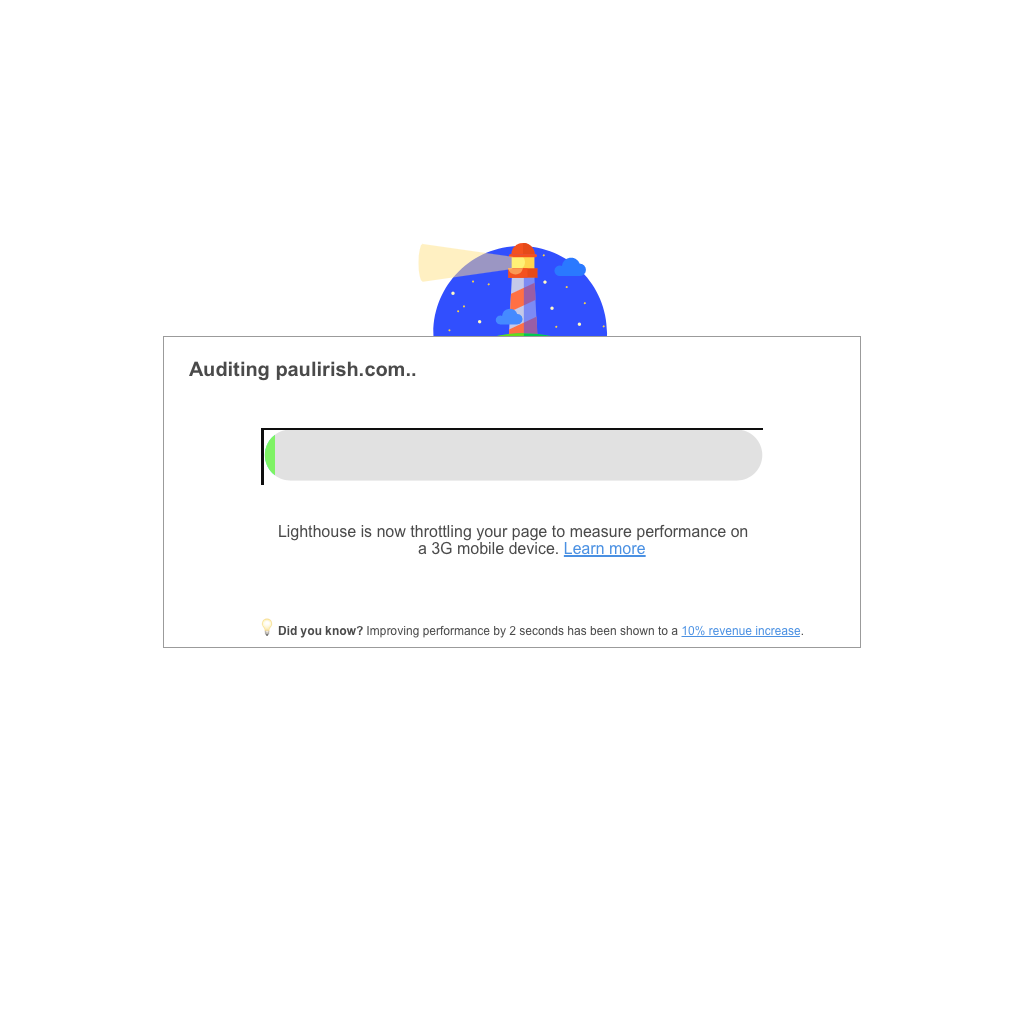
- The "Lighthouse is loading your page..." copy seems a bit too wordy to me. Can we rephrase to: "Lighthouse is emulating your page on a 3G network mobile device" OR "Lighthouse is throttling your page to measure performance on a 3G network mobile device." I think it's important for us to mention 3G network somewhere in there.
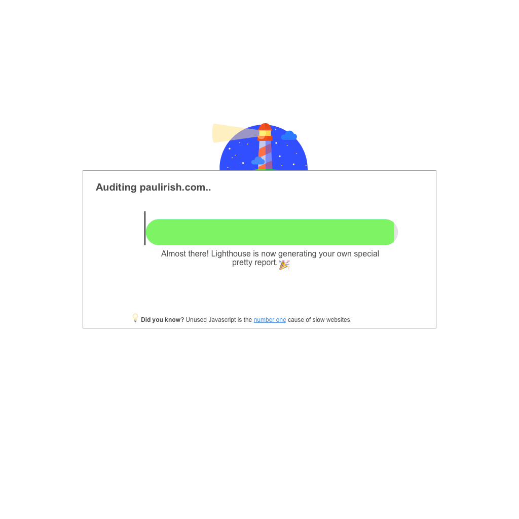
- For the last text before the report is generated ("Almost there! Lighthouse is..."), I kind of liked the copy I had in the mocks :P I feel like "generating your own special report" makes it less dry, but happy with the text you have as well.
Let me know what you think!
vinamratasingal-zz
on 22 Nov 2017
What was the reason for moving the fast facts out of its own section and into the main section? Also, what are your thoughts on explicitly labeling it as a "fast fact"? My concern is right now, the fast fact appears for <1 second, so it's hard for the user to read it. Moving to its own section might solve that (also open to other suggestions to solve this problem).
Started with fast fact in its own section and it was really a lot going on, we moved it up there to clean things up a bit. The <1s is an artifact of this particular run. Each message is shown for 8 seconds until progress has been made to move to the next section. If things load/move quickly the messages will be on the screen for much less time like in this example (partly why I included this one to give realistic impression of what might happen :) ). @paulirish and I discussed the possibility adding a minimum length of time something must be shown in a future iteration, but personally the zipping by of text actually makes the run feel much faster then allowing ample time to read all the text. There's only like ~12 fast facts so seasoned LHers will have plenty of opportunity to read them on slower runs. Paul wasn't a fan of labelling "fast fact", I'm somewhat ambivalent. When not separated out from main loading text I think the lightbulb distinguishes it enough.
Love the "Lighthouse is warming up!"
Yay! 🎉
The "Lighthouse is loading your page..." copy seems a bit too wordy to me. Can we rephrase to: "Lighthouse is emulating your page on a 3G network mobile device" OR "Lighthouse is throttling your page to measure performance on a 3G network mobile device." I think it's important for us to mention 3G network somewhere in there.
For the last text before the report is generated ("Almost there! Lighthouse is..."), I kind of liked the copy I had in the mocks :P I feel like "generating your own special report" makes it less dry, but happy with the text you have as well.
Yeah that sounds good I'll switch to those
patrickhulce
on 22 Nov 2017
Apologies for the late response on this, and thanks for the detailed response Patrick!
I'm OK with not labeling it explicitly as a fast fact. However, I do think that given that these facts might appear for <1 seconds for certain runs (thereby making it impossible for users to read it), separating it out and perhaps decreasing the size of the fast facts so that a) it's clearly separated visual hierarchy and it feels like there's less going on and b) those who want to read a fact can read it. @paulirish @patrickhulce WDYT? I don't want us to block on this, but I do feel that with the way it's currently implemented, not sure how much benefit users will get out of the fast facts... especially if we're planning on adding Learn More links (there will be 0 time for users to click on them).
Another idea is to change the underlying implementation of the progression such that we can guarantee at least 3-4 seconds for the Fast Fact to be shown on the screen. WDYT?
I also don't want to keep dragging this out so and be the blocker so if we can't reach consensus here, I'm happy to try to collect some more data or bring in Hwi for an expert opinion :)
Vinamrata
vinamratasingal-zz
on 28 Nov 2017
Yeah makes sense 👍 I like the proposal of waiting at least 3-4 seconds. Would you be comfortable with the final message being shown for potentially less time if the entire run finishes early? i.e. we don't artificially delay the report just so you can finish reading the fast fact
patrickhulce
on 28 Nov 2017
👍 on trying to keep each visible for 3-4 seconds.
paulirish
on 29 Nov 2017
Shweeettt. Let's do it team. Let me know if there are any questions :)
vinamratasingal-zz
on 30 Nov 2017
updated! see https://chromium-review.googlesource.com/c/chromium/src/+/809912 for progress on CL review

patrickhulce
on 6 Dec 2017
Awesome work, guys! Let's hope this gets into the new Chrome release :)
fronbasal
on 6 Dec 2017
Ahhh Patrick I forgot to respond- I think it's OK if the run finishes early for the fast fact to not be displayed :)
It still feels a bit too fast, but it could just be that specific run. If we can mess around with the timings a bit more to give more time to the Fast Fact, that would be great, but otherwise NBD and LGTM.
vinamratasingal-zz
on 7 Dec 2017
landed!
patrickhulce
on 4 Jan 2018
Related issues
 mohanrohith
·
3Comments
mohanrohith
·
3Comments
 motiejuss
·
3Comments
motiejuss
·
3Comments
 timj2
·
3Comments
timj2
·
3Comments
 mbparvezme
·
3Comments
mbparvezme
·
3Comments
 etelai
·
3Comments
etelai
·
3Comments
Most helpful comment
Instead of "fun facts" you should call it "fast facts"!