Light-client: I want to see my transfers
User Story
As Chris I want to see my transfers in the dApp.
Acceptance criteria
- Have a small overview on the transfer screen
Tasks
 christianbrb
All 19 comments
Current status of the discussion
christianbrb
on 20 Apr 2020
Discussion:
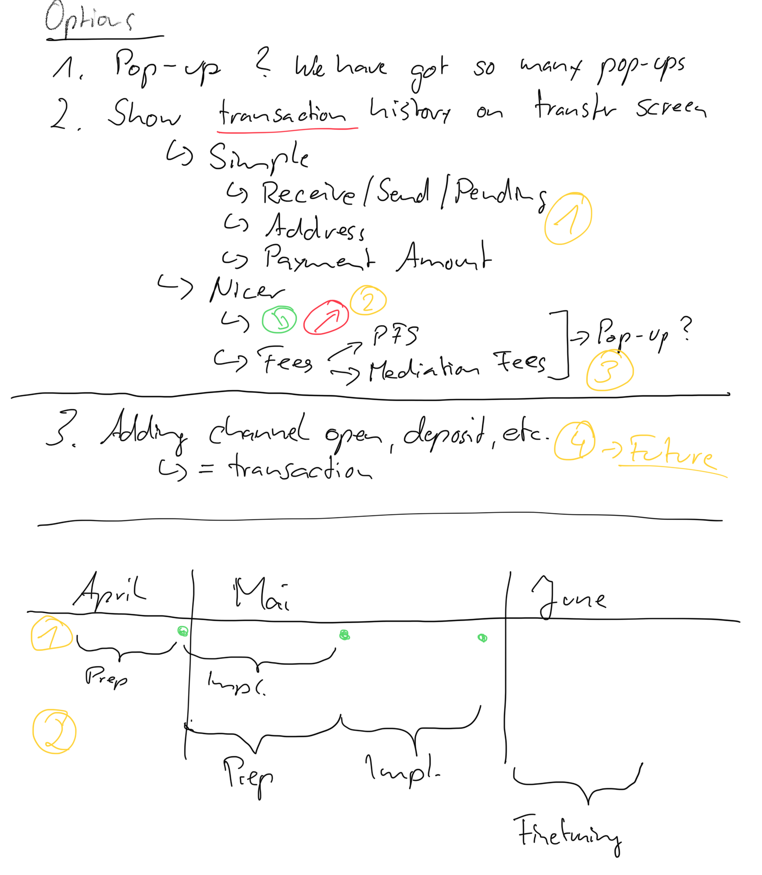
- Proposal: Instead of using Pending and Confirmed having the detailed status of the transaction like in the transfer model.
- We go with the second screen
christianbrb
on 24 Apr 2020
* Proposal: Instead of using Pending and Confirmed having the detailed status of the transaction like in the transfer model.
I was thinking of exactly the same thing during the discussion. It doesn't make any sense to have an expansion just for the status we can show the status directly into the chip in the transfer history.
 kelsos
on 27 Apr 2020
kelsos
on 27 Apr 2020
@taleldayekh @sashseurat I have been thinking about your proposal
Do you see a possibility to stack address and amount (as it is right now) instead of putting them next to each other? We could maybe reduce the size of the transaction history or rearrange the buttons.
christianbrb
on 27 Apr 2020
@taleldayekh @sashseurat I have been thinking about your proposal
Do you see a possibility to stack address and amount (as it is right now) instead of putting them next to each other? We could maybe reduce the size of the transaction history or rearrange the buttons.
Why?
 sashseurat
on 28 Apr 2020
sashseurat
on 28 Apr 2020
So Talel and i discussed the input fields and decided we need to validate the assumption the input fields work better this way, and collect feedback from non raiden devs if the input fields are too short or not. Then according to that - plan how they will appear in the next iteration.
sashseurat
on 28 Apr 2020
Regarding the different states / process messages (other than confirmed & pending), is this what you guys are referring to?
https://github.com/raiden-network/light-client/pull/1286
If so, we can explore that idea, but it will take a couple of days of extra work. For this iteration there should be feedback regarding the messages and we can see how much critical it is for the user to have those steps in (and plan accordingly).
sashseurat
on 29 Apr 2020
Great that you plan to collect feedback!
collect feedback from non raiden devs if the input fields are too short or not
Just to add the background to my comment: We experimented with displayed partial addresses before but then got the feedback from @czepluch that it would be better to have some option to see the full address (https://github.com/raiden-network/light-client/issues/930) – was not related to input fields though
 nephix
on 30 Apr 2020
nephix
on 30 Apr 2020
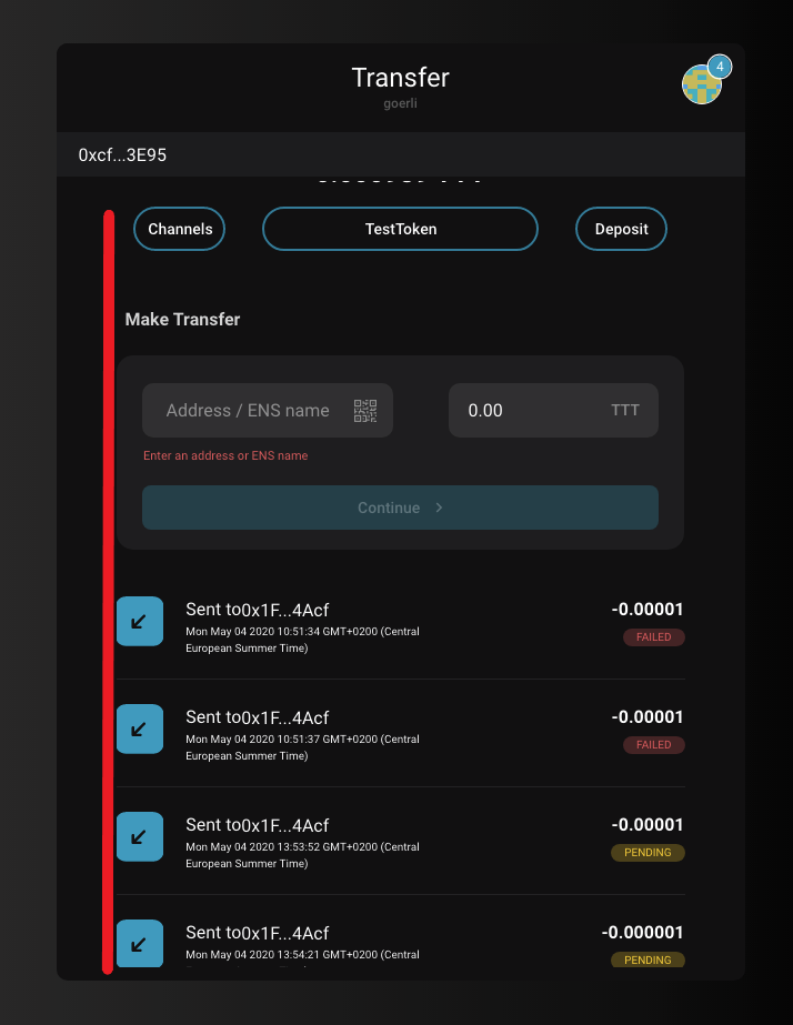
@taleldayekh Thanks for providing the first in-dev screenshot ;)
It looks nice :)
Could we align the transfer area and the history differently? It looks quite mixed at the moment (grey area around transfer, no grey area surrounding the history, transfer has a label, history not, my visual perception sees a broken line between the channels and continue button and the send/receive indicator)
Let's briefly discuss in the daily.
christianbrb
on 4 May 2020
Wouldn't sent transfers be the up-right arrow? I'd feel down is received. Nonetheless, very nice overall, thanks!
 andrevmatos
on 4 May 2020
andrevmatos
on 4 May 2020
@andrevmatos Yes, you are right.
 taleldayekh
on 4 May 2020
taleldayekh
on 4 May 2020
@taleldayekh Thanks for requesting feedback.
The alignment already looks much better.
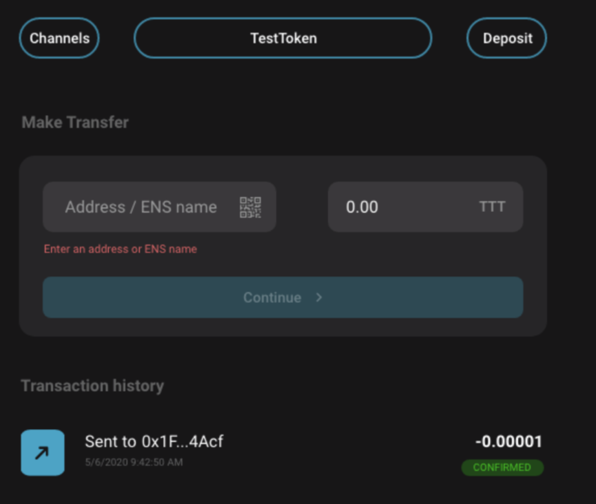
Could you delete the new gray area and align the continue button and the address with "Make Transfer" and "Transfer History" (upper case) on the left and the continue button and the amount field with the transfer amounts on the right.
Let us have a brief call if it is not obvious what I have tried to describe.
christianbrb
on 6 May 2020
@christianbrb are you referring to the gray area grouping the transfer fields?
kelsos
on 6 May 2020
Yes
christianbrb
on 6 May 2020
Is there any specific reason why we should remove it? In my prespective it seems to provide a nice grouping of the components.
kelsos
on 6 May 2020
For grouping it might make sense.
We either need it for "Make Transfer" and "Transfer History" or we remove it for "Make Transfer". It is just a mixed state right now.
christianbrb
on 6 May 2020
We shouldn't have a red colored Please enter an address or ENS name. As long as the user hasn't entered something he made nothing wrong and typically red indicates that.
The font size of Please enter an address or ENS name looks smaller than it has been before. It should be 14px. No font should be smaller than 12px.
christianbrb
on 6 May 2020
If this is considered a hint then yes it should not be red, but at least the planned default behavior for the control would be to display nothing before the user touching the input.
kelsos
on 6 May 2020
Feedback:
- Icon color (other gray as this one is not visible)
- Transaction -> Transfer
christianbrb
on 11 May 2020
Related issues
nephix
·
3Comments
christianbrb
·
3Comments
 agatsoh
·
4Comments
christianbrb
·
5Comments
agatsoh
·
4Comments
christianbrb
·
5Comments
 MrCleanerPickerUpper
·
6Comments
MrCleanerPickerUpper
·
6Comments
Most helpful comment
So Talel and i discussed the input fields and decided we need to validate the assumption the input fields work better this way, and collect feedback from non raiden devs if the input fields are too short or not. Then according to that - plan how they will appear in the next iteration.