Layer5: Enhance landscape categories section wrapping
As noted in https://github.com/layer5io/layer5/issues/65#issuecomment-536144029, the Categories section on the Service Mesh Landscape page currently wraps category cards by floating them down in a way that functions poorly on smaller screens.
Here is how the Categories section currently looks on a 1280px display:
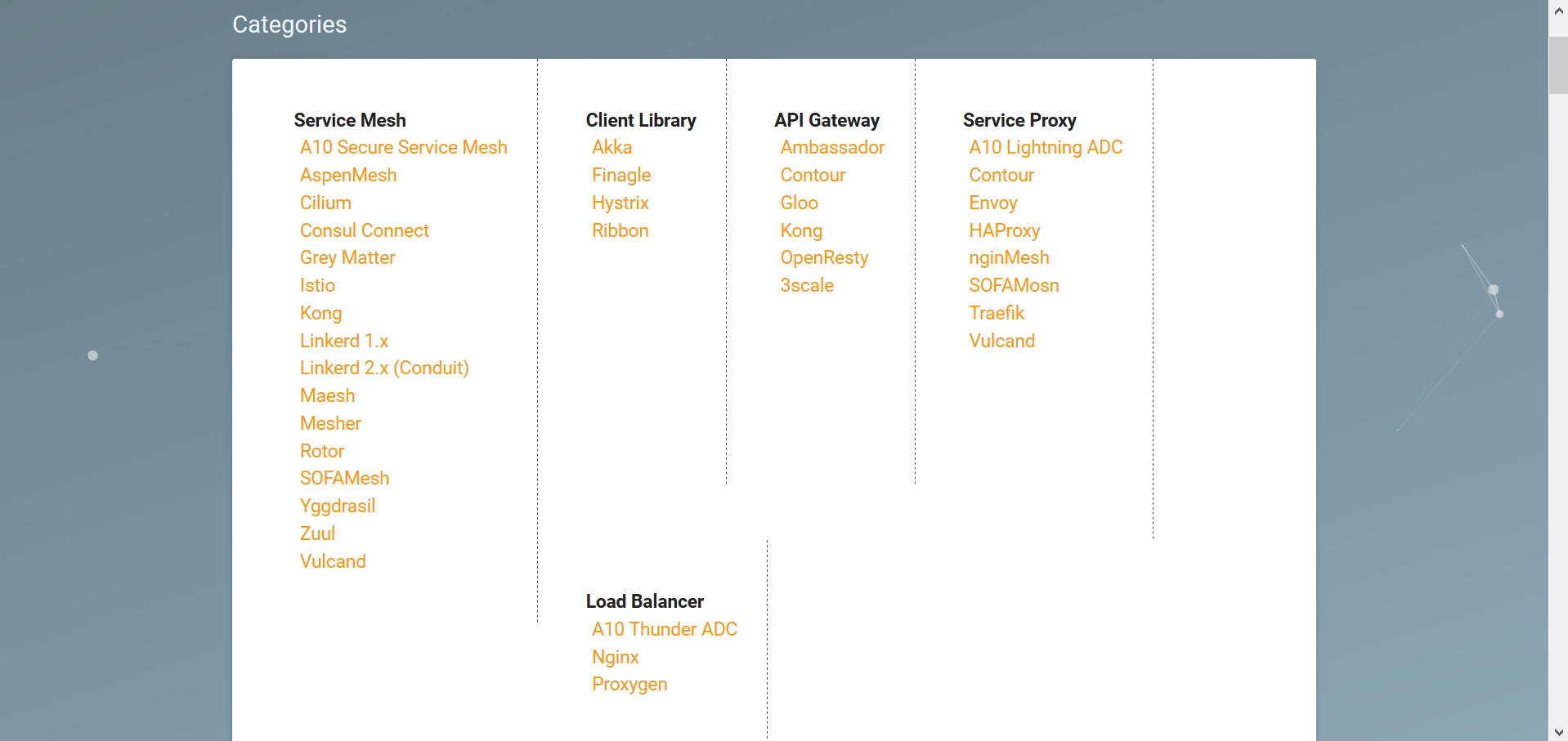
Note that scrolling the page was required to reveal the Load Balancer category.
As more categories will be added in the future (as per https://github.com/layer5io/layer5/issues/65#issuecomment-536144417), this section should be restyled to promote scalability.
 Silvyre
All 5 comments
I think the categories might scale better if aligned in a vertical stack. I'll have a mockup soon.
Silvyre
on 2 Oct 2019
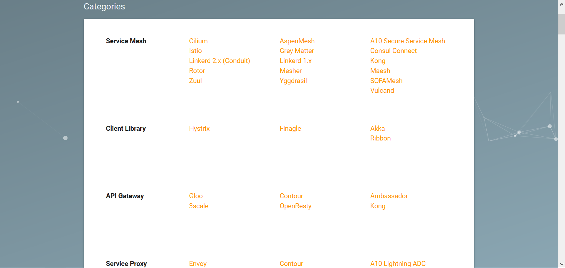
A minimal proof of concept for a vertically-stacked categories section can be generated by adding a few CSS rules:
.card .card-content li {
  float: right;
  width: 200px;
}

.card .card-content {
  border: none;
}
On a 1280px display:
Alternatively, with some padding removed and the dotted border reoriented:
.card .card-content {
  border-right: unset;
  padding: 0 0 5px 0;
}

.card .card-content:not(:last-child) {
  border-bottom-width: 1px;
  border-bottom-style: dashed;
  border-bottom-color: var(--main-dark-grey);
}

Any thoughts, @yogi4?
Silvyre
on 2 Oct 2019
@Silvyre thanks for jumping in here and providing a couple choices of restyling. This wrapping issue has long plagued the site.
The second of your mockups in which a dashed line is used to separate the categories looks like a winner. We would love to receive your PR here.
 leecalcote
on 2 Oct 2019
leecalcote
on 2 Oct 2019
Thank you so much, Lee! I'm thrilled to contribute my first Hacktoberfest PR to your project!
Silvyre
on 2 Oct 2019
Ha! That's awesome. :) If you haven't see it already, be sure to checkout the Meshery project --> https://github.com/layer5io/meshery. Contributions are warmly received there as well.
See the Meshery Contributor Welcome Guide and join the Slack account to get better connected with the community - http://slack.layer5.io. I'd love to see you in there.
leecalcote
on 2 Oct 2019
Related issues
 chandrashritii
·
12Comments
chandrashritii
·
12Comments
 Tanuj22
·
33Comments
leecalcote
·
10Comments
Tanuj22
·
9Comments
leecalcote
·
9Comments
Tanuj22
·
33Comments
leecalcote
·
10Comments
Tanuj22
·
9Comments
leecalcote
·
9Comments