Kuma: T - Auth provider logos should be grayscale
On the sign-up page, we show the chosen authentication provider's logo with a checkmark, and then to the right, the user's avatar from this provider.
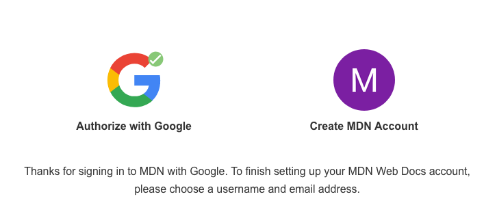
The original design calls for these logos to be grayscale.
 schalkneethling
All 16 comments
@atopal @tobinmori I have one question around this though. Looking at Google's brand guidelines, it looks like we are not even allowed to use the G version of their logo:
https://www.google.com/permissions/logos-trademarks/
It also seems to suggest that the logo should always be full-color on a white background. Do we have special permission to:
- Use the
Glogo and, - Display it grayscaled?
schalkneethling
on 14 Feb 2020
This is probably the better guidelines to follow @schalkneethling @atopal :
https://developers.google.com/identity/branding-guidelines
For identity stuff we can use the logo and size appears not to matter, but, yes - looks like it needs to be in color, according to this:
"Regardless of the text, you can't change the size or color of the Google "G" logo. It must be the standard color version and appear on a white background. If you need to create your own custom size Google logo, start with any of the logo sizes included in the download bundle."
 tobinmori
on 14 Feb 2020
tobinmori
on 14 Feb 2020
No offense to Nick, but I never understood the grey'ing out of the logos. In my 2020 head, that means it's disabled or loading.
 peterbe
on 14 Feb 2020
peterbe
on 14 Feb 2020
Yea, I was surprised by that tweak, it's standard practice to not mess with a company's logo. Company's really don't like that, understandably.
tobinmori
on 14 Feb 2020
This is probably the better guidelines to follow @schalkneethling @atopal :
Thanks, Tobin! Ah yes, but that is when used with(in the context of) a "Sign in to Google" button. Also, technically our button layout does not match https://developers.google.com/identity/branding-guidelines#padding
I would personally vote to update both our buttons to resemble what is suggested above btw. :)
When we use it on the sign-up page, it is in a completely different context and is used standalone, so I do wonder whether the overall https://www.google.com/permissions/logos-trademarks/ trademark rules apply here?
schalkneethling
on 15 Feb 2020
@atopal can we get your feedback on this one? is using a B/W Google approved by them?
tobinmori
on 19 Feb 2020
bumping this @atopal @malqinneh
https://www.google.com/permissions/logos-trademarks/
Google says here:
1) cannot alter colors
2) cannot use the 'G'
Also, should we block the launch until we resolve this?
tobinmori
on 24 Feb 2020
Okay, let's not change he color. Let's also remove the G and let's keep the checkmark.
 atopal
on 25 Feb 2020
atopal
on 25 Feb 2020
Okay, let's not change he color. Let's also remove the G and let's keep the checkmark.
What would use in place of the G?
schalkneethling
on 25 Feb 2020
Google seems to only specify guidelines for a sign-in _button_ here:
https://developers.google.com/identity/branding-guidelines
Not sure what would go in place of the G. Any ideas @atopal @malqinneh ?
tobinmori
on 25 Feb 2020
Showing/communicating to users that their 'Account' (previously 'Profile') avatar will be pulled via GitHub/Google (respectively), there are no advantages to having that section appear in the sign up flow. It's one more thing we're asking users to consider but unlike 'Username' and 'Email', users are not able to change their avatar from the MDN sign up flow.
How do you feel about the following:

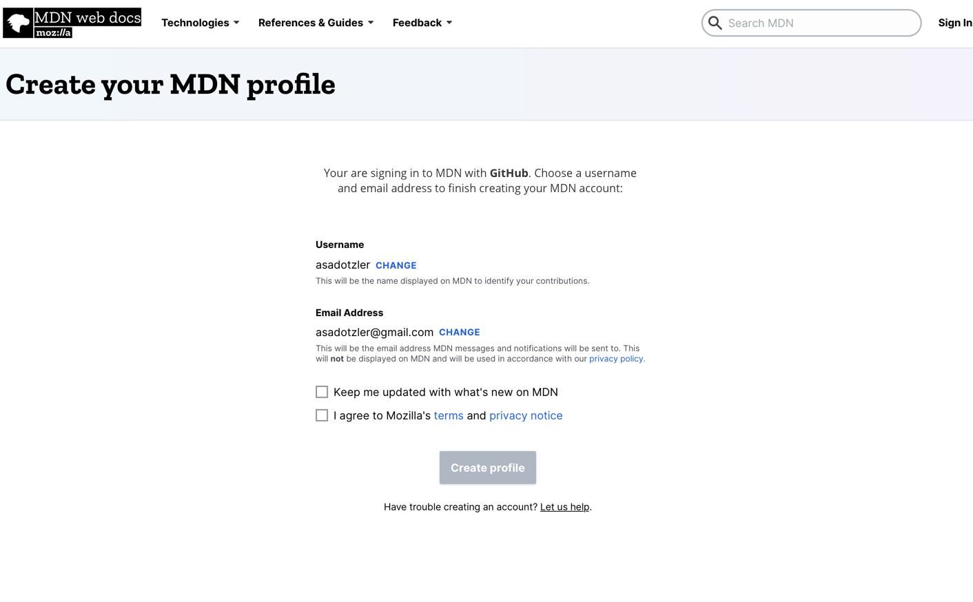
(cc @schalkneethling, @tobinmori, @atopal)
 malqinneh
on 25 Feb 2020
malqinneh
on 25 Feb 2020
I was going to suggest we drop that section as well @malqinneh
I reckon what you propose here is a good solution. The only comment I have is that we should probably not center align the copy. Perhaps instead left align it so it lined up with the rest of the page content. Thoughts?
Then again, it does kinda works with the button and support copy being centered as well.
schalkneethling
on 25 Feb 2020
Then again, it does kinda works with the button and support copy being centered as well.
Precisely.
Tried to come up with a viable solution given the time we have. I would not have centered the copy if that makes you feel better about your suggestion though.
malqinneh
on 25 Feb 2020
@malqinneh Note that we're very soon changing the email portion so you can not change it. The "Change email" link is going away.
With that in mind, you're actually here to confirm your username. Almost.
I think what I'm suggesting is to drop the whole second sentence so it just says: "You are signing in to MDN with GitHub/Google."
But again, at that point, it's not really helping users because they probably already know they used GitHub/Google 2 seconds ago.
Perhaps the sentence can just be "Complete your profile."
Or, what about; nothing?
peterbe
on 25 Feb 2020
I would not have centered the copy if that makes you feel better about your suggestion though.
Agreed.
@atopal We do need a call on this though. Should I go ahead and just completely remove the header section that shows the logo and avatar, and update the copy as @malqinneh suggested in https://github.com/mdn/kuma/issues/6500#issuecomment-590898506
schalkneethling
on 26 Feb 2020
The whole idea of that section was to make it clear to to people what is happening. It's not intuitive that you have just 'logged in' and now have to create an account. Yeah, the text does that too, but my assumption is that few people will actually read it. At this point, I'm okay with it, whatever gets us to launch Google auth already. As long as we have telemetry on the process we can tweak it later. So, yes, go ahead with the text, whether centered or not.
atopal
on 26 Feb 2020
Related issues
atopal
·
7Comments
schalkneethling
·
5Comments
 a2sheppy
·
12Comments
a2sheppy
·
12Comments
 caitmuenster
·
3Comments
caitmuenster
·
3Comments
 wbamberg
·
9Comments
wbamberg
·
9Comments
Most helpful comment
The whole idea of that section was to make it clear to to people what is happening. It's not intuitive that you have just 'logged in' and now have to create an account. Yeah, the text does that too, but my assumption is that few people will actually read it. At this point, I'm okay with it, whatever gets us to launch Google auth already. As long as we have telemetry on the process we can tweak it later. So, yes, go ahead with the text, whether centered or not.