Kuma: Bugzilla #1587029 Update the DevEdition banner on the landing page
Summary
_What should be changed? (Please provide a URL if applicable)_
https://bugzilla.mozilla.org/show_bug.cgi?id=1587029
Rationale
_What problems would this solve?_
Improve CTA.
Audience
_Who would use this changed feature?_
Proposal
_What would users see and do? What would happen as a result?_
"Build/Design in the browser" is something we can probably word to be easier to understand based on recent user research
The Learn More CTA can be improved as well
It would be great to do some AB testing here to tweak the messages, but I don't know how well we are set up for this.
Users better understand the banner and engage more.
Additional context
_Is there anything else we should know?_
 tobinmori
All 24 comments
Happy to help brainstorm new design/copy for an improved banner. cc: @digitarald
 violasong
on 28 Oct 2019
violasong
on 28 Oct 2019
@atopal do you want us to provide A/B testing on this? @gregoor has suggested possibly using Google Optimize to track audience groups.
tobinmori
on 13 Nov 2019
No, we'll do time based testing.
 atopal
on 13 Nov 2019
atopal
on 13 Nov 2019
If we have a/b testing in place, it makes sense to test messaging (especially for other locales).
 digitarald
on 13 Nov 2019
digitarald
on 13 Nov 2019
Unfortunately we don't have that already.
atopal
on 13 Nov 2019
Hi @violasong and @digitarald,
Are there required changes here beyond copy? If the intent is to also change the design elements, please let me know so we can sync-up on the format etc. Thanks!
 schalkneethling
on 18 Nov 2019
schalkneethling
on 18 Nov 2019
The current CTR is about 1.1%. It will be quite the challenge to improve upon that, prominent banners across the site usually get about .3%, but let's see what we can do :)
atopal
on 18 Nov 2019
From the survey data we've collected, MDN's homepage seems to get a lot of beginners, so it could be good to call out a learning-type feature. A great candidate for that would be Inactive CSS. I'd also like to make the copy a bit clear about being a link to DevEdition.
Firefox Developer Edition
The browser built for devs like you,
with features like Inactive CSS
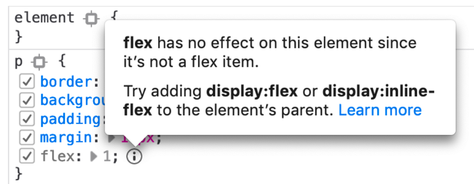
(We'd need to update the DevEdition website to say something about Inactive CSS)
violasong
on 19 Nov 2019
From the survey data we've collected, MDN's homepage seems to get a lot of beginners, so it could be good to call out a learning-type feature. A great candidate for that would be Inactive CSS. I'd also like to make the copy a bit clear about being a link to DevEdition.
Firefox Developer Edition
The browser built for devs like you,
with features like Inactive CSS
(We'd need to update the DevEdition website to say something about Inactive CSS)
That sounds like sane reasoning and a good version to test. We can also accommodate those design elements in our featured banner component. Let me know when you are ready to move forward on this.
schalkneethling
on 19 Nov 2019
That sounds good to me. @violasong is that the final design?
atopal
on 19 Nov 2019
Great! I'm working on a design here and would love feedback:
https://www.figma.com/file/7IA9MGWn9R4ToIQw3eY4qH/MDN-banner-inactive-css?node-id=1%3A11
I had to cut down on the text, including the words "Inactive CSS," because it was competing with the screenshot which already has a lot of text in it.
violasong
on 20 Nov 2019
Great! I'm working on a design here and would love feedback:
https://www.figma.com/file/7IA9MGWn9R4ToIQw3eY4qH/MDN-banner-inactive-css?node-id=1%3A11
I had to cut down on the text, including the words "Inactive CSS," because it was competing with the screenshot which already has a lot of text in it.
Awesome! Thanks @violasong - I made a small suggestion on Figma, let me know your thoughts.
schalkneethling
on 20 Nov 2019
@violasong you went down that path somewhat with the new design: I would recommend focussing on the general value of our CSS tools and not sell with a specific feature name. The screenshot works intuitively, so this is all about copy.
digitarald
on 20 Nov 2019
Cool! I changed the example from being about flex:1 to being about width/display:inline, which seemed like a more common/recognizable problem.
And Schalk, I added the checkboxes (it's still a somewhat simplified version of the UI).
https://www.figma.com/file/7IA9MGWn9R4ToIQw3eY4qH/MDN-banner-inactive-css?node-id=1%3A11
violasong
on 21 Nov 2019
@digitarald and @violasong do we have sign-off on the design in https://github.com/mdn/kuma/issues/6059#issuecomment-556936574
schalkneethling
on 21 Nov 2019
Just talked to Harald - yep, we've signed off on it!
Here are the 2x assets for the banner and app icon, which should be displayed at 313px wide and 64px wide respectively.
assets.zip
Do you have an estimate for when this may go live? I'm going to work on adding an Inactive CSS section to the DevEdition website that can hopefully launch around the same time (doesn't have to be exact).
violasong
on 22 Nov 2019
Just talked to Harald - yep, we've signed off on it!
Here are the 2x assets for the banner and app icon, which should be displayed at 313px wide and 64px wide respectively.
assets.zipDo you have an estimate for when this may go live? I'm going to work on adding an Inactive CSS section to the DevEdition website that can hopefully launch around the same time (doesn't have to be exact).
Thanks, @violasong. I would estimate this could go live on Monday, but let's make the official day Tuesday to be sure.
schalkneethling
on 22 Nov 2019
This should also change the utm_campaign (now css_grid_learn_more_2), maybe deved_inactive_css?
digitarald
on 22 Nov 2019
Great, thank you Schalk! (DE website bug filed)
violasong
on 23 Nov 2019
@violasong and @digitarald The PR is open https://github.com/mdn/kuma/pull/6160#issue-345624938
schalkneethling
on 26 Nov 2019
@tobinmori @schalkneethling This is marked as Done in the spreadsheet, but the PR is still open. Move to next sprint?
 jmswisher
on 3 Dec 2019
jmswisher
on 3 Dec 2019
Yes please! Thanks @jmswisher
tobinmori
on 3 Dec 2019
@violasong @digitarald This one has been merged https://github.com/mdn/kuma/pull/6160 and in all likelihood will go live today o/\o Apologies for the delay in getting it out there.
schalkneethling
on 4 Dec 2019
No worries! Thanks so much Schalk!
violasong
on 5 Dec 2019
Related issues
 caitmuenster
·
3Comments
atopal
·
7Comments
caitmuenster
·
3Comments
atopal
·
7Comments
 peterbe
·
12Comments
tobinmori
·
3Comments
peterbe
·
12Comments
tobinmori
·
3Comments
 groovecoder
·
10Comments
groovecoder
·
10Comments