Kolibri: Use the "official" language switching icon
Observed behavior
We are currently using a globe.
A world icon does not signify language it signify location
Related: #2742
Expected behavior
We could use the much recommended language icon from http://www.languageicon.org/

User-facing consequences
Better visualization of RTL interface switching.
Errors and logs
n/a
Steps to reproduce
n/a
Context
n/a
 benjaoming
All 14 comments
We considered using the world icon from languageicon.org and intentionally decided against it.
I don't recall the reasoning, but I know for sure that it was considered. Perhaps @jtamiace or @khangmach remembers?
 indirectlylit
on 6 Sep 2019
indirectlylit
on 6 Sep 2019
I don't remember either but maybe @rtibbles knows
Some options from http://materialdesignicons.com/
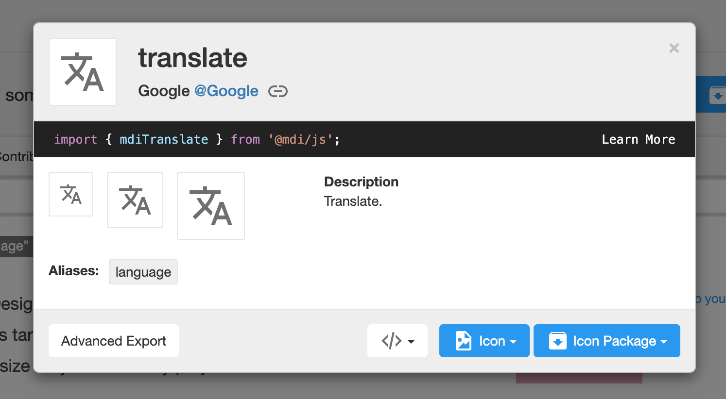
And the default material library
https://material.io/resources/icons/?icon=g_translate&style=baseline

Wouldn't be opposed to either of these. We haven't done any testing with the globe, but the above imo indicate language much better than the globe
 jtamiace
on 6 Sep 2019
jtamiace
on 6 Sep 2019
note that the latter icon above is literally the logo for the google translate app.
https://apps.apple.com/us/app/google-translate/id414706506
My issue with the language icons above is that they indicate two characters: english and a kanji character
 khangmach
on 6 Sep 2019
khangmach
on 6 Sep 2019
Two scripts - the "A" appears in a bunch of different languages. It excludes other non-Western and East Asian scripts and may even look unrecognizable by those who natively speak languages of scripts outside of these. That's the downside I see, but still in that case, both the globe and the suggestions above would be gibberish
jtamiace
on 6 Sep 2019
FYI here's the thread where it was discussed: https://learningequality.slack.com/archives/C0LKG14NL/p1500047631547416
including a link to https://usersnap.com/blog/design-language-switch/
which says
But have you ever seen that icon on one of your favorite websites or applications? I haven’t. And our user tests showed that people won’t recognize this icon as an option for selecting languages.
It seems that the standardized language icon isn’t widely used.
indirectlylit
on 6 Sep 2019
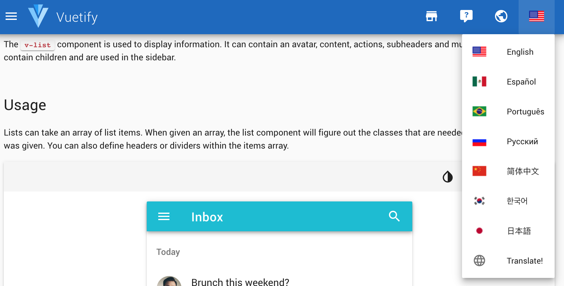
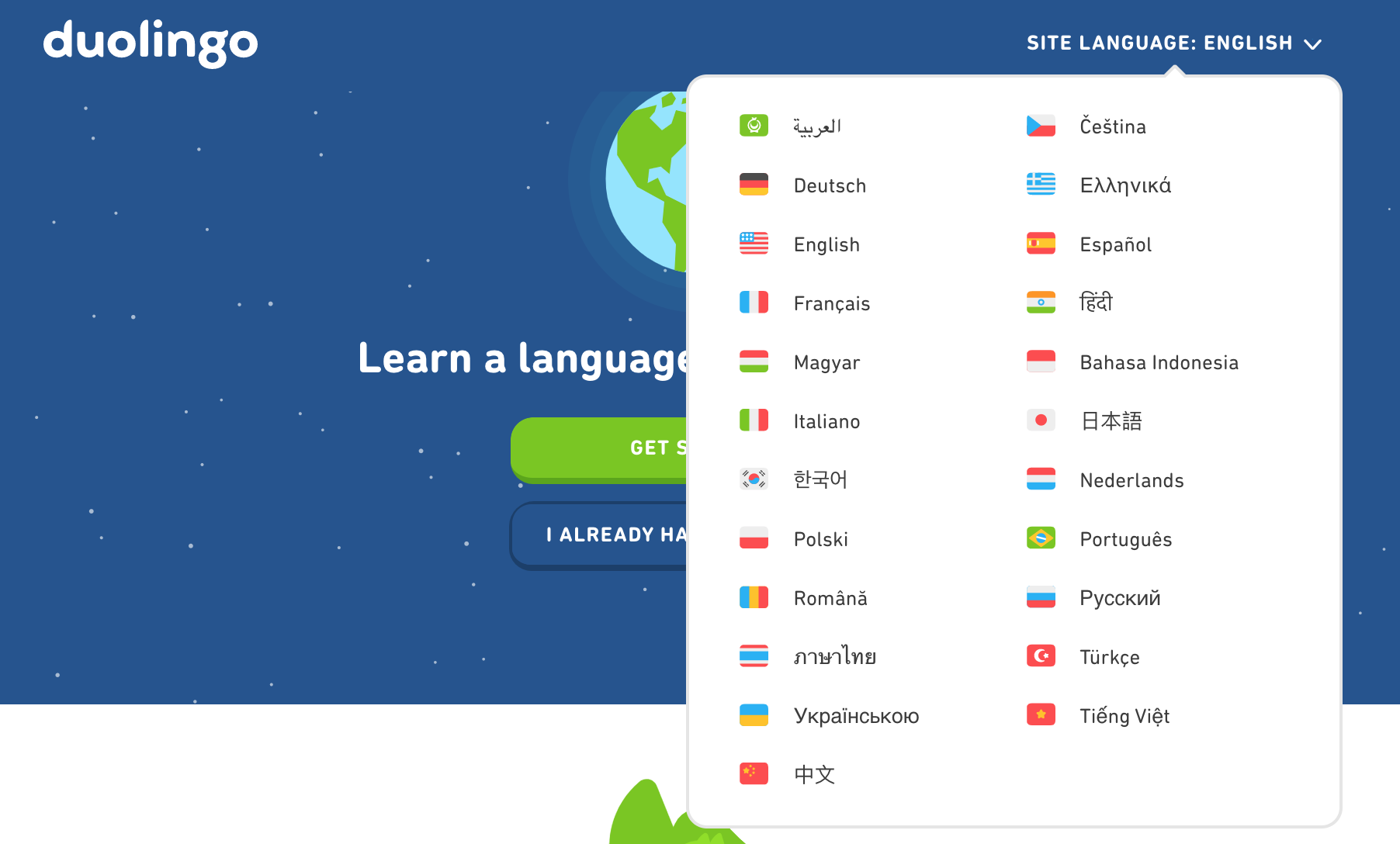
We could import a set of flag icons and pair it with the language text. That'd be cool
khangmach
on 6 Sep 2019
We could import a set of flag icons and pair it with the language text. That'd be cool
With 67 flags next to English :)
Just read the blog post, I get the discussion was had in 2017 and there aren't any clear answers or outlooks of diving back into it, also agree with @jtamiace 's view on the downsides of the "character wheel" :+1:
benjaoming
on 6 Sep 2019
something like this
khangmach
on 10 Sep 2019
or this
khangmach
on 10 Sep 2019
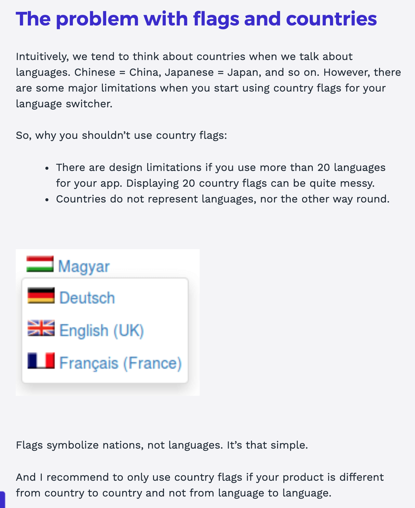
I would be opposed to using flags to represent languages, as it's exclusive and reductive. Same language may be spoken in many countries, so why prioritizing one over others to represent it?
 radinamatic
on 10 Sep 2019
radinamatic
on 10 Sep 2019
Some notes from my pov
- from an experience perspective it does the best job at getting the most users to parse through information and recognize the association of country and language.
- Using US as an example: Yes, there are many languages spoken in the states, but does us putting 67 flags next to english hamper or help the intentions of the feature?
- What about people coming to the platform from all around the world? Are they supposed to cipher through the intentions of the people developing the platform first before getting a good UX?
khangmach
on 10 Sep 2019
I wasn't aware of the discussions AFTER the languageicon.org initiative -- and that it had so much depth. Really sorry about opening up this -- perhaps the current solution is actually just fine. I was only opening the issue because I thought that the new icon would be a very simple adjustment :)
benjaoming
on 10 Sep 2019
I think using a flag is really problematic. I'll just link this but there are lots of reasons out there why this shouldn't be done http://www.flagsarenotlanguages.com/blog/why-flags-do-not-represent-language/
And from the link that Devon posted earlier
jtamiace
on 10 Sep 2019
@jtamiace Awesome, thanks the article. In the article here, the world icon seems like a universal representation of "language". http://www.flagsarenotlanguages.com/blog/best-practice-for-presenting-languages/
khangmach
on 10 Sep 2019
Related issues
jtamiace
·
4Comments
 metodimilevqa
·
3Comments
metodimilevqa
·
3Comments
 jonboiser
·
5Comments
jonboiser
·
5Comments
radinamatic
·
6Comments
jonboiser
·
5Comments
jonboiser
·
5Comments
radinamatic
·
6Comments
Most helpful comment
I would be opposed to using flags to represent languages, as it's exclusive and reductive. Same language may be spoken in many countries, so why prioritizing one over others to represent it?