Kitty: Kitty Term resizing glyph incorrectly
Operating System: Mac OSX
Kitty Version: 0.13.3
Hi there!
Recently downloaded kitty, and I _love_ the terminal, really awesome work on this.
One small thing that has been bugging me (it really shouldn't but I'd love to fix it) is that my zsh glyph prompt isn't working as intended. Rather than getting a full size arrow, I get half an arrow that's cut off. Oddly enough, this only happens when I use a ligatured font, like Hasklig or Fira Code (i've only tested 4 fonts, but this seems to be the pattern from that small sample size). I've messed with font sizes and it seems like the issues exists regardless of the size of the font itself.
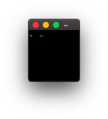
To see what I'm talking about, check out this screen grab I took.
https://imgur.com/a/UD4fk5e
I looked through the issues and while I found stuff I believe was mentioning my issue, I don't think they were ever really resolved.
 igniscyan
All 12 comments
what unicode character are you using for that arrow?
 kovidgoyal
on 10 Mar 2019
kovidgoyal
on 10 Mar 2019
The arrow is U+279C, I actually tried a different arrow and got the same issue.
igniscyan
on 11 Mar 2019
Works fine for me, simply install a scaleable font that has the glyph,
such as symbola. You can check which font kitty is using to render the
character with --debug-font-fallback
kovidgoyal
on 12 Mar 2019
I am still experiencing this problem which is particularly annoying because that is the prompt given by the default oh-my-zsh theme. Very bad first impression of Kitty coming from iTerm or Alacritty that the prompt doesn't render correctly only for Kitty.
 jessebett
on 18 Jul 2019
jessebett
on 18 Jul 2019
Works for me, the arrow is not cut off. What does kitty print when you start it with kitty --debug-font-fallback?
 Luflosi
on 19 Jul 2019
Luflosi
on 19 Jul 2019
Happens to me too (note two glyphs being cut off in that screenshot). Using spacefish here.

The output of kitty --debug-font-fallback is:
[273 11:15:00.724659] Preloaded font faces:
[273 11:15:00.724700] normal face: {'monospace': True, 'bold': False, 'italic': False, 'family': 'Fira Code'}
[273 11:15:00.724717] bold face: {'monospace': True, 'bold': True, 'italic': False, 'family': 'Fira Code'}
[273 11:15:00.724731] italic face: {'monospace': True, 'bold': False, 'italic': True, 'family': 'Fira Code'}
[273 11:15:00.724743] bi face: {'monospace': True, 'bold': True, 'italic': True, 'family': 'Fira Code'}
U+2b22 bold Face(family=STIXGeneral, full_name=STIXGeneral-Regular, postscript_name=STIXGeneral-Regular, path=/Library/Fonts/STIXGeneral.otf, units_per_em=1000, ascent=29.5, descent=12.7, leading=0.0, point_sz=0.0, scaled_point_sz=28.0, underline_position=-2.1 underline_thickness=1.4) (new face)
U+279c bold Face(family=Zapf Dingbats, full_name=Zapf Dingbats, postscript_name=ZapfDingbatsITC, path=/System/Library/Fonts/ZapfDingbats.ttf, units_per_em=2048, ascent=22.8, descent=4.9, leading=0.0, point_sz=0.0, scaled_point_sz=28.0, underline_position=-2.1 underline_thickness=1.4) (new face)
 adambubenicek
on 30 Sep 2019
adambubenicek
on 30 Sep 2019
As I said above, install symbola its metrics are more compatible with most monospace fonts than STIX or Zapf Dingbats
kovidgoyal
on 30 Sep 2019
Thanks, I did install Symbola and it did fix the arrow. It did not, however, fix the other glyph in that screenshot.
I understand this can be very difficult to fix due to the nature of Kitty's GPU optimisations, but regular users (such as myself) might not know which extra fonts they do need to install to make all their symbols render properly. Especially since all of these characters render properly out of the box in other terminals like Terminal.app or Alacritty. Except for this, Kitty has been really great though 🙏
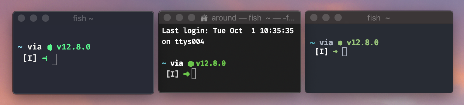
Kitty, Terminal.app, Alacritty
adambubenicek
on 1 Oct 2019
Oops, my bad, the arrow was fixed after I changed the font and not after I installed Symbola. Installing Symbola (from Homebrew) appears to have done nothing
adambubenicek
on 1 Oct 2019
Neither of those terminals is rendering the arrow correctly, look more closely, in the middle screenshot the arrow is overlapping with the next cell, which just happens to look ok because the next cell is a space and in the third screenshot the arrow glyph has been resized and so is no longer correctly aligned to the baseline and appears in a different font size than the rest of the text. You simply cannot use glyphs that have widely varying metrics in the same character cell display, and expect good results. The proper fix is to pick fonts with compatible metrics.
kovidgoyal
on 1 Oct 2019
And I can actually get perfect rendering for these glyphs in kitty by using the same trick it uses for PUA glyphs, namely to allow the glyph to bleed onto a neighboring cell if and only if the cell is a space. So unicode symbols will render perfectly with any font when followed by a space and render cut-off when using incompatible metrics and not followed by a space.
kovidgoyal
on 1 Oct 2019
Is there an option to disable this feature?
 iamcco
on 30 Jan 2020
iamcco
on 30 Jan 2020
Related issues
 z0rc
·
33Comments
z0rc
·
33Comments
 mihaicristiantanase
·
62Comments
mihaicristiantanase
·
62Comments
 maximbaz
·
30Comments
maximbaz
·
30Comments
 egmontkob
·
46Comments
egmontkob
·
46Comments
 serebit
·
28Comments
serebit
·
28Comments
Most helpful comment
And I can actually get perfect rendering for these glyphs in kitty by using the same trick it uses for PUA glyphs, namely to allow the glyph to bleed onto a neighboring cell if and only if the cell is a space. So unicode symbols will render perfectly with any font when followed by a space and render cut-off when using incompatible metrics and not followed by a space.