Kibana: [APM] Service map: layout improvements (timeboxed exploration)
There are currently two separate issues with the layout:
- The current layout is not as visually pleasing as we'd like
- we have indications from customers that the layout is incorrect in certain scenarios
We will try to solve the first point by experimenting with different Cytoscape layouts and settings. Ideally, something in the style of a flow chart would more accurately represent relationships between service nodes.
We will try to solve the second point by inspecting the service map for different customers and create specific issues for the problems we find.
 ogupte
All 11 comments
Pinging @elastic/apm-ui (Team:apm)
 elasticmachine
on 14 Jul 2020
elasticmachine
on 14 Jul 2020
Some feedback on when there are just 2 nodes on the map and looking at maps within a service.

- We should get rid of the turn, if there are only 2 components involved.
- The connector should be thinner.
- The map is too zoomed in for the nodes.
 nehaduggal
on 23 Jul 2020
nehaduggal
on 23 Jul 2020
We have very interesting UX feedbacks initiated by @formgeist .
Can we leverage this feedback to improve the UI of service maps? This feedback included insights on:
- The style of connectors: rounded, square elbows, lines
- The positioning of services on the map
- Service maps with many services
- Service maps for async services
 cyrille-leclerc
on 27 Jul 2020
cyrille-leclerc
on 27 Jul 2020
Some possibilities:
- We started out with cytoscape-dagre. We might want to try it again, along with some of the more sophisticated methods of rendering the lines so they're pretty and curvy.
- The (appropriately named) cytoscape-elk implements the Eclipse Layout Kernel layout algorithms. It looks like it might be appropriate and flexible.
 smith
on 6 Aug 2020
smith
on 6 Aug 2020
Service maps layout recommendations
Current layout:
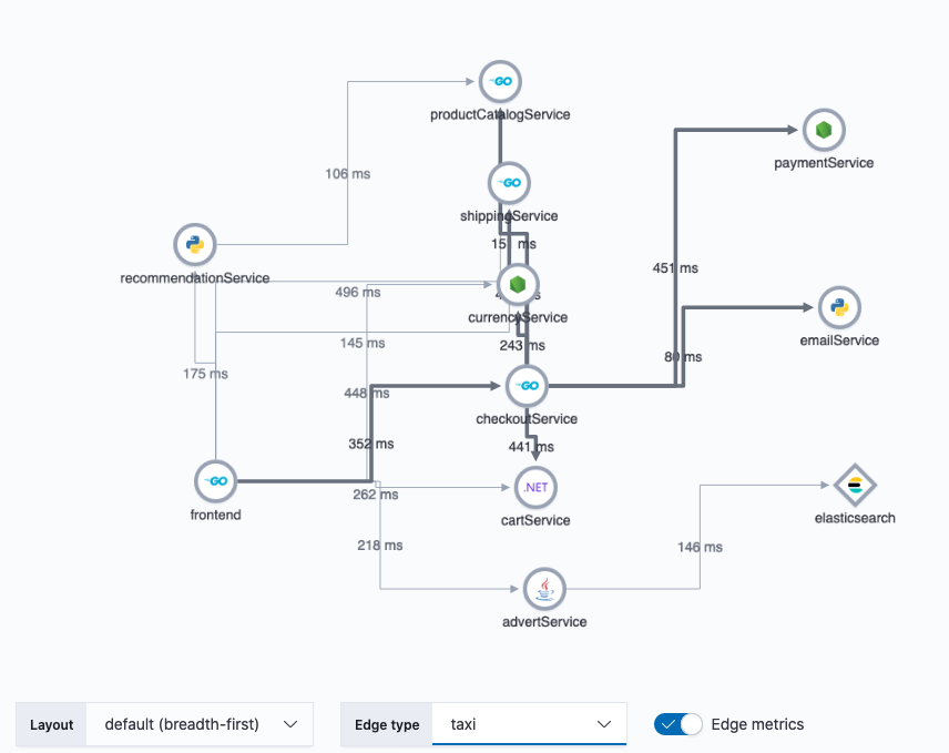
With existing service map examples in storybook, I tried a number of different layout and edge combinations. Here are a few that stood out to me:
dagre + unbundled-bezier edges
This combo seems the most natural to me:
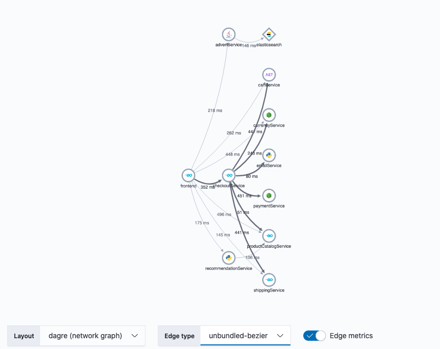
- The
dagrelayout positions the nodes in a similar Left -> Right pattern that we currently have. In contrast the to default,breadth-firstlayout, where nodes are aligned purely by rank (distance from starting services),dagreis much more organic, with highly connected services being located closer to each other. - The edge type
unbundled-bezierhas the advantage of overcoming overlapping lines issue we have withtaxiedges. Also the curved edges compliment the more organic arrangement of nodes. When you consider how edge metrics are displayed on the curved lines vs thetaxi, there's much less confusion on which connection the metric applies.
cose + taxi edges
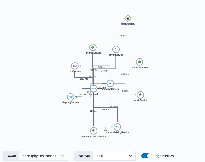
taxiedges convey a deliberate connection between nodes, like a schematic. The disadvantage oftaxiedges is that they don't tolerate overlapping well. Without interaction and inspection, it can be difficult to discern which nodes ataxiedge is connecting.- The
coselayout overcomes the shortcomings of thetaxiedges, by effectively minimizing the amount of edge overlap. It does this by running the graph through a physics engine, simulating attraction, repulsion, elasticity, etc. The result is a graph with very natural arrangement. The downside is that it can be difficult to influence the final positions of individual nodes when the graph is initialized. E.g. client nodes which connect to many service nodes tend to end up in the middle of the graph rather than the left side, since the center is the natural position to minimize overlaps.
breadth-first + segment edges
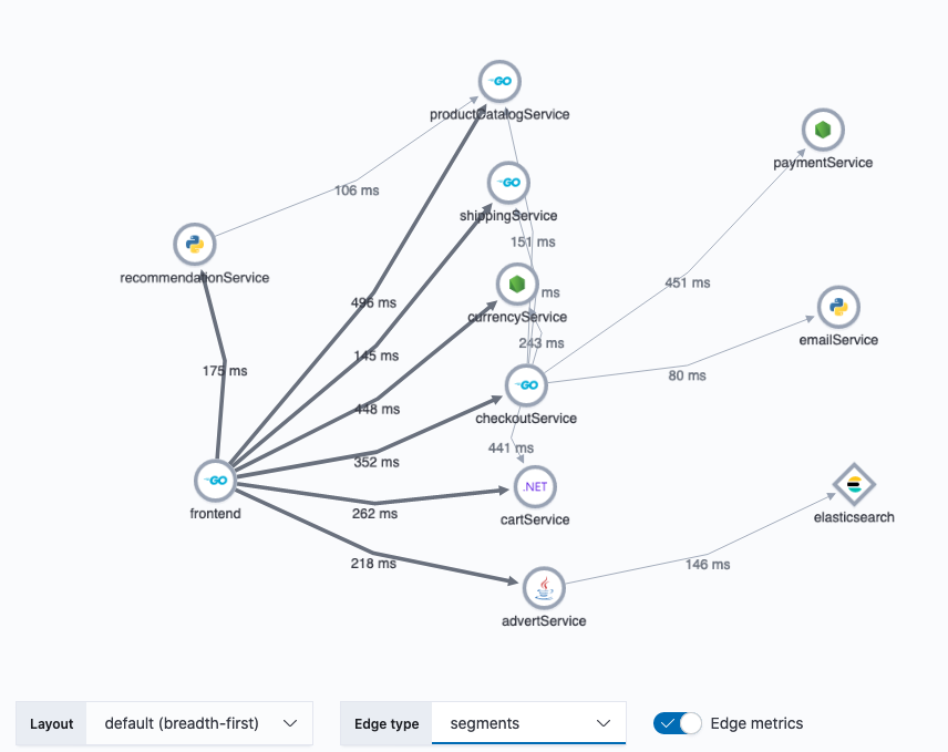
- The existing breadth-first layout enjoys more control over which services appear in the beginning and end of the service map, however nodes in the middle are purely positioned by order of their rank in the connection hierarchy (distance from root nodes). This mean that if a service has many first-level connections, they will all be lined up in the same rank which can be an inefficient use of real estate. It also suffers from confusing cross connections between nodes of the same rank.
segmentedges help overcome the issue of overlapping lines of thetaxiandstraightedge styles while maintaining the clean, deliberate connection between nodes that we like intaxi. Metrics displayed onsegmentedges, also enjoy a strong visual association with their respective connecting lines.
breadth-first + unbundled-bezier edges
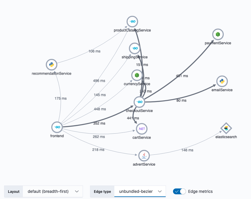
- This has the advantage of being the least complex solution, since it's just a simple style change for the edges.
Try it out
Check out the examples by pulling my branch (https://github.com/ogupte/kibana/tree/apm-71770-service-maps-layout-spike) and running yarn storybook apm to view it locally. You can copy the hipster store response data and paste it into the JSON-based service map to recreate the screenshots above.
ogupte
on 25 Aug 2020
Thanks for putting these together. We can probably do a lot more with unbundled bezier edges by tweaking the settings. cytoscape/cytoscape.js#2579 has a bunch of good examples we could draw from.
smith
on 25 Aug 2020
Awesome work with storybook @ogupte. Is the storybook with the different knobs merged in for anyone to play around with?
 sqren
on 25 Aug 2020
sqren
on 25 Aug 2020
Exciting @ogupte ! I like as well "dagre + unbundled-bezier". ISs it possible to add more horizontal spacing? I have in mind that it could help prevent overlaps on vertical connectors and better position metrics on the map while leveraging the large width of modern screens.
cyrille-leclerc
on 25 Aug 2020
@cyrille-leclerc these are our available options when using cytoscape-dagre: https://github.com/cytoscape/cytoscape.js-dagre#api, so yes we can adjust every kind of spacing. We'll of course want to try any adjustments on many maps and screens, since an improvement in once situation may not be right in another.
smith
on 25 Aug 2020
Awesome work with storybook @ogupte. Is the storybook with the different knobs merged in for anyone to play around with?
@sqren, It can be pulled from my branch (https://github.com/ogupte/kibana/tree/apm-71770-service-maps-layout-spike). I don't plan to merge this branch since it adds a bunch of code to import new layout extensions and expose various settings. Once the spike is complete, I'll create a new PR to merge the specific changes we want.
ogupte
on 25 Aug 2020
@ogupte Thanks for providing these examples. I was wonder if it's not too many much work, would it be possible to add the health statuses to the nodes in the generated maps? I would love to be able to see how the indicators might factor into this as well. Thanks!
 formgeist
on 25 Aug 2020
formgeist
on 25 Aug 2020
Related issues
 bhavyarm
·
3Comments
bhavyarm
·
3Comments
 spalger
·
3Comments
spalger
·
3Comments
 stacey-gammon
·
3Comments
stacey-gammon
·
3Comments
 tbragin
·
3Comments
tbragin
·
3Comments
 LukeMathWalker
·
3Comments
LukeMathWalker
·
3Comments
Most helpful comment
Service maps layout recommendations
Current layout:
With existing service map examples in storybook, I tried a number of different layout and edge combinations. Here are a few that stood out to me:
dagre+unbundled-bezieredgesThis combo seems the most natural to me:
dagrelayout positions the nodes in a similar Left -> Right pattern that we currently have. In contrast the to default,breadth-firstlayout, where nodes are aligned purely by rank (distance from starting services),dagreis much more organic, with highly connected services being located closer to each other.unbundled-bezierhas the advantage of overcoming overlapping lines issue we have withtaxiedges. Also the curved edges compliment the more organic arrangement of nodes. When you consider how edge metrics are displayed on the curved lines vs thetaxi, there's much less confusion on which connection the metric applies.cose+taxiedgestaxiedges convey a deliberate connection between nodes, like a schematic. The disadvantage oftaxiedges is that they don't tolerate overlapping well. Without interaction and inspection, it can be difficult to discern which nodes ataxiedge is connecting.coselayout overcomes the shortcomings of thetaxiedges, by effectively minimizing the amount of edge overlap. It does this by running the graph through a physics engine, simulating attraction, repulsion, elasticity, etc. The result is a graph with very natural arrangement. The downside is that it can be difficult to influence the final positions of individual nodes when the graph is initialized. E.g. client nodes which connect to many service nodes tend to end up in the middle of the graph rather than the left side, since the center is the natural position to minimize overlaps.breadth-first+segmentedgessegmentedges help overcome the issue of overlapping lines of thetaxiandstraightedge styles while maintaining the clean, deliberate connection between nodes that we like intaxi. Metrics displayed onsegmentedges, also enjoy a strong visual association with their respective connecting lines.breadth-first+unbundled-bezieredgesTry it out
Check out the examples by pulling my branch (https://github.com/ogupte/kibana/tree/apm-71770-service-maps-layout-spike) and running
yarn storybook apmto view it locally. You can copy the hipster store response data and paste it into the JSON-based service map to recreate the screenshots above.