Kibana: Scaling date histograms is confusing
For some reason when selecting date interval by second or minute the interval is set to hour:
"aggs": {
"2": {
"date_histogram": {
"field": "executionDate",
"interval": "3600000ms",
"min_doc_count": 1,
"extended_bounds": {
"min": 1422359119035,
"max": 1422963919035
}
 shayts7
All 12 comments
What is you time filter range? Kibana will auto scale intervals that are too small if needed. This behavior is determined by the "maxBars" setting in the Advanced settings section
 rashidkpc
on 3 Feb 2015
rashidkpc
on 3 Feb 2015
IMO this is very confusing, when I set explicitly the interval to "Second" or "Minute" I expect the behavior will be according to those settings and won't get influenced by the time range nor the maxBars.
WDYT?
shayts7
on 4 Feb 2015
I don't know what wdyt means.
We can't show you raw second or minute, its just too much data unfortunately. I'm open to other ideas, but simply showing everything isn't an option
rashidkpc
on 6 Feb 2015
WDYT stands for "What Do You Think",
The thing is that depending on the filter there might be small amount events for the graph and in that case minute or even second is ok.
But above all - I do not think it's self explained, I as a consumer of a graph cannot tell for sure which interval Kibana chose for me...
shayts7
on 7 Feb 2015
Even if Kibana scales the data, it should do it in the representation rather than changing the actual data.
So for example, I select 'second' interval, and kibana says it is being scaled to 5 seconds. Then it represents a count of 3 in 5 seconds as 0.6. Thats weird and not intuitive, right? It should rather change the interval itself from 1 seconds to 5 seconds (sort of like auto interval, but more fine grained I guess).
Also, do you plan to have an option for stating finegrained intervals? I would like to choose intervals of 10 seconds for example.
 sdht0
on 18 Feb 2015
sdht0
on 18 Feb 2015
I think that this is a very good functionality. And I'd like it to be in "Unique Count" as well. There are use cases when you don't want bars to "grow" when zooming out in time, like for example if each document represents a session, and bars represent concurrent sessions. Then you want the average.
However, it should be opt in, and it should be documented.
 sqpdln
on 18 Jun 2015
sqpdln
on 18 Jun 2015
@siddharthasahu That's funny, your "not intuitive" scenario of scaling the y-axis value per second is exactly what I want and can't find now. I'd love to see it work that way, but I'm okay if it's opt-in. Kibana 3 had a checkbox for this purpose at Histogram Settings -> Panel -> Transform Settings -> seconds (tooltip: 'Normalize intervals to per-second').
Our use case is to show "events per second" for operational monitoring, no matter the auto-scale on the x-axis.
 carver
on 27 Jun 2015
carver
on 27 Jun 2015
 thomasneirynck
on 2 Apr 2018
thomasneirynck
on 2 Apr 2018
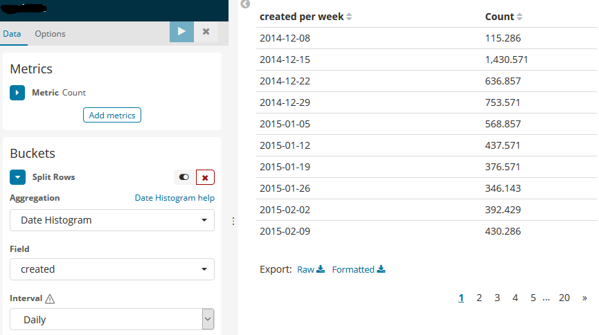
I found this extremely confusing and spent a long time trying to track down why my numbers weren't right until I discovered this ticket. I understand the arguments on both sides but I think that if it says "per week" I would expect it to be showing me data "per week", not per day.
I think that either the behaviour needs to change or the wording needs to change.
 jgough
on 24 Aug 2018
jgough
on 24 Aug 2018
@jgough 5.6 doesn't have this behavior of averaging the data from the response to display in the data table like you show here. The averaging does occur for other visualizations in 5.6 like the bar chart which is really unfortunate to only find this out now.
This behavior doesn't make sense. I mean the purpose of the setting was to act as a minimum interval. So show me daily if possible and we can all understand why it can't for larger time ranges. However, why would we think the metric displayed would also change. The user didn't ask for it to.
I'm scared to find out how many bar charts my users have been using in the wrong way. I guarantee they didn't think it was average data they were drilling down into in these cases. It makes a huge difference as the graph's peaks and valley's would be completely different across the time range. What's worse is that there's no way to even know which metric you're seeing because you didn't create the visualization.
 JacobBrandt
on 21 Dec 2018
JacobBrandt
on 21 Dec 2018
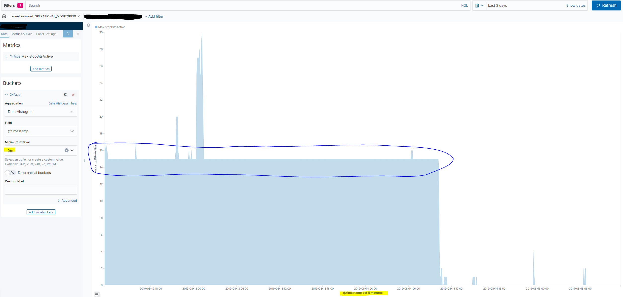
Now in 7.2 we still have the issue of confusing/misleading scaling. Let's take an example.
I have an index with a field called stopBitsActive which is sampled every 30 second and I want to create an area chart with date histogram and show the max value of stopBitsActive within some time buckets.
I would like to display 5-minute buckets if possible, so I set Minimal interval to 5m.
The true max value is 15 for most of the buckets during the last 3 days.
If I select a time period of the last 3 days, then no scaling of the time buckets occurs and I get the proper max value observed within each of the 5-minute buckets.
If I select a longer period, then some scaling occurs do to the increased number af data points.
When I select the last 7 days the buckets are scaled to 10 minutes, which is shown below the x axis. However, the buckets which before showed a max of 15 now shows 7.5 (max value divided by 2 as scaled bucket is twice as long as the minmum interval setting).
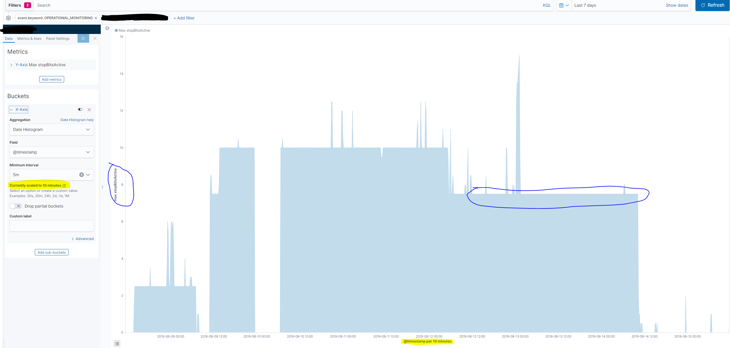
The dashboard viewer naturally has no idea about the scaling occured, but unknowingly reads a wrong value on the y axis.
When I select last 30 days the buckets are scaled to 30 minutes - and the max values of the periods where the max is actually 15 is now displayed as 2.5 on the y axis. The true value is divided by 6, because the scaled bucket is 6 times longer than the minimum interval specified.
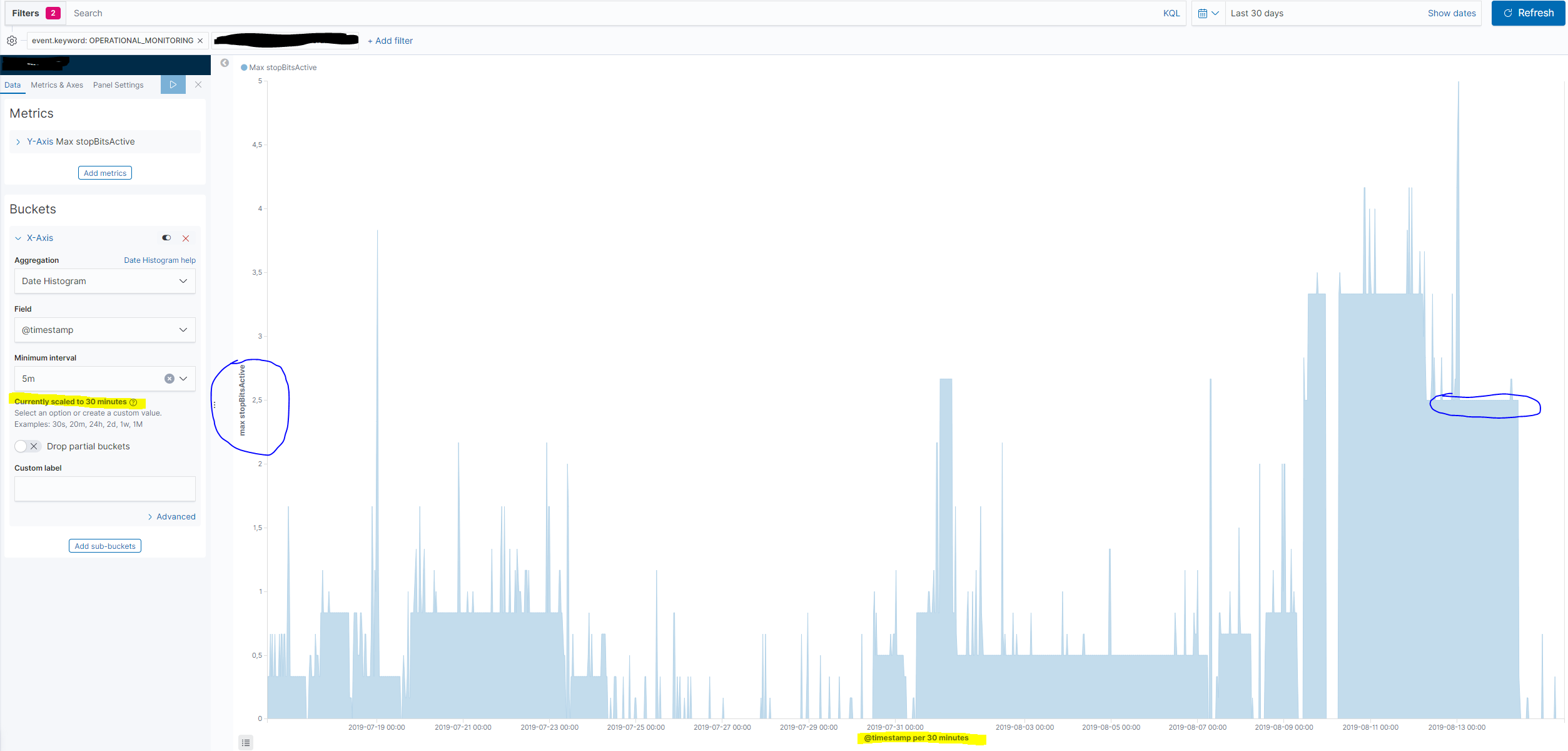
In the example above I used the Max aggregation, but exactly the same error occurs whenI use the Average aggregation and scaling of the Minimal interval is performed.
However, the dashboard user can newer see, when scaling has been performed. So for now I can only safely use the Auto setting on the Minimal interval when using date histograms, otherwise the values on the y-axis may be wrong. The consequence of this is in my case that I get auto buckets of 1 hour, 3 hours and 12 hours respectively when showing data for the last 3, 7 or 30 days. Bucket sizes which are not very useful in this situation.
 jtkarb
on 15 Aug 2019
jtkarb
on 15 Aug 2019
Why does this behaviour also apply to tables?
 djmcgreal-cc
on 30 Oct 2019
djmcgreal-cc
on 30 Oct 2019
Related issues
 treussart
·
3Comments
treussart
·
3Comments
 socialmineruser1
·
3Comments
socialmineruser1
·
3Comments
 spalger
·
3Comments
spalger
·
3Comments
 mark54g
·
3Comments
mark54g
·
3Comments
 stacey-gammon
·
3Comments
stacey-gammon
·
3Comments
Most helpful comment
I found this extremely confusing and spent a long time trying to track down why my numbers weren't right until I discovered this ticket. I understand the arguments on both sides but I think that if it says "per week" I would expect it to be showing me data "per week", not per day.
I think that either the behaviour needs to change or the wording needs to change.